Re: Defend America [9 Jan 2014] v10 pg.5
UPDATE!!
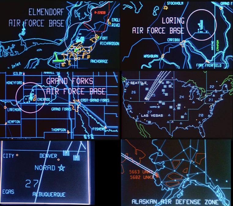
Large Map:
Small Map:

Color blind tests and 888 tests are in the OP!
Large Map:
- Click image to enlarge.

Small Map:
Color blind tests and 888 tests are in the OP!
Conquer Club, a free online multiplayer variation of a popular world domination board game.
https://beta.conquerclub.com/forum/
https://beta.conquerclub.com/forum/viewtopic.php?f=242&t=173146
RedBaron0 wrote:The background to me, seem as more of an afterthought, just a few military stock photos filtered and quickly added. To go along with this the legend is probably better off being more of a panel, with an appropriate military kinda theme. (buttons, lights, dials, readouts, etc.) The remaining empty areas can either be incorporated into the theme of the top panel, or something similar be added in those areas that could tie things together.
agentcom wrote:You mentioned in another thread that this map will use the new transformations, but I can't figure out what that means! Is it something to do with the factories and building "extra Fighters, Bombers and Hover-Tanks"?
agentcom wrote:Also, your description of empty regions contains an error. "i.e." means "that is." You want to use "e.g." which means "for example." IOW, if you use "i.e." you'd have to follow it with a comprehensive list of all the empty regions.
Armandolas wrote:What are the transformations? whats that all about?


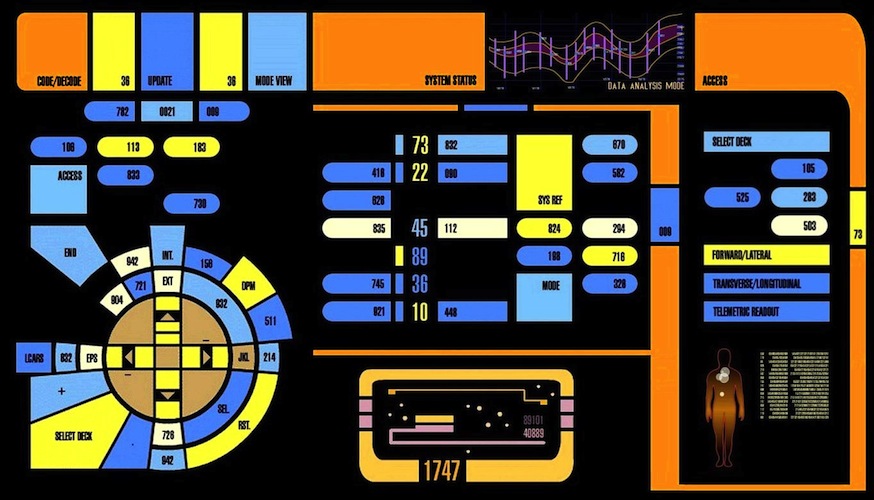

koontz1973 wrote:I like the panals, but as you said, think drone strike. Imagine you are one of these future warriors conducting this battle. How would you have your layout?
Something like the top half me thinks.


koontz1973 wrote:Much better for the legend. I know I said I would find things for you to do but this is not them honestly.
How about trying to give a 3D perspective to the screens? Like a computer monitor seem from a side angle. But the lighting is of on the borders of the panels now. You have the light coming from the top left but you have light and shade next to each other from the 2nd, 3rd & 4th column.


RedBaron0 wrote:The concept is still good, and I like where its all going isaiah. The big thing that is really bothering me right now is the cut && paste quaility of the monitor frames. Its seems to me that they are the exact same frame copied and then scaled to fit your need. Other than that a few minor touches should create that look you are aiming for. Add a light layer of glare to create the illusion of a glass screen, and change the uniformity of the background of the screens, and little(and I do mean little) bit of static or interference to at least a couple of the screens.


RedBaron0 wrote:If you can swing it space wise, putting in a screen or two that is all static, denoting loss of video feed and the peril the USA would seem to be facing on all sides would go a long way to setting the tone of your theme here.
puppydog85 wrote:There used to be a board game that was close to this concept. Except each group had a laser tower in one territory that could recharge and nuke a region every so many turns.


isaiah40 wrote:I will be getting an update up this weekend sometime!
RedBaron0 wrote:isaiah40 wrote:I will be getting an update up this weekend sometime!
:pokes isaiah with a stick: