Page 10 of 15

Re: San Marino [I,Gp,Gr]

PostPosted: Fri Jun 06, 2008 10:34 am
by sam_levi_11
TaCktiX wrote:I agree with pamoa about the bridge. It's out of place next to your really clean look on everything else. The mountains are fine, in my opinion. And the river color is just slightly "off", I don't know if it's the bevel on them, but it's not the right blue, a slightly lighter or darker shade would work.

put it this way, i thought it was steps not bridges :lol:

Re: San Marino [I,Gp,Gr] - map on pages 1 & 14

PostPosted: Wed Jun 18, 2008 10:31 pm
by AndyDufresne
              Final Forge

---The San Marino Map has reached the ‘Final Forge’ Stage. I've revived this thread from the pits of the Foundry Furnace (okay, maybe not) and have examined the contents. Nearly every major concern has been addressed. If there are any other current concerns, please make your voice heard. If after a reasonable amount of time there has not been any objection or protest, the map will be deemed finished with the 'Foundry Brand' of approval and will be submitted for live play. As long as there is still discussion or posts that have yet to be commented on, the map will remain in Final Forge until said discussion has reached the conclusion that the map has reached its final and polished version.

Post questions and concerns if any.

              Image

--Andy

Re: San Marino [I,Gp,Gr] - map on pages 1 & 14

PostPosted: Thu Jun 19, 2008 3:04 am
by yeti_c
Congrats Ruben.

C.

Re: San Marino [I,Gp,Gr] - map on pages 1 & 14

PostPosted: Thu Jun 19, 2008 9:44 am
by yeti_c
As discussed Ruben - here's some XML...

http://www.fileden.com/files/2008/1/19/ ... marino.xml

Not centered yet... - can you check spelling for me... -> they're consistent - but they may be consistently wrong!

Summary: 0 errors and 0 warnings detected in sanmarino.xml (13 continents, 37 territories)

C.

PS (Note - your first page is incorrect - you have 37 territories - not 36!)

Re: San Marino [I,Gp,Gr] - map on pages 1 & 14

PostPosted: Thu Jun 19, 2008 4:13 pm
by Ruben Cassar
yeti_c wrote:As discussed Ruben - here's some XML...

http://www.fileden.com/files/2008/1/19/ ... marino.xml

Not centered yet... - can you check spelling for me... -> they're consistent - but they may be consistently wrong!

Summary: 0 errors and 0 warnings detected in sanmarino.xml (13 continents, 37 territories)

C.

PS (Note - your first page is incorrect - you have 37 territories - not 36!)


Thanks Yeti. I'll have a look at it and check for spelling mistakes.

Bloody hell I thought they were 36! Hehe.

Re: San Marino [I,Gp,Gr] - map on pages 1 & 14

PostPosted: Sat Jun 28, 2008 9:22 am
by gimil
Just whenever your not watching football ruben it would be nice if you posted large and small with arny numbers :)

Re: San Marino [I,Gp,Gr] - map on pages 1 & 14

PostPosted: Sat Jun 28, 2008 9:55 am
by Ruben Cassar
gimil wrote:Just whenever your not watching football ruben it would be nice if you posted large and small with arny numbers :)


It's the next thing on my list. ;)

I was busy updating my Punic War map today.

Re: San Marino [I,Gp,Gr] - map on pages 1 & 14

PostPosted: Sun Jun 29, 2008 11:47 am
by Ruben Cassar
Small Version

Image

Large Version

Image

Re: San Marino [I,Gp,Gr] - map on pages 1 & 14

PostPosted: Sun Jun 29, 2008 9:18 pm
by AndyDufresne
Hm, the middle continent, Borgo, has been itching away at me, but I was never sure why. I think now it is because it feels too bright compared to the rest of your color choices. I don't mind the color chosen, but perhaps a tone or shade slightly darker or duller maybe, would keep it from standing out.

Additionally, the bright color makes the mountains sharp edges stand out horrendously. Is there any way to address this? The icons, both the mountains and the Torres, oddly just feel so jagged, edgy, and sharp in comparison with the rest surrounding soft graphic style.


--Andy

Re: San Marino [I,Gp,Gr] - map on pages 1 & 14

PostPosted: Mon Jun 30, 2008 1:22 am
by Ruben Cassar
AndyDufresne wrote:Hm, the middle continent, Borgo, has been itching away at me, but I was never sure why. I think now it is because it feels too bright compared to the rest of your color choices. I don't mind the color chosen, but perhaps a tone or shade slightly darker or duller maybe, would keep it from standing out.

Additionally, the bright color makes the mountains sharp edges stand out horrendously. Is there any way to address this? The icons, both the mountains and the Torres, oddly just feel so jagged, edgy, and sharp in comparison with the rest surrounding soft graphic style.


--Andy


I will try to tone the Yellow colour down a bit and see how that works out. Hopefully that will make everything look a bit better. However I am not going to change the towers again at this stage. I have changed them a million times and made a poll with 6 options which was running for several days. I think I dedicated more pages in this thread to those towers than anything else! :lol:

Re: San Marino [I,Gp,Gr] - map on pages 1 & 14

PostPosted: Mon Jun 30, 2008 12:31 pm
by Ruben Cassar
Is this better Andy?

Version 22 Small

Image

Version 22 Large

Image

Re: San Marino [I,Gp,Gr] - map on pages 1 & 14

PostPosted: Mon Jun 30, 2008 12:34 pm
by gimil
A touch more yellow and a little less green and your sound!

Re: San Marino [I,Gp,Gr] - map on pages 1 & 14

PostPosted: Mon Jun 30, 2008 12:34 pm
by Ruben Cassar
gimil wrote:A touch more yellow and a little less green and your sound!


It was like that before Gimil!

Re: San Marino [I,Gp,Gr] - map on pages 1 & 14

PostPosted: Mon Jun 30, 2008 12:48 pm
by Ruben Cassar
Any better Gimil?

Version 1.22 A Small

Image

Version 1.22A Large

Image

Re: San Marino [I,Gp,Gr] - map on pages 1 & 14

PostPosted: Mon Jun 30, 2008 1:20 pm
by RjBeals
You also need to adjust your layer blending on that yellow region. I can't see any land texture through the color. I can on all the other colors.

Re: San Marino [I,Gp,Gr] - map on pages 1 & 14

PostPosted: Mon Jun 30, 2008 1:24 pm
by gimil
The layers are much worst that you can imagine!

(wait for ruben to twat me)

Re: San Marino [I,Gp,Gr] - map on pages 1 & 14

PostPosted: Mon Jun 30, 2008 1:26 pm
by Ruben Cassar
gimil wrote:The layers are much worst that you can imagine!

(wait for ruben to twat me)


Hehe merci Monsieur Gimil! :p

Re: San Marino [I,Gp,Gr] - map on pages 1 & 14

PostPosted: Tue Jul 01, 2008 6:36 pm
by TaCktiX
Is that bridge going to get an adjustment, or will I be left thinking there's a giant stairway between those two territories?

Re: San Marino [I,Gp,Gr] - map on pages 1 & 14

PostPosted: Tue Jul 01, 2008 6:45 pm
by Ruben Cassar
TaCktiX wrote:Is that bridge going to get an adjustment, or will I be left thinking there's a giant stairway between those two territories?


What bridge? That's a marble stairway! :shock:

Re: San Marino [I,Gp,Gr] - map on pages 1 & 14

PostPosted: Tue Jul 01, 2008 10:08 pm
by AndyDufresne
Looking better. I didn't mean for you to change the mountain or torre graphics...simply attempt to fix the horrendous sharp edges somehow, as they don't blend with map at all! :)


--Andy

Re: San Marino [I,Gp,Gr] - map on pages 1 & 14

PostPosted: Wed Jul 02, 2008 1:32 am
by Ruben Cassar
AndyDufresne wrote:Looking better. I didn't mean for you to change the mountain or torre graphics...simply attempt to fix the horrendous sharp edges somehow, as they don't blend with map at all! :)


--Andy


Okay Andy I'm going to ponder a bit on how to do that while I sip some ice tea. I'll fix them in the next update. :-k

Re: San Marino [I,Gp,Gr] - map on pages 1 & 14

PostPosted: Fri Jul 04, 2008 5:14 pm
by MrBenn
Aaarg... I just posted wrote a sizeable post but got timed out...

Still like the look of this map, and can't think of any gameplay flaws at the moment! Here is the brief version of my thoughts:

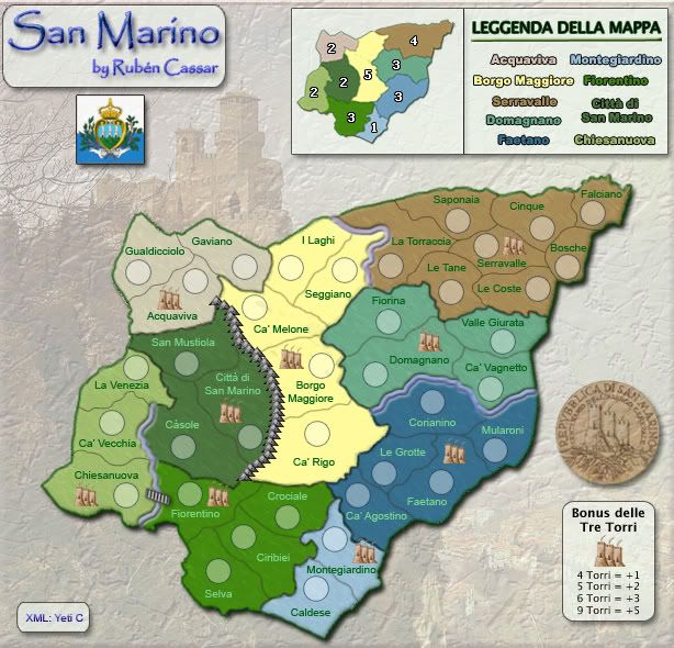
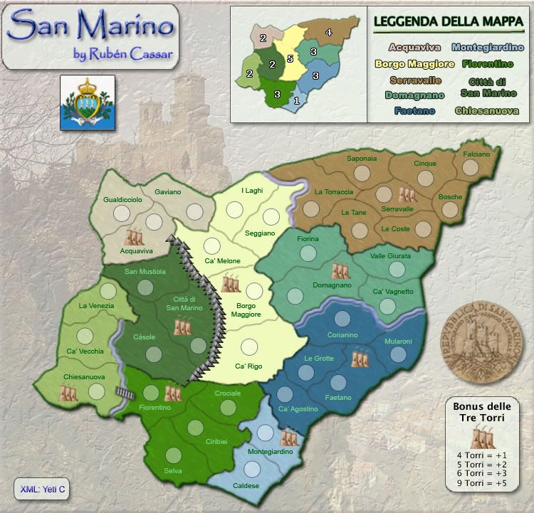
1. The outer green border still looks a bit pixelly, especially around Guildicciolo.
2. Is there any way you can make Chiesanuova look 'higher' than Fiorentino? This would help the marble stairs look less out of place.
3. Andy's got a point about the blending on the mountains. Perhaps you could just put a shadow falling to the right of them to soften that edge?
4. Did you ever try softening the bottom edge of te Torri?
5. As you've got 37 territories, it might be worth making Borgo Maggiore start neutral (the terr, not the region!). If anywhere is going to be neutral, I think that's the best place, and it would stop anybody starting with a +5 bonus for holding the region, or all the Torri.

Keep up the good work Ruben ;-)

Re: San Marino [I,Gp,Gr] - map on pages 1 & 14

PostPosted: Sat Jul 05, 2008 10:28 am
by Ruben Cassar
Version 1.23a - New bridge, New mountains, refined towers

Image

Re: San Marino [I,Gp,Gr] - map on pages 1 & 14

PostPosted: Sat Jul 05, 2008 12:39 pm
by ZeakCytho
I like the new mountains style, but they seem too bright on the light-facing side. The bridge still looks like a staircase ;)

Re: San Marino [I,Gp,Gr] - map on pages 1 & 14

PostPosted: Sat Jul 05, 2008 9:43 pm
by AndyDufresne
MrBenn wrote:4. Did you ever try softening the bottom edge of te Torri?
5. As you've got 37 territories, it might be worth making Borgo Maggiore start neutral (the terr, not the region!). If anywhere is going to be neutral, I think that's the best place, and it would stop anybody starting with a +5 bonus for holding the region, or all the Torri.

Keep up the good work Ruben ;-)

Agreed on 4, possibly on 5.

ZeakCytho wrote:I like the new mountains style, but they seem too bright on the light-facing side. The bridge still looks like a staircase ;)

Also in agreement with both points.


--Andy