Bruceswar wrote:To better get my point across... Say you are driving down the road, and you see Billboards along side it.
This one

and this one

Which one are you more likely to notice?
Personally most would notice the one first with contrasting colors. Same reason Open Signs are Blue and Red etc etc. I think you get the point.
RjBeals wrote:(EDIT) I get the point sure, but sometimes hard contrast doesn't fit well into the artistic theme of a map
I'm not a advertising man in real life, but i think that your images and the RJ answer are saying the same thing:
The first image is intentionally (like the map) less flashy.
The creators want that you'll see the beer first and then you'll see the wonderful big hand trying to take it.
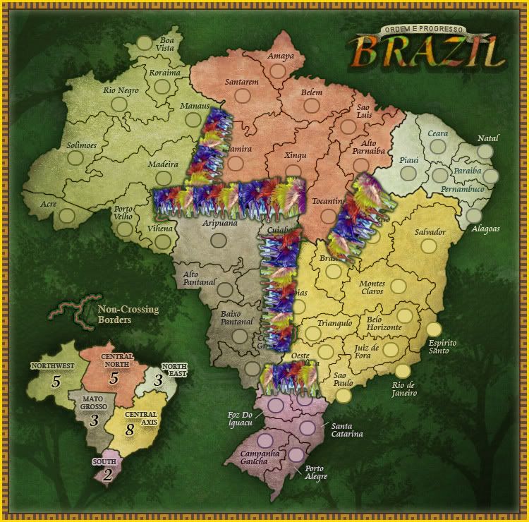
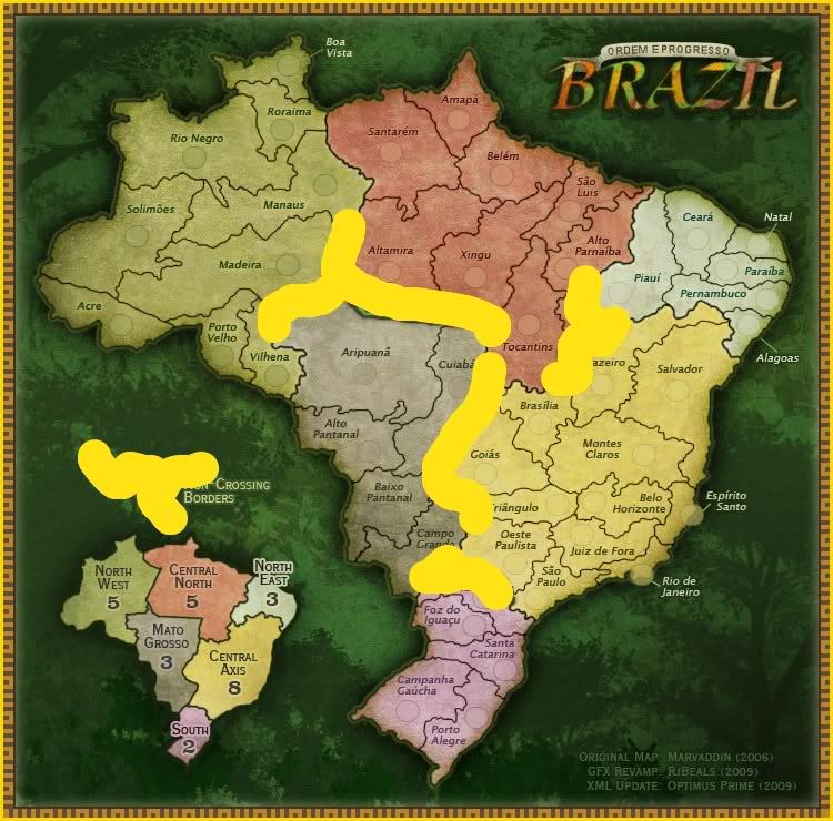
In the map you'll see the impassable in a second and then you will search what they mean in the rest of the map.
The impassable text is visible, so you'll find the borders, a bit camouflaged in the trees.
The second image you posted is obviously more flashy.
But if RJ will change the colors, the actual problem is only reversed on the map, like in the orange or yellow example.
Visible on legend, horrible on map.
I'm of the opinion that is better to spend a second searching the impassable explaination than destroy the actual wonderful look of this map.
The map is perfect !
Nice work RJ!

thenobodies80

](./images/smilies/eusa_wall.gif "Brick wall")