Page 13 of 14

Re: [Official] Brazil REVAMP [Beta]

PostPosted: Fri Jun 05, 2009 7:12 am
by Bruceswar
RjBeals wrote:here's a previous draft.. like this?

Click image to enlarge.
image


LIke that but the orange on the outside rather than the green... So the line would read orange green orange or whatever colors stood out more.

Re: [Official] Brazil REVAMP [Beta]

PostPosted: Fri Jun 05, 2009 7:14 am
by Bruceswar
You could use the same color of orange you used in the B on the Brazil heading. Sad to see you are unofficially retired from making maps. :( I love the ones you made and wish more were coming!

Re: [Official] Brazil REVAMP [Beta]

PostPosted: Fri Jun 05, 2009 7:34 am
by karelpietertje
Bruceswar wrote:To better get my point across... Say you are driving down the road, and you see Billboards along side it.

This one
Image

and this one
Image

Which one are you more likely to notice?

Personally most would notice the one first with contrasting colors. Same reason Open Signs are Blue and Red etc etc. I think you get the point.

duhh the Heineken billboard is way bigger... so you're saying the legend of the impassables should be made super-big?

lol just kidding :P
you're argument is a true one though. and what's the point in having a legend if it's not seeable?

Re: [Official] Brazil REVAMP [Beta]

PostPosted: Fri Jun 05, 2009 8:07 am
by jiminski
Image

here use this one Bruce.

Re: [Official] Brazil REVAMP [Beta]

PostPosted: Fri Jun 05, 2009 8:18 am
by RjBeals
](*,)

Re: [Official] Brazil REVAMP [Beta]

PostPosted: Fri Jun 05, 2009 8:24 am
by jiminski
RjBeals wrote:](*,)


hahah sorry RJ, FFS just ignore Bruce.

Re: [Official] Brazil REVAMP [Beta]

PostPosted: Fri Jun 05, 2009 8:28 am
by RjBeals
jiminski wrote:
RjBeals wrote:](*,)


hahah sorry RJ, FFS just ignore Bruce.


Well, some foundry members do accept all feedback, not that you could tell from the debate in General Discussion right now. ;)

Re: [Official] Brazil REVAMP [Beta]

PostPosted: Fri Jun 05, 2009 8:29 am
by jiminski
RjBeals wrote:
jiminski wrote:
RjBeals wrote:](*,)


hahah sorry RJ, FFS just ignore Bruce.


Well, some foundry members do accept all feedback, not that you could tell from the debate in General Discussion right now. ;)


i fixed it above for you RJ ...

i pass over the copyright for my artwork to you!

Re: [Official] Brazil REVAMP [Beta]

PostPosted: Fri Jun 05, 2009 8:38 am
by thenobodies80
Bruceswar wrote:To better get my point across... Say you are driving down the road, and you see Billboards along side it.

This one
Image

and this one
Image

Which one are you more likely to notice?

Personally most would notice the one first with contrasting colors. Same reason Open Signs are Blue and Red etc etc. I think you get the point.


RjBeals wrote:(EDIT) I get the point sure, but sometimes hard contrast doesn't fit well into the artistic theme of a map


I'm not a advertising man in real life, but i think that your images and the RJ answer are saying the same thing:

The first image is intentionally (like the map) less flashy.
The creators want that you'll see the beer first and then you'll see the wonderful big hand trying to take it.
In the map you'll see the impassable in a second and then you will search what they mean in the rest of the map.
The impassable text is visible, so you'll find the borders, a bit camouflaged in the trees.
The second image you posted is obviously more flashy.
But if RJ will change the colors, the actual problem is only reversed on the map, like in the orange or yellow example.
Visible on legend, horrible on map.

I'm of the opinion that is better to spend a second searching the impassable explaination than destroy the actual wonderful look of this map.

The map is perfect !
Nice work RJ! =D>

thenobodies80

Re: [Official] Brazil REVAMP [Beta]

PostPosted: Fri Jun 05, 2009 9:35 am
by mibi
I think the current borders do an effective job of identifying themselves as impassibles as well as fit in with the aethetic of the map. Any brighter or more contrasted and you will have ruined the delicate balance that RJ has created here.

Take it from me, a world famous graphic designer. :twisted:

Re: [Official] Brazil REVAMP [Beta]

PostPosted: Fri Jun 05, 2009 9:56 am
by sully800
Yeah, the current impassables look great BECAUSE they match the color of the background and therefore fit with the theme. Making them really bright to stand out from everything else would indeed make them more noticeable and it would also look really bad.

The saving grace here is that there is no other thick bold line on the map except for the impassables, so there is nothing to confuse them with. Even if you can't see the colors properly they are very distinct from everything else on the map itself so they don't need to be changed.

The one thing that COULD be changed is the legend for the impassables, because in that instance it does blend into the background. But since I am of the opinion that you shouldn't even need to include such a legend on simple maps where its obvious that the objects are impassable, I personally don't think this needs to be changed.

Re: [Official] Brazil REVAMP [Beta]

PostPosted: Fri Jun 05, 2009 10:01 am
by jiminski
mibi wrote:I think the current borders do an effective job of identifying themselves as impassibles as well as fit in with the aethetic of the map. Any brighter or more contrasted and you will have ruined the delicate balance that RJ has created here.

Take it from me, a world famous graphic designer. :twisted:


Preposterous! if you cast your eye above, i have carefully and subtly blended the new impassables to create the perfect synergy of the essential nature of Brasil with the aesthetic gestalt nuance of form and colour!

Re: [Official] Brazil REVAMP [Beta]

PostPosted: Fri Jun 05, 2009 11:08 am
by Tisha
Bruce =;

i love them green, and there is so much land color between the impassables and the trees.. i don't see how they can be mistaken for anything else :?

Re: [Official] Brazil REVAMP [Beta]

PostPosted: Fri Jun 05, 2009 12:16 pm
by dolomite13
Please don;t change the impassable border colors, They look fantastic as does the rest of this map. It is quite obvious that the borders are thick and thus denoting that you cannot cross the border.

I really love this revamp.

--D

Re: [Official] Brazil REVAMP [Beta]

PostPosted: Fri Jun 05, 2009 12:32 pm
by jiminski
dolomite13 wrote:Please don;t change the impassable border colors, They look fantastic as does the rest of this map. It is quite obvious that the borders are thick and thus denoting that you cannot cross the border.

I really love this revamp.

--D


i think you are safe dol. ; )

Re: [Official] Brazil REVAMP [Beta]

PostPosted: Fri Jun 05, 2009 12:37 pm
by wcaclimbing
I think the impassables are good.
Don't need to change.

Re: [Official] Brazil REVAMP [Beta]

PostPosted: Fri Jun 05, 2009 1:13 pm
by MrBenn
Actually RJ, I think the impassable border could do with a little bit of work... Brazil is renowned for it's parade in Rio - I wonder if you could try and find a way of representing a carnival or something? There's no way you could battle through all those dancing girls, and the bright colours would really help the impassable border to just 'zing'.

show: example


Warning wrote:This post may contain trace elements of irony.

Re: [Official] Brazil REVAMP [Beta]

PostPosted: Fri Jun 05, 2009 2:08 pm
by Bruceswar
Sorry I started a revolution. Lots of work is not needed, but just a simple color shade different. That is just my opinion. Nobody said you had to kill the maps theme to do it, or spend hours going back over it, but just something with a bit more zing to it.

Re: [Official] Brazil REVAMP [Beta]

PostPosted: Fri Jun 05, 2009 2:14 pm
by gimil
An alternative would be to slap a little contrasting glow or something around the unpassable legends part. To be honest though i am not sure this is a grave concern. People will see the 'unpassable' text, see the image next to it and put 2+2 together.

Streching the imagination the only concern that may arise is with colourblind people would may not be able to see it at all. I doubt this will happen however.

Re: [Official] Brazil REVAMP [Beta]

PostPosted: Fri Jun 05, 2009 3:24 pm
by Bruceswar
thenobodies80 wrote:
I'm not a advertising man in real life, but i think that your images and the RJ answer are saying the same thing:

The first image is intentionally (like the map) less flashy.
The creators want that you'll see the beer first and then you'll see the wonderful big hand trying to take it.
In the map you'll see the impassable in a second and then you will search what they mean in the rest of the map.
The impassable text is visible, so you'll find the borders, a bit camouflaged in the trees.
The second image you posted is obviously more flashy.
But if RJ will change the colors, the actual problem is only reversed on the map, like in the orange or yellow example.
Visible on legend, horrible on map.

I'm of the opinion that is better to spend a second searching the impassable explaination than destroy the actual wonderful look of this map.

The map is perfect !
Nice work RJ! =D>

thenobodies80


The point is not what you see first, but more so how quick you see it. When driving you only have a small window of time to notice a billboard. Same works many times in CC. People look quick make the drop of men and move on. People will make the mistake taking the impassible for some thickish border between the regions. They will make this mistake 1 or 2 times and think, screw it. I will not play this map again. We must remember not everybody speaks English as a native lang, people are generally not interested in reading a legend,(If so we would all know AOR 2 well the first time we play) and people hurry. Point is we should make maps as user friendly as possible. I am web designer and it is known that ease of use drives people to your site. Colors that are close to each other tend to drive people away.

Re: [Official] Brazil REVAMP [Beta]

PostPosted: Fri Jun 05, 2009 3:32 pm
by Danyael
gimil wrote:An alternative would be to slap a little contrasting glow or something around the unpassable legends part. To be honest though i am not sure this is a grave concern. People will see the 'unpassable' text, see the image next to it and put 2+2 together.

Streching the imagination the only concern that may arise is with colourblind people would may not be able to see it at all. I doubt this will happen however.


i would have to agree a slight change like gimil states might improve it i think its clear what is and what is not passable (mainly due to the copy past of the one impassable)
having the legend pop out more might make it clearer but i think it would throw the over all feel of the map off
and i'm as colour blind as they come and it does not blend it at all

edit :: forgot to mention that keeping the non passable borders like they are keeps the original ones essence

Re: [Official] Brazil REVAMP [Beta]

PostPosted: Fri Jun 05, 2009 4:01 pm
by RjBeals
where were you people a month ago?

Re: [Official] Brazil REVAMP [Beta]

PostPosted: Fri Jun 05, 2009 4:03 pm
by Danyael
RjBeals wrote:where were you people a month ago?

loving the look of the map

Re: [Official] Brazil REVAMP [Beta]

PostPosted: Fri Jun 05, 2009 4:06 pm
by Bruceswar
RjBeals wrote:where were you people a month ago?


I was around, but I did not notice it. But for me this is not such an issue as I know the map. For others it will be.

Re: [Official] Brazil REVAMP [Beta]

PostPosted: Fri Jun 05, 2009 7:38 pm
by Bruceswar
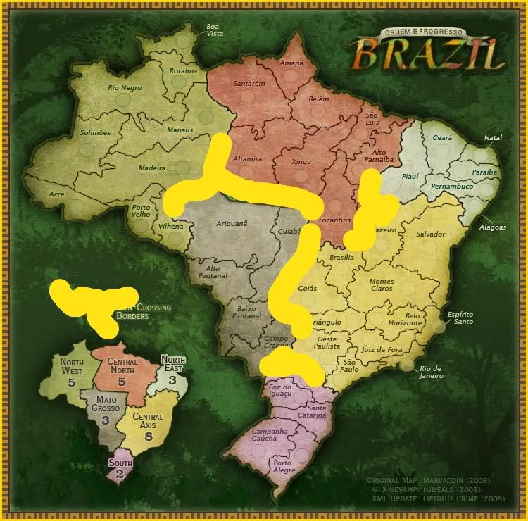
Here This is more what I mean... I took your orange from the B in Brazil and used it to highlight the impassable borders. The look you were after seems to be fully there still, yet people know 100% what it is... Obviously this would be copied from the legend to the map area.

Image