Official: Central America Comp, Rnd 1 thread
Round 2 is up and has been moved!
[size=110]The new Round 2 voting can be found over here...
viewtopic.php?f=10&t=75431&start=0
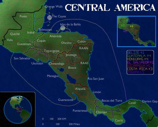
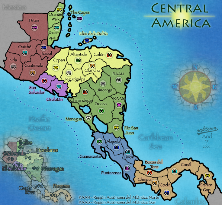
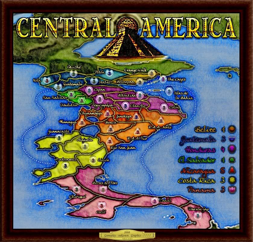
Entry #1
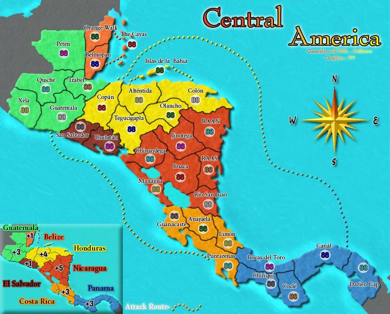
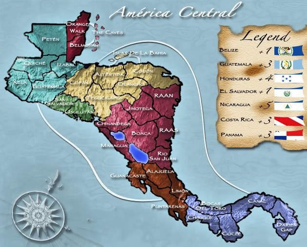
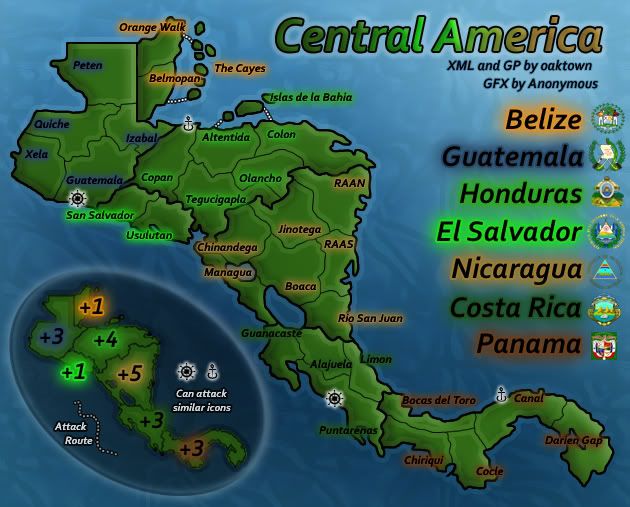
Entry #2
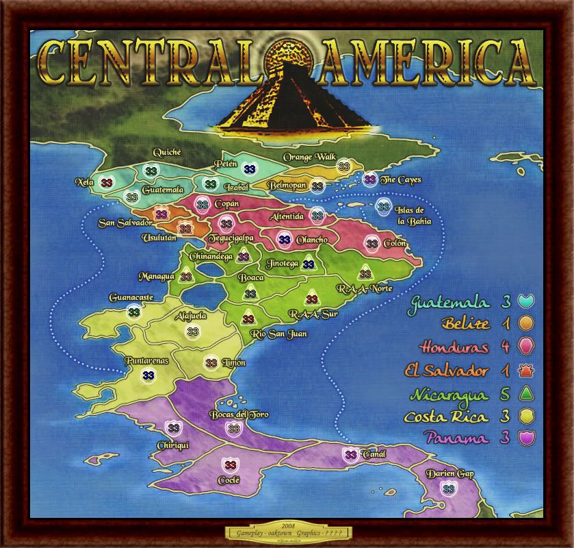
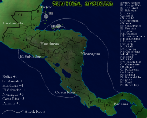
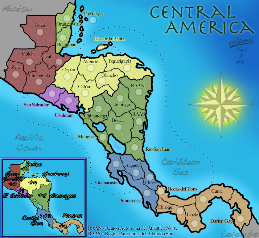
Entry #3
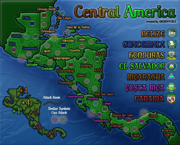
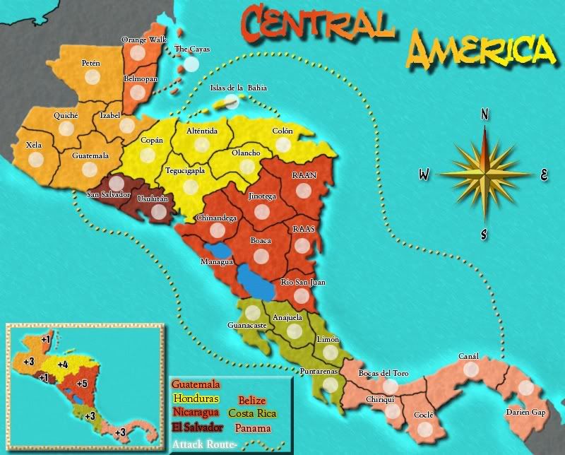
Entry #4
Entry #5
Entry #6
Links to round 1 drafts, if anybody cares to compare...
Entry #1: http://i141.photobucket.com/albums/r76/ ... /map01.png
Entry #2: http://i141.photobucket.com/albums/r76/ ... /map02.jpg
Entry #3: http://i141.photobucket.com/albums/r76/ ... /map03.jpg
Entry #4: http://i141.photobucket.com/albums/r76/ ... /map04.jpg
Entry #5: http://i141.photobucket.com/albums/r76/ ... /map05.png
Entry #6 was not included in round 1.
[size=110]The new Round 2 voting can be found over here...
viewtopic.php?f=10&t=75431&start=0
Entry #1
- Click image to enlarge.
Entry #2
- Click image to enlarge.
Entry #3
- Click image to enlarge.
Entry #4
- Click image to enlarge.
Entry #5
- Click image to enlarge.
Entry #6
- Click image to enlarge.
Links to round 1 drafts, if anybody cares to compare...
Entry #1: http://i141.photobucket.com/albums/r76/ ... /map01.png
Entry #2: http://i141.photobucket.com/albums/r76/ ... /map02.jpg
Entry #3: http://i141.photobucket.com/albums/r76/ ... /map03.jpg
Entry #4: http://i141.photobucket.com/albums/r76/ ... /map04.jpg
Entry #5: http://i141.photobucket.com/albums/r76/ ... /map05.png
Entry #6 was not included in round 1.