Mappa Mundi - UPDATE 0.5 (24 Mar) - Poll
Map Name: Mappa Mundi
Mapmaker(s): Balsiefen
Well hullo all, it's been a long time.
So I've been thinking of doing a map based on the medieval Mappae Mundi, particularly the Hereford mappa and the Dover one based off of it. I had an evening free today so I've thrown up a sketch of the small version. It should be a fun one to do as medieval maps are a great mix of wonky geography mixed in with Greek, Roman and Christian mythology. The further away from western Europe you get the more interesting things become.
Gameplay-wise, I'm anticipating this to be a moderately large map in terms of territories. (I haven't planned out all of it yet but the density of what's filled in should give an idea) Also I'm probably going to add extra gameplay based around Christian holy cities. Currently I am thinking +1 autodeploy for Rome, Constantinople and Alexandria which start out at neutral 4; +2 autodeploy for Jerusalem, starting as a neutral 5 and +4 autodeploy for Paridisos/Eden (the island at the top of the map) with neutral 10.
Eden should probably be only connected to Jerusalem but can be bombarded by the other holy cities.
I'm thinking I will place territories around the map that are able to one-way attack some or all of the holy cities.
Win conditions will be to hold all holy cities plus Eden.
Obviously the graphics are very early on also but some opinions on how easy things are to read (baring in mind this is the small map) would be useful. Beyond that, Medieval maps are always covered in fantastic and bizarre sketches. I'd love for the final map to look similar but I unfortunately lack the skills. If anyone is good enough with photoshop to lift images from existing mappae that could be placed on this one I'd be very happy, although it's still quite a bit away from that point.
Sources
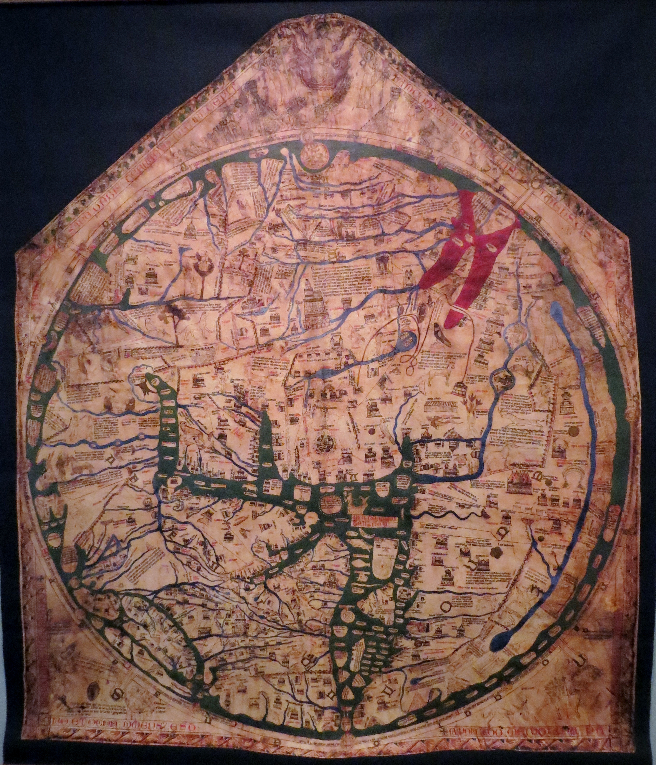
http://www.williamcowley.co.uk/wp-conte ... 1-Copy.jpg Dover Map, main source - based off the Hereford Map
http://upload.wikimedia.org/wikipedia/c ... G_3895.JPG Hereford Map
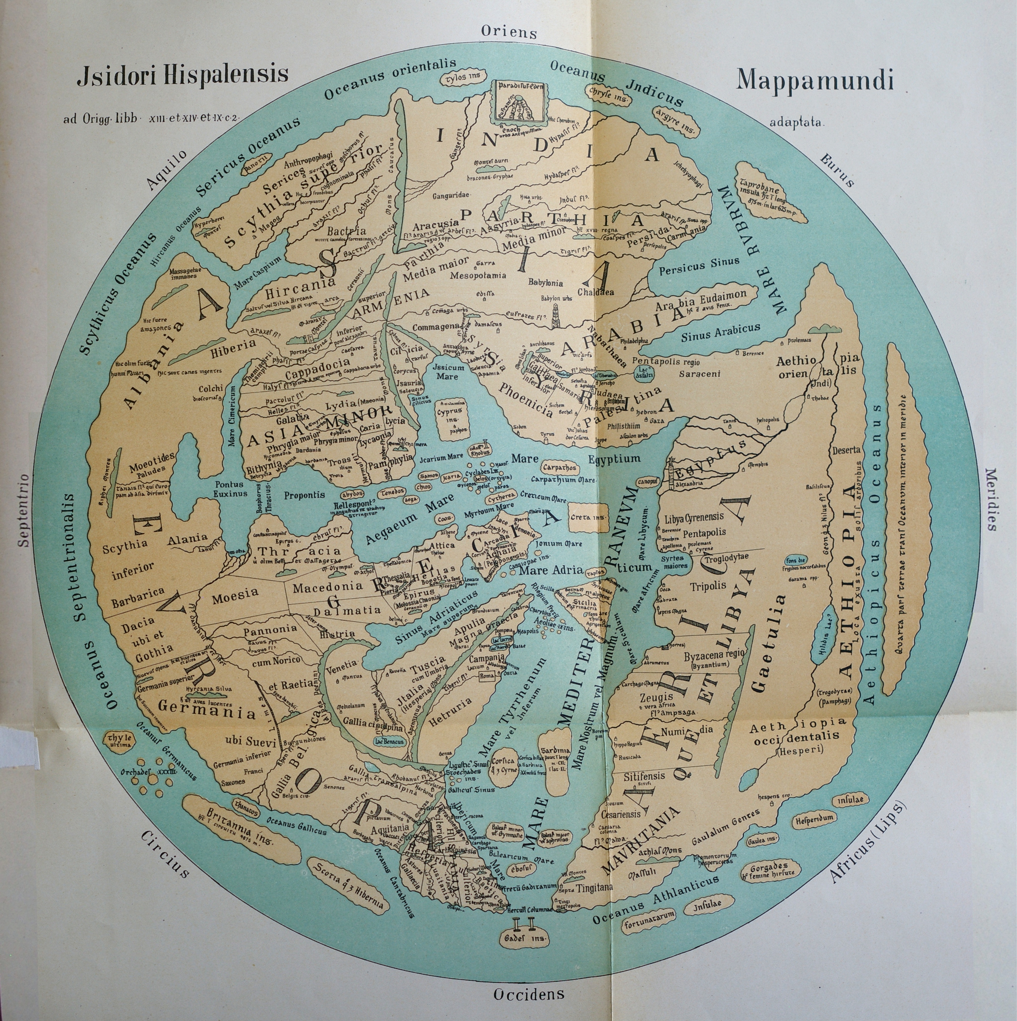
http://swanrad.ch/mappaemundi/13_Isidor.jpg Ravenna Cosmography, probably the easiest one to read
https://expateastafrica.files.wordpress ... c-1300.jpg Ebsdorf Map
Current Map Image:
MM 0.4s
MM 0.5s
Mapmaker(s): Balsiefen
Well hullo all, it's been a long time.
So I've been thinking of doing a map based on the medieval Mappae Mundi, particularly the Hereford mappa and the Dover one based off of it. I had an evening free today so I've thrown up a sketch of the small version. It should be a fun one to do as medieval maps are a great mix of wonky geography mixed in with Greek, Roman and Christian mythology. The further away from western Europe you get the more interesting things become.
Gameplay-wise, I'm anticipating this to be a moderately large map in terms of territories. (I haven't planned out all of it yet but the density of what's filled in should give an idea) Also I'm probably going to add extra gameplay based around Christian holy cities. Currently I am thinking +1 autodeploy for Rome, Constantinople and Alexandria which start out at neutral 4; +2 autodeploy for Jerusalem, starting as a neutral 5 and +4 autodeploy for Paridisos/Eden (the island at the top of the map) with neutral 10.
Eden should probably be only connected to Jerusalem but can be bombarded by the other holy cities.
I'm thinking I will place territories around the map that are able to one-way attack some or all of the holy cities.
Win conditions will be to hold all holy cities plus Eden.
Obviously the graphics are very early on also but some opinions on how easy things are to read (baring in mind this is the small map) would be useful. Beyond that, Medieval maps are always covered in fantastic and bizarre sketches. I'd love for the final map to look similar but I unfortunately lack the skills. If anyone is good enough with photoshop to lift images from existing mappae that could be placed on this one I'd be very happy, although it's still quite a bit away from that point.
Sources
http://www.williamcowley.co.uk/wp-conte ... 1-Copy.jpg Dover Map, main source - based off the Hereford Map
http://upload.wikimedia.org/wikipedia/c ... G_3895.JPG Hereford Map
http://swanrad.ch/mappaemundi/13_Isidor.jpg Ravenna Cosmography, probably the easiest one to read
https://expateastafrica.files.wordpress ... c-1300.jpg Ebsdorf Map
Current Map Image:
MM 0.4s
- Click image to enlarge.

So I've gone back and done each continent with a different font. Which do you folks think look the best and fit the theme best? For all of these I've been as conservative as possible so there is the potential for increasing both the font size and the spacing between letters to increase clarity.
MM 0.5s
- Click image to enlarge.

Filled in borders.


