Page 1 of 3
NEW MAP: TEXAS - UPDATE! -- PAGE 3

Posted:
Fri Aug 10, 2007 2:05 amby biotxlub
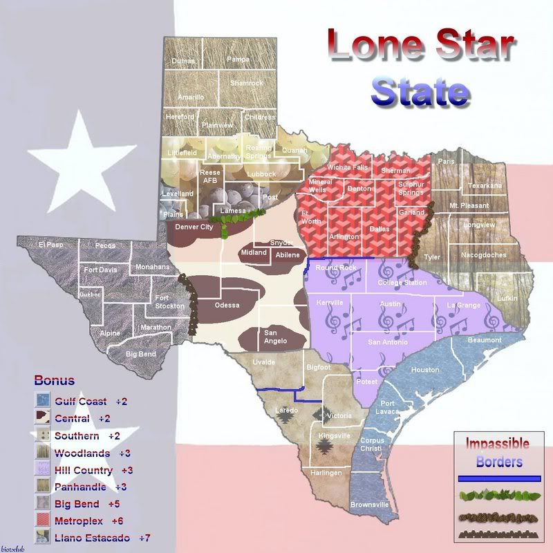
This is a Texas map that I just finished working on, for the moment anyway. I have a few working titles: Lone Star State, Texas Regions, Regions of Texas, or just Texas. Any suggestions?
All of the cities and towns on the map are real places. Some are very, very small and others are huge, but I wanted to include a little of everything. I added the bonuses you get for holding an area, and I chose the backgrounds in the map to represent the diversity of the regions. I also included the impassible, natural borders in the bottom, right corner (pinecones, a *river*, and leaves).
There are 66 territories on the map. Please let me know what you think, or if you have any suggestions.
Posted:
Fri Aug 10, 2007 2:31 amby cena-rules
I like the map other than the backgrounds where it has a pattern.
Make it just block colours. 66 is a good amount of territories so dont change that.
Other than that I like it.
Posted:
Fri Aug 10, 2007 5:18 amby WidowMakers
There is already a Texas map in development.
http://www.conquerclub.com/forum/viewtopic.php?t=11283
I do not know if it has been abandoned.
WM
Posted:
Fri Aug 10, 2007 9:34 amby biotxlub
As for the other TX map Widow Makers, I looked it up, and this is what I found.
DiM wrote:TroyMcClure wrote:DiM wrote:guys this map is most likely abandoned as there hasn't been any talk on it for over a month and a half.
what if it's not abandoned?
when a map maker does not show up in the forum for over 6 weeks my guess is the map is abandoned

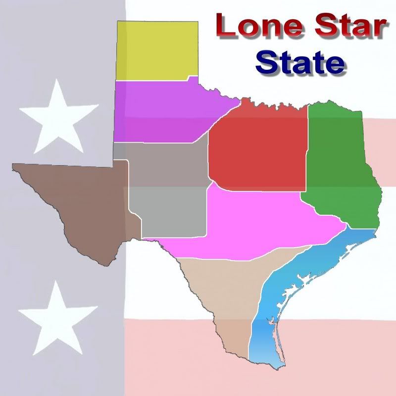
Cena, thanks for the feedback. I knew that some really wouldn't like the backgrounds, but I wanted to show diversity. Texas has a little bit of everything, from flat lands and mountains to metroplexes and the gulf. The panhandle region, I chose a grassy textured background, because it's really not much of anything but grassland. The Austin area, I chose the purple w/ music notes, because Austin is considered to be the Music Capitol of Texas. However, I did fade them down drastically so they wouldn't be bright and vibrant. I could make them even more transparent, but I think it might be hard to tell what's what on the bonus key unless I add the region names to the region. I'm working on a solid color instead of the backgrounds anyway, so I'll see how it turns out and post it here. This is really just a draft, because some of the boundary lines need to be defined more, and I just slapped the lines and town names in to see how it looked. Geographically, it's fairly accurate, but I'm still changing it some. Thanks again.
Posted:
Fri Aug 10, 2007 12:10 pmby biotxlub
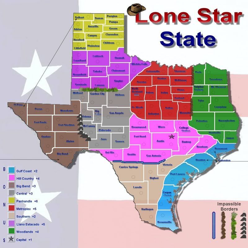
Here is one with solid colors, instead of the backgrounds. What do you all think?
Posted:
Fri Aug 10, 2007 12:40 pmby gimil
now were talking business

Posted:
Fri Aug 10, 2007 1:01 pmby biotxlub
Okay, I'll work on getting it all mapped out on the solid color map.
Posted:
Fri Aug 10, 2007 1:48 pmby Bad Speler
I would consider not making the fill transparent though
Posted:
Fri Aug 10, 2007 1:49 pmby gimil
Bad Speler wrote:I would consider not making the fill transparent though
really? i think we should wing it and wait to see what the end result is
Posted:
Fri Aug 10, 2007 2:25 pmby biotxlub
I think it's cool to leave it semi-transparent. I don't think it will be as noticeable once it's all mapped. But, I can always make it less transparent. Thanks!
Posted:
Fri Aug 10, 2007 7:07 pmby Goz83
the tribes map is what you had passion with. think it through man. don't let ass wipes shoot you down. some people are critical because they are asses and have no life so that is reflected in their attitude when someone actually goes and does something productive. Finish what you started and implement the positive suggestions. I look forward to the end reult.
Oh and someone should make a snakes and ladders board.

Posted:
Fri Aug 10, 2007 7:11 pmby gimil
Goz83 wrote:the tribes map is what you had passion with. think it through man. don't let ass wipes shoot you down. some people are critical because they are asses and have no life so that is reflected in their attitude when someone actually goes and does something productive. Finish what you started and implement the positive suggestions. I look forward to the end reult.
who are you and what are you talking about?
Posted:
Fri Aug 10, 2007 7:14 pmby Goz83
well i'm not a lil green man. i'm talking about the previos maps bio put up. check them out.
Posted:
Sat Aug 11, 2007 11:31 amby Kaplowitz
Goz83 wrote:well i'm not a lil green man. i'm talking about the previos maps bio put up. check them out.
soooo confussseeeddd....


Posted:
Sat Aug 11, 2007 4:46 pmby Spockers
He is talking about the Native Tribes map which I called "Pointless and Uninteresting"
Posted:
Sat Aug 11, 2007 4:53 pmby gimil
Spockers wrote:He is talking about the Native Tribes map which I called "Pointless and Uninteresting"
you call everything pointless an uninteresting
Posted:
Sat Aug 11, 2007 8:32 pmby misterman10
gimil wrote:Spockers wrote:He is talking about the Native Tribes map which I called "Pointless and Uninteresting"
you call everything pointless an uninteresting
Simple, Spokers just needs to raise his low self-esteem, so he feeds off others through the internet
Posted:
Sat Aug 11, 2007 11:09 pmby KEYOGI
So far the map's uninspiring, but then any map of a U.S. state is going to have limited appeal to most.
Also, I really think there has been more than enough Spockers flaming in the foundry. Take it to Flame Wars guys and leave map threads to map development talk.
Posted:
Sat Aug 11, 2007 11:36 pmby biotxlub
I have to agree. This part of the forum is for map development. I have to say, I didn't necessarily like or appreciate the Spockers comment in my other thread, but everyone has their own opinion, so to each his own. Thank you Goz, for coming to my defense. You're right, the Native American theme was my passion, and I'd decided on doing a US map, but since someone else has decided to take that over and post their links in my threads, I'm going to put it on the back burner.
So anyway, back to the map... Keyogi, what could I do to make it more inspiring? I rather like it, although I'm biased, and I'm not finished with it. I think it's interesting because Texas has to be the most diverse, or at least one of the most diverse states in the US. I could connect territories that can attack from the other side of the state, etc. What do you think? I'm almost done adding territories and such, so I'll post an update soon to get more opinions.
Posted:
Sun Aug 12, 2007 11:37 pmby KEYOGI
To be fair and offer any real constructive feedback, we'll need to see further updates.
Posted:
Mon Aug 13, 2007 5:35 amby Spockers
gimil wrote:Spockers wrote:He is talking about the Native Tribes map which I called "Pointless and Uninteresting"
you call everything pointless an uninteresting
That is both untrue and beside the point. I call it as I see it.
NEW MAP: TEXAS - UPDATE / PAGE 2
Posted:
Mon Aug 13, 2007 2:35 pmby biotxlub
Suggestions?
Thinking about changing the text... a few are a little harder to read.
There are now 86 territories. It would be quite a challenge (I think).
Posted:
Mon Aug 13, 2007 3:04 pmby gimil
font and army circles need to be much clearer and bigger, try dropping the impassable boarders and separating each continent like in the USA map.
The star for the capital needs to be MUCH more noticeable.
On the gulf coast the drop shadow looks a little odd. maybe replace it with an outer glow instead?
I like white boarders but perhaps make them thinner.
The font for the title should be much bigger, it should scream Texas to me

The hat should be tipped a little more to make it look like its dangling on the side
make the legends bigger to take up some more space.
That all for now
Posted:
Mon Aug 13, 2007 3:46 pmby Spockers
You realise this map eventually has to be A LOT smaller, which means your army circles and names are going to have to be A LOT bigger.
That attack route up the top left where the giant arrow is has to go. It's contrived and non-nonsensical.
Also, don't just "invent" impassable borders for the sake of them helping your map. Design your territories so that you wont need them.
Posted:
Mon Aug 13, 2007 4:03 pmby gimil
Spockers wrote:You realise this map eventually has to be A LOT smaller, which means your army circles and names are going to have to be A LOT bigger.
This is true but i dont think 600x600 should be a problem on the small.
Spockers wrote:That attack route up the top left where the giant arrow is has to go. It's contrived and non-nonsensical.
I think all hte attack lines should be dropped. There not really needed.
Spockers wrote:Also, don't just "invent" impassable borders for the sake of them helping your map. Design your territories so that you wont need them.
Agreeded