Conquer Club

Baltic States [3/10] V33 P34 Beta!!

Care to peruse completed maps? Take a stroll through the Atlas.

Moderator: Cartographers

Forum rules
Please read the Community Guidelines before posting.

Re: Baltic States [6/26] V23 P23 What is next?

Postby greenoaks on Wed Jun 26, 2013 9:25 pm

Bruceswar wrote:
greenoaks wrote:the two 5's in the legend look closer to the left edge than the other numbers


Optical illusion. . They are all the same distance.

:D

the 5's seem to end a space before all other numbers. maybe it is the width of that number compared to the 2's & 3's.
User avatar
Sergeant greenoaks
 
Posts: 9977
Joined: Mon Nov 12, 2007 12:47 am

Re: Baltic States [6/26] V23 P23 What is next?

Postby Bruceswar on Wed Jun 26, 2013 9:28 pm

greenoaks wrote:
Bruceswar wrote:
greenoaks wrote:the two 5's in the legend look closer to the left edge than the other numbers


Optical illusion. . They are all the same distance.

:D

the 5's seem to end a space before all other numbers. maybe it is the width of that number compared to the 2's & 3's.


Just triple checked. All numbers are the same size. They all start and end at the same pixels.
Highest Rank: 26 Highest Score: 3480
Image
User avatar
Private 1st Class Bruceswar
 
Posts: 9713
Joined: Sun Dec 23, 2007 12:36 am
Location: Cow Pastures

Re: Baltic States [6/26] V23 P23 What is next?

Postby greenoaks on Wed Jun 26, 2013 9:59 pm

Bruceswar wrote:
greenoaks wrote:
Bruceswar wrote:
greenoaks wrote:the two 5's in the legend look closer to the left edge than the other numbers


Optical illusion. . They are all the same distance.

:D

the 5's seem to end a space before all other numbers. maybe it is the width of that number compared to the 2's & 3's.


Just triple checked. All numbers are the same size. They all start and end at the same pixels.

ok, thanks for making me feel old. :D

for two of the terit names you've removed the border but not for Marijampole.
User avatar
Sergeant greenoaks
 
Posts: 9977
Joined: Mon Nov 12, 2007 12:47 am

Re: Baltic States [6/26] V23 P23 What is next?

Postby Bruceswar on Wed Jun 26, 2013 10:08 pm

Already fixed in next update :)
Highest Rank: 26 Highest Score: 3480
Image
User avatar
Private 1st Class Bruceswar
 
Posts: 9713
Joined: Sun Dec 23, 2007 12:36 am
Location: Cow Pastures

Re: Baltic States [6/26] V23 P23 What is next?

Postby Aleena on Thu Jun 27, 2013 2:04 am

I think you map looks a little over worked...

I think it should look more like this:

It's clean, simple and refreshing...

Image
User avatar
Private 1st Class Aleena
 
Posts: 277
Joined: Wed Jun 05, 2013 10:55 pm

Re: Baltic States [6/26] V23 P23 What is next?

Postby cairnswk on Thu Jun 27, 2013 3:01 am

Aleena wrote:I think you map looks a little over worked...

I think it should look more like this:

It's clean, simple and refreshing...


Aleena. I have been in the foundry since 2007 and have over 30 maps to my name - some good, some not so good.
It has long been policy of the foundry to require certain things to happen on the map and part of the requirements is a certain graphics standard, atop good gameplay.
While you can advocate for simplicity, i do not agree with you on your statements above, as i beleive Bruceswar and team are doing an exemplary job of attaining the required standard for this map. It is not an easy task to get to standards required these days for maps, (and i understand you are just starting out) but standards have improved greatly over the years. Requiring that certain standard is what differentiates this site from other sites out there. The version you have put forward unfortunately would not make the cut. :)
Image
* Pearl Harbour * Waterloo * Forbidden City * Jamaica * Pot Mosbi
User avatar
Private cairnswk
 
Posts: 11510
Joined: Sat Feb 03, 2007 8:32 pm
Location: Australia

Re: Baltic States [6/26] V23 P23 What is next?

Postby Bruceswar on Thu Jun 27, 2013 6:50 am

cairnswk wrote:
Aleena wrote:I think you map looks a little over worked...

I think it should look more like this:

It's clean, simple and refreshing...


Aleena. I have been in the foundry since 2007 and have over 30 maps to my name - some good, some not so good.
It has long been policy of the foundry to require certain things to happen on the map and part of the requirements is a certain graphics standard, atop good gameplay.
While you can advocate for simplicity, i do not agree with you on your statements above, as i beleive Bruceswar and team are doing an exemplary job of attaining the required standard for this map. It is not an easy task to get to standards required these days for maps, (and i understand you are just starting out) but standards have improved greatly over the years. Requiring that certain standard is what differentiates this site from other sites out there. The version you have put forward unfortunately would not make the cut. :)


I agree.. While the version quoted is nice, my current version is much better if you ask me. It is also much cleaner and game play issued fixed. Not to mention the needed added in things.
Highest Rank: 26 Highest Score: 3480
Image
User avatar
Private 1st Class Bruceswar
 
Posts: 9713
Joined: Sun Dec 23, 2007 12:36 am
Location: Cow Pastures

Re: Baltic States [6/26] V23 P23 What is next?

Postby RedBaron0 on Sun Jun 30, 2013 9:31 pm

Aleena wrote:I think you map looks a little over worked...

I think it should look more like this:

It's clean, simple and refreshing...

Image


While I enjoy simplicity, and am a advocate of simpler less complicated cairnswk :lol: ;) type maps. But this ā†‘ is/was a draft and would not have passed through the Foundry, in whatever form it existed in 2006. There are an amazing amount of programs out there that allow anyone with the time and energy to make maps look simple, when indeed they take an ENORMOUS amount of know-how and behind the scenes work.

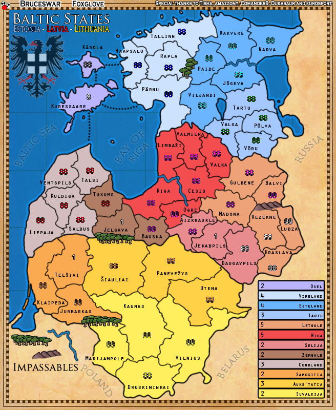
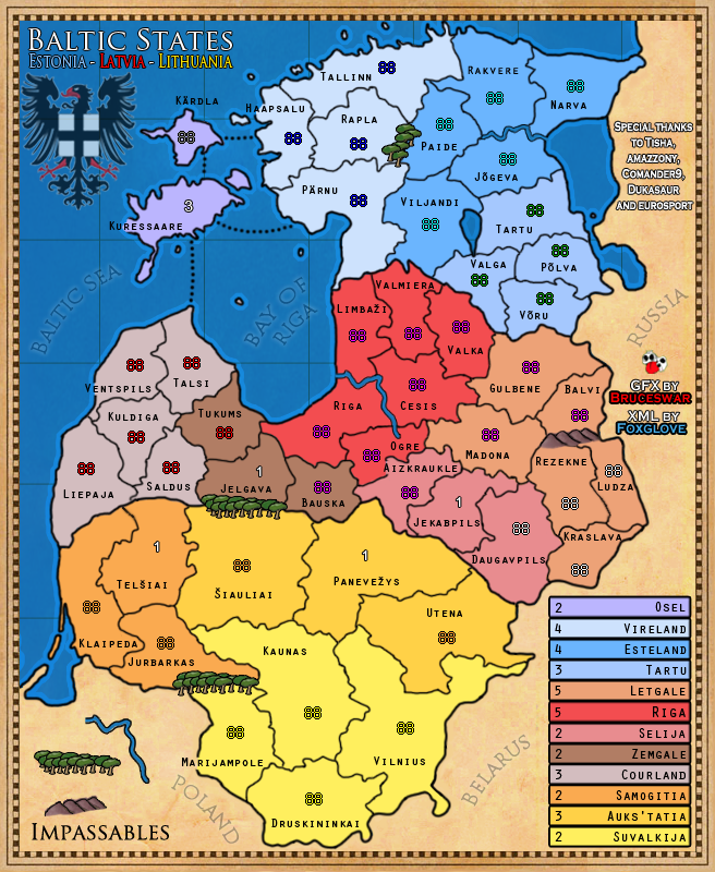
Bruce, the map. Is decent. Needs work. The grid lines, need to blend into the background more, now they are on top, of everything, including territory names. Also, I'd suggest the grid be a bit larger, the whole grid work really just makes the map seem confining, and should be more open.
The "Impassibles" font, has gotta be different. It clashes with the rest of the text.
Your special thanks and signature text are absolutely eyesores on this map. I can understand you wanting your own flare to these thanks and such, but they cannot clash so horridly with the style of the map. Look for better ways to incorporate these into the map. I'd suggest using the Russian space some, and find a better font there too. Remember these little types of shout outs can just inhabit 1 version of your map.(large or small) So you don't necessarily have to squeeze all that stuff onto the small map too.
I agree with lanyards on the impassibles, the hills... eh, ok, but can be better, but the mushroom trees? Please no. Um.... I feel like I've said this before, oh yeah, I did. viewtopic.php?f=10&t=142607&p=3650109&hilit=trees#p3650109

Same kinda problems from before, by the way I liked the texture on that map much better, you're kinda on the bland side right now.

Good Luck Bruce!
ImageImage
User avatar
Sergeant 1st Class RedBaron0
 
Posts: 2657
Joined: Sun Aug 19, 2007 12:59 pm
Location: Pennsylvania

Re: Baltic States [6/26] V23 P23 What is next?

Postby Bruceswar on Sun Jun 30, 2013 10:04 pm

those trees are pretty spot on for the area...

Image
Highest Rank: 26 Highest Score: 3480
Image
User avatar
Private 1st Class Bruceswar
 
Posts: 9713
Joined: Sun Dec 23, 2007 12:36 am
Location: Cow Pastures

Re: Baltic States [6/26] V24 P24 What is next?

Postby Bruceswar on Mon Jul 01, 2013 5:03 am

Version 24:

Image

What is new:

  • New Impassible text
  • Fixed the borders some
  • Changed the title places
  • New Map maker name text
  • Fixed some number locations and territory names
  • Moved the lines back so they cover the water only
  • Other minor fixes
Last edited by Bruceswar on Tue Jul 02, 2013 6:55 pm, edited 1 time in total.
Highest Rank: 26 Highest Score: 3480
Image
User avatar
Private 1st Class Bruceswar
 
Posts: 9713
Joined: Sun Dec 23, 2007 12:36 am
Location: Cow Pastures

Re: Baltic States [6/26] V24 P24 What is next?

Postby Bruceswar on Mon Jul 01, 2013 8:16 am

I just realized Pane is supposed to be a neutral 1. I will fix that in the next update.
Highest Rank: 26 Highest Score: 3480
Image
User avatar
Private 1st Class Bruceswar
 
Posts: 9713
Joined: Sun Dec 23, 2007 12:36 am
Location: Cow Pastures

Re: Baltic States [6/26] V24 P24 What is next?

Postby IcePack on Mon Jul 01, 2013 11:22 pm

The font looks fine on the map, but i have a hard time reading it in the boxes / lower right. Could those be sized differently, or some way to make them clearer and easier to read?
Image
User avatar
Captain IcePack
Multi Hunter
Multi Hunter
 
Posts: 15585
Joined: Wed Aug 04, 2010 6:42 pm
Location: California

Re: Baltic States [6/26] V24 P24 What is next?

Postby Bruceswar on Tue Jul 02, 2013 12:34 am

IcePack wrote:The font looks fine on the map, but i have a hard time reading it in the boxes / lower right. Could those be sized differently, or some way to make them clearer and easier to read?


I will see what I can do :) Thanks for stopping in.
Highest Rank: 26 Highest Score: 3480
Image
User avatar
Private 1st Class Bruceswar
 
Posts: 9713
Joined: Sun Dec 23, 2007 12:36 am
Location: Cow Pastures

Re: Baltic States [7/1] V24 P24 What is next?

Postby JamesKer1 on Tue Jul 02, 2013 6:48 pm

Not to be a killjoy, but this looks like it would be pretty tough on colorblind people (might be wrong though)- I personally like the layout of colors, but they are very close to each other. Maybe try mixing in a purple or dark blue in place of some oranges?
User avatar
Private JamesKer1
 
Posts: 1338
Joined: Fri Jun 24, 2011 9:47 am
Location: Good ol' Kentucky

Re: Baltic States [7/1] V24 P24 What is next?

Postby Bruceswar on Tue Jul 02, 2013 6:54 pm

JamesKer1 wrote:Not to be a killjoy, but this looks like it would be pretty tough on colorblind people (might be wrong though)- I personally like the layout of colors, but they are very close to each other. Maybe try mixing in a purple or dark blue in place of some oranges?


This already passed the color blind test. I have checked it already and a color blind person has looked at it.
Highest Rank: 26 Highest Score: 3480
Image
User avatar
Private 1st Class Bruceswar
 
Posts: 9713
Joined: Sun Dec 23, 2007 12:36 am
Location: Cow Pastures

Re: Baltic States [7/1] V24 P24 What is next?

Postby JamesKer1 on Tue Jul 02, 2013 6:57 pm

Alright, apparently I was wrong (which is a good thing)

Glad to hear it, nice job!
User avatar
Private JamesKer1
 
Posts: 1338
Joined: Fri Jun 24, 2011 9:47 am
Location: Good ol' Kentucky

Re: Baltic States [7/1] V24 P24 What is next?

Postby RedBaron0 on Tue Jul 02, 2013 10:52 pm

Bruceswar wrote:those trees are pretty spot on for the area...

Image


How do they look green, and you mean to tell me those are the -only- trees native to the region?

That being also said the black outlines around the impassible have a bit of pixelation and could stand to be cleaned up.

The grid just being on the water is... odd. Is it on the map or not?

The top line of the map with all your personal stuff looks terrible. It detracts from the ascetics of the map as a whole and absolutely need to be different. Put them in different spots, different fonts, whatever. The only thing that I honestly don't care about up there is the cow, though it could be blended into the corner a little better, but the whole top line other than that just looks slapped on in crayon after the fact....
ImageImage
User avatar
Sergeant 1st Class RedBaron0
 
Posts: 2657
Joined: Sun Aug 19, 2007 12:59 pm
Location: Pennsylvania

Re: Baltic States [7/1] V24 P24 What is next?

Postby Aleena on Tue Jul 02, 2013 11:11 pm

Great Job Bruce...
At least you've made it past draft to game play - keep it up - save the first game for me :)
User avatar
Private 1st Class Aleena
 
Posts: 277
Joined: Wed Jun 05, 2013 10:55 pm

Re: Baltic States [7/1] V24 P24 What is next?

Postby Bruceswar on Tue Jul 02, 2013 11:25 pm

RedBaron0 wrote:
Bruceswar wrote:those trees are pretty spot on for the area...

Image


How do they look green, and you mean to tell me those are the -only- trees native to the region?

That being also said the black outlines around the impassible have a bit of pixelation and could stand to be cleaned up.

The grid just being on the water is... odd. Is it on the map or not?

The top line of the map with all your personal stuff looks terrible. It detracts from the ascetics of the map as a whole and absolutely need to be different. Put them in different spots, different fonts, whatever. The only thing that I honestly don't care about up there is the cow, though it could be blended into the corner a little better, but the whole top line other than that just looks slapped on in crayon after the fact....


I will see what I can do about the thanks and sig line.. I happen to like the fact that they stick out. Sure they do not fit 100% with the map, but that is part of what I want. I want people to notice it.

With that said I will see what I can do.


Those tree's are not the only ones, but surely one of the main trees. They look just like the photo but with green leaves on them. Circle looking in fact.

Image below is local trees in Riga.

Image


The grid is something I am working on. I will see where I like it and just go with it. Seems everybody has a different idea on it. So as a map maker I am going go with what I like. People want it up top.. people want it on the bottom... people have asked me to try different settings, etc etc etc...
Highest Rank: 26 Highest Score: 3480
Image
User avatar
Private 1st Class Bruceswar
 
Posts: 9713
Joined: Sun Dec 23, 2007 12:36 am
Location: Cow Pastures

Re: Baltic States [7/1] V24 P24 What is next?

Postby greenoaks on Wed Jul 03, 2013 8:45 am

i like the grid on the map. that's water and land. i like the grid under everything else. title, eagle symbol & legend.

i get why you have the cow on the map but why special thanks? what is so special about their contributions that the aesthetics of this map takes a back seat? they aren't doing the graphics or the xml so why?
User avatar
Sergeant greenoaks
 
Posts: 9977
Joined: Mon Nov 12, 2007 12:47 am

Re: Baltic States [7/1] V24 P24 What is next?

Postby Seamus76 on Wed Jul 03, 2013 10:13 am

greenoaks wrote:i like the grid on the map. that's water and land. i like the grid under everything else. title, eagle symbol & legend.
I agree with this, but in the end go with what you think is best. I had the same kind of issue on Alaska, with them being a little distracting, so you might try just raising them up, but lowering the opacity.
ImageImageImage
User avatar
Sergeant 1st Class Seamus76
 
Posts: 1574
Joined: Fri Feb 25, 2011 5:41 pm
Location: Atlanta, GA

Re: Baltic States [7/1] V24 P24 What is next?

Postby cairnswk on Wed Jul 03, 2013 1:02 pm

Image

Bruceswar...i hope this helps you get that graphics stamp, and up to you if you want to make these adjustments.
but i did some "old" fine tooth combing and these are my thoughts...sorry for writing all over the map

1. black circles - some pressure points, bits sticking out, jaggered edges etc on borders that can be smoothed i beleive...the dotted sea route doesn't meet the coast properly

2. i've moved the impassables legend down to bottom corner to see if it looks better and moved "Poland" up but it still needs twisting a fraction - not a big one, just a suggestion if it looks better.

3. green circle - the balck edge end of the mountain looks unfinished

4. blue circles - there is a fraction of blue river not meeting the black border

5. red rectangles on bonus legend - the edge lines are very blurry, is there any way you can get them looking a fine line without blur another line beside it.

6. yellow circle up top - there is border line that crosses into frame.

the grid lines look much better now :)
Image
* Pearl Harbour * Waterloo * Forbidden City * Jamaica * Pot Mosbi
User avatar
Private cairnswk
 
Posts: 11510
Joined: Sat Feb 03, 2007 8:32 pm
Location: Australia

Re: Baltic States [7/1] V24 P24 What is next?

Postby Bruceswar on Wed Jul 03, 2013 10:27 pm

cairnswk wrote:
Bruceswar...i hope this helps you get that graphics stamp, and up to you if you want to make these adjustments.
but i did some "old" fine tooth combing and these are my thoughts...sorry for writing all over the map

1. black circles - some pressure points, bits sticking out, jaggered edges etc on borders that can be smoothed i beleive...the dotted sea route doesn't meet the coast properly

2. i've moved the impassables legend down to bottom corner to see if it looks better and moved "Poland" up but it still needs twisting a fraction - not a big one, just a suggestion if it looks better.

3. green circle - the balck edge end of the mountain looks unfinished

4. blue circles - there is a fraction of blue river not meeting the black border

5. red rectangles on bonus legend - the edge lines are very blurry, is there any way you can get them looking a fine line without blur another line beside it.

6. yellow circle up top - there is border line that crosses into frame.

the grid lines look much better now :)


1. Black Circles = Check!

2. Fixed!

3. Green Fixed!

4. Blue Fixed!

5. Red cannot be done as it is stroke so ideas?

6. Yellow also fixed!
Highest Rank: 26 Highest Score: 3480
Image
User avatar
Private 1st Class Bruceswar
 
Posts: 9713
Joined: Sun Dec 23, 2007 12:36 am
Location: Cow Pastures

Re: Baltic States [6/26] V24 P24 What is next?

Postby Bruceswar on Wed Jul 03, 2013 10:32 pm

IcePack wrote:The font looks fine on the map, but i have a hard time reading it in the boxes / lower right. Could those be sized differently, or some way to make them clearer and easier to read?


Fixed!
Highest Rank: 26 Highest Score: 3480
Image
User avatar
Private 1st Class Bruceswar
 
Posts: 9713
Joined: Sun Dec 23, 2007 12:36 am
Location: Cow Pastures

Re: Baltic States [7/1] V25 P25 Small Map ready?

Postby Bruceswar on Wed Jul 03, 2013 10:41 pm

Version 25:

Image

What is new:

  • Lots of border fixes
  • Pane back to neutral 1
  • Fixed the text on the legend
  • Moved the impassbles some and changed the text
  • Moved the special thanks and map maker text to make better use of the space
  • other minor fixes

As I stated I am waiting for the small map until very last thing... Are we to that point?
Last edited by Bruceswar on Wed Jul 03, 2013 10:45 pm, edited 1 time in total.
Highest Rank: 26 Highest Score: 3480
Image
User avatar
Private 1st Class Bruceswar
 
Posts: 9713
Joined: Sun Dec 23, 2007 12:36 am
Location: Cow Pastures

PreviousNext

Return to The Atlas

Who is online

Users browsing this forum: No registered users

cron