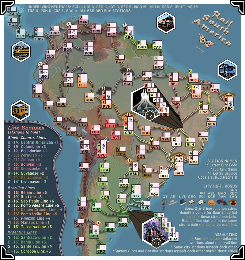
iancanton wrote:cairnswk wrote:So if you want to keep the fourth H line, i am thinking that maybe B FOR can be alleviated.
Do you agree to return to 89 GN ?
i seem to remember that koontz suggested removing a whole load of neutrals to move up to the next golden number. do we have enough non-essential neutrals to do this? if not, then keep B FOR if possible because fortaleza is a well-known city, one of the largest in brazil. ESG in paraguay or VVI in bolivia are better candidates for removal, since they are obscure places whose elimination hardly changes any of the gameplay on the map.
OK, i'll take VVI out.
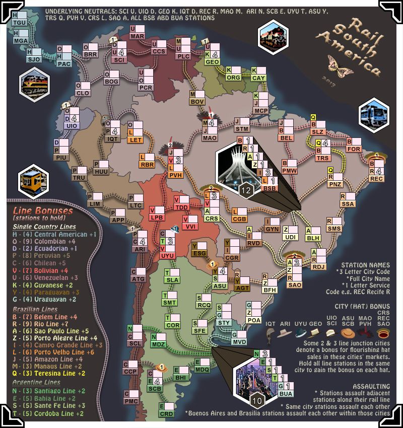
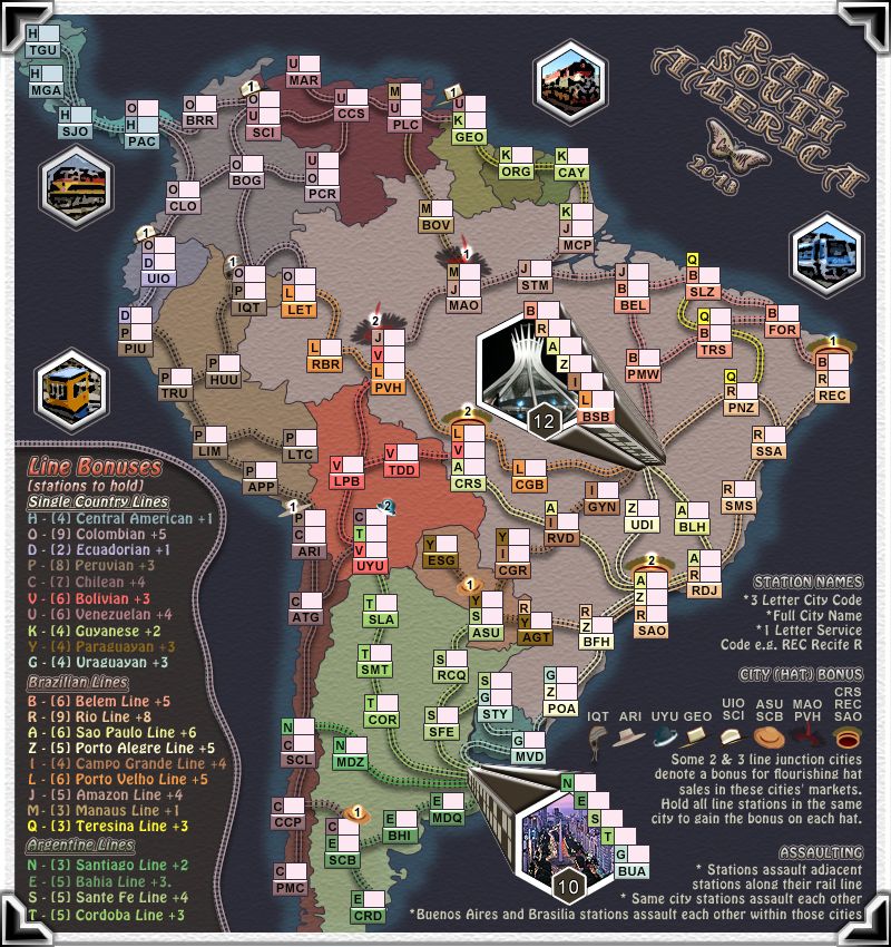
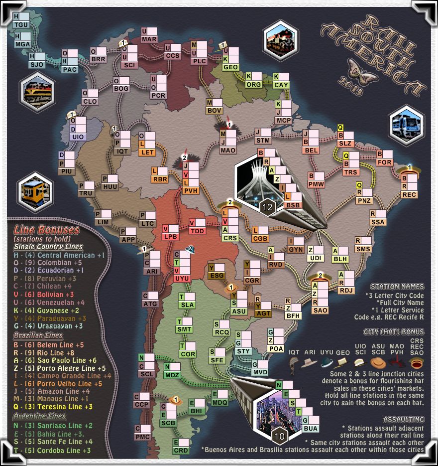
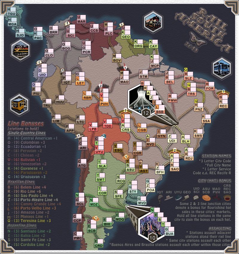
cairnswk wrote:these are the new bonuses i propose...
These are worked with adjustments made for
1. minus hat bonuses
the hat bonuses haven't been deducted correctly: they have to be done at the end of the calculation, not in the middle, since each hat reduces the bonus by only 0.17 at the moment (the correct deduction is 0.5 for a 2-station hat and 0.67 for a 3-station hat).
ian.
this is the new bonus list with the hats removed at the end.
- Line Bonus CONTINENT Plus Hat Bonus
1 H - Central America 0
3 O - Columbian 3
0 D - Ecuadorian 1
2 P - Peruvian 2
2 C - Chilean 3
1 V - Bolivean 3
2 U - Venezuelan 2
1 K - Guyanese 1
2 Y - Paraguayan 1
3 G - Uraguayan 0
4 B - Belem Line 1
6 R - Rio Line 2
4 A - Soa Paulo Line 2
4 Z - Porto Alegre Line 1
4 I - Campo Grande Line 0
3 L - Porto Velho Line 2
2 J - Amazon Line 2
1 M - Manaus Line 1
3 Q - Teresina Line 0
2 N - Santiago Line 0
2 E - Bahia Line 1
3 S - Santa Fe Line 1
2 T - Cordoba Line 1
But i am sorry, i have to say, i don't agree with many of those bonuses, particularly when some continents have 4 stations to defend but only get 3 to defend it with.