Page 10 of 36
Posted: Fri Jun 15, 2007 5:29 pm
by cairnswk
edbeard wrote:yes that's much better. You have a lot going on already, which is fine.
I don't think you need to add to it by having different coloured lines and drastically different styles on the lines.
All the attack lines work the same anyway, so have them look the same. I realize you have squares and circles for ship to ship and ship to aircraft respectively, and I think that is fine. Slightly different, but nothing distracting.
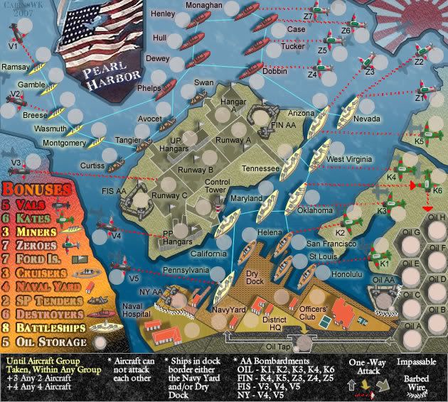
Edbeard...i've just posted V21b for the attack lines....dbl red tracer style bullets from the planes->ships, and straight light blue for the ship->ships.
this works for me. gives more definition to the ship defense lines and makes it very clear which are the aircraft attack lines.
What do you think?

Posted: Fri Jun 15, 2007 5:45 pm
by edbeard
the water paths are fine
But, I really don't like the aircraft attack lines at all. Note sure if it's the colour, the style, or the combination of the two
I still greatly prefer the earlier version with all white
Posted: Fri Jun 15, 2007 5:49 pm
by cairnswk
edbeard wrote:the water paths are fine
But, I really don't like the aircraft attack lines at all. Note sure if it's the colour, the style, or the combination of the two
I still greatly prefer the earlier version with all white
MMmmmm...OK thanks for that - appreciate your reply.

Posted: Fri Jun 15, 2007 5:55 pm
by cairnswk
edbeard wrote:the water paths are fine
But, I really don't like the aircraft attack lines at all. Note sure if it's the colour, the style, or the combination of the two
I still greatly prefer the earlier version with all white
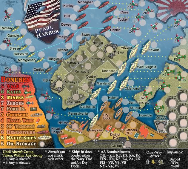
OK....below is a version of round dots like you prefer in yellow....
the challenge i'm having now is that with the round dots, everytime i look at different colours all i can think of is "carnival lights"

Posted: Fri Jun 15, 2007 6:04 pm
by edbeard
yea I still can't get over the different colours.
I'm totally sold that they should be the same no matter if they are ship to ship or ship to airplane
as for the style, I prefer the dots and squares, but the lines seem to work well too.
Posted: Fri Jun 15, 2007 6:16 pm
by cairnswk
edbeard wrote:yea I still can't get over the different colours.
I'm totally sold that they should be the same no matter if they are ship to ship or ship to airplane
as for the style, I prefer the dots and squares, but the lines seem to work well too.
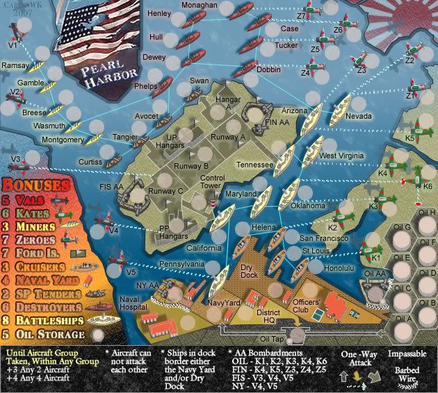
What about this one in all light blue...solid ship-ship.....tracers planes-ship

Posted: Fri Jun 15, 2007 6:19 pm
by edbeard
yea it's definitely the style I don't like (though I wasn't fond of the red colour either)
I think the best thing is for you to find 3 or 4 that you like and post em up. And, then just have everyone vote on 'em.
Posted: Fri Jun 15, 2007 6:22 pm
by hulmey
Ok looks good and its less complicated now and easier to see who can attack you and where from.
Can ALL the shaips attack the aeroplanes back?
Also the ships in the dock can they attack each other because their are no lines?
Posted: Fri Jun 15, 2007 6:26 pm
by cairnswk
edbeard wrote:yea it's definitely the style I don't like (though I wasn't fond of the red colour either)
I think the best thing is for you to find 3 or 4 that you like and post em up. And, then just have everyone vote on 'em.
Kewl

Posted: Fri Jun 15, 2007 6:40 pm
by cairnswk
hulmey wrote:Ok looks good and its less complicated now and easier to see who can attack you and where from.
yes i agree hulmey.
Can ALL the shaips attack the aeroplanes back?
yes...these are all two way attack routes from ships to planes....the only ones that i just realised might not be two way are the two Vals that are attacking the PP Hangers and Runway C, although I guess both of these would have had some sort of guns to fire back ineffectively at those two Vals.
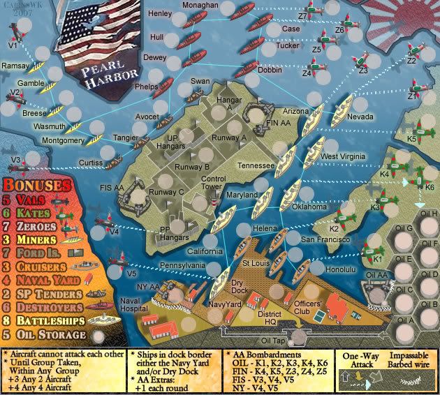
Also the ships in the dock can they attack each other because their are no lines?
OK....that is something i hadn't thought of....good point.
I've just added some attack lines to those ships...i don't think it clutters that area too much
What do you think of V22 below?

Posted: Sat Jun 16, 2007 2:34 am
by onbekende
This one is made of WIN
Posted: Sat Jun 16, 2007 2:43 am
by cairnswk
onbekende wrote:This one is made of WIN
You like this one Onbekende?

Posted: Sat Jun 16, 2007 2:46 am
by onbekende
Yep, was something I even had in mind
Posted: Sat Jun 16, 2007 3:12 am
by cairnswk
onbekende wrote:Yep, was something I even had in mind
Great!

I am writing xml at present...big job this one!
Posted: Sat Jun 16, 2007 4:57 am
by onbekende
agreed, I can always overlook it if you want
Posted: Sat Jun 16, 2007 4:57 am
by Wisse
cairnswk wrote:edbeard wrote:the water paths are fine
But, I really don't like the aircraft attack lines at all. Note sure if it's the colour, the style, or the combination of the two
I still greatly prefer the earlier version with all white
OK....below is a version of round dots like you prefer in yellow....
the challenge i'm having now is that with the round dots, everytime i look at different colours all i can think of is "carnival lights"

i like this one the most
but then with the boat routes from before
Posted: Sat Jun 16, 2007 6:47 am
by gimil
in eth legends ford Is. to destroyers arnt as clear and crisp as the rest of the legends. Thats all i can see for now.
keep up the good work

Posted: Sat Jun 16, 2007 7:34 am
by cairnswk
gimil wrote:in eth legends ford Is. to destroyers arnt as clear and crisp as the rest of the legends. Thats all i can see for now.
keep up the good work

Yeh thanks gimil....all those have been treated in exactly the same manner...i would say it has to do with the colour on the background and and the font used.
Posted: Sat Jun 16, 2007 8:00 am
by gimil
it think its to do with the lack of a black outline in those ones. I noticed teh diffrence between those one and vals, which has a darker outline.
V23 Updadte
Posted: Sat Jun 16, 2007 7:22 pm
by cairnswk
gimil wrote:it think its to do with the lack of a black outline in those ones. I noticed teh diffrence between those one and vals, which has a darker outline.
Gimil....I have re-worked the entire bonus list and now they all have the very same emboss.
Also started to tidy up the "destructions"...may not be the correct colour yet, but at least it provides some contrast in that area.
EDIT\\ Might help is I put a mapo in eh?!

XML advise
Posted: Sat Jun 16, 2007 10:12 pm
by cairnswk
I have a couple of questions please.....
1. Can someone please advise if this is the correct coding for X for Y bonuses that I want to use in this map.
2. does this x for y bonus feature still produce bonuses on top of the Region bonus, once the region is conquered completely?
<!-- Vals -->
<continent>
<name>Vals</name>
<bonus>5</bonus>
<components>
<component>V1</component>
<component>V2</component>
<component>V3</component>
<component>V4</component>
<component>V5</component>
</components>
</continent>
<collection>
<name>Val Aircraft</name>
<components>
<component>V1</component>
<component>V2</component>
<component>V3</component>
<component>V4</component>
<component>V5</component>
</components>
<bonuses>
<bonus quantity="2">3</bonus>
<bonus quantity="4">4</bonus>
</bonuses>
</collection>
<!-- Kates -->
<continent>
<name>Kates</name>
<bonus>6</bonus>
<components>
<component>K1</component>
<component>K2</component>
<component>K3</component>
<component>K4</component>
<component>K5</component>
<component>K6</component>
</components>
</continent>
<collection>
<name>Kate Aircraft</name>
<components>
<component>K1</component>
<component>K2</component>
<component>K3</component>
<component>K4</component>
<component>K5</component>
<component>K6</component>
</components>
<bonuses>
<bonus quantity="2">3</bonus>
<bonus quantity="4">4</bonus>
</bonuses>
</collection>
<!-- Zeroes -->
<continent>
<name>Zeroes</name>
<bonus>7</bonus>
<components>
<component>Z1</component>
<component>Z2</component>
<component>Z3</component>
<component>Z4</component>
<component>Z5</component>
<component>Z6</component>
<component>Z7</component>
</components>
</continent>
<collection>
<name>Zero Aircraft</name>
<components>
<component>Z1</component>
<component>Z2</component>
<component>Z3</component>
<component>Z4</component>
<component>Z5</component>
<component>Z6</component>
<component>Z7</component>
</components>
<bonuses>
<bonus quantity="2">3</bonus>
<bonus quantity="4">4</bonus>
</bonuses>
</collection>
Posted: Sun Jun 17, 2007 5:21 pm
by peteeson10
thts a realy good idea. would play on it many times.
Posted: Sun Jun 17, 2007 9:20 pm
by AndyDufresne
Interested in Pearl Harbour?
Yes
71% [ 77 ]
No
28% [ 31 ]
Total Votes : 108
Posted: Sun Jun 17, 2007 11:36 pm
by hulmey
Make the bonus legend more steely and military like. At the moment it looks like your dreaded firework show which i personally dont find fitting to this map....
Also the bottom legend is very bright.....
Posted: Mon Jun 18, 2007 1:10 am
by Wisse
hulmey wrote:Make the bonus legend more steely and military like. At the moment it looks like your dreaded firework show which i personally dont find fitting to this map....
Also the bottom legend is very bright.....
hulm can you edit your sig? its much to big...
and cairns you forgot my post again

