Page 2 of 3
Posted: Mon Aug 13, 2007 4:14 pm
by Spockers
You know, i didn't even see the other attack route arrows. Yes they should all go.
Posted: Tue Aug 14, 2007 9:50 am
by biotxlub
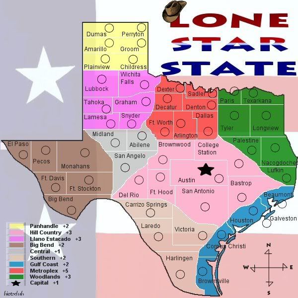
Ok, here is the update. I tried to take everyone's suggestions into consideration. I made this one a 600 x 600, so I had to decrease the number of territories in order to make the text and circles fit. There are now 50 territories.
The suggestion I didn't take into consideration was splitting it up like the US map. I can understand why that one might have been done that way, since there are more than one, but there isn't a Texas map, and I'd like to keep it in one solid piece.
Posted: Tue Aug 14, 2007 10:07 am
by Gnome
1.The army circles are still to small, maybe you can just make it so you dont need army circles...
2.your names in Black and your map borders fight...see 'corpus christi' and 'Brwonsville' it's barely readable maybe make the names glow would be better...
3. play a bit more with your legend, I don't realy like it, I'm sure you can do better
4.one more, I think it's better to put the army circle in the land instead of the name (Beaumont)
Just suggestions...nothing personal

Posted: Tue Aug 14, 2007 10:40 am
by misterman10
The borders are very hard to see in the yellow area, i do not like the white borders and the black text
Posted: Tue Aug 14, 2007 11:05 am
by jako
its looking better than the first map, but still a lot of probs:
1, ur terr borders still need some work, they look like just squares in a box, work there borders so there's some semblance of randomess, adn not just straight lines everywhere
2. dont try to sqeeze ur terr names and ur army circles into terrs that are too small to fit both (ie. dexter, sadler, paris)
3. ur bonuses need a major overhaul (ie. southern = 4 terrs, and 4 entry points, but only a +2?)
4. ur legend needs some imagination to make it more interesting
5. i know that some people told u to get rid of impasable borders, but try a reference map for some natural barriers and put those in to offset how everthing almost touchs everything else and put a challenge into gameplay.
6. take out the transparency, its just not doing it for this map
thats all for me, hope i didnt make too many newbie suggestions

Posted: Tue Aug 14, 2007 12:45 pm
by Bad Speler
I agree with all the previous suggestions except this one:
jako wrote:1, ur terr borders still need some work, they look like just squares in a box, work there borders so there's some semblance of randomess, adn not just straight lines everywhere
The reason is, if those are the real county boundaries, then they should be kept.
Also, try to clean up the border between San Angelo, Del Rio, Carrizo Springs, Big Ben, and Ft. Stockton, its very hard to see what borders what there.
Posted: Wed Aug 15, 2007 1:48 pm
by biotxlub
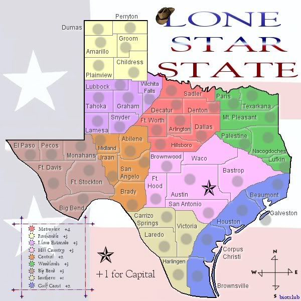
Again, I tried to take everyone's suggestions into consideration. I really, really like this... but I'm biased.
Posted: Wed Aug 15, 2007 2:15 pm
by misterman10
Here we go:
1) The title overlaps with the map, not good. Too much spacing between the lines in my opinion.
2) You need to start altering the borders. I know you want it to be accurate, but as of now, continents are way too hard to defend. Some territories need to be made so that they don't touch other continents, and the only way to do that is alter the territory borders.
3) Try to center the territory names and circles more.
4) The bonus key looks ok, but it is WAY WAY WAY too small. Not to mention, the bonuses are too small considering how many fronts you have to defend
Graphics 8/10
Gameplay 4/10
Thats it for now
Posted: Wed Aug 15, 2007 2:38 pm
by Risktaker17
Bonuses are way whack!
Posted: Wed Aug 15, 2007 2:40 pm
by biotxlub
Thanks, Misterman. I really appreciate your feedback. I understand the territories being harder to defend, but I purposely did it like that. I don't want it to be an easy map, I want it to be a challenge. It's like the world map... I'm playing a game on that map right now, and I'm holding a lot of Africa. I fortify, but I'm still attacked every time because there are so many directions to attack me from. That's the kind of challenge I was going for, as well as accuracy. As far as the bonus box - I could make it a *little bigger* but if I make the colored suns bigger, I have to make the text smaller. So either way... I don't know, I'll try it and see. The title I overlapped on purpose. I was thinking I saw another map that had the title overlapped. But, I can move it really easily. The text and circles I can also try to center more, but some of them, the way I drew territory lines, it's hard. I don't want city/town names all over the place like in the world map, so I tried on almost all of them to fit both into the territory. That's why it's not all centered. Nothing against the world map, I just didn't want to do it that way. And... I left off the circle for Waco.

Posted: Wed Aug 15, 2007 4:00 pm
by misterman10
oh, and when I said the key is too small, I meant the text, its too hard to read, but I like the suns
Posted: Wed Aug 15, 2007 4:47 pm
by biotxlub
Risktaker17 wrote:Bonuses are way whack!
Okay.... Will you tell me why, please?
Posted: Wed Aug 15, 2007 6:54 pm
by Spockers
you need to get rid of the capital bonus
Posted: Wed Aug 15, 2007 7:21 pm
by khazalid
agreed, austin is an excellent territory on its own, esp in escalating games.
Posted: Wed Aug 15, 2007 7:43 pm
by biotxlub
Austin is the capital of Texas. That's why I included it. It's a good territory on its own, yes I agree. But I think there should be something, because it's an important city.
Posted: Wed Aug 15, 2007 7:49 pm
by Spockers
oh please. everybody knows the capital is Dallas.
Anyway, i'm sure its a great city in it's own right, and doesn't need a star or bonus to make it so.
Posted: Thu Aug 16, 2007 9:27 am
by biotxlub
Spockers,
I don't know if you're really serious or not, I honestly can't tell, but Dallas is *not* the capital of Texas.

Anyway, another thought I had is that it may be a good idea to keep the Austin capital bonus because it's going to be pretty difficult to defend. It can be attacked from every direction.
Posted: Thu Aug 16, 2007 9:34 am
by Risktaker17
The bonuses are too small you gotta make them bigger especially the southeast coast. You have 4 borders to protect and get 2 extra guys?
Posted: Thu Aug 16, 2007 10:19 am
by gimil

here some river take some of them and try to break the continents up a little
Posted: Thu Aug 16, 2007 12:15 pm
by jako
biotxlub wrote:Thanks, Misterman. I really appreciate your feedback. I understand the territories being harder to defend, but I purposely did it like that. I don't want it to be an easy map, I want it to be a challenge. It's like the world map... I'm playing a game on that map right now, and I'm holding a lot of Africa. I fortify, but I'm still attacked every time because there are so many directions to attack me from. That's the kind of challenge I was going for, as well as accuracy. As far as the bonus box - I could make it a *little bigger* but if I make the colored suns bigger, I have to make the text smaller. So either way... I don't know, I'll try it and see. The title I overlapped on purpose. I was thinking I saw another map that had the title overlapped. But, I can move it really easily. The text and circles I can also try to center more, but some of them, the way I drew territory lines, it's hard. I don't want city/town names all over the place like in the world map, so I tried on almost all of them to fit both into the territory. That's why it's not all centered. Nothing against the world map, I just didn't want to do it that way. And... I left off the circle for Waco.
okay, just from that paragraph u wrote, u contradicted urself. u want it to be like world map, yet u dont want it like world map? make up ur mind.
and texas is not the world, i know texans like to think that texas should be the world but its not.
ur bonuses are totally screwed and ur borders are just as bad. take a look at metroplex bonus, +4 yet u have to control 7 terrs and defend 6 borders, or llano estacado, +3 bonus, 6 terrs, and 6 entry points, and yet u have the same bonus amount for panhandle at +3, 6 terrs, but only 2 entry points. totally messed up.
if u keep all ur borders and bonuses liek that, this map wont be a challenge, it will be shit, and never make it into final forge. i know i may be sounding harsh but thats the way this map is currently.
also like misterman said, center those army circles and names, and try to keep them together, and i wont comment on waco, since u said u left it out intentionally for now.
Posted: Thu Aug 16, 2007 12:30 pm
by gimil
that was ridiculously harsh. Bonuses arnt a concern just now until the layout and game play are sorted. There no point change the current bonuses to just change them again once impassable are added.
The legends do need to be increases in size.
The title shouldn't overlap, it looks out of place. You also need to save you JPEG quality higher.
Right now around the terr names there seems to be distorded.
your boarders are pixalated and square. They need to be smoother.
I still don't like the title although the hat is a good addition.
Ill take that picture and highlight where i would like to see rivers.
Posted: Thu Aug 16, 2007 12:34 pm
by onbekende
Code: Select all
Continent      Bonus
Metroplex      6
Panhandle      3
Llano Estacodo 5
Hill Country   6
Central        5
Woodlands      5
Big Bend       4
Soutern        3
Gulf Coast     4
(hope I got the names right, your font is sometimes hard)
- Metroplex, go for a 5, you made it so 6 territories need to be defended
- Panhandle, my calc likes it, so good
- Llano Estacodo (correct?); perhaps 4, seeing when you get it, panhandle is easy graping and thus having a nice bonus
- Hill country, 5!!!!! its the smack middle man!!!
- Central, 4, to be nie to it, name says its very central, will be fought over
- Woodlands, a 5, its a nice continent to get, althou hard to keep
- Big Bend, 3 is fine, let it be 3
- Southern, 1??? 1??????, 3 man, go with 3!!
- Gulf Coast, a 4, 4 territories to control it totally, an excellent choise

Posted: Thu Aug 16, 2007 12:44 pm
by gimil

added a few real river that you could possible use. I tried my best to keep them realistic. the black is bridges. This layout will allow for a more central type battle with the surrounding continents easier to hold. Hope you use the rivers
Posted: Thu Aug 16, 2007 12:45 pm
by tim02
onbekende wrote:Code: Select all
Continent      Bonus
Metroplex      6
Panhandle      3
Llano Estacodo 5
Hill Country   6
Central        5
Woodlands      5
Big Bend       4
Soutern        3
Gulf Coast     4
(hope I got the names right, your font is sometimes hard)
- Metroplex, go for a 5, you made it so 6 territories need to be defended
- Panhandle, my calc likes it, so good
- Llano Estacodo (correct?); perhaps 4, seeing when you get it, panhandle is easy graping and thus having a nice bonus
- Hill country, 5!!!!! its the smack middle man!!!
- Central, 4, to be nie to it, name says its very central, will be fought over
- Woodlands, a 5, its a nice continent to get, althou hard to keep
- Big Bend, 3 is fine, let it be 3
- Southern, 1??? 1??????, 3 man, go with 3!!
- Gulf Coast, a 4, 4 territories to control it totally, an excellent choise
did you or did you not look at what gimil just wrote????
Posted: Thu Aug 16, 2007 12:54 pm
by hilo333
I must say, as a texan, this map sucks! Houston ter. is to big, along with bastrop and a few other territories, and a lot of territories are way off, like Victoria! It is in between Houston and Corpus Christi! Another town you should add is Huntsville, because it is pretty major, and you could make it like -1, because the prison is there.
BTW, I am sitting at my computer right now, and my desk is rattling from the thunder, and it is black outside, all because of Tropical Storm Erin. We have probably had 3-5 inches of rain here in NW Houston.