Page 14 of 19
Posted: Tue Dec 11, 2007 3:04 pm
by oaktown
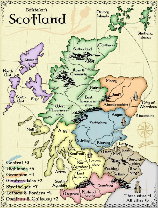
Is there anyway that you could move the XML numbers for territories like the Shetland and Orkney islands onto the islands and not on beneath the names? That way they'd all look like Arran.
All number placement is still on the table (note that Coleman's latest comment was that he was very pleased with the number placement!). My preference would, of course, be to put both the name and the number in the territory itself; barring that I am happy to put the number in the territory provided 1) the number fits without touching borders, and 2) it is clear which territory title it goes with.
Other than that, I really like the look and feel of this map. Maybe you could even tone the colors down a bit so it'd look kinda like the Ireland map.
I also like the look of Ireland, but as a color blind player I found it difficult to distinguish territories and quickly put in on my 'do not play' list. If the consensus is to further lighten the map I will work on finding a happy medium.
So... thoughts on color?
Posted: Tue Dec 11, 2007 3:15 pm
by Balsiefen
oaktown wrote:Is there anyway that you could move the XML numbers for territories like the Shetland and Orkney islands onto the islands and not on beneath the names? That way they'd all look like Arran.
All number placement is still on the table (note that Coleman's latest comment was that he was very pleased with the number placement!). My preference would, of course, be to put both the name and the number in the territory itself; barring that I am happy to put the number in the territory provided 1) the number fits without touching borders, and 2) it is clear which territory title it goes with.
Agreed. I think you should be able to do that on sky, mull, orkney and shetland at least. With mabye north uist. (though it wont matter too much if you can't.
Other than that, I really like the look and feel of this map. Maybe you could even tone the colors down a bit so it'd look kinda like the Ireland map.
I also like the look of Ireland, but as a color blind player I found it difficult to distinguish territories and quickly put in on my 'do not play' list. If the consensus is to further lighten the map I will work on finding a happy medium.
So... thoughts on color?
I'm not sure that that is too needed. Good though ireland is, i would like scotland to have a more unique feel. Possibly you could see what happnes if you tone down a couple of territories (mabye western isles) but atm i think it looks fine.
Posted: Tue Dec 11, 2007 3:23 pm
by I GOT SERVED
oaktown wrote:I also like the look of Ireland, but as a color blind player I found it difficult to distinguish territories and quickly put in on my 'do not play' list. If the consensus is to further lighten the map I will work on finding a happy medium.
So... thoughts on color?
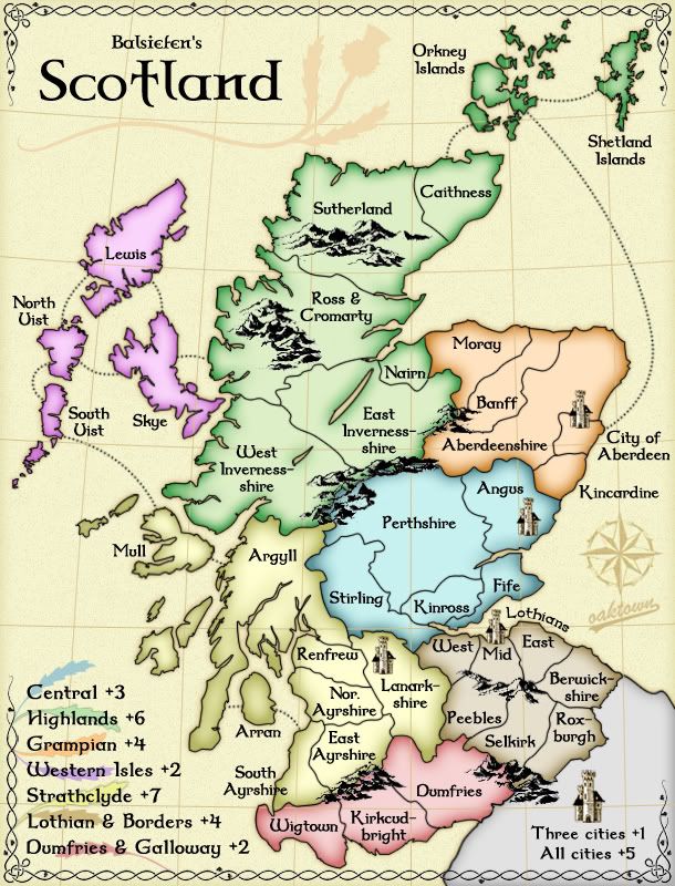
Fair enough. I'm not really partial on whether to lighten them or not. I was just throwing the idea out there, and seeing what kind of a reaction I got. If it's not too much extra work, maybe have a draft with some sort of a medium. Maybe have it kinda like on the Great Lakes map, where the color is dulled a bit in the middle of the territory.
Posted: Tue Dec 11, 2007 8:33 pm
by oaktown
I've lightened things up a bit and added some other touches... I can certainly lighted more if you all like this direction. Balsie?
Posted: Tue Dec 11, 2007 10:33 pm
by I GOT SERVED
What you did on the highlands was exactly what I had in mind. If you could just do that for everyplace else, I'll be a happy camper.
Actually, if you could make the outer edge of the territories a tid bit darker, then I'd even better.
Posted: Tue Dec 11, 2007 10:34 pm
by I GOT SERVED
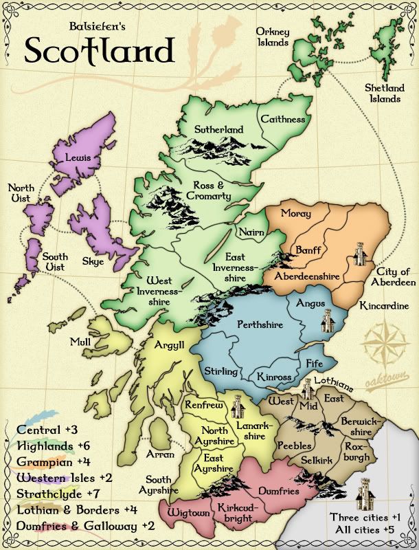
My apologies for the double post, but you seem to have a rogue word on the map. Just above where it says West-Mid-East, there's a bit that says Lothians. What's that all aboot?
Posted: Tue Dec 11, 2007 10:51 pm
by oaktown
I GOT SERVED wrote:My apologies for the double post, but you seem to have a rogue word on the map. Just above where it says West-Mid-East, there's a bit that says Lothians. What's that all aboot?
the territories are West Lothian, Midlothian, and East Lothians. There's no way the entire territory titles were going to fit, so that was our little nod to the titles. It looks a bit odd just hanging out there with no context, but once you're in the game and trying to figure out where your "East Lohtian" territory is it should make sense.
Lighter territories, more contrast... sure, what the heck.

Posted: Wed Dec 12, 2007 3:09 am
by Balsiefen
I'm not sure what to think. I liked it when it was dark but some elements when it it is lighter are good too.
I'm definatly not sure about the third version.
I think we need more viewpoints on this.
Posted: Wed Dec 12, 2007 4:54 pm
by iancanton
i have a slight preference for the third version posted on page 21 (the one without the psychedelic purple). lothian & borders could do with being a bit lighter and the outer glow a bit darker, maybe halfway between the third version on page 21 and the latest one on page 23).
ian.

Posted: Wed Dec 12, 2007 4:58 pm
by gimil
I like hte grid, altohugh it may look better under the map . . .
Posted: Wed Dec 12, 2007 8:13 pm
by oaktown
Very well. As I've said, I'm just the pixel pusher on this one... you all come up with a preference and let me know where to push it. Ligher, darker, whatever floats your collective boat!
Posted: Wed Dec 12, 2007 8:17 pm
by I GOT SERVED
This one does seem a bit too bright. Perhaps some sort of a medium between the most recent one and the one before hand on pg. 22
Posted: Thu Dec 13, 2007 6:26 am
by Balsiefen
My favorate would have to be the one on page 22. I'm not really a fan of the pink islands
Posted: Thu Dec 13, 2007 6:48 am
by edbeard
gimil wrote:I like hte grid, altohugh it may look better under the map . . .
I don't like the grid at all. But, seeing it in this way is probably a good idea if possible.
Posted: Fri Dec 14, 2007 7:19 pm
by iancanton
iancanton wrote:let's reduce the grampian bonus to 3. my reasoning is that, although grampian has one extra border territory, central has stirling which, like classic's north africa, is a strategic territory on an attack route. on the other hand, grampian's location is rather quiet and only two continents border it, so it's less likely to be attacked.
any opinion on giving a smaller bonus for holding grampian? at the moment, central is looking relatively unattractive to hold compared with grampian.
is there any way of redrawing ayrshire so that the word "north" can fit inside the territory?
ian.
Posted: Fri Dec 14, 2007 8:40 pm
by oaktown
Good ideas all in the past couple of days. Changes:
• slightly lighter than the last page 21 version, but increased contrast with the borders
• "north" is spelled out in Ayshire - please, nobody give me flak for the borders not being true to life
• map grid is off the playable area, but still on the oceans and england
• continued to tweak some tight borders
There are two nagging gameplay conerns raised as of late:
1. Central is undervalued compared to Grampian, but i can't see giving a +4 to a five territory region with three borders... Africa in classic is a +3 with three borders and 6 terits.
2. The two-territory bottleneck in the middle. Hold Sterling and Argyll and nobody can get through.
We could address both issues by restoring the Kinross-West Lothian border. Central would have four borders and warrant the higher bonus, and Kinross would be a third territory in the bottleneck. Discuss and get back to me.

Posted: Fri Dec 14, 2007 10:08 pm
by I GOT SERVED
I have to say, I like this version the best. Just tone down the inland greed section ever so slightly, and it'll be perfect. However, the mountains look rather pixellated. Any way to remedy this?
Posted: Sat Dec 15, 2007 3:53 am
by Balsiefen
There are two nagging gameplay conerns raised as of late:
1. Central is undervalued compared to Grampian, but i can't see giving a +4 to a five territory region with three borders... Africa in classic is a +3 with three borders and 6 terits.
2. The two-territory bottleneck in the middle. Hold Sterling and Argyll and nobody can get through.
1. its a hard one. but i reckon, scince it is out of the way in a corner, we can take the gramp bonus down to 3. What do people think?
2. I'm still quite happy witht that, although someone may take all of the lowlands, it would be hard to do that witout someone else taking all of the highlands. Its a gameplay feature, somthing for players to look out for.
Posted: Sat Dec 15, 2007 8:40 am
by Ogrecrusher
This map is looking amazing.

Posted: Sat Dec 15, 2007 8:41 am
by iancanton
I GOT SERVED wrote:I have to say, I like this version the best. Just tone down the inland greed section ever so slightly, and it'll be perfect. However, the mountains look rather pixellated. Any way to remedy this?
i think this map is visually very close to the finished article. we do need to make the outer glow on orkney and shetland a bit thinner, just like the western isles. are the mountains deliberately pixellated to simulate old-fashioned printing methods, in keeping with the antique look of the map? perhaps we can also move the name of south ayrshire to the left because it's now the only name that crosses a boundary line.
ian.
Posted: Sat Dec 15, 2007 1:09 pm
by oaktown
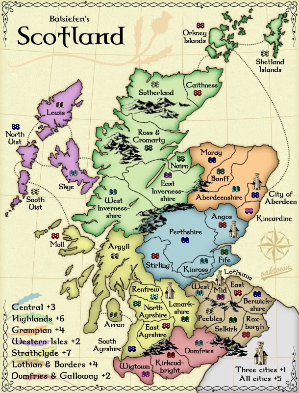
This round features:
• slightly darker highlands
• less border around the northern islands
• South Ayrshire title off the border
• moved some army counts - I actually meant to put Mull count on the island, as there is space, but I simply forgot.
I have also taken steps to provide some
softer mountain options, as follows:
1. on the nothernmost mountains I've applied a soft blur
2. on the mountains in Ross & Cromarty I've hand-smudged the edges
3. on the mountains along the Perthshire border I've made a duplicate layer, blurred it, dropped the opacity, and left the sharper original layer underneath.
The other mountains are as they have always been, for comparison. Please let me know which, if any, of the approaches to de-pixelating the mountains you prefer.
Posted: Sat Dec 15, 2007 1:42 pm
by yeti_c
I like the opacity dropped mountains...
Also - the mountains in the middle of the singular territories - could you slightly move them away from the borders - as they might confuse people?
Do they? Perhaps not - what do you think!?
C.
Posted: Sat Dec 15, 2007 1:44 pm
by Coleman
I like the mountains in Lothian & Borders most.
Posted: Sat Dec 15, 2007 2:29 pm
by Balsiefen
Mountainwise, 2 and 3 look good but i had no real problems with the old mountains.
For army counts, as well as mull, could you put orkney, and north Uist onto the largest islands. (if there isn't space in north uist, could you move it under the territory name so its closer to the island)
Posted: Sat Dec 15, 2007 2:54 pm
by iancanton
yell needs to be detached from mainland shetland, by creating a wide L-shaped channel starting from the top of the island. unst (the northeasternmost island) needs to be longer in a northerly direction. the shetlands will have to be moved down a bit so that unst isn't obscured by the vine.
http://www.geo.ed.ac.uk/scotgaz/councils/region31.html
perthshire mountains look good.
ian.