Page 16 of 31
Re: IMPERIUM ROMANUM-p-1-25-with explanation box 25jun[idea]
Posted: Wed Jun 25, 2008 8:04 am
by Qwert
by yeti_c on Wed Jun 25, 2008 2:10 pm
What I would do with this... is change the Blue dots (Towns) to something not dotty or blue... something like a House or something.
This then leaves your other dots - as all the same thing - i.e. transport from Main map to inset map.
Then all you need to do is put something like
" . . . . link from main map to inset maps. "
You mean ,these something short for explanation will work? If i find to replace Blue dots with house or something,what will you write for explanation?
These can be helpfyl.

Re: IMPERIUM ROMANUM-p-1-25-with explanation box 25jun[idea]
Posted: Sat Jun 28, 2008 1:04 am
by oaktown
yeti_c wrote:What I would do with this... is change the Blue dots (Towns) to something not dotty or blue... something like a House or something.
Great idea. if you are going to be using the dots to reference something off the map you shouldn't also use the same dots to represent a bonus of the map itself.
Text... it's a mess right now, so let's clean it up, and make it less busy. This is what i would do:
• Bithynia et Pontus. This is confusing and it doesn't have to be. I suggest you take it out of the legend entirely, get rid of the trident, and on the territory itself you just write "Bith. et Pont." If you then wrote it "Bithynia et Pontus" in the XML people will get it.
• Put the bonuses together... move the city bonus up with the rest of the bonuses. Then I would take the wall out from between the text and the armies showing the bonus - it's just confusing splitting up information that needs to go togethr.
• again, increase the size of the roman numerals in the legend a bit. It's important information, so make it look important.
• Get rid of the info across the bottom. I know you put it there to make a point, but it's insulting.
• For the 10th time, split the two inset maps. They aren't connected, so putting them in one element is confusing.
• make the alpes inset a bit bigger - you have the space, so by making it a bit larger you can put the circles on the territories and include the titles of the surrounding territories.
• perhaps you should somehow make the wolves in the Roma map bigger so it is obvious what they are... at that size they don't look like anything, and at first glance they don't look like the image in the legend.
Here's a crappy mock up showing some of what I'm talking about...
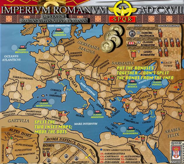
Finally, you are getting good feedback about how to improve this map graphically, so I don't understand why you are resisting. Lining up the territory titles across the top won't improve gameplay, but it will help the map look better. Of course, if you don't want the map to look better that's fine, but then don't get upset if you don't get stamped.
Re: IMPERIUM ROMANUM-p-1-25-with explanation box 25jun[idea]
Posted: Sat Jun 28, 2008 2:46 am
by Qwert
Oaktown,you finnaly show me what you want,and its great help

Now i know what to do.Get rid of explanation box,ok-split roma and alpes inset,ok-put town bonuses with other bonuses,ok-bit et pontus without symbol,ok-
Wolwes to be biger in roma inset,i will se what i can do.
You see when you want,you can try to help,and i also several time say,that visualy can understand words better.

Re: IMPERIUM ROMANUM-p-1-25-with explanation box 25jun[idea]
Posted: Sat Jun 28, 2008 3:07 am
by hulmey
qwert wrote:Oaktown,you finnaly show me what you want,and its great help
Now i know what to do.Get rid of explanation box,ok-split roma and alpes inset,ok-put town bonuses with other bonuses,ok-bit et pontus without symbol,ok-
Wolwes to be biger in roma inset,i will se what i can do.
You see when you want,you can try to help,and i also several time say,that visualy can understand words better.
Go for it Qwert, this is lovely map but needs just a little fine tuning

Re: IMPERIUM ROMANUM-p-1-26-new 28jun[idea]
Posted: Sat Jun 28, 2008 6:16 pm
by Qwert
yeti_c wrote:
What I would do with this... is change the Blue dots (Towns) to something not dotty or blue... something like a House or something.
ok, i think that these will like to you,instead blue dots i put Ancient building(parthenon).
oaktown
Bithynia et Pontus. This is confusing and it doesn't have to be. I suggest you take it out of the legend entirely, get rid of the trident, and on the territory itself you just write "Bith. et Pont." If you then wrote it "Bithynia et Pontus" in the XML people will get it.
Change like you say.
oaktown
Put the bonuses together... move the city bonus up with the rest of the bonuses. Then I would take the wall out from between the text and the armies showing the bonus - it's just confusing splitting up information that needs to go togethr
Change like you say
oaktown
again, increase the size of the roman numerals in the legend a bit. It's important information, so make it look important.
I increase to 14 text size.
oaktown
Get rid of the info across the bottom. I know you put it there to make a point, but it's insulting.
I erase bottom info,hmm if something again be confusing,then i will activate these.
oaktown
For the 10th time, split the two inset maps. They aren't connected, so putting them in one element is confusing.
Ok i change these to.
oaktown
make the alpes inset a bit bigger - you have the space, so by making it a bit larger you can put the circles on the territories and include the titles of the surrounding territories.
I change these also,now i have more space because these map is no longer 630x562,its now 630x600,so its easy to encrease.
oaktown
perhaps you should somehow make the wolves in the Roma map bigger so it is obvious what they are... at that size they don't look like anything, and at first glance they don't look like the image in the legend.
Now when map is biger,i enlarge wolwes to.
oaktown
Finally, you are getting good feedback about how to improve this map graphically, so I don't understand why you are resisting. Lining up the territory titles across the top won't improve gameplay, but it will help the map look better. Of course, if you don't want the map to look better that's fine, but then don't get upset if you don't get stamped.
Like i say several time before,picture say more then words,unfortunaly these last i can not apply,terittory names will stay like now,because i like to look like in old maps,to go in all directions.
8 of 9 sugestion i apply.

Re: IMPERIUM ROMANUM-p-1-26-new 28jun[idea]
Posted: Sat Jun 28, 2008 8:55 pm
by oaktown
quick thought... the Roma bonus seems unnecessarily complex - first you get +3 for holding the first three territories, then another plus two just for holding the fourth. Think about making it simpler. However, that won't hold things up on my end.
You still have some visual issues to work out in my opinion - for instance the legend makes better sense but it doesn't look great - but you have my stamp.

Re: IMPERIUM ROMANUM-p-1-26-new 28jun[idea]
Posted: Sat Jun 28, 2008 9:17 pm
by AndyDufresne
The bottom legend looks considerably better! It is more certainly a step in the right direction. It feels much more clearer than it previously did!
--Andy
Re: IMPERIUM ROMANUM-p-1-26-new 28jun[idea]
Posted: Sat Jun 28, 2008 9:19 pm
by ZeakCytho
The gap between the Alpes and Roma inserts seems too large - could you move them a bit closer together?
Re: IMPERIUM ROMANUM-p-1-26-new 28jun[idea]
Posted: Sat Jun 28, 2008 9:26 pm
by AndyDufresne
It's not too large. I'd rather have qwert increase the size of either one of the insets than simply move them closer.
--Andy
Re: IMPERIUM ROMANUM-p-1-26-new 28jun[idea]
Posted: Sat Jun 28, 2008 9:27 pm
by ZeakCytho
AndyDufresne wrote:It's not too large. I'd rather have qwert increase the size of either one of the insets than simply move them closer.
--Andy
That works too. The dead space between them just looks odd to me now.
Re: IMPERIUM ROMANUM-p-1-26-new 28jun[idea]
Posted: Sun Jun 29, 2008 4:28 am
by stuart133
Either way it looks like a good new map and i dont think there is a roman empire map yet. I really look forward to playing it
Re: IMPERIUM ROMANUM-p-1-26-new 28jun[idea]
Posted: Sun Jun 29, 2008 7:53 am
by Qwert
by oaktown on Sun Jun 29, 2008 3:55 am
quick thought... the Roma bonus seems unnecessarily complex - first you get +3 for holding the first three territories, then another plus two just for holding the fourth. Think about making it simpler. However, that won't hold things up on my end.
You still have some visual issues to work out in my opinion - for instance the legend makes better sense but it doesn't look great - but you have my stamp.
Where you find that you get +3 for holding 3 praetorian?
If you hold 3 you will get +1,hmm if you think,i can put bonus for roma +1,and in that way you will get for holding 4 +2,similar like Oceania in classica map,what you think?
by ZeakCytho on Sun Jun 29, 2008 4:19 am
The gap between the Alpes and Roma inserts seems too large - could you move them a bit closer together?
by AndyDufresne on Sun Jun 29, 2008 4:26 am
It's not too large. I'd rather have qwert increase the size of either one of the insets than simply move them closer.
These is no problem,i can increase roma box.
by stuart133 on Sun Jun 29, 2008 11:28 am
Either way it looks like a good new map and i dont think there is a roman empire map yet. I really look forward to playing it
thanks,i belive that in production is several maps from diferent roma period(punic wars,fall of roman empire)
Re: IMPERIUM ROMANUM-p-1-26-new 28jun[idea]
Posted: Sun Jun 29, 2008 12:46 pm
by oaktown
qwert wrote:[Where you find that you get +3 for holding 3 praetorian?
If you hold 3 you will get +1,hmm if you think,i can put bonus for roma +1,and in that way you will get for holding 4 +2,similar like Oceania in classica map,what you think?
You're right, I misread it - it's fine as is.
The victory condition idea is not so good. Unless you can justify it, it seems random.
Re: IMPERIUM ROMANUM-p-1-26-new 28jun[idea,gameplay]
Posted: Sun Jun 29, 2008 1:06 pm
by Kaplowitz
I think this is looking great so im just going to put down a stupid suggestion:
Maybe switch the red and white dots in the Alpes to looks more like the Italian flag?
Re: IMPERIUM ROMANUM-p-1-26-new 28jun[idea,gameplay]
Posted: Sun Jun 29, 2008 1:10 pm
by Qwert
new update,i redesign roma inset,its biger now,and have more ancient look,also i put down roma bonus to +1,so if someon hold praetorians and Capital,will get +2, and will not have big advantage.

oaktown
The victory condition idea is not so good. Unless you can justify it, it seems random
Well i send you PM,so people will not know what we are talk.

To other people,i just meant,if its possible to put Victory condition for these map,like hold all towns,and capital, if these not good then ok,gameplay stay same.
Re: IMPERIUM ROMANUM-p-1-26-new 29jun[idea,gameplay]
Posted: Sun Jun 29, 2008 1:19 pm
by Qwert
by Kaplowitz on Sun Jun 29, 2008 8:06 pm
I think this is looking great so im just going to put down a stupid suggestion:
Maybe switch the red and white dots in the Alpes to looks more like the Italian flag?

If you have time machine,and go back in these period with these flag,i belive that Roman soldier will arest you,or kill you,assume that you are enemy of empire.
Its a joke,i think that flag with red colours is real flag of roman empire.
Re: IMPERIUM ROMANUM-p-1-26-new 29jun[idea,gameplay]
Posted: Sun Jun 29, 2008 1:23 pm
by Kaplowitz
qwert wrote:by Kaplowitz on Sun Jun 29, 2008 8:06 pm
I think this is looking great so im just going to put down a stupid suggestion:
Maybe switch the red and white dots in the Alpes to looks more like the Italian flag?
If you have time machine,and go back in these period with these flag,i belive that Roman soldier will arest you,or kill you,assume that you are enemy of empire.
Its a joke,i think that flag with red colours is real flag of roman empire.
Thanks for the warning! I guess i wont be going back to the Roman Empire any time soon!
But seriously, i still think this looks awesome
Re: IMPERIUM ROMANUM-p-1-26-new 29jun[idea,gameplay]
Posted: Sun Jun 29, 2008 1:38 pm
by AndyDufresne
Good thoughts on increasing the Roma inset, it looks much better.
The bonus legion images (both in the top right and the one in the Roma inset) look a little jagged and rough compared to the general smoothness of all your other lines on the map.
Also, it may be worthwhile to increase the bottom half of the Bonus Legend up in the right where the explanation of the town is. You could extend it a little more right towards the image cut off, and include the town graphic image so it is consistent with the the rest of legends (I.E. the the other bonuses use icons also). You wouldn't have to use a big representation, even the size of it on the gameboard would do, unless you want to be perfectly consistent in regards to size.
--Andy
Re: IMPERIUM ROMANUM-p-1-26-new 29jun[idea,gameplay]
Posted: Sun Jun 29, 2008 1:50 pm
by Qwert
--Andy
Good thoughts on increasing the Roma inset, it looks much better.
The bonus legion images (both in the top right and the one in the Roma inset) look a little jagged and rough compared to the general smoothness of all your other lines on the map.
Also, it may be worthwhile to increase the bottom half of the Bonus Legend up in the right where the explanation of the town is. You could extend it a little more right towards the image cut off, and include the town graphic image so it is consistent with the the rest of legends (I.E. the the other bonuses use icons also). You wouldn't have to use a big representation, even the size of it on the gameboard would do, unless you want to be perfectly consistent in regards to size.
hmm,i must say that i dont quit understand what precise you mean

to many new words combined,can someon help visualy,sorry Andy

Re: IMPERIUM ROMANUM-p-1-26-new 29jun[idea,gameplay]
Posted: Tue Jul 01, 2008 11:28 am
by Qwert
new update will be ready today
Re: IMPERIUM ROMANUM-p-1-26-new 29jun[idea,gameplay]
Posted: Tue Jul 01, 2008 4:44 pm
by Qwert
after several reading,i think that i understand what you mean Andy.
You want to put Town image to Bonus box,same like other bonuses.
Also i work on soldiers and i think that now they look great.
- Click image to enlarge.

The more i look these map,i realise that Graphicaly,its mine best map ever,and every new(if i ever start again some map),will be chalenge for me.
Re: IMPERIUM ROMANUM-p-1-27-NEW!!!!!!!!!!!!! 1jul[idea,gameplay]
Posted: Wed Jul 02, 2008 12:01 pm
by DiM
the map looks good but i have 2 concerns:
1. the roman flag in the title looks poor. it's blurry and squishy like a poor quality image stretched and then blurred. i'd redraw it too look as crisp as the swoed or the SPQR
2. i'm afraid the alps inset and the roma inset could use a bit more defining both graphically and written. look at bamboo jack, cairns has made some big icons that clearly show the connection graphically. he also put text explaining how the insets work. and yet many people have a problem with them and don't get it. you have just a few coloured dots (very easy to miss) and no explanation.
Re: IMPERIUM ROMANUM-p-1-27-NEW!!!!!!!!!!!!! 1jul[idea,gameplay]
Posted: Wed Jul 02, 2008 1:05 pm
by Qwert
by DiM on Wed Jul 02, 2008 7:01 pm
the map looks good but i have 2 concerns:
1. the roman flag in the title looks poor. it's blurry and squishy like a poor quality image stretched and then blurred. i'd redraw it too look as crisp as the swoed or the SPQR
2. i'm afraid the alps inset and the roma inset could use a bit more defining both graphically and written. look at bamboo jack, cairns has made some big icons that clearly show the connection graphically. he also put text explaining how the insets work. and yet many people have a problem with them and don't get it. you have just a few coloured dots (very easy to miss) and no explanation.
1.Roman Flag? what roman Flag?
2.
,o man when i create explanation box,Oaktown tell me that these is insulting(we have very long discusion abouth that). But its look that you miss all these,so probably you should go back several pages,and then give your opinion,ok.
Re: IMPERIUM ROMANUM-p-1-25-with explanation box 25jun[idea]
Posted: Wed Jul 02, 2008 3:21 pm
by yeti_c
I think you need something like this somewhere - to explain that the Dots represent transports.
yeti_c wrote:
" . . . . link from main map to inset maps. "
C.
C.
Re: IMPERIUM ROMANUM-p-1-27-NEW!!!!!!!!!!!!! 1jul[idea,gameplay]
Posted: Wed Jul 02, 2008 4:50 pm
by Qwert
by yeti_c on Wed Jul 02, 2008 10:21 pm
I think you need something like this somewhere - to explain that the Dots represent transports.
yeti_c wrote:
" . . . . link from main map to inset maps. "
Now these look like twiling zone. I know that you give these sugestion,and i start to create explanation box,but Oaktown think that these is insulting to people inteligent(i belive that these what he related when he wrote that),and give me visual sugestion for these dots,and i apply these. Now you request to go back creating explanation box again? I realy dont see what is so confusing with dots. If you think that explanation box is desperately need,then i must reconsider what to do,its look that now i have two group of people-people who understand what dots present,and people who is confused with dots.