Page 18 of 36
Posted: Thu Aug 02, 2007 5:32 am
by yeti_c
onbekende wrote:oil good
planes attack 1 thing at a time, and I still want Fort Is. going as a real fort, with people wanting to have it but with not so many attack routes into it
It's For
d island... not For
t I think?!
C.
Posted: Thu Aug 02, 2007 6:06 am
by onbekende
its fort in dutch, sorry
Posted: Thu Aug 02, 2007 6:42 am
by KEYOGI
cairnswk wrote:OK...back to topic...
Two things for discussion...
* does anyone agree with Geoster about the planes being able to attack further from their initial path, and being able to attack Ford Island also.
* Unit_2 says the oil drums need to be made smaller.
I don't think either of these things need to be changed.
Legend is still perhaps a little messy. The bright red of Vals is clashing pretty badly and I'm not convinced the font is ideal. The rest of the map's looking pretty neat though.

V34 Update
Posted: Thu Aug 02, 2007 11:17 am
by cairnswk
KEYOGI wrote:cairnswk wrote:OK...back to topic...
Two things for discussion...
* does anyone agree with Geoster about the planes being able to attack further from their initial path, and being able to attack Ford Island also.
* Unit_2 says the oil drums need to be made smaller.
I don't think either of these things need to be changed.
Thanks for bringing these things up now Keyogi....
With regard the planes etc, I agree...its something that would further complicate a very complicated map...to say the least.
Legend is still perhaps a little messy. The bright red of Vals is clashing pretty badly and I'm not convinced the font is ideal. The rest of the map's looking pretty neat though.
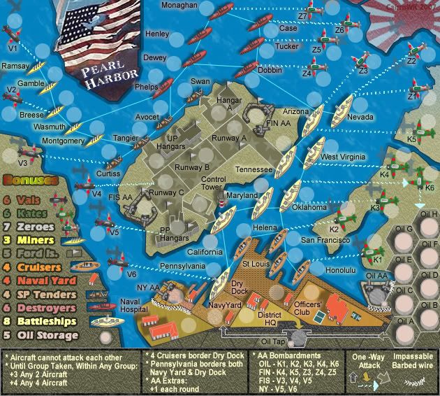
*OK...i've dulled the red of the Vals so that doesn't clash so much
* I think the font is fine and indeed very appropriate...it is Atlantic Line font, almost the same as Stencil font which was used by the ordinances in WWII...it is now fleshed it out to its full 100%
* and also given the water vessel in the legend a dry dock each....i think this works OK.
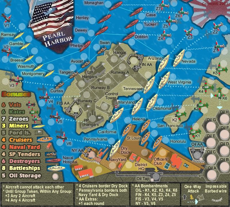
Small V34
 Large V34

Posted: Thu Aug 02, 2007 11:30 pm
by KEYOGI
The red in the legend is a bit better, but still not great. It's the red and green combo, always hard to get it right.
Is the legend font bolded at all?
Posted: Fri Aug 03, 2007 1:24 am
by cairnswk
KEYOGI wrote:The red in the legend is a bit better, but still not great. It's the red and green combo, always hard to get it right.
Is the legend font bolded at all?
Yes Keyogi, the font is bolded but it looks worse when normal. It is a strong font by itself.
Anyway...here's what i did...
* covered the red vals font with a transparency of 50% brown
* dulled the green a little more
* covered the Bonuses word with a green transparency that wipes out the strong reds oranges and yellows but doesn't look out of place with the green as the green works in with the olve background.
Hope this is better!
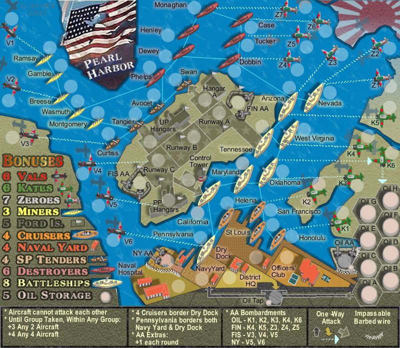
v35 Update
Small
 Large
Large
Posted: Fri Aug 03, 2007 3:46 am
by KEYOGI
Hmm... I'm still unsure on the legend, it's probably the last major sticking point for me. See what others say about it... if nobody else mentions it, just choose which version you like the best.

Posted: Fri Aug 03, 2007 3:56 am
by cairnswk
KEYOGI wrote:Hmm... I'm still unsure on the legend, it's probably the last major sticking point for me. See what others say about it... if nobody else mentions it, just choose which version you like the best.
Keyogi...what is bothering you about it please?
I like the latest version, but I would like to see if I can provide some satisfaction for you.
Posted: Fri Aug 03, 2007 4:13 am
by KEYOGI
I think it's mainly the font, maybe it was the font all along. I understand why you want to keep the font and I'm not going to push the issue. I'd rather see what others have to say about it, if anything at all.
Posted: Fri Aug 03, 2007 4:20 am
by cairnswk
KEYOGI wrote:I think it's mainly the font, maybe it was the font all along. I understand why you want to keep the font and I'm not going to push the issue. I'd rather see what others have to say about it, if anything at all.
Okies...thanks...we'll see if there is any other reaction.
Posted: Fri Aug 03, 2007 7:16 am
by DiM
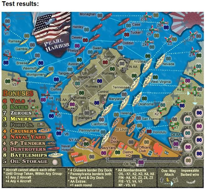
1. the legend is fine.
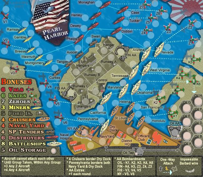
2. the airplane shade in front of Z2 is actually the shade of Z1 so it should have the same tilt as Z1.
3. where's the butterfly?

Posted: Fri Aug 03, 2007 7:32 am
by cairnswk
DiM wrote:1. the legend is fine.
2. the airplane shade in front of Z2 is actually the shade of Z1 so it should have the same tilt as Z1.
3. where's the butterfly?
* 2 is noted for fixing next version.
* no butterfly on this one...told you nothing is set in concrete yet.
Posted: Sat Aug 04, 2007 1:20 pm
by cairnswk
DiM wrote:1. the legend is fine.
2. the airplane shade in front of Z2 is actually the shade of Z1 so it should have the same tilt as Z1.
PLane shadow fixed in V35 below, DiM please refresh you're browser.
Posted: Sat Aug 04, 2007 10:21 pm
by AndyDufresne
---
The Pearl Harbor Map has reached the
‘Final Forge’ Stage. I've revived this thread from the pits of the Foundry furnace and have examined the contents. Nearly every major concern has been addressed. If there are any other current concerns, please make your voice heard. If after a reasonable amount of time there has not been any objection or protest, the map will be deemed finished with the 'Foundry Brand' of approval and will be submitted for live play. As long as there is still discussion or posts that have yet to be commented on, the map will remain in
Final Forge until said discussion has reached the conclusion that the map has reached its final and polished version.
Post questions and concerns if any.
--Andy
Posted: Sun Aug 05, 2007 3:55 am
by onbekende
I belief in a god, a god that wants cairnswk to be god.
Posted: Sun Aug 05, 2007 4:29 am
by DiM
congrats cairns.
Posted: Sun Aug 05, 2007 4:57 am
by hulmey
congrats cairns ..good job so far.
Could you possibly explain to me one by one what all the text in boxe's (below the map ) means??? im abit thick
Posted: Sun Aug 05, 2007 5:03 am
by RobinJ
Congrats on the final forge - it's about time cos this is one hell of a map
Posted: Sun Aug 05, 2007 5:39 am
by cairnswk
Thanks Andy for Final Forge.
Thanks also to all those who have assisted in getting this far, it has been an epic...but I beleive well worth it.
Thanks for those messages of congrats to DiM, Onbekende, RobinJ and Hulmey.
Let's see where we go from here.

Posted: Sun Aug 05, 2007 9:44 am
by DiM
cairnswk wrote:Let's see where we go from here.
my guess is to quenching

Posted: Wed Aug 08, 2007 6:24 am
by cairnswk
I'll rue this question, but i am going to start producing the army shadows and this map will move to two images. Before i do this, r there any further changes to be made, speak now or forever hold yor peace.
Large and Small w/ Armies
Posted: Fri Aug 10, 2007 7:54 pm
by cairnswk
V35 Large map w/ armies
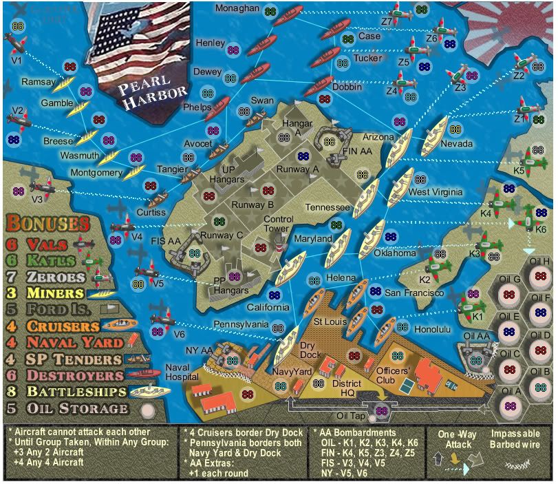 V35 Small map w/ armies
V36 Resize
Posted: Wed Aug 15, 2007 5:15 am
by cairnswk
V36 Resize to 630px wide.
Are there any final adjustments to be made on this map before I upsize it to the large map?
I'd like to get them out of the way going more towards the final map.
Posted: Mon Aug 20, 2007 1:19 pm
by Coleman
After 5 days I would say probably no further suggestions for improvement. Get us that map cairnswk.
V36 Large
Posted: Mon Aug 20, 2007 4:16 pm
by cairnswk
Here is the large version...
V36 Large