Page 20 of 31
Re: IMPERIUM ROMANUM-p-1-31-NEW 11 jul [id,ga,gr]
Posted: Tue Jul 15, 2008 5:25 pm
by Qwert
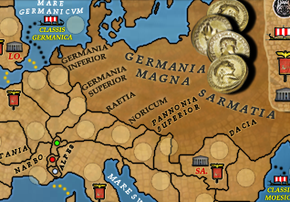
ok,here it map with clear half of names,so everybody can experiment to find better solution then what i create.Dont forget require text style is-Book Antiqua Italic,no shadows(its not realistic if names have shadows.
Good luck to all who want to help.
- Click image to enlarge.

note:just copy and paste images.
Re: IMPERIUM ROMANUM-p-1-31-experimental map for names[id,ga,gr]
Posted: Tue Jul 15, 2008 5:53 pm
by MrBenn
Qwert, here is an example of what I've been talking about - look at the difference between the two font styles.
 I have uploaded the PSD here.
 It expires in 3 days
In my example, there is still room for improvement, but this is the sort of thing I've been trying to get at...
Re: IMPERIUM ROMANUM-p-1-31-experimental map for names[id,ga,gr]
Posted: Tue Jul 15, 2008 6:02 pm
by Qwert
well its easy to use only these part of map when you have space to do what you want,you have so many terittories to fill.Also names must go L I K E T H E S E.
You will se that is not easy to create names to stay good in all provinces.
Re: IMPERIUM ROMANUM-p-1-31-new 16jul!!!!!!!!!!!!!!!!![id,ga,gr]
Posted: Wed Jul 16, 2008 3:38 pm
by Qwert
new update,i change names outer glow,and now its same like nonplayabile area(except colour of text)
- Click image to enlarge.

note,all names(except non playabile)its same size,colour(except names in sea),and outer glow,so if you see that some not look same,these is probably eye feel(i have these with lusitania).
Re: IMPERIUM ROMANUM-p-1-32-new 16jul!!!!!!!!!!!!!!!!![id,ga,gr]
Posted: Wed Jul 16, 2008 3:48 pm
by yeti_c
That actually hurts my eyes now.
C.
Re: IMPERIUM ROMANUM-p-1-32-new 16jul!!!!!!!!!!!!!!!!![id,ga,gr]
Posted: Wed Jul 16, 2008 4:06 pm
by Qwert
by yeti_c on Wed Jul 16, 2008 10:48 pm
That actually hurts my eyes now.
Yeti,now i have desire to say some very bad things on mine language.What is problem now

Re: IMPERIUM ROMANUM-p-1-32-new 16jul!!!!!!!!!!!!!!!!![id,ga,gr]
Posted: Thu Jul 17, 2008 12:01 pm
by max is gr8
There is nothing wrong with it any more, QUENCH!
Re: IMPERIUM ROMANUM-p-1-32-new 16jul!!!!!!!!!!!!!!!!![id,ga,gr]
Posted: Thu Jul 17, 2008 1:03 pm
by yeti_c
qwert wrote:by yeti_c on Wed Jul 16, 2008 10:48 pm
That actually hurts my eyes now.
Yeti,now i have desire to say some very bad things on mine language.What is problem now
What I'm saying is that the previous version is better than that version.
C.
Re: IMPERIUM ROMANUM-p-1-32-new 16jul!!!!!!!!!!!!!!!!![id,ga,gr]
Posted: Thu Jul 17, 2008 4:45 pm
by Qwert
What I'm saying is that the previous version is better than that version.
what previous version?
Re: IMPERIUM ROMANUM-p-1-32-new 16jul!!!!!!!!!!!!!!!!![id,ga,gr]
Posted: Thu Jul 17, 2008 5:36 pm
by cairnswk
max is gr8 wrote:There is nothing wrong with it any more, QUENCH!
I agree...get this into FF.
Yeti_c...i'm not being a smartass..perhaps if you don't wear them already, you could join the glasses club like MrBenn and myself.

Re: IMPERIUM ROMANUM-p-1-32-new 16jul!!!!!!!!!!!!!!!!![id,ga,gr]
Posted: Fri Jul 18, 2008 3:06 am
by yeti_c
This version...
- Click image to enlarge.

Is MUCH better than this version...
- Click image to enlarge.
This new one hurts my eyes.
C.
PS - Cairns I had them tested the other day - I have -0.25 -0.25 eyes -> as near as makes no difference 20/20.
Re: IMPERIUM ROMANUM-p-1-32-new 16jul!!!!!!!!!!!!!!!!![id,ga,gr]
Posted: Fri Jul 18, 2008 7:59 am
by Qwert
yeti,i like bouth version. You change yours thinking like other people tell,First you dont like first version,and now you say that first version is better,and that you dont like second version.I think that second version is better,names is much bigger and better for read.
Now aim understand why is yours European revolution map is so dark,because your eyes can look on ligh maps.Try to use sun glases.

Re: IMPERIUM ROMANUM-p-1-32-new 16jul!!!!!!!!!!!!!!!!![id,ga,gr]
Posted: Fri Jul 18, 2008 8:22 am
by yeti_c
qwert wrote:yeti,i like bouth version. You change yours thinking like other people tell,First you dont like first version,and now you say that first version is better,and that you dont like second version.I think that second version is better,names is much bigger and better for read.
Now aim understand why is yours European revolution map is so dark,because your eyes can look on ligh maps.Try to use sun glases.
Better - is subjective -> Vomitting at the end of a night of drink is Better than vomitting the next day... still not a pleasant experience...
Euro Rev - isn't my graphics - in fact - I told Gimil that it was too dark to start with. (Not in thread via Skype)
1st version is OK - it is better than the 2nd version - I wouldn't be able to play on the second version as it hurts my eyes.
C.
Re: IMPERIUM ROMANUM-p-1-32-new 16jul!!!!!!!!!!!!!!!!![id,ga,gr]
Posted: Fri Jul 18, 2008 8:27 am
by Qwert
Can you explane,why hurts your eyes?
Re: IMPERIUM ROMANUM-p-1-32-new 16jul!!!!!!!!!!!!!!!!![id,ga,gr]
Posted: Fri Jul 18, 2008 8:28 am
by yeti_c
qwert wrote:Can you explane,why hurts your eyes?
I look at it - and it hurts... I suspect it's the fuzziness of the lettering due to the light edges bleeding into the dark writing.
The first one doesn't hurt at all.
C.
Re: IMPERIUM ROMANUM-p-1-32-new 16jul!!!!!!!!!!!!!!!!![id,ga,gr]
Posted: Fri Jul 18, 2008 8:30 am
by Qwert
But then why you support Mrbeen,if you all ready satisfy with old version?
Re: IMPERIUM ROMANUM-p-1-32-new 16jul!!!!!!!!!!!!!!!!![id,ga,gr]
Posted: Fri Jul 18, 2008 8:35 am
by yeti_c
qwert wrote:But then why you support Mrbeen,if you all ready satisfy with old version?
I wasn't supporting Mr Benn?!
I was agreeing with his comment that the wordings *could* be better...
And now I am saying the newer version is a retrograde step...
At the moment - the 1st version is OK. - it is neither great nor perfect - it is OK.
If that's OK enough to pass the standard - then so be it...
The new lettering is NOT OK.
C.
Re: IMPERIUM ROMANUM-p-1-32-new 16jul!!!!!!!!!!!!!!!!![id,ga,gr]
Posted: Fri Jul 18, 2008 8:38 am
by Qwert
If that's OK enough to pass the standard - then so be it...
Now these is very interesting,for all mine work here i never find who is responsibile to create standards for text in maps? I belive that mine decision for these map is good,its these mean that i decide these,or do we have some not writen rules for that?
Re: IMPERIUM ROMANUM-p-1-32-new 16jul!!!!!!!!!!!!!!!!![id,ga,gr]
Posted: Fri Jul 18, 2008 1:50 pm
by max is gr8
I can't actually tell any substantial difference, except the text, and who actually reads that anyway?
Re: IMPERIUM ROMANUM-p-1-32-new 16jul!!!!!!!!!!!!!!!!![id,ga,gr]
Posted: Fri Jul 18, 2008 2:10 pm
by oaktown
I think the text is much better on the second version personally... easier to read.
Re: IMPERIUM ROMANUM-p-1-32-new 16jul!!!!!!!!!!!!!!!!![id,ga,gr]
Posted: Fri Jul 18, 2008 2:16 pm
by ZeakCytho
I think the text is bad on both versions. I don't see why the spacing between each letter needs to be so wide.
Re: IMPERIUM ROMANUM-p-1-32-new 16jul!!!!!!!!!!!!!!!!![id,ga,gr]
Posted: Fri Jul 18, 2008 4:52 pm
by Qwert
OK,i think is time for poll.
Question will be:
who text option is better.
option A
option B
Re: IMPERIUM ROMANUM-p-1-34-TEXT POLL OPTIONS VOTE[id,ga,gr]
Posted: Fri Jul 18, 2008 4:59 pm
by Qwert
POLL OPTIONS FOR TEXT ON MAP
OPTION A
- Click image to enlarge.

OPTION B
- Click image to enlarge.
----------------------------------------------------------------------------------------------------------
Re: IMPERIUM ROMANUM-p-1-34-TEXT POLL OPTIONS VOTE[id,ga,gr]
Posted: Fri Jul 18, 2008 5:01 pm
by ZeakCytho
Can there be a neither option?
Re: IMPERIUM ROMANUM-p-1-34-TEXT POLL OPTIONS VOTE[id,ga,gr]
Posted: Fri Jul 18, 2008 5:02 pm
by Androidz
I like the black best, It gives more Power to the map:D
The red is dashling into the background, but what makes the red good is bigger letters some of the black letter on the map is verry small and hard to read.
So i voted A. But i probbably would have voted none of theese if that was an option atm.