Page 2 of 4
Posted: Tue Jan 29, 2008 6:49 pm
by lanyards
Here is Version 2:

Changes:
1) Upsized the map and is now 630 pixels wide.
2) Removed army circles and territory names temporarily.
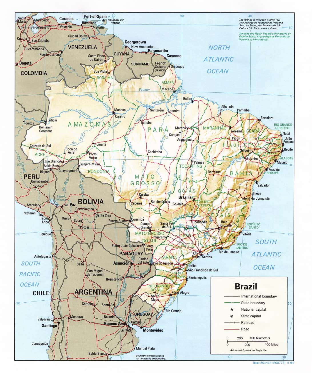
3) Added the rest of South America behind Brazil to be used as dead space.
4) Added the Atlantic and Pacific Oceans.
Is this a good background?
--lanyards
Posted: Tue Jan 29, 2008 8:54 pm
by Captain Nutbar
just looks like too many places to fortify to keep an area, good otherwise
Posted: Tue Jan 29, 2008 8:57 pm
by lanyards
Captain Nutbar wrote:just looks like too many places to fortify to keep an area, good otherwise
Yes, mountains and rivers will be added in the correct place as impassables just like the original map. The gameplay will be exactly the same, and I'm not allowed to change it.
--lanyards
Posted: Wed Jan 30, 2008 5:51 pm
by lanyards
Come on guys, I need some ideas on impassables and feedback on graphics.
Here is version 3:

Changes:
1) Added "Brazil" title on top right corner.
2) Added mine and Marvaddin's signatures.
3) Fixed some border issues Marvaddin pointed out to me though a PM.
--lanyards
Posted: Wed Jan 30, 2008 7:04 pm
by Unit_2
taht looks good, though can you please ask Marvin if you can change the inpassables because there is no suchc things in Brazil, if you do get the right to i would change it so there is the rivers there i.e. in the west there could be the Amazon river.
Posted: Wed Jan 30, 2008 7:13 pm
by Kaplowitz
you cant change gameplay Unit_2
Posted: Wed Jan 30, 2008 9:23 pm
by Unit_2
well.. if you don't then its not Brazil, its just Brazil with nothing that doesn't have what is really there.
Posted: Wed Jan 30, 2008 9:41 pm
by whitestazn88
id prefer it if you could possibly zoom in on the map of brazil. so much dead space if i do say so myself
Posted: Wed Jan 30, 2008 9:45 pm
by lanyards
whitestazn88 wrote:id prefer it if you could possibly zoom in on the map of brazil. so much dead space if i do say so myself
Most of the dead space with be covered up with the legend and bonuses. I'll probably have that in the next update.
--lanyards
Posted: Thu Jan 31, 2008 2:49 am
by edbeard
So it's hard to give a lot of feedback without much done. The borders are obviously better.
I guess I understand why you changed the colours a bit. It makes everything a bit more subdued. But, I wonder how people will feel about the change?
The big question is what to do with the impassable borders. Maybe some research should be done to find out if there's anything really in those places which could be passed off as impassable.
One thing I would like is to make it less wide. There seems to be more than enough space for the title, legend and a flag. We don't need to show all of this ocean and so much to the west of Brazil.
Something really important is to get this map to be greatly better than the original. At the moment you're just started so it's hard to say, but it needs to be very good. Otherwise, there's no point in revamping the map.
Posted: Thu Jan 31, 2008 3:07 pm
by lanyards
Well, I believe I need a little extra space on the small, because some of the territory names get a bit cramped when it is smaller, and I think I used the space wisely. I placed the coordinates on the map so you can see how they will be placed. And if anyone doesn't like the colors like Edbeard said, speak up.
Version 4:

Changes:
1) Moved title and signatures down and to the left a little bit.
2) Added the bonus box.
3) Added the country flag.
4) Added territory names.
Ideas for impassables?
--lanyards
Posted: Thu Jan 31, 2008 3:22 pm
by MrBenn
It looks good, and at the moment I prefer this map to the Fuzzy Penguin/Lone Prophet one.
That said, there is still quite a bit that I think needs tweaking.
1. I'm not keen on the font you've used for the Brazil title.
2. Do the territory names have to spelt in capitals? In areas where the territory name has to cross a border, it is quite hard to read... perhaps you could increase the glow slightly?
3. The Brazil flag looks a bit like an afterthought, and could probably be incorporated to look part of the design.
4. I like the Bonus legend style, but the opacity of it should probably be increased so that you can 'only just' see the background through it
5. I like the colours you've used, although I think I slightly prefer the more 'vibrant' ones.
6.The map texture looks very slightly 'dotty', and its probably just my eyes but I think it look a bit streaky' (a tiny bit like an inkjet printer that is about to start running out of ink).
That's it for now...

Posted: Thu Jan 31, 2008 3:27 pm
by lanyards
MrBenn wrote:It looks good, and at the moment I prefer this map to the Fuzzy Penguin/Lone Prophet one.
That said, there is still quite a bit that I think needs tweaking.
1. I'm not keen on the font you've used for the Brazil title.
2. Do the territory names have to spelt in capitals? In areas where the territory name has to cross a border, it is quite hard to read... perhaps you could increase the glow slightly?
3. The Brazil flag looks a bit like an afterthought, and could probably be incorporated to look part of the design.
4. I like the Bonus legend style, but the opacity of it should probably be increased so that you can 'only just' see the background through it
5. I like the colours you've used, although I think I slightly prefer the more 'vibrant' ones.
6.The map texture looks very slightly 'dotty', and its probably just my eyes but I think it look a bit streaky' (a tiny bit like an inkjet printer that is about to start running out of ink).
That's it for now...

Thanks for the input MrBenn, I will look into all your suggestions very shortly. Although I don't see were you get the inkjet printer streaks from. I can't see any so can you point them out to me so I can fix them?
--lanyards
Posted: Thu Jan 31, 2008 3:54 pm
by Unit_2
Can you change that yellow? Its hard to read the names with the glow and the yellow...
Also you missed the army numbers for "Triangulo" and "Juiz De Fora".
Like I said use the Amazon and Rio Grande rivvers and also use some lakes and swamps:

Posted: Thu Jan 31, 2008 4:36 pm
by MrBenn
lanyards wrote:Thanks for the input MrBenn, I will look into all your suggestions very shortly. Although I don't see were you get the inkjet printer streaks from. I can't see any so can you point them out to me so I can fix them?
--lanyards
I think it's just an optical illusion.. possibly due to all the Capital letters.. iit's a bit like those magic eye pictures where you can see it and not-see it at the same time...
Posted: Thu Jan 31, 2008 4:38 pm
by MrBenn
Unit_2 wrote:Like I said use the Amazon and Rio Grande rivvers and also use some lakes and swamps:
The problem is that those rivers aren't in the right place to be the impassables... Marv has said that gameplay (ie territory locations, borders, and names cannot change)
Posted: Thu Jan 31, 2008 4:50 pm
by The Fuzzy Pengui
MrBenn wrote:Unit_2 wrote:Like I said use the Amazon and Rio Grande rivvers and also use some lakes and swamps
The problem is that those rivers aren't in the right place to be the impassables... Marv has said that gameplay (ie territory locations, borders, and names cannot change)
He has also told me via MSN and PM that the impassable borders ARE NOT to be any natural border (ie mountains, rivers, forests, etc) because they aren't there in real life.
It is looking good though, I don't really like the all caps either, and the flag doesn't fit....but I can't find a flag that fits the map style, nor am I artistic enough to draw one that does

Posted: Thu Jan 31, 2008 5:13 pm
by edbeard
I'm not saying to scale down the map. I'm saying that you should chop off the right side of the map. And, maybe a bit of the left.
The flag doesn't need to be that big and the legend can be moved over to the right.
Posted: Thu Jan 31, 2008 5:22 pm
by lanyards
I think mabye the impassables should be some sort of a wall since it can't be anything natural. A wall would be better than impassable blobs. I don't know if I like these but what do yall think of this type of wall?

--lanyards
Posted: Thu Jan 31, 2008 5:25 pm
by The Fuzzy Pengui
lanyards wrote:I don't know if I like these but what do yall think of this type of wall?
Can we have the zoomed out version of it too please? Just to see it so it's not that large

Posted: Thu Jan 31, 2008 5:26 pm
by ParadiceCity9
What connection does that type of wall have with Brazil?
Posted: Thu Jan 31, 2008 5:28 pm
by lanyards
The Fuzzy Pengui wrote:lanyards wrote:I don't know if I like these but what do yall think of this type of wall?
Can we have the zoomed out version of it too please? Just to see it so it's not that large

Large wall sample:

So a wall is best?
--lanyards
Posted: Thu Jan 31, 2008 5:35 pm
by lanyards
ParadiceCity9 wrote:What connection does that type of wall have with Brazil?
None, it was a suggestion. Marv said no mountains or rivers or anything natural, so nothings else to use that I can think of. If you have anything better, then tell me.
--lanyards
Posted: Thu Jan 31, 2008 5:36 pm
by ParadiceCity9
It's too worm-like if that's not being too picky. Maybe decrease the thickness a bit and maybe the waviness too.
Posted: Thu Jan 31, 2008 5:38 pm
by lanyards
ParadiceCity9 wrote:It's too worm-like if that's not being too picky. Maybe decrease the thickness a bit and maybe the waviness too.
Ya, I don't think I like it either. Sort of snake-ish with scales. But is the idea of a wall good?
--lanyards


