OK so I looked through the posts and found most of the suggestions that pamoa had. I centered all of the icons so that at least 1 is 90% visible on each state fro each map (I moved some roads and text as well to help out)
In Southeast I put the palmetto tree for South Carolina and added a Sun to Florida
Removed the tilts from all of the icons.
And I did see your suggestion Night Strike about the Arch in Missouri. I still don't like it for the same reason as not liking the Statue of Liberty for New York (which is now an apple)
VERSION 9 West VERSION 7 Southwest VERSION 6 Rockies VERSION 11 Southeast VERSION 13 Great Lakes VERSION 8 New England
Last edited by WidowMakers on Tue Nov 25, 2008 10:41 pm, edited 1 time in total.
I'll give all these maps a once over for gameplay soonish because I'm looking at New Jersey and seeing a +2 but we've got it at +3 right now. Makes me wonder what I said before.
Graphics seem good to me. All the icons make sense. Colours are good.
edbeard wrote:I'll give all these maps a once over for gameplay soonish because I'm looking at New Jersey and seeing a +2 but we've got it at +3 right now. Makes me wonder what I said before.
Graphics seem good to me. All the icons make sense. Colours are good.
Nope. You are right. You said 2 and I put 3. I will update the image above.
Rockies, Montana & Utah, the contrast may be stronger
South-West, Oklahoma, due to the empty eyes effect, the icons seems more some kind of devil head rather than a buffalo one
De gueules à la tour d'argent ouverte, crénelée de trois pièces, sommée d'un donjon ajouré, crénelé de deux pièces
Gules an open tower silver, crenellated three parts, topped by a apertured turret, crenellated two parts
Rockies, Montana & Utah, the contrast may be stronger
South-West, Oklahoma, due to the empty eyes effect, the icons seems more some kind of devil head rather than a buffalo one
edbeard wrote:I'll give all these maps a once over for gameplay soonish because I'm looking at New Jersey and seeing a +2 but we've got it at +3 right now. Makes me wonder what I said before.
Graphics seem good to me. All the icons make sense. Colours are good.
Nope. You are right. You said 2 and I put 3. I will update the image above.
Thanks
WM
oh.
then I'm gonna retract my previous comment about going through all the maps again since doing that takes a lot out of you.
plus it'll give Iancanton a task that'll make anything else he does seem easy
hi widowmakers, here to make suggestions about the Alabama background, something to replace the gators which i suppose belong in Florida:
1) cotton? this one is probably best but may be a bit tough visually
2) the state bird is the yellowhammer, which also has Civil War significance, so a nice little birdie might work, altho most folks might not really appreciate it
3) birmingham was known for steel mills....something with that?
4) huntsville has a space and rocket center....rockets? that might infringe on houston territory.....
5) other than that, i don't know.....crickets? crawdads?
6) you could always put little X's like on the state flag?
cheers!
Liberté, egalité, cash moné
Hey, Fox News: Pedicabo ego vos et irrumabo
My heart beats with unconditional love
But beware of the blackness that it's capable of
Nephilim wrote:hi widowmakers, here to make suggestions about the Alabama background, something to replace the gators which i suppose belong in Florida:
1) cotton? this one is probably best but may be a bit tough visually
Used in Virginia
2) the state bird is the yellowhammer, which also has Civil War significance, so a nice little birdie might work, altho most folks might not really appreciate it
Possibly.
3) birmingham was known for steel mills....something with that?
I Beam?
4) huntsville has a space and rocket center....rockets? that might infringe on houston territory.....
Texas is Longhorns but I still don't like the rockets. It just does not say Alabama to me.
5) other than that, i don't know.....crickets? crawdads?
Crickets will work. I already have crawshish in Louisiana.
6) you could always put little X's like on the state flag?
While this might be noticeable by people living in the sate, I think an animal or resource or industry will be better.
cheers!
Right now the Cricket is my fav. It is a new icons and is distinct from all the others.
WM
Updates:
-Switched Alabama icon to Cricket
-Switched to full Bison icon in Oklahoma
-Added Backgrounds to Southeast and New England
-Tweak Several other backgrounds
VERSION 9 West VERSION 10 Southwest VERSION 8 Rockies VERSION 12 Southeast VERSION 15 Great Lakes VERSION 9 New England
De gueules à la tour d'argent ouverte, crénelée de trois pièces, sommée d'un donjon ajouré, crénelé de deux pièces
Gules an open tower silver, crenellated three parts, topped by a apertured turret, crenellated two parts
New England background is perfect. I am opposed to any further changes to it. The Great Lakes and Rocky Mountains are also very good.
I can see how hard it is to make them blend in and act as a background, but you got those three down really well.
In the Southeast... it is a really good picture, but I think it needs to be extended out to the other side of the Atlantic.
Southwest: both pictures should extend farther horizontally. The top image should extent a little farther to the left, and then almost to the Name of the map on the right. The lower image only needs to be extended towards the legend.
I would recommend changing the images in the West, they do not fit in with each other.
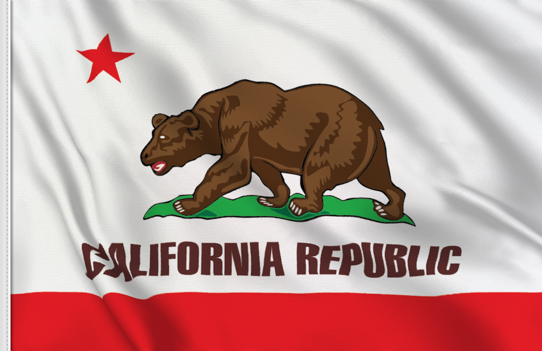
for a while I hadn't thought the California icon was a good one. I didn't say anything because I couldn't think of a good replacement.
to me the strawberry isn't good because you don't really think of it when you think of California. problem is you don't think of any ONE thing when you think of California. I just thought a good solution was to use the image from the state flag
edbeard wrote:for a while I hadn't thought the California icon was a good one. I didn't say anything because I couldn't think of a good replacement.
to me the strawberry isn't good because you don't really think of it when you think of California. problem is you don't think of any ONE thing when you think of California. I just thought a good solution was to use the image from the state flag
You sure it's not a bunch of grapes? If it's not, then perhaps grapes would be good due to the wineries.
The Neon Peon wrote:New England background is perfect. I am opposed to any further changes to it. The Great Lakes and Rocky Mountains are also very good.
I can see how hard it is to make them blend in and act as a background, but you got those three down really well.
In the Southeast... it is a really good picture, but I think it needs to be extended out to the other side of the Atlantic.
Southwest: both pictures should extend farther horizontally. The top image should extent a little farther to the left, and then almost to the Name of the map on the right. The lower image only needs to be extended towards the legend.
I would recommend changing the images in the West, they do not fit in with each other.
I can easily do the Southwest and east images.
What do you suggest for the west? They currently are redwood trees and coast line. Both of those are pretty representative of three of the 4 states in the West.