

Feudal Epic, L&S, Pg. 49 [D, Gp, Gr]
Moderator: Cartographers
Forum rules
Please read the Community Guidelines before posting.
Please read the Community Guidelines before posting.

Re: Feudal Epic, L&S, Pg. 31 [D, Gp, Gr]
/tannoy for gimil or yeti

PB: 2661 | He's blue... If he were green he would die | No mod would be stupid enough to do that
-
Kotaro

- Posts: 3467
- Joined: Sat Mar 03, 2007 2:31 pm
- Location: TheJonah: You`re a fucking ruthless, little cunt!
Re: Feudal Epic, L&S, Pg. 31 [D, Gp, Gr]
tannoy?MrBenn wrote:/tannoy for gimil or yeti
Lakad Matataaag!
Normalin, normalin.

Normalin, normalin.
TheJonah wrote:I`m not really that arsed. Just supporting my mucker.
Re: Feudal Epic, L&S, Pg. 31 [D, Gp, Gr]
Tannoy.Kotaro wrote:tannoy?MrBenn wrote:/tannoy for gimil or yeti
PB: 2661 | He's blue... If he were green he would die | No mod would be stupid enough to do that
-
Kotaro
- Posts: 3467
- Joined: Sat Mar 03, 2007 2:31 pm
- Location: TheJonah: You`re a fucking ruthless, little cunt!
Re: Feudal Epic, L&S, Pg. 31 [D, Gp, Gr]
*gasp*Powered loudspeaker systems for studio monitoring and sound reinforcement.
I think yeti, the xml writer, is on vacation. Or drunk
Lakad Matataaag!
Normalin, normalin.
Normalin, normalin.
TheJonah wrote:I`m not really that arsed. Just supporting my mucker.
-
gimil

- Posts: 8599
- Joined: Sat Mar 03, 2007 12:42 pm
- Gender: Male
- Location: United Kingdom (Scotland)
Re: Feudal Epic, L&S, Pg. 31 [D, Gp, Gr]
Sorry for all the delay on this. I have been working non-stop since I came back from my holiday.
Sully, you idea for reshuffling rebels is fine with me. When I get a minute I will get onto it.
Sully, you idea for reshuffling rebels is fine with me. When I get a minute I will get onto it.
What do you know about map making, bitch?
Top Score:2403natty_dread wrote:I was wrong
-
jammyjames
- Posts: 1394
- Joined: Tue May 06, 2008 3:17 am
- Gender: Male
Re: Feudal-ate *The sequal to Feudal War!*
i think the 1 entrance idea will bring a new level of difficulty to the map, just cant wait for the coding to be completed, then we can play an even awesomer version of fuedal!!lord voldemort wrote:gameplay for 1v1 will be interesting with the 8 starting points...
andd i agree with wat tom said....about only one entrance


Re: Feudal Epic, L&S, Pg. 31 [D, Gp, Gr]
I've been on holiday - but will be available this weekend to sort out the XML...
C.
C.

Highest score : 2297
-
porkenbeans

- Posts: 2546
- Joined: Mon Sep 10, 2007 4:06 pm
Re: Feudal Epic, L&S, Pg. 31 [D, Gp, Gr]
 Hey all,
I was just checking on the progress of this map. I have not looked at it for a few weeks, and now that I have looked at it again, I notice that it is really on the dark side. I do not remember it being so dark. If it is not to late maybe it can be looked at once more, I quickly took it straight to photobucket, and just used their editing room to play with the contrast, hue, and brightness. I think that maybe somewhere between this edit and the original might be worth trying.
- Click image to enlarge.
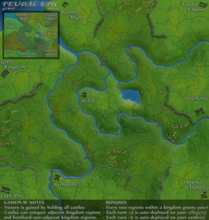
- Click image to enlarge.
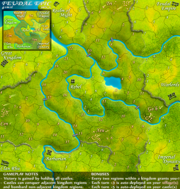

-
the.killing.44

- Posts: 4724
- Joined: Thu Oct 23, 2008 7:43 pm
- Gender: Male
- Location: now tell me what got two gums and knows how to spit rhymes
- Contact:
Re: Feudal Epic, L&S, Pg. 31 [D, Gp, Gr]
 No thanks, I'd like to be able to look at the map for more than 5 seconds…
-
porkenbeans
- Posts: 2546
- Joined: Mon Sep 10, 2007 4:06 pm
Re: Feudal Epic, L&S, Pg. 31 [D, Gp, Gr]
I said somewhere in between. Took it as bright as I could without distortion, just to show just how dark it really was.the.killing.44 wrote:
Is this better ?
- Click image to enlarge.
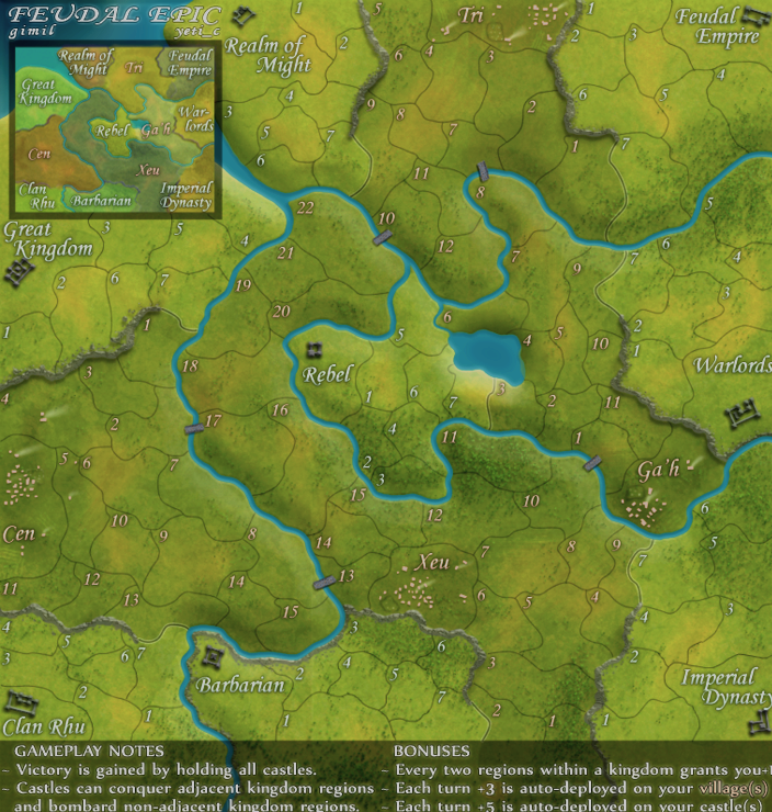
- Click image to enlarge.
-
porkenbeans
- Posts: 2546
- Joined: Mon Sep 10, 2007 4:06 pm
-
porkenbeans
- Posts: 2546
- Joined: Mon Sep 10, 2007 4:06 pm
Re: Feudal Epic, L&S, Pg. 31 [D, Gp, Gr]
Also, I just noticed that there is light patch south of the lake.

Re: Feudal Epic, L&S, Pg. 31 [D, Gp, Gr]
I like the dark the best. But your second suggestion looks OK, I suppose.
-
The Neon Peon

- Posts: 2342
- Joined: Sat Jun 14, 2008 12:49 pm
- Gender: Male
Re: Feudal Epic, L&S, Pg. 31 [D, Gp, Gr]
This one is my favorite. It gives a nice feeling of Autumn.porkenbeans wrote:
- Click image to enlarge.
Re: Feudal Epic, L&S, Pg. 31 [D, Gp, Gr]
i agree 100 percent.. It also adds depth to the map..The Neon Peon wrote:This one is my favorite. It gives a nice feeling of Autumn.porkenbeans wrote:
- Click image to enlarge.

Re: Feudal Epic, L&S, Pg. 31 [D, Gp, Gr]
Both images look fine to me... what I really want to see is some XML 
PB: 2661 | He's blue... If he were green he would die | No mod would be stupid enough to do that

-
gimil
- Posts: 8599
- Joined: Sat Mar 03, 2007 12:42 pm
- Gender: Male
- Location: United Kingdom (Scotland)
Re: Feudal Epic, L&S, Pg. 31 [D, Gp, Gr]
Sorry this took so long.
Updated those borders in realm of might for sully but I am not going to mess with the colouring anymore. It has been played around with enought I feel.
Updated those borders in realm of might for sully but I am not going to mess with the colouring anymore. It has been played around with enought I feel.
- Click image to enlarge.

- Click image to enlarge.
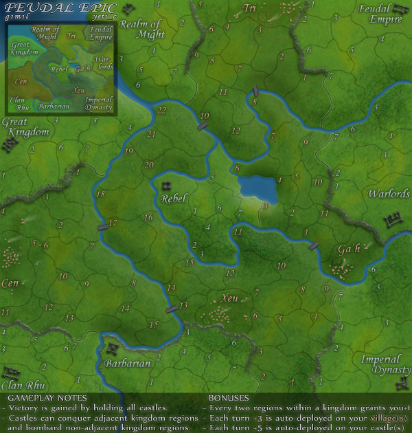
What do you know about map making, bitch?
Top Score:2403natty_dread wrote:I was wrong
-
Kotaro
- Posts: 3467
- Joined: Sat Mar 03, 2007 2:31 pm
- Location: TheJonah: You`re a fucking ruthless, little cunt!
Re: Feudal Epic, L&S, Pg. 31 [D, Gp, Gr]
Thank God. <3 Gimilgimil wrote:Sorry this took so long.
Updated those borders in realm of might for sully but I am not going to mess with the colouring anymore. It has been played around with enought I feel.
Lakad Matataaag!
Normalin, normalin.
Normalin, normalin.
TheJonah wrote:I`m not really that arsed. Just supporting my mucker.
Re: Feudal Epic, L&S, Pg. 31 [D, Gp, Gr]
Seriously.Kotaro wrote:Thank God. <3 Gimilgimil wrote:Sorry this took so long.
Updated those borders in realm of might for sully but I am not going to mess with the colouring anymore. It has been played around with enought I feel.
This map could be poo brown or black and I wouldn't care, just want to play it.


-
God Emperor Q
- Posts: 545
- Joined: Fri Jul 11, 2008 3:42 pm
- Gender: Male
- Location: Baltimore
Re: Feudal Epic, L&S, Pg. 37 [D, Gp, Gr]
LB Ninja wrote:so does it look like we will get the xml anytime soon?

Re: Feudal Epic, L&S, Pg. 37 [D, Gp, Gr]
What happened to the size of the large map? It's become smaller and smaller. The difference between the small and large map is now just ~30px.
I'm having a really hard time wrapping my mind around the map if i just look at the latest version.
For me at least the size of 709px × 744px, as in version 17, feels like an absolute minimum. I guess this is dependant on the size of your screen and resolution - but if you don't need the map to be that size, you can probably use the small map just as well, right?
I also find the minimap to be somewhat indistinct and unclear. Not as big of a problem, but still.
I'm having a really hard time wrapping my mind around the map if i just look at the latest version.
For me at least the size of 709px × 744px, as in version 17, feels like an absolute minimum. I guess this is dependant on the size of your screen and resolution - but if you don't need the map to be that size, you can probably use the small map just as well, right?
I also find the minimap to be somewhat indistinct and unclear. Not as big of a problem, but still.
-
porkenbeans
- Posts: 2546
- Joined: Mon Sep 10, 2007 4:06 pm
Re: Feudal Epic, L&S, Pg. 37 [D, Gp, Gr]
Got to go along with Grand, The large version should be larger in contrast to the small. Otherwise, why bother even making two versions. You can go as high as 840 X 800, so why not take advantage of this, and give us the largest allowed ?grandin wrote:What happened to the size of the large map? It's become smaller and smaller. The difference between the small and large map is now just ~30px.
I'm having a really hard time wrapping my mind around the map if i just look at the latest version.
For me at least the size of 709px × 744px, as in version 17, feels like an absolute minimum. I guess this is dependant on the size of your screen and resolution - but if you don't need the map to be that size, you can probably use the small map just as well, right?
I also find the minimap to be somewhat indistinct and unclear. Not as big of a problem, but still.

Also I was noticing what was said about the inset. Yes this observation is dead on. It got me to thinking that on this map, this inset is redundant. It has no information that is not already on the map. The color coded numbers do the job pretty well to distinguish the kingdoms. I say loose it altogether.

OK, so I farted around with the settings one more time. I stated before that the map seemed "dark". I think that maybe it was not too dark, but had a foggy haze that made it seem too dark. Here is a version that is still as dark, but with more contrasting tones that eliminates the muddiness that it has, and makes it more crisp and easier to read.
- Click image to enlarge.

- Click image to enlarge.
-
Kotaro
- Posts: 3467
- Joined: Sat Mar 03, 2007 2:31 pm
- Location: TheJonah: You`re a fucking ruthless, little cunt!
Re: Feudal Epic, L&S, Pg. 37 [D, Gp, Gr]
porker, if I were gimil, and this is just me, I'd be pissed that someone was taking my image, altering it, and than telling me he thought it was better than mine. He has said he likes the graphics as they are - they're fine.
And gimil/yeti_c, I hope this doesn't miss getting Beta'd 'cause you disappeared and didn't write xml. Where you two at?
And gimil/yeti_c, I hope this doesn't miss getting Beta'd 'cause you disappeared and didn't write xml. Where you two at?
Lakad Matataaag!
Normalin, normalin.
Normalin, normalin.
TheJonah wrote:I`m not really that arsed. Just supporting my mucker.