Moderator: Community Team


second that.....pamoa wrote:Is it technically possible to have the old font as an option
sorry to say this but the new one isn't an improvement





nice joblackattack wrote:Sorry that wierdness was my mistake.
I'm looking into improving performance of the army printing...

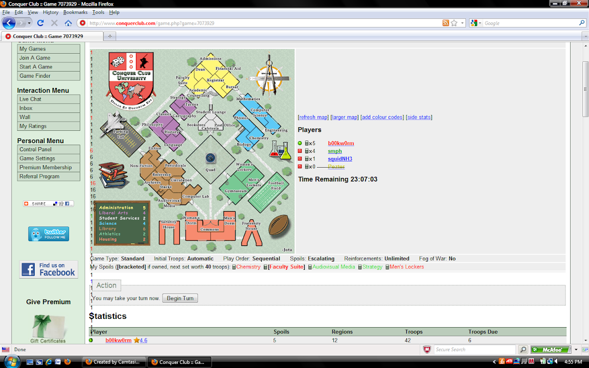
1. I'd ike to add my comment to those of others that that the new way of displaying army counts is very poor for me. There are some interesting ideas and potential reasons in here but bottom line as a user it has impacted my usage as it makes it harder for me to read. I'm on several times a day so I've had time to "get used to it" and it's not happening. There are blurry numbers and letters (I use colour codes) The placement of codes next to the numbers is much tighter and the colours are not looking the same.king achilles wrote:
...
Please be sure that you are viewing the map on a 'normal' level and not in a zoomed setting. For now, I would say this is the "fix" in avoiding to see any sort of blurry numbers or letters.Tobikera wrote:I wouldn't call this "improved army printing." Since updating Bob, as requested by the flashing red notice on the Bob Menu, my letters are larger, seemingly a different font, and blurry. Also, for some reason, my Australia map doesn't ever load - stuck in eternal Bob processing. I use FireFox 3.6.3. Any clues would be appreciated. I'm not going to play the Ctrl+ and Ctrl- game every time I log in - that's ridiculous. I appreciate the efforts to improve CC, but this one sent me back a couple steps.
...
 and I'd ask you to remove it.
Also, statistics have gone wacky. Sometimes it puts negative numbers in place of regions held. And the snap shots are again from what appears to be other games. Weird.morleyjoe wrote:I've not noticed many of the problems others are having, but have issues now with BOB snapshots not working properly. (I've kept BOB up to date so far) For some previous snapshots it shows completely different armies and numbers, ones that never existed in the game. Also, it messes up the "show color codes" by deleting the letters, and making me have to click twice on the color code option to get them back.

That sounds like BOB stuff - could you please report this in the BOB topic so the script's author will read it?morleyjoe wrote:Also, statistics have gone wacky. Sometimes it puts negative numbers in place of regions held. And the snap shots are again from what appears to be other games. Weird.
what if it's a 10% speed reduction for the user but the server can handle twice the load? and things always suck at the beginning...then they get better.caymanmew wrote:could you please get rid of your "improvement" so thing can run faster
bedub1 wrote:what if it's a 10% speed reduction for the user but the server can handle twice the load? and things always suck at the beginning...then they get better.caymanmew wrote:could you please get rid of your "improvement" so thing can run faster