AOS: Orient Express 1883 [quench'd]
Moderator: Cartographers
Forum rules
Please read the Community Guidelines before posting.
Please read the Community Guidelines before posting.
-
The Bison King

- Posts: 1957
- Joined: Thu Aug 27, 2009 5:06 pm
- Location: the Mid-Westeros
Re: AOS: Orient Express 1883 <v15> p1,20 [GP] - i like graph
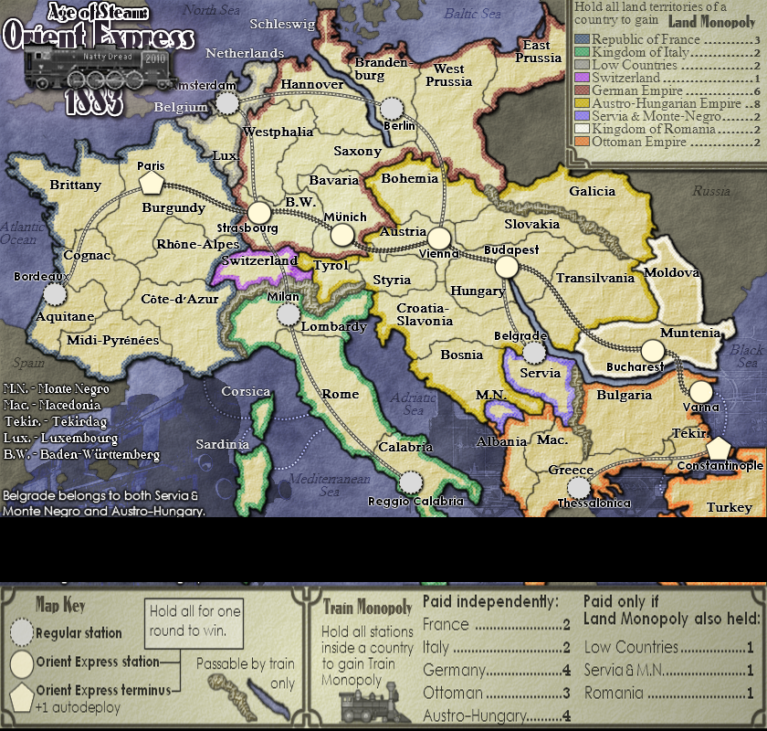
Is there something special about the rail between Munich and Vienna? The rail between them looks darker.

-
natty dread

- Posts: 12877
- Joined: Fri Feb 08, 2008 8:58 pm
- Location: just plain fucked
-
natty dread
- Posts: 12877
- Joined: Fri Feb 08, 2008 8:58 pm
- Location: just plain fucked


-
porkenbeans

- Posts: 2546
- Joined: Mon Sep 10, 2007 4:06 pm
Re: AOS: Orient Express 1883 <v16> p1,21 [GP] - i like graph
Looking good. The mountains I no longer hate. 
One thing I noticed, maybe you could rotate Russia like Spain. Just to retain continuity.
Also, your sig. could be moved over, and put under the top right legend.
One thing I noticed, maybe you could rotate Russia like Spain. Just to retain continuity.
Also, your sig. could be moved over, and put under the top right legend.

-
The Bison King
- Posts: 1957
- Joined: Thu Aug 27, 2009 5:06 pm
- Location: the Mid-Westeros
Re: AOS: Orient Express 1883 <v16> p1,21 [GP] - i like graph
Spain is tilted to follow along a border, I think it would just look weird if you did the same to Russia.One thing I noticed, maybe you could rotate Russia like Spain. Just to retain continuity.
-
natty dread
- Posts: 12877
- Joined: Fri Feb 08, 2008 8:58 pm
- Location: just plain fucked
Re: AOS: Orient Express 1883 <v16> p1,21 [GP] - i like graph
Well, I usually like to keep my sig near the title. I think I'll just move the Russia text under the legend.

-
porkenbeans
- Posts: 2546
- Joined: Mon Sep 10, 2007 4:06 pm
Re: AOS: Orient Express 1883 <v16> p1,21 [GP] - i like graph
Why ?The Bison King wrote:Spain is tilted to follow along a border, I think it would just look weird if you did the same to Russia.One thing I noticed, maybe you could rotate Russia like Spain. Just to retain continuity.
It can be rotated to follow the border as well. What is "weird" about that ?
-
porkenbeans
- Posts: 2546
- Joined: Mon Sep 10, 2007 4:06 pm
Re: AOS: Orient Express 1883 <v16> p1,21 [GP] - i like graph
Yes, I thought about that. Russia would do fine over there.natty_dread wrote:Well, I usually like to keep my sig near the title. I think I'll just move the Russia text under the legend.
Your sig is kinda just floating out there in the ocean, maybe it would look better if it was actually included under the title, in black w/out the white stroke.
Also, I noticed that you have used different style, and sized text, to distinguish the Train stations (cities), from the Countries. This is a good idea. I suggest taking it a bit further, by using different colors as well. While we are on the text, I see that you are still having kerning issues with your software. It is not as bad as your previous maps, but I can see a handful of names, that need attention. Bosnia being on the top of the list. Also some of the names can be nudged here and there to center them up better.
Last edited by porkenbeans on Wed Jul 07, 2010 12:02 pm, edited 1 time in total.
-
natty dread
- Posts: 12877
- Joined: Fri Feb 08, 2008 8:58 pm
- Location: just plain fucked
Re: AOS: Orient Express 1883 <v16> p1,21 [GP] - i like graph
Yeah I was also thinking of moving the sig under the title.porkenbeans wrote:Yes, I thought about that. Russia would do fine over there.natty_dread wrote:Well, I usually like to keep my sig near the title. I think I'll just move the Russia text under the legend.
Your sig is kinda just floating out there in the ocean, maybe it would look better if it was actually included under the title, in black w/out the white stroke.
-
natty dread
- Posts: 12877
- Joined: Fri Feb 08, 2008 8:58 pm
- Location: just plain fucked
Re: AOS: Orient Express 1883 <v16> p1,21 [GP] - i like graph
Ta-dah

Text kerning: I'm not sure if I want to correct it. All the names are legible, and the slight kerning errors kinda give them an authentic feel to them, you know? Like, printing wasn't yet too sophisticated in the 19th century.
Different colour territory names for stations: eww, not going to happen. Nothing against the idea in general, but doesn't fit the style of this map.
- Click image to enlarge.

Text kerning: I'm not sure if I want to correct it. All the names are legible, and the slight kerning errors kinda give them an authentic feel to them, you know? Like, printing wasn't yet too sophisticated in the 19th century.
Different colour territory names for stations: eww, not going to happen. Nothing against the idea in general, but doesn't fit the style of this map.
-
natty dread
- Posts: 12877
- Joined: Fri Feb 08, 2008 8:58 pm
- Location: just plain fucked
Re: AOS: Orient Express 1883 <v16> p1,21 [GP] - i like graph
XML update -> http://www.fileden.com/files/2010/2/7/2 ... ientx4.xml
Test results:
Large 88
Large 888
Small 88

Small 888

Test results:
Large 88
- Click image to enlarge.

- Click image to enlarge.

Small 888
-
natty dread
- Posts: 12877
- Joined: Fri Feb 08, 2008 8:58 pm
- Location: just plain fucked
Re: AOS: Orient Express 1883 <v16> p1,21 [GP] - xml results
- Click image to enlarge.


fixed a few small glithces, also corrected the kerning on some places where it was obvious. If there are some small kerning errors left I don't think I want to correct them, for reasons mentioned earlier.

Re: AOS: Orient Express 1883 <v16> p1,21 [GP] - xml results
natty....a couple of things...
1. the small locos on the title and under the Train monopoly look excatly like the trains on the monopoly board and i don't think fit the style of the map with the other trains in the background. I understand what the train monopoly bit is all about graphically, but hum...doesn't work for me with the overall layout.
2. the font on the small map "Map Key" and "Train Monopoly" doesn't work well and the M is difficult to read.
3. Any chance of increasing the yellow border in intensity so it stands out a bit more...it's kinda lost with the cream, and the hite for Romania.
4. You are using .pngs for clarity...once a previous version has been replaced by a new one, any chance you can place the old images in the hidden drop thingy show tag....your images are taking forever to download on my computer and i'd prefer to only download the latest version, not several on one page. I know its being a bit picky, but i'm thinking of the bytage that gets used with several version on one page.

* Pearl Harbour * Waterloo * Forbidden City * Jamaica * Pot Mosbi
-
Industrial Helix

- Posts: 3462
- Joined: Mon Jul 14, 2008 6:49 pm
- Gender: Female
- Location: Ohio
Re: AOS: Orient Express 1883 <v16> p1,21 [GP] - xml results
Perhaps darken the yellow so it doesn't merge in tone with the creme color?
Sketchblog [Update 07/25/11]: http://indyhelixsketch.blogspot.com/
Living in Japan [Update 07/17/11]: http://mirrorcountryih.blogspot.com/
Russian Revolution map for ConquerClub [07/20/11]: http://www.conquerclub.com/forum/viewto ... 1&t=116575
Living in Japan [Update 07/17/11]: http://mirrorcountryih.blogspot.com/
Russian Revolution map for ConquerClub [07/20/11]: http://www.conquerclub.com/forum/viewto ... 1&t=116575
-
natty dread
- Posts: 12877
- Joined: Fri Feb 08, 2008 8:58 pm
- Location: just plain fucked
Re: AOS: Orient Express 1883 <v16> p1,21 [GP] - xml results
Thanks guys for your input.
1) well that's kind of intentional. When using terms like "Train Monopoly" or "Land Monopoly" a subtle reference to monopoly seemed appropriate. I could try to find another locomotive for the title.
2) I'll try to tweak it
3) you're referring to austro-hungary? It was previously brighter but people wanted it less bright to match the other colours better. I don't want to keep switching it back and forth. In reference to IH, I'm afraid if I make it any darker it will bring colour-blind problems.
4) unfortunately the spoiler tags will not keep the images from being loaded. For the first page I've been trying to remove the img tags from old versions occasionally but I can't be bothered to do that between each update... As a workaround, you can right-click any image and select "view image" to only view the one image.
-
natty dread
- Posts: 12877
- Joined: Fri Feb 08, 2008 8:58 pm
- Location: just plain fucked


-
porkenbeans
- Posts: 2546
- Joined: Mon Sep 10, 2007 4:06 pm
Re: AOS: Orient Express 1883 <v17> p1,22 [GP] - xml results
Yes, the title looks much better centered up. I would try the train layer over the text layer. It does not matter if it covers some of it, and as a matter of fact, it would look cool that way. Even with it partially covered, it still can be read.
I see that you fixed some of the kerning problems. Much better.
I still do not like your sig floating out there in the water. I think that it will fit nicely across the boiler on the train.
I see that you fixed some of the kerning problems. Much better.
I still do not like your sig floating out there in the water. I think that it will fit nicely across the boiler on the train.
-
natty dread
- Posts: 12877
- Joined: Fri Feb 08, 2008 8:58 pm
- Location: just plain fucked
Re: AOS: Orient Express 1883 <v17> p1,22 [GP] - xml results
It is over the text layer. The order is, 1883 > train > main title.I would try the train layer over the text layer.
Don't worry, my sig is waterproof.I still do not like your sig floating out there in the water. I think that it will fit nicely across the boiler on the train.
-
porkenbeans
- Posts: 2546
- Joined: Mon Sep 10, 2007 4:06 pm
Re: AOS: Orient Express 1883 <v17> p1,22 [GP] - xml results
What I mean is not just over the layer in order, but actually covering the text just a bit, so that it looks like the train is in front of the text.It is over the text layer. The order is, 1883 > train > main title.
So the order would be title, 1883, train.
-
natty dread
- Posts: 12877
- Joined: Fri Feb 08, 2008 8:58 pm
- Location: just plain fucked
Re: AOS: Orient Express 1883 <v17> p1,22 [GP] - xml results
As for the train covering more of the title text: I actually tried that when I was fiddling with the title, and I didn't like how it looked. The white part of the text outline gets covered and then it just looks uneven somehow, unbalanced, if you know what I mean.porkenbeans wrote:What I mean is not just over the layer in order, but actually covering the text just a bit, so that it looks like the train is in front of the text.It is over the text layer. The order is, 1883 > train > main title.
So the order would be title, 1883, train.
As for moving the 1883 layer under the train layer, yeah that can be done. I'll try to remember it for the next update.
-
porkenbeans
- Posts: 2546
- Joined: Mon Sep 10, 2007 4:06 pm
Re: AOS: Orient Express 1883 <v17> p1,22 [GP] - xml results
3 suggs, I went ahead and illustrated them 4 ya.
1.) The title
2.) The rivers. Lightened them up a bit.
3.) Stretched the height of the canvas, so that you could do two things. 1st. and most important, add the rest of Italy. 2nd, so that you could make the legend bigger if you want.
1.) The title
2.) The rivers. Lightened them up a bit.
3.) Stretched the height of the canvas, so that you could do two things. 1st. and most important, add the rest of Italy. 2nd, so that you could make the legend bigger if you want.
- Click image to enlarge.
-
natty dread
- Posts: 12877
- Joined: Fri Feb 08, 2008 8:58 pm
- Location: just plain fucked
Re: AOS: Orient Express 1883 <v17> p1,22 [GP] - xml results
OK now don't take this the wrong way, but... none of those 3 are improvements.
1) the locomotive on top of the text just looks freakishly ugly and clumsy. It kind of hides the main part of the title, the title itself. The locomotive should be complementing the text, not dominating it. The signature overlaid on top of the locomotive just looks cheesy and ridiculous.
2) the lighter rivers just don't work. They have no reason to be lightened, if you get what I mean.
3) Adding more to the map brings absolutely no extra information, and it's a shitload of work for no gain. It only hurts the map, because it sets the two legends farther apart from each other.
So thanks for suggestions, but I will not be doing any of these.
-
natty dread
- Posts: 12877
- Joined: Fri Feb 08, 2008 8:58 pm
- Location: just plain fucked
Re: AOS: Orient Express 1883 <v17> p1,22 [GP] - xml results
I won't be working on this for the next 2 weeks as I won't have web access. Any feedback is still welcome and will be addressed when I return.
-
natty dread
- Posts: 12877
- Joined: Fri Feb 08, 2008 8:58 pm
- Location: just plain fucked
Re: AOS: Orient Express 1883 <v17> p1,22 [GP] - xml results
Ok so I'm back from vacation and ready to resume work on this... although it's a bit discouraging to see there has been no posts while I was gone.
Is there still support for this map?
Is there still support for this map?
-
carlpgoodrich
- Posts: 408
- Joined: Tue Aug 04, 2009 2:12 pm
Re: AOS: Orient Express 1883 <v17> p1,22 [GP] - xml results
Of course there is, I think people were just waiting until you got back...