Thanks isaiah.
ps. mods, I think the poll has served its purpose... can someone take it down?
AOS: Orient Express 1883 [quench'd]
Moderator: Cartographers
Forum rules
Please read the Community Guidelines before posting.
Please read the Community Guidelines before posting.
-
natty dread

- Posts: 12877
- Joined: Fri Feb 08, 2008 8:58 pm
- Location: just plain fucked

Re: AOS: Orient Express 1883 <v18> p1,24 [GP] - updated
Mmmm. There is still room for vast improvement. 

* Pearl Harbour * Waterloo * Forbidden City * Jamaica * Pot Mosbi
-
natty dread
- Posts: 12877
- Joined: Fri Feb 08, 2008 8:58 pm
- Location: just plain fucked
Re: AOS: Orient Express 1883 <v18> p1,24 [GP] - updated
No doubt. Can you elaborate?cairnswk wrote:Mmmm. There is still room for vast improvement.

-
Industrial Helix

- Posts: 3462
- Joined: Mon Jul 14, 2008 6:49 pm
- Gender: Female
- Location: Ohio
Re: AOS: Orient Express 1883 <v18> p1,24 [GP] - updated
The poll...
Which name for the map pack:
Age of Steam... 64%
Age of Tycoons... 6%
Epic Railways... 18%
no common name, just name each map independently... 9%
Other, specify?... 3%
Which name for the map pack:
Age of Steam... 64%
Age of Tycoons... 6%
Epic Railways... 18%
no common name, just name each map independently... 9%
Other, specify?... 3%
Sketchblog [Update 07/25/11]: http://indyhelixsketch.blogspot.com/
Living in Japan [Update 07/17/11]: http://mirrorcountryih.blogspot.com/
Russian Revolution map for ConquerClub [07/20/11]: http://www.conquerclub.com/forum/viewto ... 1&t=116575
Living in Japan [Update 07/17/11]: http://mirrorcountryih.blogspot.com/
Russian Revolution map for ConquerClub [07/20/11]: http://www.conquerclub.com/forum/viewto ... 1&t=116575
-
Raskholnikov

- Posts: 638
- Joined: Fri Sep 11, 2009 3:40 pm
Re: AOS: Orient Express 1883 <v18> p1,24 [GP] - updated
Greece (ie peninsular Greece, former Morea) became independent in 1829. Northern Greece and Macedonia remained under the Ottomans until 1914. Therefore, Natty's map is correct and there is no problem with Greece not being orange for reasons just stated.2. But what is happening with the bottom of Greece, the bit under Thessalonica, shouldn't that be orange also.


Allons enfants de la patrie --Click here to support this map
Le jour de gloire est arrivé! if you love the Napoleon Era
-
natty dread
- Posts: 12877
- Joined: Fri Feb 08, 2008 8:58 pm
- Location: just plain fucked
Re: AOS: Orient Express 1883 <v18> p1,24 [GP] - updated
Thanks for the confirmation Rask.Raskholnikov wrote:Greece (ie peninsular Greece, former Morea) became independent in 1829. Northern Greece and Macedonia remained under the Ottomans until 1914. Therefore, Natty's map is correct and there is no problem with Greece not being orange for reasons just stated.2. But what is happening with the bottom of Greece, the bit under Thessalonica, shouldn't that be orange also.
-
natty dread
- Posts: 12877
- Joined: Fri Feb 08, 2008 8:58 pm
- Location: just plain fucked
Re: AOS: Orient Express 1883 <v18> p1,24 [GP] - updated
Cairns (or anyone), can you elaborate on that? How is this vast improvement to be achieved?natty_dread wrote:No doubt. Can you elaborate?cairnswk wrote:Mmmm. There is still room for vast improvement.
-
The Bison King

- Posts: 1957
- Joined: Thu Aug 27, 2009 5:06 pm
- Location: the Mid-Westeros
Re: AOS: Orient Express 1883 <v18> p1,24 [GP] - updated
Don't ask me, I think it's looking great.

-
The Bison King
- Posts: 1957
- Joined: Thu Aug 27, 2009 5:06 pm
- Location: the Mid-Westeros
Re: AOS: Orient Express 1883 <v18> p1,24 [GP] - updated
BUUUUUT, if you really need something to do I think I noticed some strange vertical lines in the Adriatic sea. I'm not sure if they are supposed to be there or not but they look a little funny to me.
-
natty dread
- Posts: 12877
- Joined: Fri Feb 08, 2008 8:58 pm
- Location: just plain fucked
Re: AOS: Orient Express 1883 <v18> p1,24 [GP] - updated
Ah yes. That's one of the background images, I must have forgot it there. It's a drawing of a steam engine btw...The Bison King wrote:BUUUUUT, if you really need something to do I think I noticed some strange vertical lines in the Adriatic sea. I'm not sure if they are supposed to be there or not but they look a little funny to me.
Also the large map upper legend says "Monte-Negro" with a hyphen when everywhere else it's simply Monte Negro. I've been meaning to remove the hyphen but I forget it every time...
I'll fix both for the next version.
Re: AOS: Orient Express 1883 <v18> p1,24 [GP] - updated
I accept Rash's take on Greece.natty_dread wrote:Cairns (or anyone), can you elaborate on that? How is this vast improvement to be achieved?natty_dread wrote:No doubt. Can you elaborate?cairnswk wrote:Mmmm. There is still room for vast improvement.
The top right legend still doesn't sit correctly.
You've got plenty of room to move that whole legend around and centre the title and sub-wording better; also the whole legend could use the full outline of the border (same as the bottom legend)
I still don't like the monolpoly train...i'd remove it altogether. It looks like this is meant to be a monopoly board and not the Orient Express.
I think you can take the graphics to a whole new level by using elements of that page 1 poster that will give the map the feeling of the orient express.
While some might be happy with the current graphics, i can see beyond that to make this a great expression of the period train. The borders around the legend don't entirely express the period eloquently.
In other words I'm looking for something that will scream Orient Express to me.
* Pearl Harbour * Waterloo * Forbidden City * Jamaica * Pot Mosbi
-
natty dread
- Posts: 12877
- Joined: Fri Feb 08, 2008 8:58 pm
- Location: just plain fucked
Re: AOS: Orient Express 1883 <v18> p1,24 [GP] - updated
I'll look into it, but...cairnswk wrote:I accept Rash's take on Greece.
The top right legend still doesn't sit correctly.
You've got plenty of room to move that whole legend around and centre the title and sub-wording better; also the whole legend could use the full outline of the border (same as the bottom legend)
...Are we even looking at the same map? The monopoly train is gone already!cairnswk wrote:I still don't like the monolpoly train...i'd remove it altogether. It looks like this is meant to be a monopoly board and not the Orient Express.
Well, I do have one idea for that... stay tuned...cairnswk wrote:I think you can take the graphics to a whole new level by using elements of that page 1 poster that will give the map the feeling of the orient express.
What kind of borders should there be?cairnswk wrote:The borders around the legend don't entirely express the period eloquently.
Re: AOS: Orient Express 1883 <v18> p1,24 [GP] - updated
Nup, it's still there on V18.png previous pagenatty_dread wrote:I'll look into it, but...cairnswk wrote:I accept Rash's take on Greece.
The top right legend still doesn't sit correctly.
You've got plenty of room to move that whole legend around and centre the title and sub-wording better; also the whole legend could use the full outline of the border (same as the bottom legend)
...Are we even looking at the same map? The monopoly train is gone already!cairnswk wrote:I still don't like the monolpoly train...i'd remove it altogether. It looks like this is meant to be a monopoly board and not the Orient Express.
GoodWell, I do have one idea for that... stay tuned...cairnswk wrote:I think you can take the graphics to a whole new level by using elements of that page 1 poster that will give the map the feeling of the orient express.
Perhaps something in this vain..What kind of borders should there be?cairnswk wrote:The borders around the legend don't entirely express the period eloquently.
http://www.fivestarhotelsandspas.com/im ... press1.jpg
http://4.bp.blogspot.com/_ef_M4U2nwus/S ... XPRESS.jpg
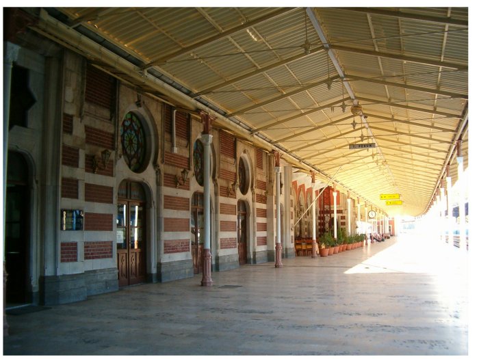
Perhaps Use something from the building architecture style:
http://www.fotografgalerisi.net/GaleriS ... ciGari.jpg
Be creative
* Pearl Harbour * Waterloo * Forbidden City * Jamaica * Pot Mosbi
-
natty dread
- Posts: 12877
- Joined: Fri Feb 08, 2008 8:58 pm
- Location: just plain fucked
Re: AOS: Orient Express 1883 <v18> p1,24 [GP] - updated
That's a different train. I thought your complaint was with the train that looked like a monopoly train. This one is similar to the locomotive used on the orient express at the time (I couldn't find a good picture of the exact model but this is very similar.)cairnswk wrote:Nup, it's still there on V18.png previous page
Or are you saying you don't want any train in the legend?
Thanks, I'll see what I can do.Perhaps something in this vain..
http://www.fivestarhotelsandspas.com/im ... press1.jpg
http://4.bp.blogspot.com/_ef_M4U2nwus/S ... XPRESS.jpg
Perhaps Use something from the building architecture style:
http://www.fotografgalerisi.net/GaleriS ... ciGari.jpg
Be creative
Re: AOS: Orient Express 1883 <v18> p1,24 [GP] - updated
I know what you're trying to express there with it, but it simply looks out of place with the whole theme.natty_dread wrote:That's a different train. I thought your complaint was with the train that looked like a monopoly train. This one is similar to the locomotive used on the orient express at the time (I couldn't find a good picture of the exact model but this is very similar.)cairnswk wrote:Nup, it's still there on V18.png previous page
Or are you saying you don't want any train in the legend?
I think the train in isometric is sufficient to hold the entire design.
* Pearl Harbour * Waterloo * Forbidden City * Jamaica * Pot Mosbi
-
porkenbeans

- Posts: 2546
- Joined: Mon Sep 10, 2007 4:06 pm
Re: AOS: Orient Express 1883 <v18> p1,24 [GP] - updated
The rivers are much improved with the gradient, but maybe you could tone it down, so that it is not as noticeable.

-
natty dread
- Posts: 12877
- Joined: Fri Feb 08, 2008 8:58 pm
- Location: just plain fucked
Re: AOS: Orient Express 1883 <v18> p1,24 [GP] - updated
Yeah... now that I look at the map on my new monitor I notice the colour saturation is way higher than I intended. (curse you laptop monitors for misleading me so. )
-
natty dread
- Posts: 12877
- Joined: Fri Feb 08, 2008 8:58 pm
- Location: just plain fucked
Re: AOS: Orient Express 1883 <v18> p1,24 [GP] - updated
One more thing: I was thinking of renaming "train monopoly" to "rail monopoly". After all the bonus is given for controlling railway stations, and by association the railways between them... therefore "rail monopoly" would make more sense I think.
Plus it sounds better (it rrrolls off the tongue!)
Plus it sounds better (it rrrolls off the tongue!)

Re: AOS: Orient Express 1883 <v18> p1,24 [GP] - updated
Yes, "rail monopoly" is better.
-
natty dread
- Posts: 12877
- Joined: Fri Feb 08, 2008 8:58 pm
- Location: just plain fucked
Re: AOS: Orient Express 1883 <v18> p1,24 [GP] - updated
Unfortunately, this will have to wait until I can get my fonts moved from the old computer.ender516 wrote:Yes, "rail monopoly" is better.
-
natty dread
- Posts: 12877
- Joined: Fri Feb 08, 2008 8:58 pm
- Location: just plain fucked
Re: AOS: Orient Express 1883 <v18> p1,24 [GP] - updated
damn, I forgot the train -> rail change. oh well, next update then...

- Click image to enlarge.

Re: AOS: Orient Express 1883 <v18> p1,24 [GP] - updated
I like the flags: a nice splash of colour.
-
natty dread
- Posts: 12877
- Joined: Fri Feb 08, 2008 8:58 pm
- Location: just plain fucked


-
carlpgoodrich
- Posts: 408
- Joined: Tue Aug 04, 2009 2:12 pm
Re: AOS: Orient Express 1883 <v19> p1,25 [GP] - new stuff do
Cool, I like the borders and the "Rail" does work better. What do you think of having a very thin border go all the way round the map? I think that might connect the legend with the map a bit better.
-
natty dread
- Posts: 12877
- Joined: Fri Feb 08, 2008 8:58 pm
- Location: just plain fucked
Re: AOS: Orient Express 1883 <v19> p1,25 [GP] - new stuff do
Hm, I'm not sure if it would really suit the style of this map... I'm afraid it would make it look too cramped...What do you think of having a very thin border go all the way round the map? I think that might connect the legend with the map a bit better.