Baltic Crusades
Moderator: Cartographers
Forum rules
Please read the Community Guidelines before posting.
Please read the Community Guidelines before posting.
-
The Bison King

- Posts: 1957
- Joined: Thu Aug 27, 2009 5:06 pm
- Location: the Mid-Westeros
Re: Baltic Crusades - bonuses set up, changes done
Here's my first suggestion. Those forests could look way cooler. Right now the look sort of pasted in. I'd like to see something a little more textured.

-
theBastard

- Posts: 994
- Joined: Sat Jan 09, 2010 9:05 am
Re: Baltic Crusades - bonuses set up, changes done
yes, I know about trees. they are only as information where should be impassables. I will find any others, or maybe I will use trees from Helix, we spoke about this.
-
Industrial Helix

- Posts: 3462
- Joined: Mon Jul 14, 2008 6:49 pm
- Gender: Female
- Location: Ohio
Re: Baltic Crusades - bonuses set up, changes done
I had a moment so I thought I would chime in on the trees. Here's what I think fits the map more than little tree icons.
It's not perfect, but I think you get the idea.
It's not perfect, but I think you get the idea.
- Click image to enlarge.
Sketchblog [Update 07/25/11]: http://indyhelixsketch.blogspot.com/
Living in Japan [Update 07/17/11]: http://mirrorcountryih.blogspot.com/
Russian Revolution map for ConquerClub [07/20/11]: http://www.conquerclub.com/forum/viewto ... 1&t=116575
Living in Japan [Update 07/17/11]: http://mirrorcountryih.blogspot.com/
Russian Revolution map for ConquerClub [07/20/11]: http://www.conquerclub.com/forum/viewto ... 1&t=116575
-
theBastard
- Posts: 994
- Joined: Sat Jan 09, 2010 9:05 am
Re: Baltic Crusades - bonuses set up, changes done
ou, I like it 
it realy fit with map style, thanks!
PS: sorry for non actual PM...
it realy fit with map style, thanks!
PS: sorry for non actual PM...
-
The Bison King
- Posts: 1957
- Joined: Thu Aug 27, 2009 5:06 pm
- Location: the Mid-Westeros
Re: Baltic Crusades - updated
Yeah I dig that waaay more.
-
thenobodies80

- Posts: 5400
- Joined: Wed Sep 05, 2007 4:30 am
- Gender: Male
- Location: Milan
Re: Baltic Crusades - updated
Some thoughts aiming to improve this map:
Looking forward your next update
Nobodies
- Legend & Co.
- Why Duchy of Estonia has a different icon?
- Why terra Mariana has a different icon?
- To win hold Grundwald...etc etc should start with capital letter
- The strongholds icons (the towers) should stay in a lower layer than the small shield or/also increase opacity of shields.
- Increase opacity of christian and pagan symbols (also the ones not in the legend)
- The note for the impassable is almost invisible in that small corner.
- Playable Part
- Borders are all clear, you should only refine some parts that are darker, for example sealovia or ingria.
- Some icons (for armies) on the map are darker and they look much better, i think you should draw all them in this way.
- Some icons (for armies) on the map are hard to see, but if you go with darker icons this should be fixed in the same time.
- The font, i think Gotica Bastard, it's nice but the letter "t" (lowercase) is really annoying, looks like a "r", making harder to read some names.I f you find something similar but with more distinct letters is much better imo.
- You should move some icons (for armies) near the coast (example Sterrin), in this way you should have clearer sea connections and more visible icons.
- Could you post a version with real armies or at least without the numbers?

- You should place all the shields (or the symbols) on the same side (i suggest left), if possible. There's a quicker reference with the legend in this way.
- Bridges are too dark and with a too high level of trasparency.
- Dotted sea connections are hard to see in some places, as already said somewhere over here...(danzig is another example)
- With sea connections reach but don't touch the land with the last dot (example dago), it will look much better.

- Colors....Are you sure that all the colors match the ones in legend or viceversa?
- Colors again...i see that there're some problems with the colorblind test of the map (see the spoiler):
the color you used for regions that aren't part of any bonus is really similar to some others, like Osel and wick. It's also not so easy understand the bonuses...poland, pomerania..
colorblindtest
- Click image to enlarge.


- Have you tried to add some white (or something like that) where you'll have the troops?
Looking forward your next update
Nobodies
-
theBastard
- Posts: 994
- Joined: Sat Jan 09, 2010 9:05 am
Re: Baltic Crusades - updated
thenobodies80 wrote:Some thoughts aiming to improve this map:
- Legend & Co.
the icons/shields are made by original shields and these two have those sharp.thenobodies80 wrote:
- Why Duchy of Estonia has a different icon?
- Why terra Mariana has a different icon?
o.k. will be done.thenobodies80 wrote: [*]To win hold Grundwald...etc etc should start with capital letter
[*]The strongholds icons (the towers) should stay in a lower layer than the small shield or/also increase opacity of shields.
[*]Increase opacity of christian and pagan symbols (also the ones not in the legend)
so do a little "legend" for it?thenobodies80 wrote: [*]The note for the impassable is almost invisible in that small corner.[/list]
will be done.thenobodies80 wrote: [*]Playable Part
- Borders are all clear, you should only refine some parts that are darker, for example sealovia or ingria.
- Some icons (for armies) on the map are darker and they look much better, i think you should draw all them in this way.
- Some icons (for armies) on the map are hard to see, but if you go with darker icons this should be fixed in the same time.
yes, I know that some letters are similar to others, but Gotica Bastard is the best what I found for this time era. I do not think that this will be big problem...thenobodies80 wrote: [*]The font, i think Gotica Bastard, it's nice but the letter "t" (lowercase) is really annoying, looks like a "r", making harder to read some names.I f you find something similar but with more distinct letters is much better imo.
you mean to move Stettin to north?thenobodies80 wrote: [*]You should move some icons (for armies) near the coast (example Sterrin), in this way you should have clearer sea connections and more visible icons.
there is map with real armies at the first post...thenobodies80 wrote: [*]Could you post a version with real armies or at least without the numbers?
o.k.thenobodies80 wrote: [*]You should place all the shields (or the symbols) on the same side (i suggest left), if possible. There's a quicker reference with the legend in this way.
I had problems with bridges, because if they were not so dark rivers were shine through them.thenobodies80 wrote: [*]Bridges are too dark and with a too high level of trasparency.
will be done.thenobodies80 wrote: [*]Dotted sea connections are hard to see in some places, as already said somewhere over here...(danzig is another example)
[*]With sea connections reach but don't touch the land with the last dot (example dago), it will look much better.
yes, I´m sure. but nobody is inerrablethenobodies80 wrote: [*]Colors....Are you sure that all the colors match the ones in legend or viceversa?
looks like the colours need any changes. o.k., I will look at this.thenobodies80 wrote: [*]Colors again...i see that there're some problems with the colorblind test of the map (see the spoiler):the color you used for regions that aren't part of any bonus is really similar to some others, like Osel and wick. It's also not so easy understand the bonuses...poland, pomerania..colorblindtest
- Click image to enlarge.
I had army circles there, but there were advice that they are not needed.thenobodies80 wrote: [*]Have you tried to add some white (or something like that) where you'll have the troops? [/list][/list]
thanks for your advices. but I do not know when will be next update release because I have broken my right hand. and left is realy leftthenobodies80 wrote: Looking forward your next update
Nobodies
I had broken my right hand (4-5 month ago) and now I have wrong adherent knucklebone of the thumb. therefore I have some problems with it and I must end my works on maps.sorry my english

Re: Baltic Crusades - updated
Sorry to hear about your hand. I'm sure everyone will be patient while you cope with that.
-
theBastard
- Posts: 994
- Joined: Sat Jan 09, 2010 9:05 am
Re: Baltic Crusades - updated
thanks ender
damned, I can not use thumb, forefinger and a little middle one...
and thanks for patience.
damned, I can not use thumb, forefinger and a little middle one...
and thanks for patience.
-
Industrial Helix
- Posts: 3462
- Joined: Mon Jul 14, 2008 6:49 pm
- Gender: Female
- Location: Ohio
Re: Baltic Crusades - updated
Sorry about your hand, that's always a nightmare of mine that I might break my right hand as I use it for just about everything.
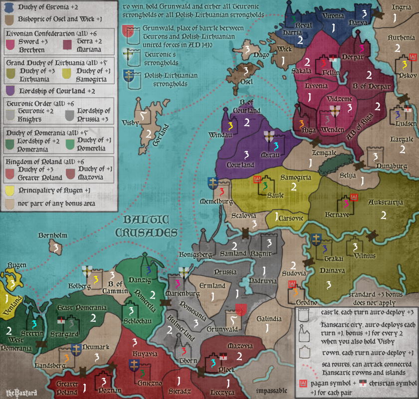
Anyway, here's the updated image with a vischeck... I want to make sure the vischeck is good before I make the shields match the bonus areas.
Anyway, here's the updated image with a vischeck... I want to make sure the vischeck is good before I make the shields match the bonus areas.
- Click image to enlarge.
- Click image to enlarge.
Sketchblog [Update 07/25/11]: http://indyhelixsketch.blogspot.com/
Living in Japan [Update 07/17/11]: http://mirrorcountryih.blogspot.com/
Russian Revolution map for ConquerClub [07/20/11]: http://www.conquerclub.com/forum/viewto ... 1&t=116575
Living in Japan [Update 07/17/11]: http://mirrorcountryih.blogspot.com/
Russian Revolution map for ConquerClub [07/20/11]: http://www.conquerclub.com/forum/viewto ... 1&t=116575
-
theBastard
- Posts: 994
- Joined: Sat Jan 09, 2010 9:05 am
Re: Baltic Crusades - updated
Industrial Helix wrote:Sorry about your hand, that's always a nightmare of mine that I might break my right hand as I use it for just about everything.
thanks. and thanks for your help. I´m totaly right handed too, so I know about what you speak
looks great for me. also nice font (maybe a little modern form but better for read). just:Industrial Helix wrote: Anyway, here's the updated image with a vischeck... I want to make sure the vischeck is good before I make the shields match the bonus areas.
- shield and religious icons could have less opacity
- the wood at the Harria/Sakala is too big. there will be not place for army number in Haria, I´m afraid
- there is "Wisk" on the map, but it is Wiek
-
theBastard
- Posts: 994
- Joined: Sat Jan 09, 2010 9:05 am
Re: Baltic Crusades - updated
Helix did great work and many necessary changes on the map, including ones which thenobodies80 noticed. so no reactions, no interest here?
Re: Baltic Crusades - updated
I think you are hearing the silence of assent. (No news is good news, as they say.) I did look twice at the forest between East Pomerania and Schlochau, because I thought it was another territory of the Lordship of Pomerania, but one that had been miscoloured. Once the troop numbers are on the map, this should be less of a problem. I do think the colours of the shields in the legend need a little correction to match the map better, in particular, the Lordship of Pomerania shield is not as dark as the map region. Perhaps all the shields need the same texture/grunge/effect as the main map to ensure that the resultant colours are more recognizably the same.
-
The Bison King
- Posts: 1957
- Joined: Thu Aug 27, 2009 5:06 pm
- Location: the Mid-Westeros
Re: Baltic Crusades - updated
When are we going to get the other forests back? I seem to remember a time when there were more impassable on this map, but then they disappeared. Are you going to put them back in or were they permanently removed?
-
Industrial Helix
- Posts: 3462
- Joined: Mon Jul 14, 2008 6:49 pm
- Gender: Female
- Location: Ohio
Re: Baltic Crusades - updated
As I recall, there were only four patches of forest on the version I received to make updates on. I presume they were permanently removed earlier on. On the brightside, at least you've got the rivers as impassables as well.
Sketchblog [Update 07/25/11]: http://indyhelixsketch.blogspot.com/
Living in Japan [Update 07/17/11]: http://mirrorcountryih.blogspot.com/
Russian Revolution map for ConquerClub [07/20/11]: http://www.conquerclub.com/forum/viewto ... 1&t=116575
Living in Japan [Update 07/17/11]: http://mirrorcountryih.blogspot.com/
Russian Revolution map for ConquerClub [07/20/11]: http://www.conquerclub.com/forum/viewto ... 1&t=116575
-
The Bison King
- Posts: 1957
- Joined: Thu Aug 27, 2009 5:06 pm
- Location: the Mid-Westeros
Re: Baltic Crusades - updated
The big one I see missing is the forest between grunwald and galindia. Maybe it was intentionally removed but I still think it should be there.
-
theBastard
- Posts: 994
- Joined: Sat Jan 09, 2010 9:05 am
Re: Baltic Crusades - updated
to ender, so I could be glad that there is nothing noticed? than move it next some shield could be realy a little darker (or what) to have them close to regions... tomorow I will go to doctor and will see what he says.
btw: we have also one saying: be saying is silver, be silent is gold. so no more hurry from me next time
to Helix, you did everything corect about trees and they all are in their place. thanks.
to Bison King, I´ve updated first page, so maybe this was what confused you. look all forests are in.
btw: we have also one saying: be saying is silver, be silent is gold. so no more hurry from me next time
to Helix, you did everything corect about trees and they all are in their place. thanks.
to Bison King, I´ve updated first page, so maybe this was what confused you. look all forests are in.
-
thenobodies80
- Posts: 5400
- Joined: Wed Sep 05, 2007 4:30 am
- Gender: Male
- Location: Milan
Re: Baltic Crusades - updated
the map is not visible 
I'll be happy to give you some further advice once the map reappears
I'll be happy to give you some further advice once the map reappears
-
theBastard
- Posts: 994
- Joined: Sat Jan 09, 2010 9:05 am
Re: Baltic Crusades - updated
hm, I´ve just copied Helix´s link. when I look at the first post, all Helix´s maps are not visible.thenobodies80 wrote:the map is not visible
I'll be happy to give you some further advice once the map reappears
Helix, could you upload your last map with edits and woods on another link? thanks.
-
Industrial Helix
- Posts: 3462
- Joined: Mon Jul 14, 2008 6:49 pm
- Gender: Female
- Location: Ohio
Re: Baltic Crusades - updated
Ah crap, I totally forgot I had this map hosted on my lame-ass photobucket account. After 4 years of using it I finally blew out the bandwidth, it's image shack for me for now on.
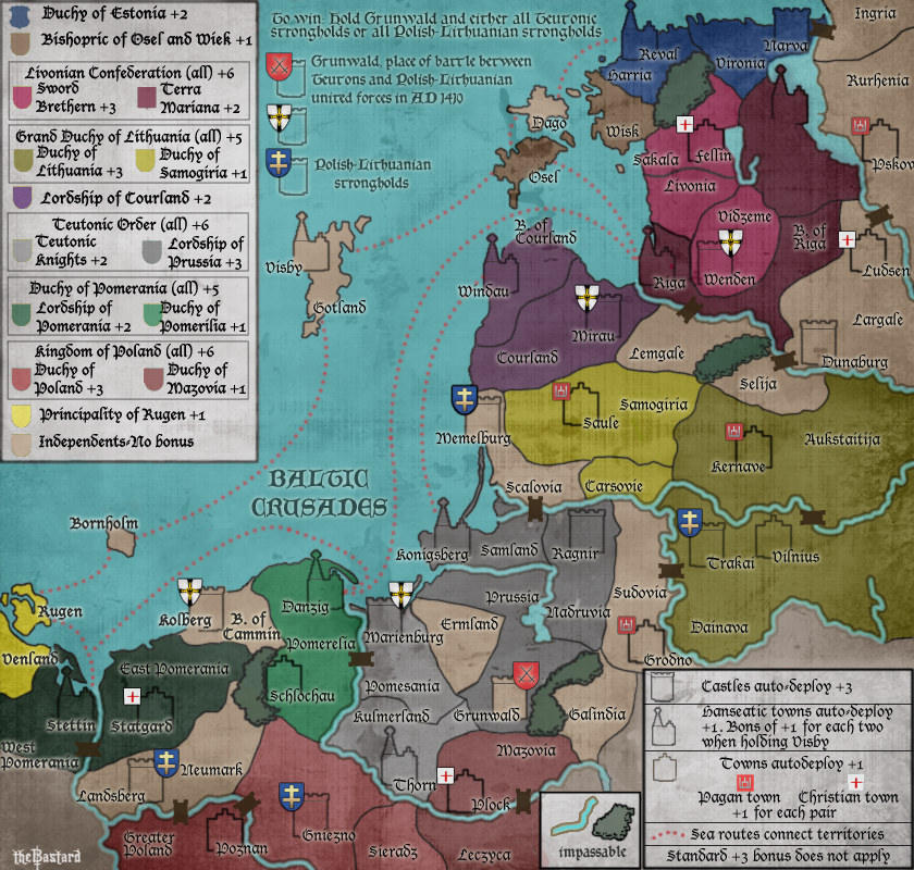
Here's the new image.
Here's the new image.
- Click image to enlarge.

Sketchblog [Update 07/25/11]: http://indyhelixsketch.blogspot.com/
Living in Japan [Update 07/17/11]: http://mirrorcountryih.blogspot.com/
Russian Revolution map for ConquerClub [07/20/11]: http://www.conquerclub.com/forum/viewto ... 1&t=116575
Living in Japan [Update 07/17/11]: http://mirrorcountryih.blogspot.com/
Russian Revolution map for ConquerClub [07/20/11]: http://www.conquerclub.com/forum/viewto ... 1&t=116575
-
theBastard
- Posts: 994
- Joined: Sat Jan 09, 2010 9:05 am
Re: Baltic Crusades - updated
big thanks Helix.Industrial Helix wrote:Ah crap, I totally forgot I had this map hosted on my lame-ass photobucket account. After 4 years of using it I finally blew out the bandwidth, it's image shack for me for now on.
-
thenobodies80
- Posts: 5400
- Joined: Wed Sep 05, 2007 4:30 am
- Gender: Male
- Location: Milan
Re: Baltic Crusades - updated
The new font is much better, clearer and more readable. You should use this font for all text (maybe except the title).
Colors are still a problem imo, specially in the lower part of the map:

Is it possible to make the wood between pomerania and pomerialia more noticeable? About pomerania, the color on the playable part doesn't match the one in the legend.
Maybe it's just me but the text "sea routes connect territories" confuses me....it means that Osel borders with Riga or B. Riga? That Rugen borders with Stettin or West Pomerania?
The symbols used for towns (pagan and christian) could be drawn better. With more opacity bridges look much better, i'd suggest to add some light brown to give them a sort of wood effect. You should rotate some bridges to follow the river or they will look weird.
Just a personal thought, but I don't know if red is the best color for sea connections, have you tried with other colors?
Can you make all the building icons bolder/darker (like plock, saule, ludsen, fellin) ?
A final thing: can you please post an updated version with 888?
Sorry about your hand, hope you get well soon.
Nobodies
Colors are still a problem imo, specially in the lower part of the map:
Is it possible to make the wood between pomerania and pomerialia more noticeable? About pomerania, the color on the playable part doesn't match the one in the legend.
Maybe it's just me but the text "sea routes connect territories" confuses me....it means that Osel borders with Riga or B. Riga? That Rugen borders with Stettin or West Pomerania?
The symbols used for towns (pagan and christian) could be drawn better. With more opacity bridges look much better, i'd suggest to add some light brown to give them a sort of wood effect. You should rotate some bridges to follow the river or they will look weird.
Just a personal thought, but I don't know if red is the best color for sea connections, have you tried with other colors?
Can you make all the building icons bolder/darker (like plock, saule, ludsen, fellin) ?
A final thing: can you please post an updated version with 888?
Sorry about your hand, hope you get well soon.
Nobodies
-
theBastard
- Posts: 994
- Joined: Sat Jan 09, 2010 9:05 am
Re: Baltic Crusades - updated
yes, I agree. Helix could you please change also rest of text?thenobodies80 wrote:The new font is much better, clearer and more readable. You should use this font for all text (maybe except the title).
I will start work on map next week and will try repare this.thenobodies80 wrote: Colors are still a problem imo, specially in the lower part of the map:
thenobodies80 wrote: Is it possible to make the wood between pomerania and pomerialia more noticeable?
if I will a little change colours of territories this will be not needed, I hope.
will do it.thenobodies80 wrote: About pomerania, the color on the playable part doesn't match the one in the legend.
the idea is that Hanseatic towns are connected only. ofcourse also isles must be connected. so no one territory on the mainland has connection. how to write this for better undertand?thenobodies80 wrote: Maybe it's just me but the text "sea routes connect territories" confuses me....it means that Osel borders with Riga or B. Riga? That Rugen borders with Stettin or West Pomerania?
sorry, what do you mean exactly?thenobodies80 wrote: The symbols used for towns (pagan and christian) could be drawn better.
no problem, will be done.thenobodies80 wrote: With more opacity bridges look much better, i'd suggest to add some light brown to give them a sort of wood effect. You should rotate some bridges to follow the river or they will look weird.
I´ve tried white, but it did not looks good for me. I´ve used red, because I saw it as sea connection on some old maps about Hanseatic league...thenobodies80 wrote: Just a personal thought, but I don't know if red is the best color for sea connections, have you tried with other colors?
yes.thenobodies80 wrote: Can you make all the building icons bolder/darker (like plock, saule, ludsen, fellin) ?
you can see map with 888 at the first post. but when I will do graphic edits I do also 888 mapthenobodies80 wrote: A final thing: can you please post an updated version with 888?
thanks, it is better. some problems with mobility but it will be goodthenobodies80 wrote: Sorry about your hand, hope you get well soon.
Nobodies
-
thenobodies80
- Posts: 5400
- Joined: Wed Sep 05, 2007 4:30 am
- Gender: Male
- Location: Milan
Re: Baltic Crusades - updated
No rush, but how is it going with your hand?
Can we expect an update soon?
Can we expect an update soon?
-
theBastard
- Posts: 994
- Joined: Sat Jan 09, 2010 9:05 am
Re: Baltic Crusades - updated
thanks for ask, hand is fine, a little mobility problem with thumb. bigger problem is that I wait for new Photoshop. I believe that in this week I can have it.