- The steam looks like smoke... I'd suggest changing it back to the way you had it before.
- Change Norfolk's port to a balloon.
SteamWorks
Moderator: Cartographers
Forum rules
Please read the Community Guidelines before posting.
Please read the Community Guidelines before posting.
-
Victor Sullivan

- Posts: 6010
- Joined: Mon Feb 08, 2010 8:17 pm
- Gender: Male
- Location: Columbus, OH
- Contact:
Re: SteamWorks - V11 - pg.1&10 - The Island of Dr.DiM
A couple small things:
Beckytheblondie: "Don't give us the dispatch, give us a mustache ride."
Scaling back on my CC involvement...
Scaling back on my CC involvement...
-
DiM

- Posts: 10415
- Joined: Wed Feb 14, 2007 6:20 pm
- Gender: Male
- Location: making maps for scooby snacks
Re: SteamWorks - V11 - pg.1&10 - The Island of Dr.DiM
the current steam icon fits the rest of the icons much better. it's true that it doesn't quite look like real steam anymore but people asked for consistency thus the change from white to black.Victor Sullivan wrote:A couple small things:-Sully
- The steam looks like smoke... I'd suggest changing it back to the way you had it before.
- Change Norfolk's port to a balloon.
as for norfolk, yeah, it can be easily done and then we'll have equal amount of ports and balloons
“In the beginning God said, the four-dimensional divergence of an antisymmetric, second rank tensor equals zero, and there was light, and it was good. And on the seventh day he rested.”- Michio Kaku

Re: SteamWorks - V11 - pg.1&10 - The Island of Dr.DiM
Going be fun to play.
only thing that is bothering me is the lighting on the pipes, and the shadow of the pipes.. to many different light sources.
add more drop shadow under the paper
I'd also make a tight drop shadow to the STEAMWORKS.
only thing that is bothering me is the lighting on the pipes, and the shadow of the pipes.. to many different light sources.
add more drop shadow under the paper
I'd also make a tight drop shadow to the STEAMWORKS.
-
DiM
- Posts: 10415
- Joined: Wed Feb 14, 2007 6:20 pm
- Gender: Male
- Location: making maps for scooby snacks
Re: SteamWorks - V11 - pg.1&10 - The Island of Dr.DiM
i'll look into it tisha and fix things in the next version.
thanks.
thanks.
“In the beginning God said, the four-dimensional divergence of an antisymmetric, second rank tensor equals zero, and there was light, and it was good. And on the seventh day he rested.”- Michio Kaku
-
AndyDufresne

- Posts: 24935
- Joined: Fri Mar 03, 2006 8:22 pm
- Location: A Banana Palm in Zihuatanejo
- Contact:
Re: SteamWorks - V11 - pg.1&10 - The Island of Dr.DiM
Agreed that Steam looks like smoke. In fact, it kind of looks like a smudge on the map. I'm still in favor of ditching to realistic stream for stylized symbols, it honestly fits rest of the aesthetic tremendously better.Victor Sullivan wrote:A couple small things:-Sully
- The steam looks like smoke... I'd suggest changing it back to the way you had it before.
- Change Norfolk's port to a balloon.
--Andy
-
DiM
- Posts: 10415
- Joined: Wed Feb 14, 2007 6:20 pm
- Gender: Male
- Location: making maps for scooby snacks
Re: SteamWorks - V11 - pg.1&10 - The Island of Dr.DiM
i can't promise that i'll change it since i'm rather fond of the realistic look of the steam. however i will try to come up with a few icons for steam and provide a few alternatives ranging from realistic to stylized and let the community decide.AndyDufresne wrote:Agreed that Steam looks like smoke. In fact, it kind of looks like a smudge on the map. I'm still in favor of ditching to realistic stream for stylized symbols, it honestly fits rest of the aesthetic tremendously better.Victor Sullivan wrote:A couple small things:-Sully
- The steam looks like smoke... I'd suggest changing it back to the way you had it before.
- Change Norfolk's port to a balloon.
--Andy
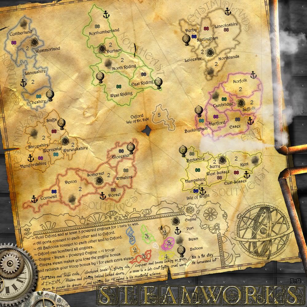
anyway, since lately most posts are about nitpicking graphics, does this mean everybody is ok with the current gameplay?
this is the latest update:
- Click image to enlarge.
“In the beginning God said, the four-dimensional divergence of an antisymmetric, second rank tensor equals zero, and there was light, and it was good. And on the seventh day he rested.”- Michio Kaku
-
Victor Sullivan
- Posts: 6010
- Joined: Mon Feb 08, 2010 8:17 pm
- Gender: Male
- Location: Columbus, OH
- Contact:
Re: SteamWorks - V11 - pg.1&10 - The Island of Dr.DiM
Norfolk's port still needs to be changed to a balloon 
-Sully
-Sully
Beckytheblondie: "Don't give us the dispatch, give us a mustache ride."
Scaling back on my CC involvement...
Scaling back on my CC involvement...
-
DiM
- Posts: 10415
- Joined: Wed Feb 14, 2007 6:20 pm
- Gender: Male
- Location: making maps for scooby snacks
Re: SteamWorks - V11 - pg.1&10 - The Island of Dr.DiM
Victor Sullivan wrote:Norfolk's port still needs to be changed to a balloon
-Sully
yep. will do.
“In the beginning God said, the four-dimensional divergence of an antisymmetric, second rank tensor equals zero, and there was light, and it was good. And on the seventh day he rested.”- Michio Kaku
-
DiM
- Posts: 10415
- Joined: Wed Feb 14, 2007 6:20 pm
- Gender: Male
- Location: making maps for scooby snacks
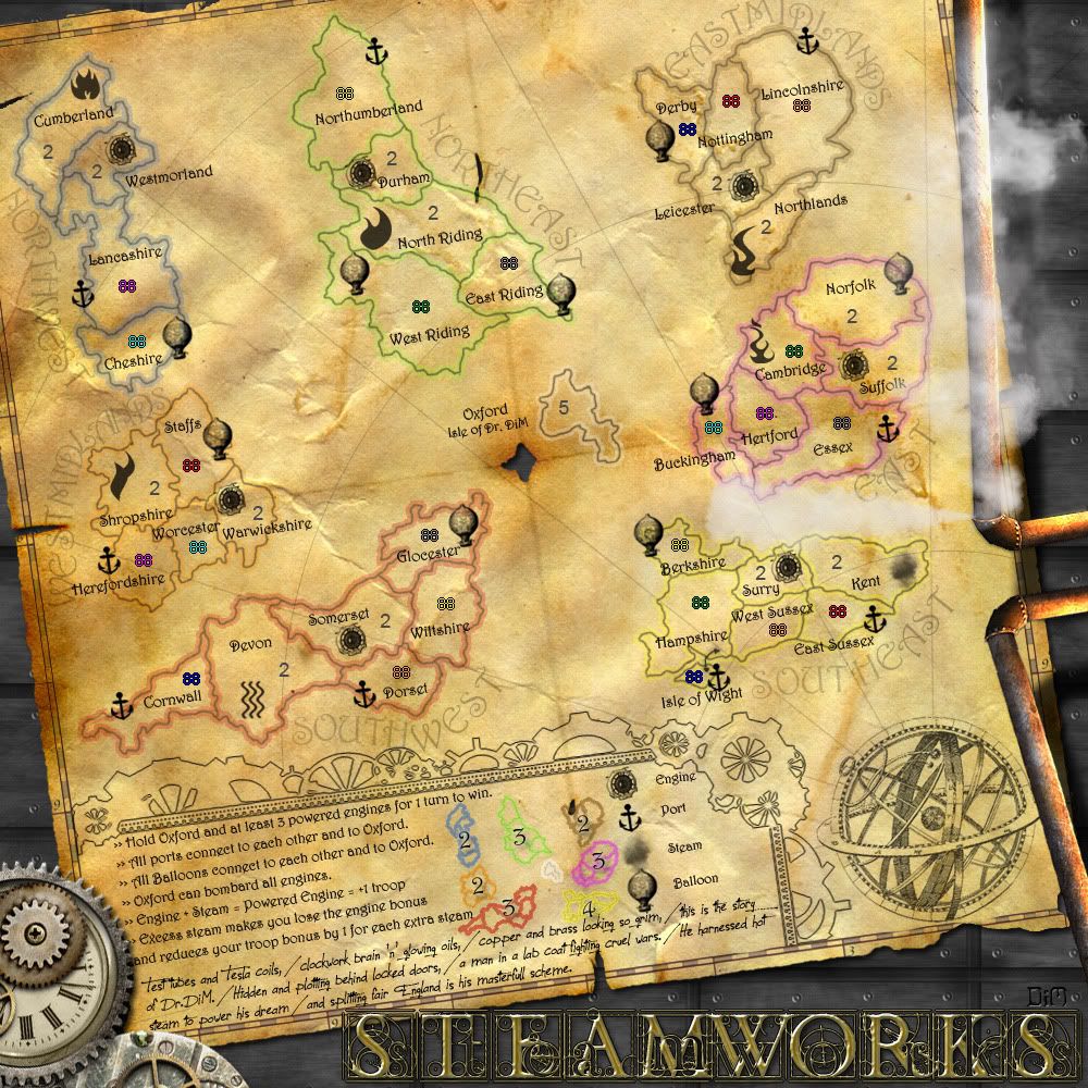
Re: SteamWorks - V11 - pg.1&10 - The Island of Dr.DiM
V12
*changed continent bonuses
*norfolk port became a balloon
*more shadow under the paper
*tweaked the shadow of the title
*placed 2 neutral in cumberland
*7 different steam icons. choose one please. - i still like the realistic steam in Kent.
*changed continent bonuses
*norfolk port became a balloon
*more shadow under the paper
*tweaked the shadow of the title
*placed 2 neutral in cumberland
*7 different steam icons. choose one please. - i still like the realistic steam in Kent.
- Click image to enlarge.
“In the beginning God said, the four-dimensional divergence of an antisymmetric, second rank tensor equals zero, and there was light, and it was good. And on the seventh day he rested.”- Michio Kaku
-
ManBungalow
- Posts: 3431
- Joined: Sun Jan 13, 2008 7:02 am
- Location: On a giant rock orbiting a star somewhere
Re: SteamWorks - V11 - pg.1&10 - The Island of Dr.DiM
I like this very much indeed.
I know it's in the gameplay workshop, but I've no gameplay-related comments to make.
However, I might be inclined to rotate the actual map a few degrees clockwise. I imagine that would be complicated to do, what with all the layers you must have going, but it would make me happier, as I'd probably end up playing this map with my head at an angle this way...
Also, I'm with you on the 'real steam' image. It looks better that way.


Re: SteamWorks - V11 - pg.1&10 - The Island of Dr.DiM
the real black steam looks the best in my opinion (the one on kent) the others look like tribal tattoos or something.
also the balloon on norfolk seems lighter then the others.
also the balloon on norfolk seems lighter then the others.
- Click image to enlarge.

-
Victor Sullivan
- Posts: 6010
- Joined: Mon Feb 08, 2010 8:17 pm
- Gender: Male
- Location: Columbus, OH
- Contact:
Re: SteamWorks - V12 - pg.1&11 - The Island of Dr.DiM
Honestly, I'm still a fan of the white steam from way back when, but certainly Kent is the best of these - the others remind me more of fire, and Devon's just looks terribly out of place.
Also, a nitpick: North Riding's border goes over the hole in the paper.
Plus, perhaps you should separate the balloons in Northeast by switching the port and balloon of Northumberland and West Riding?
-Sully
Also, a nitpick: North Riding's border goes over the hole in the paper.
Plus, perhaps you should separate the balloons in Northeast by switching the port and balloon of Northumberland and West Riding?
-Sully
Beckytheblondie: "Don't give us the dispatch, give us a mustache ride."
Scaling back on my CC involvement...
Scaling back on my CC involvement...
-
DiM
- Posts: 10415
- Joined: Wed Feb 14, 2007 6:20 pm
- Gender: Male
- Location: making maps for scooby snacks
Re: SteamWorks - V12 - pg.1&11 - The Island of Dr.DiM
as usual your input is appreciated. i already made the changes you requested and they shall be visible in the next update after i get a consensus on the steam icon. right now it heavily tilts towards the black realistic steam icon.Victor Sullivan wrote:Honestly, I'm still a fan of the white steam from way back when, but certainly Kent is the best of these - the others remind me more of fire, and Devon's just looks terribly out of place.
Also, a nitpick: North Riding's border goes over the hole in the paper.
Plus, perhaps you should separate the balloons in Northeast by switching the port and balloon of Northumberland and West Riding?
-Sully
“In the beginning God said, the four-dimensional divergence of an antisymmetric, second rank tensor equals zero, and there was light, and it was good. And on the seventh day he rested.”- Michio Kaku
-
DiM
- Posts: 10415
- Joined: Wed Feb 14, 2007 6:20 pm
- Gender: Male
- Location: making maps for scooby snacks
Re: SteamWorks - V11 - pg.1&10 - The Island of Dr.DiM
thanks for the feedback. i'll try and fiddle with the rotation to see what i can do. the problem is that by rotating the map clockwise more of the bottom left corner will go under the cogs/watch mechanism and i'll lose valuable legend space.ManBungalow wrote:I like this very much indeed.
I know it's in the gameplay workshop, but I've no gameplay-related comments to make.
However, I might be inclined to rotate the actual map a few degrees clockwise. I imagine that would be complicated to do, what with all the layers you must have going, but it would make me happier, as I'd probably end up playing this map with my head at an angle this way...
Also, I'm with you on the 'real steam' image. It looks better that way.
and thanks for the steam input.
“In the beginning God said, the four-dimensional divergence of an antisymmetric, second rank tensor equals zero, and there was light, and it was good. And on the seventh day he rested.”- Michio Kaku
-
DiM
- Posts: 10415
- Joined: Wed Feb 14, 2007 6:20 pm
- Gender: Male
- Location: making maps for scooby snacks
Re: SteamWorks - V11 - pg.1&10 - The Island of Dr.DiM
that baloon is lighter because on top of it there's a steam layer from the pipe on the right side. i don't see it as much of a problem to be honest.zimmah wrote:the real black steam looks the best in my opinion (the one on kent) the others look like tribal tattoos or something.
also the balloon on norfolk seems lighter then the others.
“In the beginning God said, the four-dimensional divergence of an antisymmetric, second rank tensor equals zero, and there was light, and it was good. And on the seventh day he rested.”- Michio Kaku

Re: SteamWorks - V12 - pg.1&11 - The Island of Dr.DiM
For the steam, i prefer the one on Devon, but it needs to be a bit more graphic and full like the other icons...perhaps with some fluffy stuff in its background.
the other steam icons look like flames.
the other steam icons look like flames.

* Pearl Harbour * Waterloo * Forbidden City * Jamaica * Pot Mosbi

Re: [IDEA] SteamWorks - V9 - pg.1&7 - The Island of Dr.DiM
I'm going to repeat this until it is addressed properlyMrBenn wrote:Well, as the only Englander to have commented on it, I still think it sucksnatty_dread wrote:I personally like the England connection. It gives the map a nice sort of "what if" undertone, and the way I see it... "what if" scenarios are what Steampunk is all about! Sans the fantasy element, Steampunk as a genre speculates on a type of world where certain aspects of our technology developed faster than others... what if things like cars, robots or computers were invented but electricity or combustion engines weren't, etc.
So I think using England as a basis for the map is well justified thematically, plus it gives it a certain connection to reality that makes the theme even more interesting.

PB: 2661 | He's blue... If he were green he would die | No mod would be stupid enough to do that
-
Nola_Lifer
- Posts: 819
- Joined: Mon Oct 13, 2008 4:46 pm
- Location: 雪山
- Contact:
Re: SteamWorks - V12 - pg.1&11 - The Island of Dr.DiM
Looks good. Steam on Kent fits the best. The one on Devon is too Egyptian looking.

Re: SteamWorks - V12 - pg.1&11 - The Island of Dr.DiM
OK. my two bobs worth, and i must admit i don't know too much about the subject apart from what i can read on the internet.
DiM, while i can see the England connection to the Victorian Era that you have on the map with the land territories, when i first saw England divided up, i thought "Oh no, not another version of England" but waited to see the response and where the idea would go.
I think that perhaps MrBenn has a point in calling for something different to be offered in the way of territories laid out on the map. There are a wealth of ideas, shapes and forms out there that one can draw on for shaping territories and heaps of different names associated with the steampunk idea that could be territoy names.
Without creating WWIII and offending you, i think it could be improved using your vivid imagination you have along with your special skills. Yes it is a graphics issue, but i know it is the heart of the gameplay at this point.
Whatever you choose is fine with me, but i thought i just should say something to offer encouragement for perhaps some alternative.
Last edited by cairnswk on Wed Jul 06, 2011 3:12 am, edited 1 time in total.
* Pearl Harbour * Waterloo * Forbidden City * Jamaica * Pot Mosbi
-
natty dread

- Posts: 12877
- Joined: Fri Feb 08, 2008 8:58 pm
- Location: just plain fucked
Re: [IDEA] SteamWorks - V9 - pg.1&7 - The Island of Dr.DiM
What part of "I think it sucks" is something that a mapmaker should address?MrBenn wrote:I'm going to repeat this until it is addressed properlyMrBenn wrote: Well, as the only Englander to have commented on it, I still think it sucks

-
DiM
- Posts: 10415
- Joined: Wed Feb 14, 2007 6:20 pm
- Gender: Male
- Location: making maps for scooby snacks
Re: [IDEA] SteamWorks - V9 - pg.1&7 - The Island of Dr.DiM
MrBenn wrote:I'm going to repeat this until it is addressed properlyMrBenn wrote:Well, as the only Englander to have commented on it, I still think it sucks
i have already addressed this properly by clearly explaining my choice for England. `further more i proved i'm willing to be flexible and give up the 21st century england and go for a 19th century one as some people felt it would be better. got my 19th century image from cairns and made the necessary changes. if you still think it sucks then it's your problem mate. not everybody can be satisfied and apparently this time you'll be the one left on the outside.
i've always stayed away from real geographical maps and used solely my imagination for terits and borders because i found it to be a much more flexible way of creating a map. well this time i went for England to fit the theme and i also managed a way to make it flexible enough by splitting it up and using balloons and ports.
“In the beginning God said, the four-dimensional divergence of an antisymmetric, second rank tensor equals zero, and there was light, and it was good. And on the seventh day he rested.”- Michio Kaku
-
DiM
- Posts: 10415
- Joined: Wed Feb 14, 2007 6:20 pm
- Gender: Male
- Location: making maps for scooby snacks
Re: SteamWorks - V12 - pg.1&11 - The Island of Dr.DiM
Nola_Lifer wrote:Looks good. Steam on Kent fits the best. The one on Devon is too Egyptian looking.
thanks for the input Nola_Lifer
“In the beginning God said, the four-dimensional divergence of an antisymmetric, second rank tensor equals zero, and there was light, and it was good. And on the seventh day he rested.”- Michio Kaku
-
DiM
- Posts: 10415
- Joined: Wed Feb 14, 2007 6:20 pm
- Gender: Male
- Location: making maps for scooby snacks
Re: SteamWorks - V12 - pg.1&11 - The Island of Dr.DiM
yeah i could use basically and map in any shape or size. heck i could even use a map of my neighbourhood or my country. hey i could even place this in cairns coral coastcairnswk wrote:OK. my two bobs worth, and i must admit i don't know too much about the subject apart from what i can read on the internet.
DiM, while i can see the England connection to the Victorian Era that you have on the map with the land territories, when i first saw England divided up, i thought "Oh no, not another version of England" but waited to see the response and where the idea would go.
I think that perhaps MrBenn has a point in calling for something different to be offered in the way of territories laid out on the map. There are a wealth of ideas, shapes and forms out there that one can draw on for shaping territories and heaps of different names associated with the steampunk idea that could be territoy names.
Without creating WWIII and offending you, i think it could be improved using your vivid imagination you have along with your special skills. Yes it is a graphics issue, but i know it is the heart of the gameplay at this point.
Whatever you choose is fine with me, but i thought i just should say something to offer encouragement for perhaps some alternative.
but if i chose anything other than england, for me, it would lose it's steampunk feel.
at first i even tried making a fantasy landscape (check out v3) but it all clicked into place once i decided to use england.
“In the beginning God said, the four-dimensional divergence of an antisymmetric, second rank tensor equals zero, and there was light, and it was good. And on the seventh day he rested.”- Michio Kaku
Re: SteamWorks - V12 - pg.1&11 - The Island of Dr.DiM
^^^ Fair enough DiM. There is no harm in asking. Cheers.
* Pearl Harbour * Waterloo * Forbidden City * Jamaica * Pot Mosbi
-
DiM
- Posts: 10415
- Joined: Wed Feb 14, 2007 6:20 pm
- Gender: Male
- Location: making maps for scooby snacks
Re: SteamWorks [04 Jul 2011] V12 pg.1&11 - The Island of Dr.
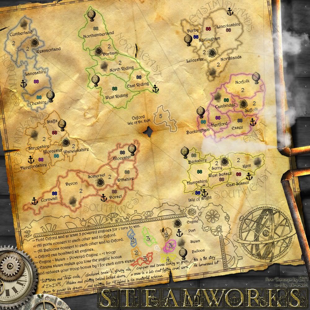
i hate to be so insistent but do people have any gameplay issues that need to be solved? i keep asking this over and over again because i'm in the gameplay subforum and for the last few pages most of the talking has been about moving a few pixels here and there, increasing a shadow correcting some lighting and picking graphics for steam.
this is the latest image that can be used to analyse gameplay:
if nobody has any objections i will start working on the small version and i have asked zimmah to start working on the xml. hopefully it will save a lot of time in the graphic and final forge subforums if these are done now.
this is the latest image that can be used to analyse gameplay:
- Click image to enlarge.
“In the beginning God said, the four-dimensional divergence of an antisymmetric, second rank tensor equals zero, and there was light, and it was good. And on the seventh day he rested.”- Michio Kaku