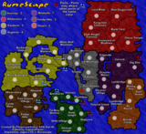
I think this looks tons better then what it started as. That said there are some issues that I think need to be addressed graphically.
Borders Some of the borders aren't consistant. A good example is the east/right side of
Tree Gnome Stronghold versus the west/left side of it. I also feel the rivers look better with the thin black line around it
(like the northern part of the river in Taverly/Falador) instead of no division between the water's edge and the landscape.
Title If you can provide an example of the actual Runescape title that looks exactly like the one you have here I'll be willing to accept the way it is and not complain about it, but right now it looks really bad.
Coloring COLOR INSIDE THE LINES!!!

Check the east/right side of
Red Dragon Isle, there should be no red on the east/right side of that border. This also happens in
Dig Site and a few other places.
Ports This is kind of minor but I would like the message better if it says ports
may attack other ports instead of
can. It really doesn't make any difference but I personally would be happier with
may.