1982 [Quenched]
Moderator: Cartographers
Forum rules
Please read the Community Guidelines before posting.
Please read the Community Guidelines before posting.
-
koontz1973

- Posts: 6960
- Joined: Thu Jan 01, 2009 10:57 am
-
natty dread

- Posts: 12877
- Joined: Fri Feb 08, 2008 8:58 pm
- Location: just plain fucked
Re: 1982 [14/11] Latest images Page 1/9
Ok, so this is in graphics, time for me to step in... 
Firstly, the border around the land area looks blocky and pixelated, it's going to need a redraw. There's two ways you can go about this (that I would recommend)...
If you're by now more comfortable with your ability to draw freehand (it can be done with a mouse, it's just kinda tedious) you can do that. Try the ink tool: set the settings so that you set both speed and size variation to 0, and use a round brush (I don't think calligraphy would really fit here) and you can get a much smoother & more consistent line than with the paintbrush tool.
Or if you don't want to do it freehand, you can select your land area and convert the selection to a path. Use the advanced settings, by shift-clicking the selection-to-path icon, and in the advanced settings set both Error treshold and Align treshold to minimum, leave the others to defaults. This gives the best result in most cases in my experience. Now when you have the path of the land shape, you can use it to stroke-path the land border. However, the shape may be slightly different from the existing land shape... so you may want to select the path, use path to selection and use the selection as your new land shape.
Ok, the next thing on the list is... the territory borders. These look nice otherwise but the glows are a bit inconsistent - they look stronger on some areas than others. You should look into that - try playing with the layer modes and the colour & opacity of the glow. Also, the colour of the borders themselves could be made a bit stronger.
Next... the forests look crappy, redo them. Sorry. They just don't fit with the map style, and are too pixelated and noisy - try a smoother style.
The mountains... I get what you're going for with them, but they are going to need more work, as well. Redo them as well.
Then... the bevel on the land area... after you've redone the land borders (and possibly adjusted the land shape if you go via that method) you'll want to look into this. I don't know which method you've used for the bevel but it doesn't quite work - at some places there's some emboss artifacting which doesn't look good. If you used my bevel script it would have settings designed to get rid of this... (shameless self advertising here). Anyway, look for a way to get rid of it. If you have the bevel on a separate layer from the land area (you should) then you could try applying some gaussian blur on it, it may work or may not...
Anyway, I would have more things to say about the icons, title & legend, but I think this is enough for now. If you have any questions regarding the methods I've described feel free to pm me.

-
koontz1973
- Posts: 6960
- Joined: Thu Jan 01, 2009 10:57 am
Re: 1982 [14/11] Latest images Page 1/9
natty, lots of good things as always.natty_dread wrote:Ok, so this is in graphics, time for me to step in...
Firstly, the border around the land area looks blocky and pixelated, it's going to need a redraw. There's two ways you can go about this (that I would recommend)...
If you're by now more comfortable with your ability to draw freehand (it can be done with a mouse, it's just kinda tedious) you can do that. Try the ink tool: set the settings so that you set both speed and size variation to 0, and use a round brush (I don't think calligraphy would really fit here) and you can get a much smoother & more consistent line than with the paintbrush tool.
Or if you don't want to do it freehand, you can select your land area and convert the selection to a path. Use the advanced settings, by shift-clicking the selection-to-path icon, and in the advanced settings set both Error treshold and Align treshold to minimum, leave the others to defaults. This gives the best result in most cases in my experience. Now when you have the path of the land shape, you can use it to stroke-path the land border. However, the shape may be slightly different from the existing land shape... so you may want to select the path, use path to selection and use the selection as your new land shape.
Ok, the next thing on the list is... the territory borders. These look nice otherwise but the glows are a bit inconsistent - they look stronger on some areas than others. You should look into that - try playing with the layer modes and the colour & opacity of the glow. Also, the colour of the borders themselves could be made a bit stronger.
Next... the forests look crappy, redo them. Sorry. They just don't fit with the map style, and are too pixelated and noisy - try a smoother style.
The mountains... I get what you're going for with them, but they are going to need more work, as well. Redo them as well.
Then... the bevel on the land area... after you've redone the land borders (and possibly adjusted the land shape if you go via that method) you'll want to look into this. I don't know which method you've used for the bevel but it doesn't quite work - at some places there's some emboss artifacting which doesn't look good. If you used my bevel script it would have settings designed to get rid of this... (shameless self advertising here). Anyway, look for a way to get rid of it. If you have the bevel on a separate layer from the land area (you should) then you could try applying some gaussian blur on it, it may work or may not...
Anyway, I would have more things to say about the icons, title & legend, but I think this is enough for now. If you have any questions regarding the methods I've described feel free to pm me.
Border around the land and sea is now done. Same colour as the other territ lines as well.
The glow looked different as the colours under where different so the shades showed through. Turned of for now while I redo them to look the same.
Redid the forests. This should be the last version for them as I refuse to go down the RD route of changing them every draft just because some one does not like them.
The same goes for the mountains. I like them as is and I believe they fit the map. If you have a problem with them, can you be more specific on what it is you dislike so I can fix that part.
Bevel around the land was a bump map. I liked it but have redone it and it does look nicer. See, I do try things out when people point them out to me.
Title, I have redone the backing and see no reason to change now.
Legend I like, it is clear and readable. See no reason to change just because someone does not like the look. But willing as always to have a go if a suggestion is given.
As for the ships, changed them to match the planes more. Might need to go further with this route.
The only icon at the moment that I do not like is the town one which is there for the LZ's. I am one my 20+ version of them and have still not found one I like. Any help here would be great.
- Click image to enlarge.


Re: 1982 [19/11] Latest images Page 1/9
you are doing great some minor suggestions
about southern mountain range
it gave the strange feeling that it's not a border
I think it is because of his colours which are quite the sane as the land around
maybe you should try to put more green inside
landing zone
you should try with a border with the colour of other borders
ships and plane
the graphics are great but to my opinion they blend to much in the background
as your graphic stile is very contrasted
maybe you should try to give them some drop shadow
legend
you have a nice white border to separate each field
why don't you try to put it all around each frame including aircraft's
keep going
edit
a last point
to my opinion you should put a line under the mine fields
it seems empty now
De gueules à la tour d'argent ouverte, crénelée de trois pièces, sommée d'un donjon ajouré, crénelé de deux pièces
Gules an open tower silver, crenellated three parts, topped by a apertured turret, crenellated two parts
Gules an open tower silver, crenellated three parts, topped by a apertured turret, crenellated two parts

Re: 1982 [19/11] Latest images Page 1/9
the mines you have in the legen look much better than the mines at the map, just a quick comment  ohterwise your goin in the rigth direction

-
natty dread
- Posts: 12877
- Joined: Fri Feb 08, 2008 8:58 pm
- Location: just plain fucked
Re: 1982 [19/11] Latest images Page 1/9
Well, the land border is better... as far as line work is concerned. I think, however, the border colour is a bit too light. Also, not too sure on that whole bluish-tint to it... I realize you're trying to do something different than the standard black borders, but the current colour just seems kinda faint. Also, at some places the borders are really hard to see now (the westernmost area) and some places they just clash with the land (the brown areas).
I suggest at least making the borders darker, and going from there.
Also, the land colour goes "over the lines" a bit on territories 3MI 3 and 4th 4. On 2Bn 4 the border is cut off from the edge of the map.
As for forests... I'm sorry, but you can't just flat out refuse to work on them further. I've had to do dozens of designs on different impassables on some maps. Current forests are better than the previous ones, but they have this kind of plastic feel to them, which doesn't really seem too forest-y to me.
The mountains... well, the problem is, they don't pop up enough. They look too flat to be impassables, and the two-tone colouring is too jarring, you should go for a more smooth gradient to get the look you're probably going for.
ALZ and BLZ icons: these look too plain and pasted-on, they should also pop up from the map more. The BLZ icons are nearly impossible to read.
-
koontz1973
- Posts: 6960
- Joined: Thu Jan 01, 2009 10:57 am
Re: 1982 [19/11] Latest images Page 1/9
Can have a look at the southern mountain range, same with the north to keep them symmetrical. Will look at a drop shadow for the ships but as the planes are seen from the side and flying, a drop shadow would look wrong.pamoa wrote:you are doing great some minor suggestions
about southern mountain range
it gave the strange feeling that it's not a border
I think it is because of his colours which are quite the sane as the land around
maybe you should try to put more green inside
landing zone
you should try with a border with the colour of other borders
ships and plane
the graphics are great but to my opinion they blend to much in the background
as your graphic stile is very contrasted
maybe you should try to give them some drop shadow
legend
you have a nice white border to separate each field
why don't you try to put it all around each frame including aircraft's
keep going
edit
a last point
to my opinion you should put a line under the mine fields
it seems empty now
Will go with the border around each zone in the legend. That seems it would look nice. But will leave it of the planes strip for now.
They are identical apart from the size. I shrank them down as on the map they were bigger than the ships. Will make them slightly bigger to be more recognisable.Flapcake wrote:the mines you have in the legen look much better than the mines at the map, just a quick comment
The colour is light, that was the reason for the lighter glow, to make then stand out better. Let me get on with the glow and get that right. If it is still too light after that, I will scrap the glow and make the lines the standard black.natty_dread wrote:Well, the land border is better... as far as line work is concerned. I think, however, the border colour is a bit too light. Also, not too sure on that whole bluish-tint to it... I realize you're trying to do something different than the standard black borders, but the current colour just seems kinda faint. Also, at some places the borders are really hard to see now (the westernmost area) and some places they just clash with the land (the brown areas).
I suggest at least making the borders darker, and going from there.
Also, the land colour goes "over the lines" a bit on territories 3MI 3 and 4th 4. On 2Bn 4 the border is cut off from the edge of the map.
As for forests... I'm sorry, but you can't just flat out refuse to work on them further. I've had to do dozens of designs on different impassables on some maps. Current forests are better than the previous ones, but they have this kind of plastic feel to them, which doesn't really seem too forest-y to me.
The mountains... well, the problem is, they don't pop up enough. They look too flat to be impassables, and the two-tone colouring is too jarring, you should go for a more smooth gradient to get the look you're probably going for.
ALZ and BLZ icons: these look too plain and pasted-on, they should also pop up from the map more. The BLZ icons are nearly impossible to read.
Will go around the borders to remove any spread of colour between zones.
Not refusing to work on the forests or the mountains natty (when have I ever
With te mountains though, they are jagged rocks but what I can do it make the lower third more of a slope than a mountain and then go with jagged rocks.
I know about the LZ icons. I bloody hate them too, just have no idea how to do them. I have tried everything from shiny tiles, matt tiles, round tiles, blah blah blah, even tried to copy Dims villages in his last map. Nothing seems to work. I just need inspiration for them.
-
natty dread
- Posts: 12877
- Joined: Fri Feb 08, 2008 8:58 pm
- Location: just plain fucked
Re: 1982 [19/11] Latest images Page 1/9
No no no no no. You don't make light objects stand out by giving them a light glow. A very basic rule to follow is this: dark objects stand out better with a light glow, while light objects stand out better with a dark shadow.koontz1973 wrote:The colour is light, that was the reason for the lighter glow, to make then stand out better.
It's all about contrast.
But the biggest problem with the border colour is this: in some places it's lighter than the surrounding colours, in some places it's darker than the surrounding colours. This means there's no consistent contrast between the borders & their surroundings. Which also means a glow or shadow won't fix them, since you can't determine if the borders are "light" or "dark" - they're both, depending on location.
So make it so that they're consistently either clearly darker or lighter from their surroundings, then see if they still need glows or shadows.
Well I'm not sure if you can do it with a map like this, where the land colour isn't consistent. You would have to make the slope blend in with the land, but in such a way that it's still clear where the impassable starts and ends - meaning the slope probably shouldn't be part of the impassable - but since you have different land colours around the mountains, this gets tricky - the slope would have to follow the colour of the land.koontz1973 wrote:With te mountains though, they are jagged rocks but what I can do it make the lower third more of a slope than a mountain and then go with jagged rocks.
Drawing mountains is one thing where there's really very few shortcuts to learn, in my experience... it's just something you practice and practice and eventually get somewhat good at. You get a sort of feel for it. I could outline the method I use to create mountains in the top-down realistic style, but I'm not sure if it would be useful to you...
My suggestion... Make them square tiles with a lighter outline, and give them a very slight drop shadow. I can show you an example of what I mean if you like.koontz1973 wrote:I know about the LZ icons. I bloody hate them too, just have no idea how to do them. I have tried everything from shiny tiles, matt tiles, round tiles, blah blah blah, even tried to copy Dims villages in his last map. Nothing seems to work. I just need inspiration for them.

Re: 1982 [19/11] Latest images Page 1/9
You can't name it 1982! I mean a ton of things happened in 1982 not just the Falkland war. Why not go with "The Falkland War"??
AoG for President of the World!!
I promise he will put George W. Bush to shame!
I promise he will put George W. Bush to shame!
-
koontz1973
- Posts: 6960
- Joined: Thu Jan 01, 2009 10:57 am
Re: 1982 [19/11] Latest images Page 1/9
natty, when I said the colour was light, it was to mean that the colour was lighter than black. But will look into it some more. Will try to post something before I go away.
Tried you idea for the Lz's and did not like it one bit. But I can have another go.
Tried you idea for the Lz's and did not like it one bit. But I can have another go.
-
natty dread
- Posts: 12877
- Joined: Fri Feb 08, 2008 8:58 pm
- Location: just plain fucked
Re: 1982 [19/11] Latest images Page 1/9
Doesn't matter, the main point you should have taken out of that was this:koontz1973 wrote:natty, when I said the colour was light, it was to mean that the colour was lighter than black.
- the biggest problem with the border colour is this: in some places it's lighter than the surrounding colours, in some places it's darker than the surrounding colours. This means there's no consistent contrast between the borders & their surroundings. Which also means a glow or shadow won't fix them, since you can't determine if the borders are "light" or "dark" - they're both, depending on location.
So make it so that they're consistently either clearly darker or lighter from their surroundings, then see if they still need glows or shadows.
You probably didn't do it right then...koontz1973 wrote:Tried you idea for the Lz's and did not like it one bit.
-
koontz1973
- Posts: 6960
- Joined: Thu Jan 01, 2009 10:57 am
Re: 1982 [19/11] Latest images Page 1/9
You cheeky sod.natty_dread wrote:You probably didn't do it right then...
-
natty dread
- Posts: 12877
- Joined: Fri Feb 08, 2008 8:58 pm
- Location: just plain fucked

-
RedBaron0

- Posts: 2657
- Joined: Sun Aug 19, 2007 12:59 pm
- Gender: Male
- Location: Pennsylvania
- Contact:
Re: 1982 [19/11] Latest images Page 1/9
Much has been said on the pixelation here, so I won't beat that dead horse...
The ships look pretty bland and generic, I'd look into something else there, and the planes I'm 'meh' on. The British chopper is awful, while the Argentine one is world better. And the mines have been mentioned...
The playable surface itself is generally pretty good. Add a glow or shadow by the Argentine flags, they are blending into the sea background. Why is there a starburst behind the legend? its kinda distracting.
You do got yourself a decent foundation here, lets build on it!


-
koontz1973
- Posts: 6960
- Joined: Thu Jan 01, 2009 10:57 am
Re: 1982 [4/12] Latest images Page 1/9
- Click image to enlarge.

Played around with the mountains and forests.
Removed the mines.
Redid the land territs.
Played with the ships, aircraft and town icons.
-
koontz1973
- Posts: 6960
- Joined: Thu Jan 01, 2009 10:57 am
Re: 1982 [19/11] Latest images Page 1/9
Thanks you, it is being sorted but point it out incase I miss it.RedBaron0 wrote:Much has been said on the pixelation here, so I won't beat that dead horse...
Changed the British chopper. What is 'meh', it gives me nothing. Ships tend to be bland as I do not want to go down the route taken by Ace in Cuban map. Mines are gone.The ships look pretty bland and generic, I'd look into something else there, and the planes I'm 'meh' on. The British chopper is awful, while the Argentine one is world better. And the mines have been mentioned...
Added glow. About the legend, can change it but how about you give me an idea on what you would like to see?The playable surface itself is generally pretty good. Add a glow or shadow by the Argentine flags, they are blending into the sea background. Why is there a starburst behind the legend? its kinda distracting.
You do got yourself a decent foundation here, lets build on it![/quote]
Thanks you.
-
koontz1973
- Posts: 6960
- Joined: Thu Jan 01, 2009 10:57 am
Re: 1982 [19/11] Latest images Page 1/9
Done as this, better than what I had but still not happy with it.natty_dread wrote:Here's what I suggest for the LZ:s

Re: 1982 [4/12] Latest images Page 1/10
I've been thinking how to approach this one.
I have gone back to this image and compared that to this.
Some good things in the first image not seen here ...
1. The flag of Argentina is light blue, I liked that colour behind the Argentinian planes.
2. I know you were doing what the others asked about more clearly demarking the areas with colours ... problem is I liked your original colours more than these! That's not to say give u7p on different colours, I just don't really like them.
3. I preferred the old borders. Check out the Cyprus map ... that has thicker borders on the outside than the inside.
4. I liked the mines, maybe you can reconsider the awful orange things!
5. The landing zones before were in keeping with the map. I don't feel the boxy things work.
6. As ugly as the old mountains were, I liked them!
7. I preferred the sea having texture.
8. I thought the ships stood out better in the earlier image.
That'll do, just my impressions and no doubt others will disagree. It has been interesting to watch this map develop as I have a similar idea but want to see this come to fruition first!
-
koontz1973
- Posts: 6960
- Joined: Thu Jan 01, 2009 10:57 am
Re: 1982 [4/12] Latest images Page 1/10
1. I did too but it seemed that having the different colours helps. I will tone down the colours a tad to try and reach a compromise between the two.thehippo8 wrote:I've been thinking how to approach this one.
I have gone back to this image and compared that to this.
Some good things in the first image not seen here ...
1. The flag of Argentina is light blue, I liked that colour behind the Argentinian planes.
2. I know you were doing what the others asked about more clearly demarking the areas with colours ... problem is I liked your original colours more than these! That's not to say give u7p on different colours, I just don't really like them.
3. I preferred the old borders. Check out the Cyprus map ... that has thicker borders on the outside than the inside.
4. I liked the mines, maybe you can reconsider the awful orange things!
5. The landing zones before were in keeping with the map. I don't feel the boxy things work.
6. As ugly as the old mountains were, I liked them!
7. I preferred the sea having texture.
8. I thought the ships stood out better in the earlier image.
That'll do, just my impressions and no doubt others will disagree. It has been interesting to watch this map develop as I have a similar idea but want to see this come to fruition first!
3. The old borders had to go. Sorry. Even I saw the problems with them. Can make them thicker around certain edges (bonus zones)
4. I liked the mines. How do you draw a circle 5 pixels wide with points coming out without it looking like crap. The current solution is temporary. I intend to put the mines back in at a later date.
5. Landing zones will be one of the hardest things to get everyone to agree on. I am still not happy with nattys solution but it is better than my shiny box.
6. The new mountains I like. I understand that the old ones where better for the beginning map, but as this comes along, I am trying to keep the styles merged. The Lz you pointed out would look better on this map now than they did on the previous version.
7. It is still they. Just toned down a tad. Will remove offending layer.
8. I brought the ships more in line to the current planes. Might be nice to go back.
It seems I might of strayed too far in the wrong direction.
Re: 1982 [4/12] Latest images Page 1/10
Hi Koontz nice to see you working on it agin,koontz1973 wrote:
4. I liked the mines. How do you draw a circle 5 pixels wide with points coming out without it looking like crap. The current solution is temporary. I intend to put the mines back in at a later date.
5. Landing zones will be one of the hardest things to get everyone to agree on. I am still not happy with nattys solution but it is better than my shiny box.
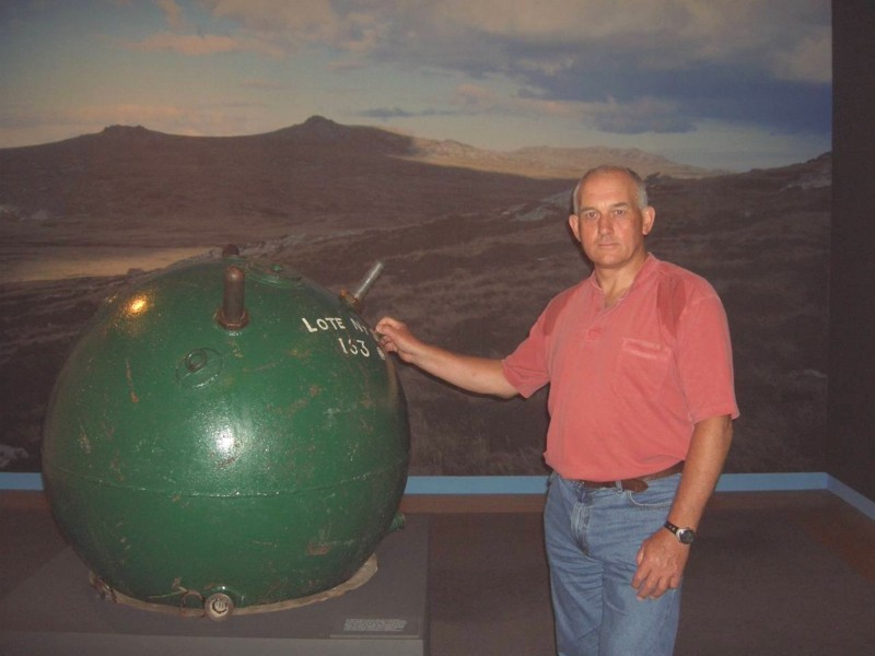
4. The mines, in my opinion you already had the bedst solution on a previous version, (http://img403.imageshack.us/img403/9461 ... puzzle.png)
and I think they will work just fine on your new version, they look cool, on a later version had you done some effects so they got a white glow on the top, I did not like, they look their best all-black, so you can clearly see what they imagine.
5. Landing zones, it's just an idea, but how about make it more clear what belongs to England and Argentina, maybe not just with flags and such but with the color red and blue for England and light blue and white for Argentina, but otherwise yes, flags could go behind the troop numbers in the column, just a proposal.
Looking real nice, am excited to see how this turn out
Re: 1982 [4/12] Latest images Page 1/10
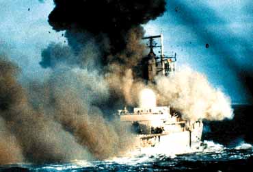
Sounds like you have a fine handle on all that! As for the mines, another way is to draw a part of the mine(s), you know like 500 times it's proper size!? Here's a picture of one ...
Or maybe the bomb going off
or
or even
and here's some other random pictures:
Happy inspiration!
- Click image to enlarge.
- Click image to enlarge.
- Click image to enlarge.

- Click image to enlarge.
- Click image to enlarge.
- Click image to enlarge.
- Click image to enlarge.
- Click image to enlarge.
- Click image to enlarge.
- Click image to enlarge.
- Click image to enlarge.
-
natty dread
- Posts: 12877
- Joined: Fri Feb 08, 2008 8:58 pm
- Location: just plain fucked
Re: 1982 [19/11] Latest images Page 1/9
You forgot to feather the drop shadowkoontz1973 wrote:Done as this, better than what I had but still not happy with it.natty_dread wrote:Here's what I suggest for the LZ:s
-
RedBaron0
- Posts: 2657
- Joined: Sun Aug 19, 2007 12:59 pm
- Gender: Male
- Location: Pennsylvania
- Contact:
Re: 1982 [4/12] Latest images Page 1/10
meh=okay, I wouldn't necessarily be opposed to the map moving forward with the jets as is, BUT they could be better. The ships though, genericness alright, but the images you are using... they're terrible. Ok you don't wanna go down the road that Cuba went down, fine. They just look way to clipart for me to fit on this map, the submarine isn't half bad, but the rest forget it.
The starburst is just... odd I understand the need for a background of the legend, but the starburst is just not it. Try different things... deck of a carrier, a radar-screen, something war related that kinda ties the whole thing together, ya'know?
Another thing that pops out at me atm the borders and outlines... very pixelly and jagged, gotta smooth them out.
-
natty dread
- Posts: 12877
- Joined: Fri Feb 08, 2008 8:58 pm
- Location: just plain fucked
Re: 1982 [4/12] Latest images Page 1/10
Yeah, what's with the borders? They were already fixed before... why are they pixelated againRedBaron0 wrote:Another thing that pops out at me atm the borders and outlines... very pixelly and jagged, gotta smooth them out.
-
koontz1973
- Posts: 6960
- Joined: Thu Jan 01, 2009 10:57 am
Re: 1982 [4/12] Latest images Page 1/10
- Click image to enlarge.

Mines are back
Sorted out pixelation
I like the planes as is, so they stayed as they are.
New background to legend
LZ symbol shadow sorted