Spoiler
--Andy
Moderator: Cartographers


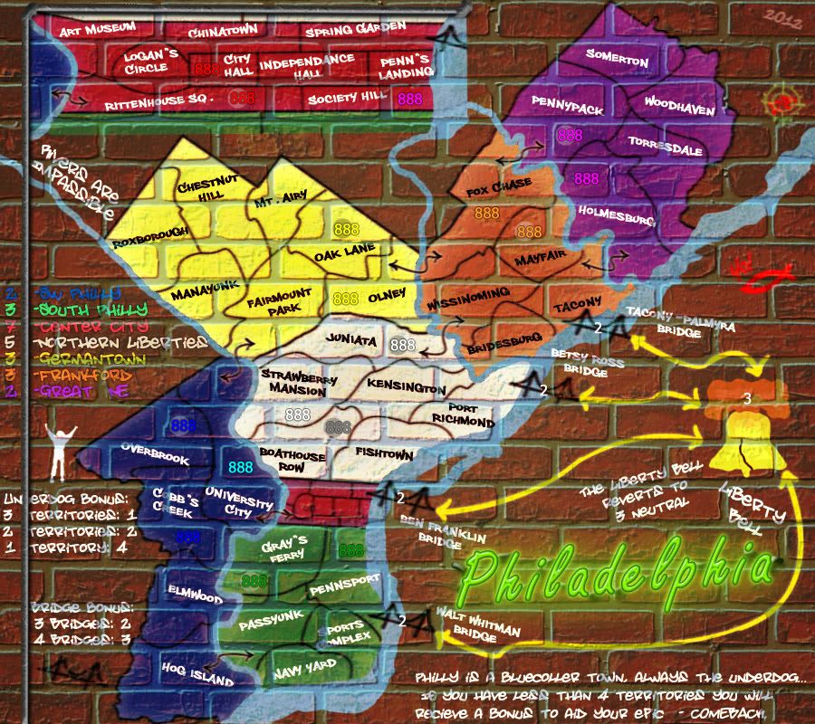
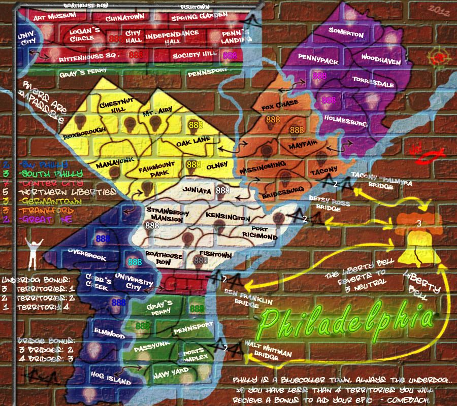
Um... Yes.RedBaron0 wrote:SW Philly's blue might have to be lighter still at any rate the borders are barely visible too.
I can put on army circles, and I am thinking I will do that, that'll clear up the army numbers issues.chapcrap wrote:I'm not sure how much I like the colors and graphics. I like the concept and having it be like graffiti, but it seems like it's going to be difficult to see many of the numbers.
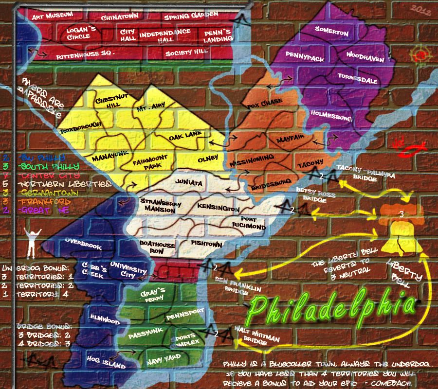
Aside from that, it's a little confusing to me that the Center City is at the top. It seems like the cutout should be closer to the actual center city of the map. I know there isn't really room for it over there with the bridges and the bell, but it's not the clearest.
And label the terts from the other continents in the cutout as well.
I would have to agree. If there were army circles on the map, which seems like a must at this point, it will detract from what the map is trying to look like.natty dread wrote:If you add army circles, make them look like they're part of the graffiti.