Elijah S wrote:Suzy-
Thanks for your support in this, but the entire thing has left such a bitter taste in my mouth that I think it's best for me to get away from this site for a while, maybe permanently.
I don't even want to make moves in my games at this point. You have my password, if you don't mind?
I've tried to make everyone happy, addressing each issue promptly, sometimes even compromising when I didn't agree.
For several of the foundry members to wait until now to completely pan my work is something I really don't get, but I feel like I've been insulted and humiliated... and for what? -The "honor" of contributing a map to a site I truly enjoyed?
Screw it. I'll save my $25 and get back to some projects I've had on hold.
Elijah S....all i can say to you is .....Welcome to the Foundry Mate.
and you know exactly what i mean by this! You thought i was harsh on you!
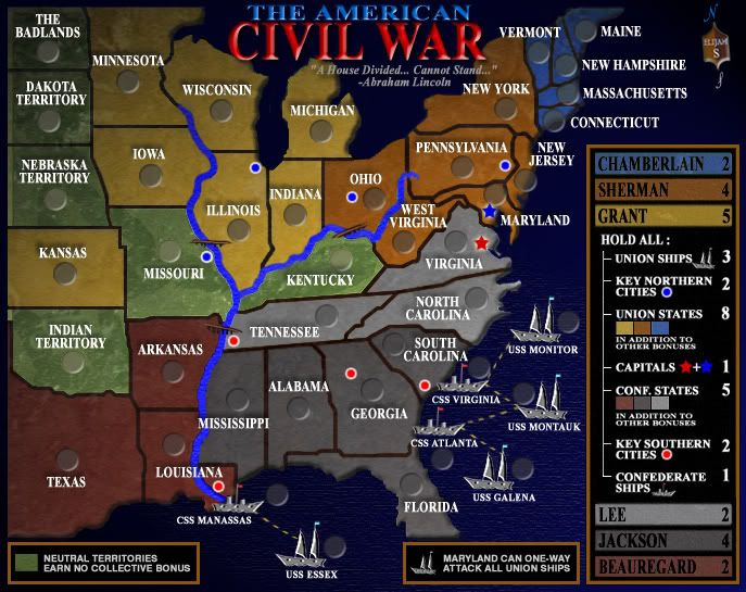
* Pearl Harbour * Waterloo * Forbidden City * Jamaica * Pot Mosbi
Oh man, I guess you can't please everyone, but I liked it so much more before. It just felt historically accurate. From the title with the mixture of the american and confederate flag to the colors of continents being based off of the uniform colors, but oh well if everyone else likes it this way I must be going crazy.
1. Font is a way more readable now, but can we make ships labels to be the same font size as states labels? For that you might need to spread ships a little.
2. Ships icons should not be touching land.
3. It is not clear if CSS Virginia/CSS Atlanta/CSS Manassas connect to mainland at all.
4. You should keep the flags you had before. You can either add them to the title, or maybe even as a watermark background to the states.
5. You should try to get rid of small text size in the legend too. If text does not fit, try to re-phrase it. I.E change "Union States in addition to other bonuses" to "Union States total" or "All Union States". Look into World 2.1 for examples.
6. try to get rid of vertical line, which goes from "Hold All" down to every combination, and push the legend labels to the left.
7. The river border in Missouri has white pixels in it. The river border in Arkansas has black pixels in it. In Ohio it actually has both white and black pixels. It should be consistent along all river banks. I suggest picking black, it looks sharper.
8. Some borders are quite pixelated. For example look into border between Kentucky and Tennessee.
9. Border lines should have same thickness. For example compare border between Minnesota and Iowa and border between New York and Pennsylvania.
10. Beauregard color on map is different color, then Beauregard color in legend.
11. Lee's and Jackson colors are quite close, can you pick another color for one of them?
12. The icon in the top right corner (your coat of arms) is skewed slightly in counter-clockwise direction.
13. Border in Kansas-Nebraska-Missouri corner does not represent the actual border line there. And as results looks quite "blocky", when in reality it is a river border.
14. The line which connects land masses to the water has different sharpness. For example compare left Michigan shoreline to its right shoreline. Same happens around Florida and some other places.
Last edited by AndrewB on Wed Nov 28, 2007 12:38 pm, edited 1 time in total.
If I don't comment after each post it's not that I'm ignoring you... I'm merely waiting for more comments in order to get a consensus of what to address...
Gimil - Thanks! And, the water texture softening is an easy fix.
yedi_c - lol... "no comment"
rev. kyle - I knew this would come up because this map is a departure from the other, but I think this one is far more graphically sound.
andrew b - I printed out your suggestions and will look at each issue.
Coleman wrote:I'm going to agree here about the river, but like kyle I'm a little sad. I don't feel the Union and the Confederate states contrast enough anymore.
When all of the other things are fixed (or left as they are with explanation)
I'll try to work the other color scheme into it and put it to a poll.
I liked the "blue - gray" of the previous version too, but agreed with mibi's suggestion to go with more of a sepia feel to capture the era.
As for the river, will someone please give me some suggestions or more clear reason why they dislike it?
It contrasts with the ocean too much. In life we all know rivers and oceans aren't the same color but in maps for some reason they look better that way. Or at least the majority feels so.
Elijah, this is a Spectacular map. You know that I always liked the other one too. This one has a much sharper appeal. The colors are different, but work for this map beautifully. I loved the flags in the other map as it seems several others did too. You definitely have turned this map around. Genius work. I love it.
I miss the blue/grey as well, but this really does look better. Especially the ocean and how it fades to a solid background color. Very nice.
River is indeed ugly. In addition to bringing down the color, what if the land beveled off at the river's edges, just as it does at the shoreline? It would give the sense of a depression, and help give the impression that the bridges really pop out over the rivers.
I was just trying to figure out a way to resolve the Blue/Grey with the sepia feel and I realized...
Why not do both. I noticed your greys are mostly the same, but the blue colors have changed. Is there a way you could bring back the old colors with a sepia tint to it.