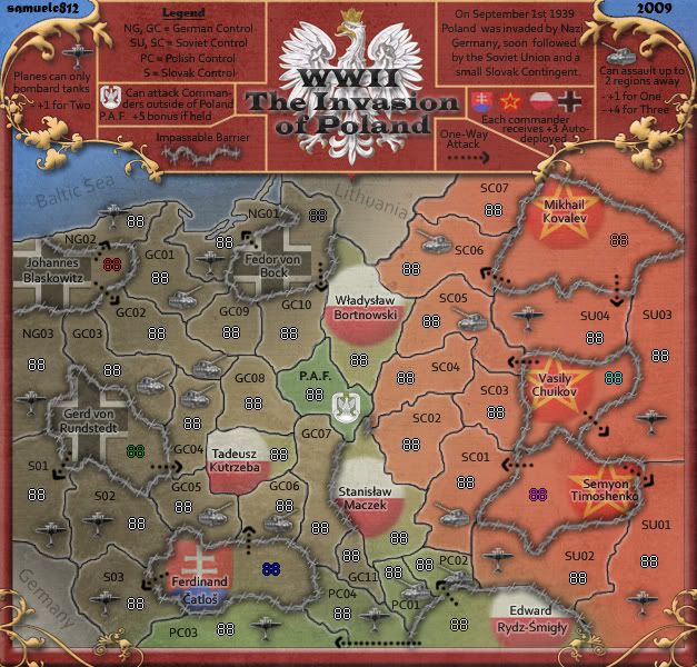
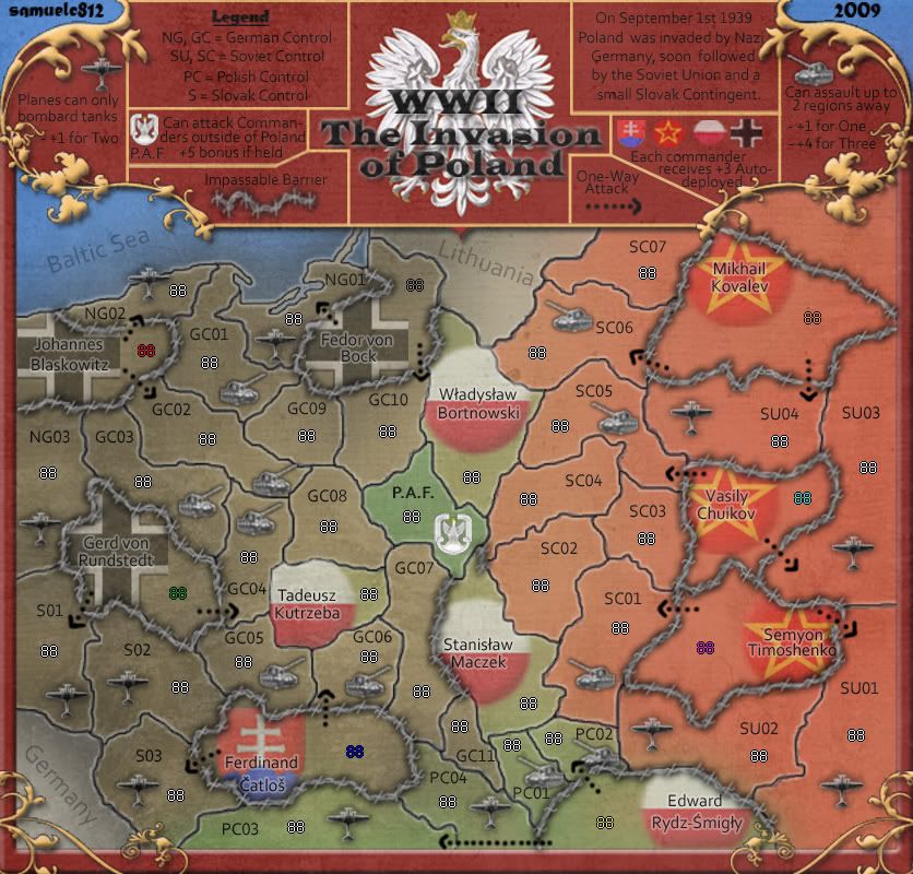
- Click image to enlarge.

- Changed planes and tanks once again
- Added 88's
- Cleaned up a bit?
Moderator: Cartographers


 .
.the.killing.44 wrote:I don't like the new planes and tanks … way against the theme …
.44

Notice the big NEW. That's referring to the new graphical representation of them …danfrank wrote:the.killing.44 wrote:I don't like the new planes and tanks … way against the theme …
.44
Against the theme? What do you mean? ... way against the theme.... How did they invade Poland ? .. With their walking canes and wheelchairs. I thought valid input was nescessary to be a foundry assistant. Who cares what you don`t like.. The tanks and planes definitly add balance to this map. It also adds much more strategic possibilities..
.
the.killing.44 wrote:Notice the big NEW. That's referring to the new graphical representation of them …danfrank wrote:the.killing.44 wrote:I don't like the new planes and tanks … way against the theme …
.44
Against the theme? What do you mean? ... way against the theme.... How did they invade Poland ? .. With their walking canes and wheelchairs. I thought valid input was nescessary to be a foundry assistant. Who cares what you don`t like.. The tanks and planes definitly add balance to this map. It also adds much more strategic possibilities..
.44
What isn't straight? I stated i didn't like them, and said why.danfrank wrote:Well for starters cant expect a straight answer from an assistant only a smart one..
No, actually they don't fit the theme. Overall the map is a grungy, tough-looking map with faded and noisy (in the Photoshop sense) icons, background, etc. The new tanks and planes are metallic, shiny, and polished — against what the rest of the map is like. They aren't realistic (against the textured feel of the map), stand out too much (the rest is faded, all very integrated, etc.), and don't look WWII-esque in terms of graphics. So no, they don't fit the theme.First the images are true and correct for the time period they represent.. Also they are nice and neat in a box and not cluttered like the OLD ONES...
SO THEY ARE INFACT NOT AGAINST THE THEME


I think part of it is that we've all gotten used to seeing the actual tanks and planes, part of it is that stalingrad looks to have about twice (or more) times as many terits as this... besides, every map is different... and this one looks to be a blast. Very well done indeed, sam!samuelc812 wrote:Can i enquire as to why these new planes and tanks don't work when cairnswk's Stalingrad map has similar symbols to represent his tanks, artillery bombers etc.???


Cheers TaCktiXTaCktiX wrote:What can the P.A.F. assault outside of Poland? It appears the Commanders word that's rather key to map understanding disappeared. I'm sure you can fix that little nitpick with no difficulty whatsoever, so I consider this map Stamped for Graphics.