Cairns Coral Coast [Quenched] - Loaded!

Care to peruse completed maps? Take a stroll through the Atlas.

Moderator: Cartographers

Forum rules
Please read the Community Guidelines before posting.
User avatar
cairnswk
Posts: 11510
Joined: Sat Feb 03, 2007 8:32 pm
Gender: Male
Location: Australia

Post by cairnswk »

Thanx MasterZ. Comment appreciated. :D

Santon836....early days for new bridges....maybe the old ones will get put back. Thanks. :D

I do agree about shadows Teya. Is there a special xml code to ahieve this, or is it a graphic image that has to be input. If graphic, what size should the circles be. Perhaps someone can advise on this aspect, please.
As always, Teya, comments appreciated. :D
Image
* Pearl Harbour * Waterloo * Forbidden City * Jamaica * Pot Mosbi
User avatar
Samus
Posts: 372
Joined: Mon Jan 01, 2007 12:33 pm

Post by Samus »

Teya wrote:I personally think the small map is very crowded with the numbers on the map. The number in emerald creek barely fits. And that is only a single number. If it was a 10 it wouldnt fit. I also dont think the lakes has enough room. And they are only the territories that I can be bothered typing.


I think this would greatly benefit from experimenting with new fonts. If you look at the territories themselves, they are easily big enough that it's not a problem. It's just that the current font (on the small map) is a rather space consuming one.

And yes, I definitely agree on the army shadows.
User avatar
cairnswk
Posts: 11510
Joined: Sat Feb 03, 2007 8:32 pm
Gender: Male
Location: Australia

Post by cairnswk »

Teya and Samus

Compromise....this new version shows:
Font change
Territory size change - moved title down slightly and expanded some of those tight territories you mentioned Teya.
Map includes army shadow testing.

Image
Image
* Pearl Harbour * Waterloo * Forbidden City * Jamaica * Pot Mosbi
User avatar
Bad Speler
Posts: 1027
Joined: Fri Jun 02, 2006 9:16 pm
Gender: Male
Location: Ottawa
Contact:

Post by Bad Speler »

Considering this is the small map, and one with 60 territories, i think the army shadows are too big. Also. no need to have mountains following a river, such as near Tolga
Highest Score: 2532
Highest Position: 69 (a long time ago)
User avatar
cairnswk
Posts: 11510
Joined: Sat Feb 03, 2007 8:32 pm
Gender: Male
Location: Australia

Post by cairnswk »

Thanks Bad Speler. Mountains near Tolga can be moved.

The circles were drawn at 25 pixels diameter. Perhaps too big. Will adjust next map.
Image
* Pearl Harbour * Waterloo * Forbidden City * Jamaica * Pot Mosbi
User avatar
Samus
Posts: 372
Joined: Mon Jan 01, 2007 12:33 pm

Post by Samus »

The font is much improved, but you might try several different ones and do a poll to see which one people like the best.

I'm pretty sure there's a standard way to do the army circles, it must be a closely held secret if no one is telling you. :)
User avatar
cairnswk
Posts: 11510
Joined: Sat Feb 03, 2007 8:32 pm
Gender: Male
Location: Australia

Post by cairnswk »

Yes, I agree Samus about the font.
A poll would be helpful after the current poll has run.
And I'll hunt around for those army circles.

What are your thoughts on extra bonuses for "capitals" of this region. e.g. Atherton, Mareeba, Cairns, Innisfail, etc.
Image
* Pearl Harbour * Waterloo * Forbidden City * Jamaica * Pot Mosbi
User avatar
Samus
Posts: 372
Joined: Mon Jan 01, 2007 12:33 pm

Post by Samus »

cairnswk wrote:What are your thoughts on extra bonuses for "capitals" of this region. e.g. Atherton, Mareeba, Cairns, Innisfail, etc.


Well my personal feelings on these kinds of things are that they feel to "gimmicky." They might be fun the first few times you play the map, but after that they're just an annoyance.

For this map specifically, you already have 10 bonuses, adding more stuff on top of that is just way too much stuff to worry about while you're playing.
User avatar
Teya
Posts: 411
Joined: Tue Oct 17, 2006 6:25 am

Post by Teya »

cairnswk wrote:What are your thoughts on extra bonuses for "capitals" of this region. e.g. Atherton, Mareeba, Cairns, Innisfail, etc.


I think you have enough bonuses to not worry about extra bonuses for capitals.

With the army shadows, I couldnt find anything on size, but I think alot of people use 24 pixel. You could always PM Andy and see what the minimum size is.
The new font, Im not a big fan. As Samus suggested, try a few different fonts.
User avatar
GreecePwns
Posts: 2656
Joined: Tue Feb 20, 2007 7:19 pm
Gender: Male
Location: Lawn Guy Lint

Post by GreecePwns »

I agree with that /\/\/\/\/\/\/\ except for the fonts. The look very nice and complement the map's theme. This map is great just how it is, but one problem. The city estates should be a different color because it is too close to the water color. Otherwise I'd really like to have this map done.
User avatar
Samus
Posts: 372
Joined: Mon Jan 01, 2007 12:33 pm

Post by Samus »

GreecePwns wrote:I agree with that /\/\/\/\/\/\/\ except for the fonts. The look very nice and complement the map's theme. This map is great just how it is, but one problem. The city estates should be a different color because it is too close to the water color. Otherwise I'd really like to have this map done.


LOL, I realize those are arrows pointing to the above posts, but when I first saw it I read it as "I agree with that [explicative]."

I think you're right about that color, the others are good though.
User avatar
joystickgenie
Posts: 62
Joined: Fri Feb 09, 2007 9:25 pm

Post by joystickgenie »

I really like the way this one is looking.
User avatar
cairnswk
Posts: 11510
Joined: Sat Feb 03, 2007 8:32 pm
Gender: Male
Location: Australia

Post by cairnswk »

To all who've recently messaged, if you like this map, and want to see it "in play" please start spreading the word about it...it needs MORE, MORE, MORE VOTES, and obviously MORE, MORE, MORE Feedback.

It's really in your hands guys and gals!

As to the colour aspect for City Estates, a new post will appear shortly....perhaps even with a font change.

Keep your eyes peeled.
Image
* Pearl Harbour * Waterloo * Forbidden City * Jamaica * Pot Mosbi
User avatar
cairnswk
Posts: 11510
Joined: Sat Feb 03, 2007 8:32 pm
Gender: Male
Location: Australia

Post by cairnswk »

Hi All. Here's your font change, and I did a complete color swap.
I really like this font...its cool. comfortable, relaxing and reflects the tropics.

Hope you like it also!

Image
Image
* Pearl Harbour * Waterloo * Forbidden City * Jamaica * Pot Mosbi
User avatar
Guiscard
Posts: 4103
Joined: Fri Dec 08, 2006 7:27 pm
Location: In the bar... With my head on the bar

Post by Guiscard »

The bottom legend fonts need changing (probably just to the same as the rest)...

I'm not keen on the compass, and what are the two white lines next to palm cove and also nerada ???

other than that, its looking god. I really like the 'hand draw' sort of style.
qwert wrote:Can i ask you something?What is porpose for you to open these Political topic in ConquerClub? Why you mix politic with Risk? Why you not open topic like HOT AND SEXY,or something like that.
User avatar
haoala
Posts: 295
Joined: Tue Feb 27, 2007 7:58 am
Location: Directly opposite the South of Napo

Post by haoala »

seems fun!
but why does dairy farmers have such a high bonus
and perhaps you should link more the islands
visually its appealing too

keep up the good work!
Gain the upper hand
User avatar
DiM
Posts: 10415
Joined: Wed Feb 14, 2007 6:20 pm
Gender: Male
Location: making maps for scooby snacks

Post by DiM »

Guiscard wrote:The bottom legend fonts need changing (probably just to the same as the rest)...

I'm not keen on the compass, and what are the two white lines next to palm cove and also nerada ???

other than that, its looking god. I really like the 'hand draw' sort of style.


the white lines are waterfalls (it's in the legend)
“In the beginning God said, the four-dimensional divergence of an antisymmetric, second rank tensor equals zero, and there was light, and it was good. And on the seventh day he rested.”- Michio Kaku
User avatar
Guiscard
Posts: 4103
Joined: Fri Dec 08, 2006 7:27 pm
Location: In the bar... With my head on the bar

Post by Guiscard »

Oh yeh, sorry... Well they look a bit too bright and out of place anyway. try making them more subtle.
qwert wrote:Can i ask you something?What is porpose for you to open these Political topic in ConquerClub? Why you mix politic with Risk? Why you not open topic like HOT AND SEXY,or something like that.
User avatar
Bad Speler
Posts: 1027
Joined: Fri Jun 02, 2006 9:16 pm
Gender: Male
Location: Ottawa
Contact:

Post by Bad Speler »

The colours in agate hills is way to close to the colour mountains beside it.
Highest Score: 2532
Highest Position: 69 (a long time ago)
User avatar
cairnswk
Posts: 11510
Joined: Sat Feb 03, 2007 8:32 pm
Gender: Male
Location: Australia

Post by cairnswk »

Bad Speler, thanks for continued feedback. This color for Agate Hills is same colour that was previously in Sugarland on page 4 map, even though it was on the other side of the eastern shed mountains of the same colour. :D Perhaps we need to chose another colour for that territory.

Guiscard, thanks for feedback, I think if I change the waterfalls colour to something more subtle, they might not be so noticeable as a feature of this 'hand drawn' map. Don't u think it has appeal?
Compass hasn't been looked at yet so, I'll see what else I can come up with.

Haoala, thanks for feedback.
Dairy Farmers: With Palmerston added it now has 7 territories and 5 borders to 4 different regions, so increase the bonus to +7.

This was part of original concept developed by Samus.
Perhaps the islands could do with more links!!!
Image
* Pearl Harbour * Waterloo * Forbidden City * Jamaica * Pot Mosbi
User avatar
Samus
Posts: 372
Joined: Mon Jan 01, 2007 12:33 pm

Post by Samus »

I like the new font, you're right it's fitting of the tropics.


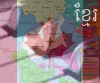
cairnswk wrote:Bad Speler, thanks for continued feedback. This color for Agate Hills is same colour that was previously in Sugarland on page 4 map, even though it was on the other side of the eastern shed mountains of the same colour. :D Perhaps we need to chose another colour for that territory.


Yeah, or you could lighten the shade of brown, but that might require rethinking the color of Maize Silos.

Guiscard, thanks for feedback, I think if I change the waterfalls colour to something more subtle, they might not be so noticeable as a feature of this 'hand drawn' map. Don't u think it has appeal?
Compass hasn't been looked at yet so, I'll see what else I can come up with.


I think you should try to find a waterfall graphic somewhere, what you currently have is now well below the rest of the map graphically. The compass doesn't stand out as much, but he's right it could probably be better.

Dairy Farmers: With Palmerston added it now has 7 territories and 5 borders to 4 different regions, so increase the bonus to +7.

This was part of original concept developed by Samus.
Perhaps the islands could do with more links!!!


Dairy Farmers actually has 6 borders now, not even sure when that happened, but I'm good with it. :)

I think the islands connections are good. The only connections we could make that wouldn't effect region borders (and thus screw with the bonus distribution) would be within The Beaches islands, but I like how that is now. The linear nature of The Beaches and Agate Hills is part of their appeal.
User avatar
cairnswk
Posts: 11510
Joined: Sat Feb 03, 2007 8:32 pm
Gender: Male
Location: Australia

Post by cairnswk »

Samus, thanks again for your input....The borders on Maize Silos increased by 1 when I made the adjustment in size of the territories to alleviate the squashed problem around Tinaroo.

Change in compass and waterfalls coming up....guys and gals.
Image
* Pearl Harbour * Waterloo * Forbidden City * Jamaica * Pot Mosbi
User avatar
boberz
Posts: 864
Joined: Sun Dec 03, 2006 12:21 pm

Post by boberz »

Can the title become less fussy perhaps get rid of the texture, it takes away the visual appeal of the map. Are the palm trees for anything specific as if not i think you could get rid of them as it clutters the map
User avatar
cairnswk
Posts: 11510
Joined: Sat Feb 03, 2007 8:32 pm
Gender: Male
Location: Australia

Post by cairnswk »

Boberz...thanks for your input. The palm trees represent the tropics, beaches etc, and they would more or less be the very last thing I would dispense with. Sorry, but I feel it adds flavour to this map.
Image
* Pearl Harbour * Waterloo * Forbidden City * Jamaica * Pot Mosbi
User avatar
cairnswk
Posts: 11510
Joined: Sat Feb 03, 2007 8:32 pm
Gender: Male
Location: Australia

Post by cairnswk »

Hi All, here is the latest updated map.

* Changed colour of Agate Hills - lighter
* Changed Compass
* Changed Waterfall
* Changed Title boxes
* Altered some borders to remove shoarp corners and make them more rounded

Hope you enjoy this one!

Image
Image
* Pearl Harbour * Waterloo * Forbidden City * Jamaica * Pot Mosbi
Post Reply

Return to “The Atlas”