WWII - Eastern Front-statistic page 1 [Quenched]5000 finish
Moderator: Cartographers
Forum rules
Please read the Community Guidelines before posting.
Please read the Community Guidelines before posting.
I'm still not a fan of the army shadows or the text. Maybe if you swapped the colours around so you had dark text on light background and orange text on dark background!?! I really do think the font size should be consistent throughout. I like the star territories having all capitals and white though.
-
Qwert

- SoC Training Adviser
- Posts: 9262
- Joined: Tue Nov 07, 2006 5:07 pm
- Location: VOJVODINA
- Contact:
first i replace text color like like ---- wrote,then i remove double black arows like Marvaddin tell.
Umpasabile borders legend remove becouse i think its not need, AL others map dont have these, only 1 or 2 maps have legend.
Marvaddin wrote
Title could be simpler, its stil not good, i think.
ok marvaddin please help wath to put for title, wath font and color, if you help me these problem wil be solve.
For now teritory stay.
-
happysadfun

- Posts: 1251
- Joined: Mon Jul 10, 2006 9:06 pm
- Location: Haundin at DotSco, Being Sad that Mark Green Lost in Suburban Wisconsin
 Children, this is what happens to hockey players, druggies, and Hillary Clinton.
Problem with the title is not the font. You should use a solid colour instead of these textures, so it could be more readable. Or at least something with less contrast. It doesnt fit ok with white (light gray) and black.
Again, consider splitting some countries in middle german, to join some in the russian side.
Again, consider splitting some countries in middle german, to join some in the russian side.

-
gavin_sidhu

- Posts: 1428
- Joined: Mon May 22, 2006 6:16 am
- Location: Brisbane, Australia
-
reverend_kyle

- Posts: 9250
- Joined: Tue Mar 21, 2006 4:08 pm
- Location: 1000 post club
- Contact:


Everyone know where is the russian front and the germany front. So my sugestion is the legend of continents and territories should be all black and the same font, unless you use Black(Comunism),White(Nazy) and Yellow for bonus.
Why you use the red Comunism star and not use the nazy symbol???
also Demjansk is bold. It shouldn't be.
Why you use the red Comunism star and not use the nazy symbol???
also Demjansk is bold. It shouldn't be.
-
reverend_kyle
- Posts: 9250
- Joined: Tue Mar 21, 2006 4:08 pm
- Location: 1000 post club
- Contact:

-
Qwert
- SoC Training Adviser
- Posts: 9262
- Joined: Tue Nov 07, 2006 5:07 pm
- Location: VOJVODINA
- Contact:
teya wrote
I also hate the yellow
Wath color you think to put, and please think wisely, i would put color wath you say and we solve these problem finaly, and then you can again complain in color ok.
Dafranca wrote
Why you use the red Comunism star and not use the nazy symbol???
Its a symbol of wermaht, nazy germany army if you dont know
-
Bad Speler
- Posts: 1027
- Joined: Fri Jun 02, 2006 8:16 pm
- Gender: Male
- Location: Ottawa
- Contact:
-
DublinDoogey

- Posts: 329
- Joined: Tue Feb 28, 2006 7:03 pm
- Location: Wisconsin

-
reverend_kyle
- Posts: 9250
- Joined: Tue Mar 21, 2006 4:08 pm
- Location: 1000 post club
- Contact:
qwert wrote:teya wrote
I also hate the yellow
Wath color you think to put, and please think wisely, i would put color wath you say and we solve these problem finaly, and then you can again complain in color ok.
Go with something simple, it doesnt have to be all elaborate, but as it is it is ugly.
DANCING MUSTARD FOR POOP IN '08!

-
Qwert
- SoC Training Adviser
- Posts: 9262
- Joined: Tue Nov 07, 2006 5:07 pm
- Location: VOJVODINA
- Contact:
well i think to my job with these EASTERN FRONT map finish.
If somebody think, i mean say something what realy mising in my map, i wil change.
Umpasabile,inpasabile borders legend its not need in map becouse everybody know in first look.OF course these my opinion.
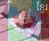
Here maps.
small 629x459 px

large 799x601px

If somebody think, i mean say something what realy mising in my map, i wil change.
Umpasabile,inpasabile borders legend its not need in map becouse everybody know in first look.OF course these my opinion.
Here maps.
small 629x459 px
large 799x601px
-
AndyDufresne

- Posts: 24935
- Joined: Fri Mar 03, 2006 8:22 pm
- Location: A Banana Palm in Zihuatanejo
- Contact: