[phpBB Debug] PHP Warning: in file [ROOT]/viewtopic.php on line 1091: Undefined array key 0 [phpBB Debug] PHP Warning: in file [ROOT]/viewtopic.php on line 1091: Trying to access array offset on null [phpBB Debug] PHP Warning: in file [ROOT]/viewtopic.php on line 1098: Undefined array key 0 [phpBB Debug] PHP Warning: in file [ROOT]/viewtopic.php on line 1098: Trying to access array offset on null [phpBB Debug] PHP Warning: in file [ROOT]/viewtopic.php on line 1098: Undefined array key 0 [phpBB Debug] PHP Warning: in file [ROOT]/viewtopic.php on line 1098: Trying to access array offset on null Which Ocean is Better? Lots of Votes please!!!! - Conquer Club
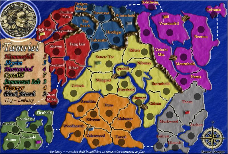
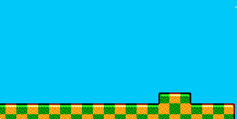
BananaStomper and I think our oceans look better. They are pretty similar but not the same. Which ocean would work better for his map? For my ocean just try to imagine that the land was on top of it.
Or if you have any suggestion on how to make the ocean better let us know. We both dont really like light colored oceans tho...
1st Ocean:
2nd Ocean:
Last edited by Hoff on Tue May 02, 2006 5:49 pm, edited 1 time in total.
They look almost identical, in fact if it weren't for some funky bumps in the Tamriel map I would say they were the same. As it is I guess the 1st? There isn't much difference...
are you seriously argueing over this those are litterally the same. Both look like the represent oceans niether look like real oceans though. But seriously who arguees over suck little diffrences.
By I guess the 1st, I meant I guess I'll choose the first. And I agree with freakshow they are both good looking oceans, almost identical just use whichever one is less hassle.
they pretty much are the same, the second is just the first with another layer over top that is transluscent. hoff says that the layer over top looks like tidal waves all over the place. I think it just makes it look less patterny. Gives it some pizazz
I like the first ocean, principally because it references a greater awareness of the perils of climate change, melting ice caps, and consequent raised sea levels.
Are people serious? The oceans aren't really the same at all, except that they both use blue. Granted, I don't think that it would make a large impact on whether or not I played the map or not, but I'm glad someone's taking the time to contemplate the aesthetic differences.
Personally, I like Ocean 2 much better. Ocean 1 looks like some funky Windows 3.1 wallpaper pattern and I think smoothing it out in Ocean 2 looks a little bit better. Also, you should put Ocean 1 underneath the continent, not on top of it (rim shot) Am I right folks or am I right?
Last edited by UTGreen on Wed May 03, 2006 1:49 pm, edited 1 time in total.
“I am not only a pacifist but a militant pacifist. I am willing to fight for peace. Nothing will end war unless the people themselves refuse to go to war.” -Albert Einstein
Try selecting a small (say 15%) portion of either ocean (I like the 2nd one, btw) and then stretching it to the full size of the image. That'll help get rid of the pattern aspect.