1982 [Quenched]
Moderator: Cartographers
Re: 1982 [1/1] Latest images Page 1/18 Graphics check please
![]() by natty dread on Sun Jan 01, 2012 2:05 pm
by natty dread on Sun Jan 01, 2012 2:05 pm
You haven't even tried my suggestion yet...

-

 natty dread
- Posts: 12877
- Joined: Fri Feb 08, 2008 8:58 pm
- Location: just plain fucked


Re: 1982 [1/1] Latest images Page 1/18 Graphics check please
![]() by DiM on Sun Jan 01, 2012 2:10 pm
by DiM on Sun Jan 01, 2012 2:10 pm
what's with the new title font?
it's too...childish.
it's too...childish.
“In the beginning God said, the four-dimensional divergence of an antisymmetric, second rank tensor equals zero, and there was light, and it was good. And on the seventh day he rested.”- Michio Kaku
-

DiM
- Posts: 10415
- Joined: Wed Feb 14, 2007 6:20 pm
- Location: making maps for scooby snacks


Re: 1982 [1/1] Latest images Page 1/18 Graphics check please
![]() by ndrs on Sun Jan 01, 2012 3:12 pm
by ndrs on Sun Jan 01, 2012 3:12 pm
This is what I came up with using Blending options: overlay, and a slight glow on the text.
The background is done with: inner glow, bevel and emboss, gradient overlay
Face: Andale Mono
The background is done with: inner glow, bevel and emboss, gradient overlay
Face: Andale Mono
-
ndrs
- Posts: 181
- Joined: Tue Oct 26, 2010 9:34 am
- Location: Malmö, Sweden


Re: 1982 [1/1] Latest images Page 1/18 Graphics check please
![]() by natty dread on Sun Jan 01, 2012 3:23 pm
by natty dread on Sun Jan 01, 2012 3:23 pm
ndrs wrote:overlay
Fun fact: The overlay mode in GIMP is in practice exactly the same as the soft light mode, due to a bug.
The text on the right looks good.
-
natty dread
- Posts: 12877
- Joined: Fri Feb 08, 2008 8:58 pm
- Location: just plain fucked
Re: 1982 [1/1] Latest images Page 1/18 Graphics check please
![]() by DiM on Sun Jan 01, 2012 3:35 pm
by DiM on Sun Jan 01, 2012 3:35 pm
ndrs wrote:This is what I came up with using Blending options: overlay, and a slight glow on the text.
The background is done with: inner glow, bevel and emboss, gradient overlay
Face: Andale Mono

your navel has forces? my navel has just lint and hair
on a more serious note, i like it. all it needs is just some grain or lines or something to give the feeling of an old monitor.
i'm not too sure about the font though. it looks just too smooth, clean and modern.
i think a more squarish ocr-a type font would fit better with the whole old monitor idea.
“In the beginning God said, the four-dimensional divergence of an antisymmetric, second rank tensor equals zero, and there was light, and it was good. And on the seventh day he rested.”- Michio Kaku
-
DiM
- Posts: 10415
- Joined: Wed Feb 14, 2007 6:20 pm
- Location: making maps for scooby snacks
Re: 1982 [1/1] Latest images Page 1/18 Graphics check please
![]() by ndrs on Sun Jan 01, 2012 3:45 pm
by ndrs on Sun Jan 01, 2012 3:45 pm
DiM wrote:your navel has forces? my navel has just lint and hair
on a more serious note, i like it. all it needs is just some grain or lines or something to give the feeling of an old monitor.
i'm not too sure about the font though. it looks just too smooth, clean and modern.
i think a more squarish ocr-a type font would fit better with the whole old monitor idea.
Beware of my navel forces!
You're probably right about the font. I just picked the first mono-font in my list.. It was right there at A
But it's condensed to fit more in a line, and mono spaced! That's key for old monitor fonts
-
ndrs
- Posts: 181
- Joined: Tue Oct 26, 2010 9:34 am
- Location: Malmö, Sweden
Re: 1982 [1/1] Latest images Page 1/18 Graphics check please
![]() by DiM on Sun Jan 01, 2012 3:52 pm
by DiM on Sun Jan 01, 2012 3:52 pm
OCR-A Std is a good font for this. google it koontz.
“In the beginning God said, the four-dimensional divergence of an antisymmetric, second rank tensor equals zero, and there was light, and it was good. And on the seventh day he rested.”- Michio Kaku
-
DiM
- Posts: 10415
- Joined: Wed Feb 14, 2007 6:20 pm
- Location: making maps for scooby snacks
Re: 1982 [1/1] Latest images Page 1/18 Graphics check please
![]() by natty dread on Sun Jan 01, 2012 4:02 pm
by natty dread on Sun Jan 01, 2012 4:02 pm
Good point about monospacing though.
-
natty dread
- Posts: 12877
- Joined: Fri Feb 08, 2008 8:58 pm
- Location: just plain fucked
Re: 1982 [1/1] Latest images Page 1/18 Graphics check please
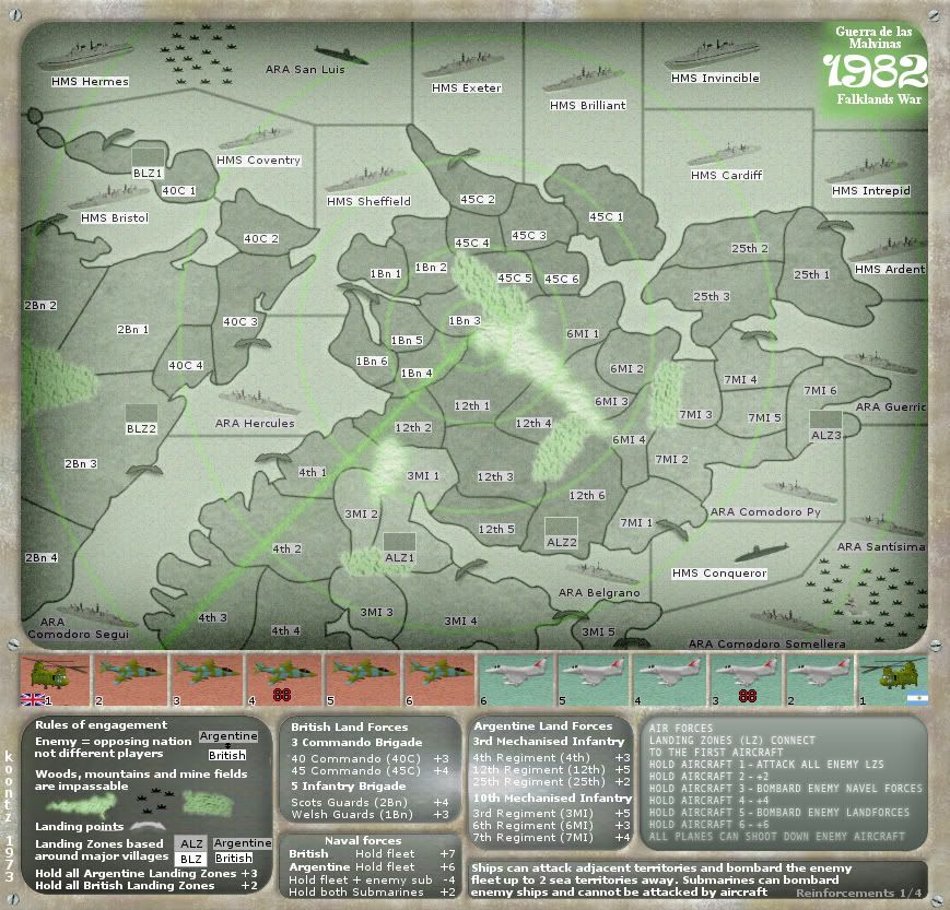
![]() by koontz1973 on Mon Jan 02, 2012 3:57 am
by koontz1973 on Mon Jan 02, 2012 3:57 am
As I said, I found a way and was getting it sorted for the small, so all this discussion was pointless. 
Not free to use so cannot be used.
Had that one on for around 20 drafts. Only one person picked up on it though.
As for the font used by ndrs, I like it and could of used it if I had gone down the route the Flapcake suggested with the plastic.
- Click image to enlarge.

- Click image to enlarge.

DiM wrote:OCR-A Std is a good font for this. google it koontz.
Not free to use so cannot be used.
Beware of my navel forces!
Had that one on for around 20 drafts. Only one person picked up on it though.
As for the font used by ndrs, I like it and could of used it if I had gone down the route the Flapcake suggested with the plastic.

-

koontz1973
- Posts: 6960
- Joined: Thu Jan 01, 2009 10:57 am


Re: 1982 [2/1] Latest images Page 1/19 Graphics check please
![]() by natty dread on Mon Jan 02, 2012 7:34 am
by natty dread on Mon Jan 02, 2012 7:34 am
You could try this:
Duplicate the text layer, put the duplicate under the text, then blur it with 1px gaussian, set it on grain merge and reduce the opacity until you have a very faint glow on the text.
Duplicate the text layer, put the duplicate under the text, then blur it with 1px gaussian, set it on grain merge and reduce the opacity until you have a very faint glow on the text.
-
natty dread
- Posts: 12877
- Joined: Fri Feb 08, 2008 8:58 pm
- Location: just plain fucked
Re: 1982 [2/1] Latest images Page 1/19 Graphics check please
![]() by koontz1973 on Mon Jan 02, 2012 10:37 am
by koontz1973 on Mon Jan 02, 2012 10:37 am
natty_dread wrote:You could try this:
Duplicate the text layer, put the duplicate under the text, then blur it with 1px gaussian, set it on grain merge and reduce the opacity until you have a very faint glow on the text.
Tried to blur the bottom layer as you said and at 1 pixel was not really seen. At 2 pixels it was seen but made the whole text blurry.
I had a slight glow on the text (which I had turned of to try your way) so brought that out more for this.
- Click image to enlarge.

-
koontz1973
- Posts: 6960
- Joined: Thu Jan 01, 2009 10:57 am
Re: 1982 [1/1] Latest images Page 1/18 Graphics check please
![]() by DiM on Mon Jan 02, 2012 11:21 am
by DiM on Mon Jan 02, 2012 11:21 am
koontz1973 wrote:DiM wrote:OCR-A Std is a good font for this. google it koontz.
Not free to use so cannot be used.
there are a few versions floating around. i know i found it for free, just don't know where exactly. if you want i can upload it from my computer.
“In the beginning God said, the four-dimensional divergence of an antisymmetric, second rank tensor equals zero, and there was light, and it was good. And on the seventh day he rested.”- Michio Kaku
-
DiM
- Posts: 10415
- Joined: Wed Feb 14, 2007 6:20 pm
- Location: making maps for scooby snacks
Re: 1982 [1/1] Latest images Page 1/18 Graphics check please
![]() by koontz1973 on Mon Jan 02, 2012 11:26 am
by koontz1973 on Mon Jan 02, 2012 11:26 am
DiM wrote:koontz1973 wrote:DiM wrote:OCR-A Std is a good font for this. google it koontz.
Not free to use so cannot be used.
there are a few versions floating around. i know i found it for free, just don't know where exactly. if you want i can upload it from my computer.
Might be nice to use, but I would not want it to stall the progression of the map trying to prove it is a free to use font. Damn those copyrights.
Apart from the font, how is it looking to you DiM?
-
koontz1973
- Posts: 6960
- Joined: Thu Jan 01, 2009 10:57 am
Re: 1982 [2/1] Latest images Page 1/19 Graphics check please
![]() by koontz1973 on Mon Jan 02, 2012 1:18 pm
by koontz1973 on Mon Jan 02, 2012 1:18 pm
Here is the small version done as the large.
How does it all look now?
- Click image to enlarge.
- Click image to enlarge.

How does it all look now?
-
koontz1973
- Posts: 6960
- Joined: Thu Jan 01, 2009 10:57 am
Re: 1982 [1/1] Latest images Page 1/18 Graphics check please
![]() by natty dread on Mon Jan 02, 2012 1:50 pm
by natty dread on Mon Jan 02, 2012 1:50 pm
DiM wrote:koontz1973 wrote:DiM wrote:OCR-A Std is a good font for this. google it koontz.
Not free to use so cannot be used.
there are a few versions floating around. i know i found it for free, just don't know where exactly. if you want i can upload it from my computer.
It doesn't matter if you found it "for free", the font licensing needs to be considered. If the font license allows personal use for free, but doesn't allow commercial use, then it can't be used for CC maps.
-
natty dread
- Posts: 12877
- Joined: Fri Feb 08, 2008 8:58 pm
- Location: just plain fucked
Re: 1982 [1/1] Latest images Page 1/18 Graphics check please
![]() by DiM on Mon Jan 02, 2012 2:39 pm
by DiM on Mon Jan 02, 2012 2:39 pm
natty_dread wrote:DiM wrote:koontz1973 wrote:DiM wrote:OCR-A Std is a good font for this. google it koontz.
Not free to use so cannot be used.
there are a few versions floating around. i know i found it for free, just don't know where exactly. if you want i can upload it from my computer.
It doesn't matter if you found it "for free", the font licensing needs to be considered. If the font license allows personal use for free, but doesn't allow commercial use, then it can't be used for CC maps.
what i meant was that various people made their own versions of OCR-A inspired fonts and gave them for free.
anyway if you don't want ocr-a you can still find lots of other fonts that are a better fit for an old monitor. you need something squarish and pixely.
pick your "navel" font: http://tinyurl.com/7x98cz2
“In the beginning God said, the four-dimensional divergence of an antisymmetric, second rank tensor equals zero, and there was light, and it was good. And on the seventh day he rested.”- Michio Kaku
-
DiM
- Posts: 10415
- Joined: Wed Feb 14, 2007 6:20 pm
- Location: making maps for scooby snacks
Re: 1982 [2/1] Latest images Page 1/20 Graphics check please
![]() by natty dread on Mon Jan 02, 2012 2:43 pm
by natty dread on Mon Jan 02, 2012 2:43 pm
I still think the font should be a fixed width font.
-
natty dread
- Posts: 12877
- Joined: Fri Feb 08, 2008 8:58 pm
- Location: just plain fucked
Re: 1982 [2/1] Latest images Page 1/20 Graphics check please
![]() by koontz1973 on Mon Jan 02, 2012 3:58 pm
by koontz1973 on Mon Jan 02, 2012 3:58 pm
natty_dread wrote:I still think the font should be a fixed width font.
What do you mean by a fixed width font. One that has all letters using the same amount of pixels going across or the kerning (I think that is the right word)?
The current one is Verdana.
-
koontz1973
- Posts: 6960
- Joined: Thu Jan 01, 2009 10:57 am
Re: 1982 [2/1] Latest images Page 1/20 Graphics check please
![]() by natty dread on Mon Jan 02, 2012 4:13 pm
by natty dread on Mon Jan 02, 2012 4:13 pm
- Code: Select all
This is a fixed width font
width of letters is fixed.
-
natty dread
- Posts: 12877
- Joined: Fri Feb 08, 2008 8:58 pm
- Location: just plain fucked
Re: 1982 [2/1] Latest images Page 1/20 Graphics check please
![]() by koontz1973 on Mon Jan 02, 2012 5:03 pm
by koontz1973 on Mon Jan 02, 2012 5:03 pm
Something like Unispace then. Still need to clean it all up and get it properly spaced out, add effects and such.
- Click image to enlarge.

-
koontz1973
- Posts: 6960
- Joined: Thu Jan 01, 2009 10:57 am
Re: 1982 [2/1] Latest images Page 1/20 Graphics check please
![]() by Flapcake on Tue Jan 03, 2012 5:47 am
by Flapcake on Tue Jan 03, 2012 5:47 am
Thats an realy 80´ font  cool
cool
Ps. the very brigth ligth in the middel of the legen, maby it should be tuned down some ?
Ps. the very brigth ligth in the middel of the legen, maby it should be tuned down some ?

-
Flapcake
- Posts: 756
- Joined: Tue Jan 11, 2011 8:22 am
- Location: beyond the unknown


Re: 1982 [3/1] Latest images Page 1/20 Graphics check please
![]() by koontz1973 on Tue Jan 03, 2012 12:09 pm
by koontz1973 on Tue Jan 03, 2012 12:09 pm
Large869/833.
Small670/642
That's both done in new font. Lowered the glow in the centre of the screen for you Flap.
- Click image to enlarge.

Small670/642
- Click image to enlarge.

That's both done in new font. Lowered the glow in the centre of the screen for you Flap.
-
koontz1973
- Posts: 6960
- Joined: Thu Jan 01, 2009 10:57 am
Re: 1982 [3/1] Latest images Page 1/20 Graphics check please
![]() by natty dread on Tue Jan 03, 2012 2:43 pm
by natty dread on Tue Jan 03, 2012 2:43 pm
Navel forces?
-
natty dread
- Posts: 12877
- Joined: Fri Feb 08, 2008 8:58 pm
- Location: just plain fucked
Re: 1982 [3/1] Latest images Page 1/20 Graphics check please
![]() by QoH on Tue Jan 03, 2012 9:07 pm
by QoH on Tue Jan 03, 2012 9:07 pm
One thing (and pretty much the only thing I don't like is the halo around the title. I don't see why it needs to be there.

Please don't invite me to any pickup games. I will decline the invite.
-
QoH
- Posts: 1817
- Joined: Fri Aug 20, 2010 12:37 pm


Re: 1982 [3/1] Latest images Page 1/20 Graphics check please
![]() by DiM on Tue Jan 03, 2012 9:23 pm
by DiM on Tue Jan 03, 2012 9:23 pm
maybe make it like a post it note is placed in the corner and the title is written on it.
PS: you have a little out of place line here:

same spot for the small image.
PS: you have a little out of place line here:
same spot for the small image.
“In the beginning God said, the four-dimensional divergence of an antisymmetric, second rank tensor equals zero, and there was light, and it was good. And on the seventh day he rested.”- Michio Kaku
-
DiM
- Posts: 10415
- Joined: Wed Feb 14, 2007 6:20 pm
- Location: making maps for scooby snacks
Who is online
Users browsing this forum: No registered users
|
|||||||
| NEW Conquer Club is not associated with RISK online in any way. Copyright © 2006-2025 by Big Wham LLC | |||||||