France [Quenched]
Moderator: Cartographers
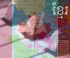
![]() by Ruben Cassar on Mon Jul 23, 2007 7:46 am
by Ruben Cassar on Mon Jul 23, 2007 7:46 am
I applaud the decision of including Corsica in an inset.  Hope to see it there in your next update.


-
 Ruben Cassar
- Posts: 2160
- Joined: Thu Nov 16, 2006 6:04 am
- Location: Civitas Invicta, Melita, Evropa


![]() by reverend_kyle on Mon Jul 23, 2007 2:51 pm
by reverend_kyle on Mon Jul 23, 2007 2:51 pm

Next update:
New things:
Inset for Corsica
Blur on the borders..does it look better or worse?
Still to do:
Title
Fonts
DANCING MUSTARD FOR POOP IN '08!
-

reverend_kyle
- Posts: 9250
- Joined: Tue Mar 21, 2006 4:08 pm
- Location: 1000 post club


![]() by cena-rules on Mon Jul 23, 2007 5:21 pm
by cena-rules on Mon Jul 23, 2007 5:21 pm
love the board.
Could you make the continents be more stand out but other than that all you need is what you have suggested
Could you make the continents be more stand out but other than that all you need is what you have suggested
19:41:22 ‹jakewilliams› I was a pedo
-

cena-rules
- Posts: 9740
- Joined: Sat Apr 28, 2007 2:27 am
- Location: Chat


![]() by thegeneralpublic on Mon Jul 23, 2007 6:34 pm
by thegeneralpublic on Mon Jul 23, 2007 6:34 pm
The mountains stand out so much from the rest of the map...any way to make them blend more?
-
thegeneralpublic
- Posts: 126
- Joined: Fri Mar 09, 2007 9:49 pm
- Location: In front of my computer screen.
![]() by wcaclimbing on Mon Jul 23, 2007 8:24 pm
by wcaclimbing on Mon Jul 23, 2007 8:24 pm
reverend_kyle wrote: Also, what do you guys think of the white borders, should they be black and would that make this better.
Yes.
Make the borders black.
It would look a lot better.

-
wcaclimbing
- Posts: 5598
- Joined: Fri May 12, 2006 10:09 pm
- Location: In your quantum box....Maybe.


![]() by thegeneralpublic on Mon Jul 23, 2007 9:25 pm
by thegeneralpublic on Mon Jul 23, 2007 9:25 pm
wcaclimbing wrote:reverend_kyle wrote: Also, what do you guys think of the white borders, should they be black and would that make this better.
Yes.
Make the borders black.
It would look a lot better.
I think I would need to see it first. I like the borders as they are now anyway.
-
thegeneralpublic
- Posts: 126
- Joined: Fri Mar 09, 2007 9:49 pm
- Location: In front of my computer screen.
![]() by Unit_2 on Mon Jul 23, 2007 9:49 pm
by Unit_2 on Mon Jul 23, 2007 9:49 pm
reverend_kyle wrote:besides the text on the legend I don't know what text your talking about.
i mean the territoy textures, try to make them smooth

-

Unit_2
- Posts: 1834
- Joined: Sun Jan 14, 2007 12:59 pm
- Location: Pennsylvania, U.S.A, North America, Earth, Milky Way, Universe.


![]() by gimil on Tue Jul 24, 2007 2:22 am
by gimil on Tue Jul 24, 2007 2:22 am
Unit_2 wrote:reverend_kyle wrote:besides the text on the legend I don't know what text your talking about.
i mean the territoy textures, try to make them smooth
why? there nothnig wrong with the way it is at the moment.
What do you know about map making, bitch?
Top Score:2403
natty_dread wrote:I was wrong
Top Score:2403
-

gimil
- Posts: 8599
- Joined: Sat Mar 03, 2007 12:42 pm
- Location: United Kingdom (Scotland)


![]() by Lucius Catilina on Tue Jul 24, 2007 9:16 pm
by Lucius Catilina on Tue Jul 24, 2007 9:16 pm
Please, no ! Stop it !
It's unbearable. I'm sorry, I don't want to offense the mappers here, but please, no ! No ! No ! No ! No !
Too many things to modify to make this map look like a real map of France.
I'm really sorry to disagree, but I couldn't bear it any longer.
It's unbearable. I'm sorry, I don't want to offense the mappers here, but please, no ! No ! No ! No ! No !
Too many things to modify to make this map look like a real map of France.
I'm really sorry to disagree, but I couldn't bear it any longer.
-

Lucius Catilina
- Posts: 23
- Joined: Mon Nov 06, 2006 2:11 pm
- Location: France
![]() by reverend_kyle on Wed Jul 25, 2007 12:18 am
by reverend_kyle on Wed Jul 25, 2007 12:18 am
Lucius Catilina wrote:Please, no ! Stop it !
It's unbearable. I'm sorry, I don't want to offense the mappers here, but please, no ! No ! No ! No ! No !
Too many things to modify to make this map look like a real map of France.
I'm really sorry to disagree, but I couldn't bear it any longer.
I don't understand, this was taken from a map of the original provinces of france... Most other people from france to visit this thread haven't said much about it not looking like a real map of france. I could fix specific things if you are that worried about it..
gimil wrote:Unit_2 wrote:reverend_kyle wrote:besides the text on the legend I don't know what text your talking about.
i mean the territoy textures, try to make them smooth
why? there nothnig wrong with the way it is at the moment.
Yeah, I really like the textures I have chosen and unless alot of people object they will stay. Smooth would be more lack of texture anyways
thegeneralpublic wrote:wcaclimbing wrote:reverend_kyle wrote: Also, what do you guys think of the white borders, should they be black and would that make this better.
Yes.
Make the borders black.
It would look a lot better.
I think I would need to see it first. I like the borders as they are now anyway.
I'm going to make it black and i'll give the option and we'll see which is liked better.
DANCING MUSTARD FOR POOP IN '08!
-
reverend_kyle
- Posts: 9250
- Joined: Tue Mar 21, 2006 4:08 pm
- Location: 1000 post club
 MIDDLE AMERICA MAP

![]() by reverend_kyle on Wed Jul 25, 2007 1:48 am
by reverend_kyle on Wed Jul 25, 2007 1:48 am
maritovw wrote:the mountains are too thick... maybe make the mountain range thinner
That is a good plan
DANCING MUSTARD FOR POOP IN '08!
-
reverend_kyle
- Posts: 9250
- Joined: Tue Mar 21, 2006 4:08 pm
- Location: 1000 post club
![]() by reverend_kyle on Wed Jul 25, 2007 1:50 am
by reverend_kyle on Wed Jul 25, 2007 1:50 am
Current to do list:
Thin mountain range.
Give options on border colors.
Add Fonts
Add numbers for preview without army shadows.
Thin mountain range.
Give options on border colors.
Add Fonts
Add numbers for preview without army shadows.
DANCING MUSTARD FOR POOP IN '08!
-
reverend_kyle
- Posts: 9250
- Joined: Tue Mar 21, 2006 4:08 pm
- Location: 1000 post club
![]() by reverend_kyle on Wed Jul 25, 2007 6:32 am
by reverend_kyle on Wed Jul 25, 2007 6:32 am

What I did:
Added a title(i'm not completely satisfied what do you guys think?)
Thinned the Mt. Range
Added font options.. which do you like best.
Border Color Black, tell me which you prefer between the ones i've shown you. White off white or black.
DANCING MUSTARD FOR POOP IN '08!
-
reverend_kyle
- Posts: 9250
- Joined: Tue Mar 21, 2006 4:08 pm
- Location: 1000 post club
![]() by reverend_kyle on Wed Jul 25, 2007 2:53 pm
by reverend_kyle on Wed Jul 25, 2007 2:53 pm
1 vote for white borders.
0 votes for black borders.
0 votes for off white borders.
0 votes for black borders.
0 votes for off white borders.
DANCING MUSTARD FOR POOP IN '08!
-
reverend_kyle
- Posts: 9250
- Joined: Tue Mar 21, 2006 4:08 pm
- Location: 1000 post club
![]() by Bad Speler on Wed Jul 25, 2007 3:19 pm
by Bad Speler on Wed Jul 25, 2007 3:19 pm
I vote white...but both versions seem to have pixelated borders
Highest Score: 2532
Highest Position: 69 (a long time ago)
Highest Position: 69 (a long time ago)
-
Bad Speler
- Posts: 1027
- Joined: Fri Jun 02, 2006 8:16 pm
- Location: Ottawa


![]() by reverend_kyle on Wed Jul 25, 2007 3:32 pm
by reverend_kyle on Wed Jul 25, 2007 3:32 pm
I don't see where you mean they are pixelated.
DANCING MUSTARD FOR POOP IN '08!
-
reverend_kyle
- Posts: 9250
- Joined: Tue Mar 21, 2006 4:08 pm
- Location: 1000 post club
![]() by gimil on Wed Jul 25, 2007 3:45 pm
by gimil on Wed Jul 25, 2007 3:45 pm
by pixalated he means they look rather square at bits and dont really flow the way there suppose to
What do you know about map making, bitch?
Top Score:2403
natty_dread wrote:I was wrong
Top Score:2403
-
gimil
- Posts: 8599
- Joined: Sat Mar 03, 2007 12:42 pm
- Location: United Kingdom (Scotland)
![]() by Bad Speler on Wed Jul 25, 2007 3:47 pm
by Bad Speler on Wed Jul 25, 2007 3:47 pm
Yes, thats what I meant...they are jagged...I've cicrled a couple of examples.

Highest Score: 2532
Highest Position: 69 (a long time ago)
Highest Position: 69 (a long time ago)
-
Bad Speler
- Posts: 1027
- Joined: Fri Jun 02, 2006 8:16 pm
- Location: Ottawa
![]() by reverend_kyle on Wed Jul 25, 2007 3:52 pm
by reverend_kyle on Wed Jul 25, 2007 3:52 pm
Anyone know how to remedy this?
DANCING MUSTARD FOR POOP IN '08!
-
reverend_kyle
- Posts: 9250
- Joined: Tue Mar 21, 2006 4:08 pm
- Location: 1000 post club
![]() by gimil on Wed Jul 25, 2007 3:53 pm
by gimil on Wed Jul 25, 2007 3:53 pm
if your using photoshop make sure you use a circle shape brush (not pencil tool) and take your time round the boarders
What do you know about map making, bitch?
Top Score:2403
natty_dread wrote:I was wrong
Top Score:2403
-
gimil
- Posts: 8599
- Joined: Sat Mar 03, 2007 12:42 pm
- Location: United Kingdom (Scotland)
![]() by reverend_kyle on Wed Jul 25, 2007 3:56 pm
by reverend_kyle on Wed Jul 25, 2007 3:56 pm
When I use a circle not pencil it is in consistant and makes the borders thicker in some places than others.
It's a double edge sword.
It's a double edge sword.
DANCING MUSTARD FOR POOP IN '08!
-
reverend_kyle
- Posts: 9250
- Joined: Tue Mar 21, 2006 4:08 pm
- Location: 1000 post club
![]() by reverend_kyle on Wed Jul 25, 2007 6:21 pm
by reverend_kyle on Wed Jul 25, 2007 6:21 pm
Also what do you guys think about the title, and which font are you guys liking better?
Well I've decided on the font but which text treatment.
Well I've decided on the font but which text treatment.
DANCING MUSTARD FOR POOP IN '08!
-
reverend_kyle
- Posts: 9250
- Joined: Tue Mar 21, 2006 4:08 pm
- Location: 1000 post club
Who is online
Users browsing this forum: No registered users
|
|||||||
| Conquer Club is not associated with RISK online in any way. Copyright © 2006-2025 by Big Wham LLC | |||||||