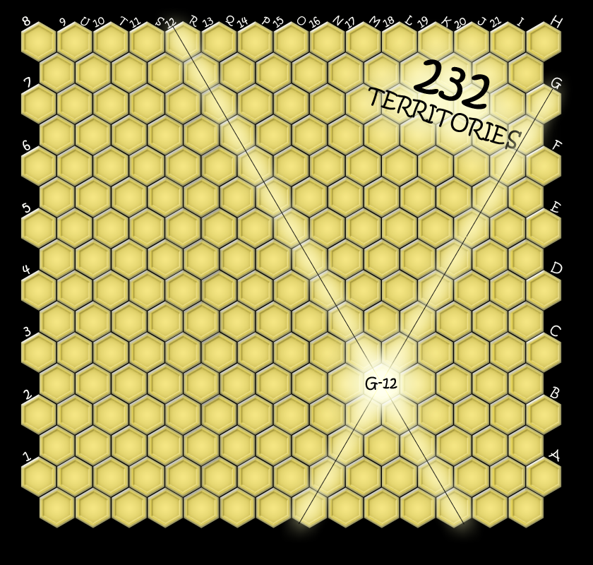
WidowMakers wrote:porkenbeans wrote:I like the large version. It can be read pretty easily. The small version however, is very fuzzy to me. I don't know, maybe it is the font not working as it is scaled down. fonts are funny that way. Some can scale down better than others. Have you tried using a different font. I would recommend doing a little experimenting there.
It is a pixel font. It only really works well that small because the font was designed to be used in these instances. I had to
manually create the font for the large map because it did NOT scale up properly and it looked bad.
cairnswk wrote:If i can't read the small map cell IDs, then I would expect that there will be others out there who will have a similar experience.

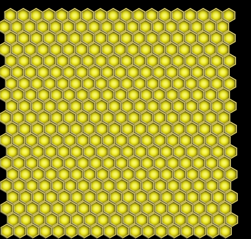
What about these maps below?
I really don't understand the issue with the text. There are plenty of other maps that have very small text.
The text is pixel font based. It has no anti aliasing. So I don't understand why there is any fuzzy appearance to anyone.
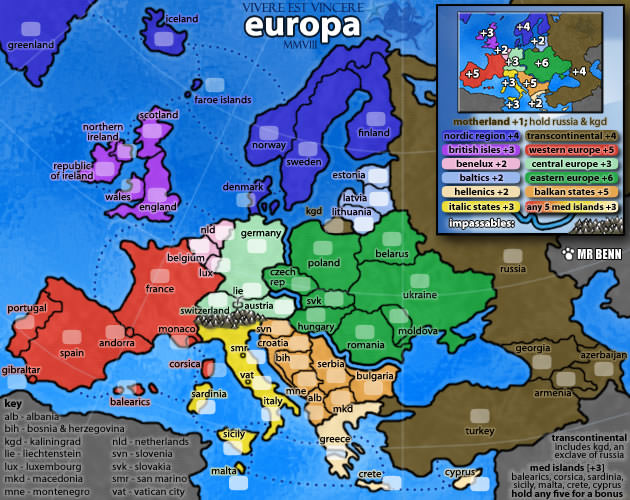
Here are some other small maps with the same size text.....
I can read the letters on all those small maps (possibly because i know where these names belong and each letter of the alphabet has a different design to it. I can even read your large map here, and i commend you for taking the initiative in designing larger size font for it, you've gone way beyond what i would have, i'd simply have changed the font.
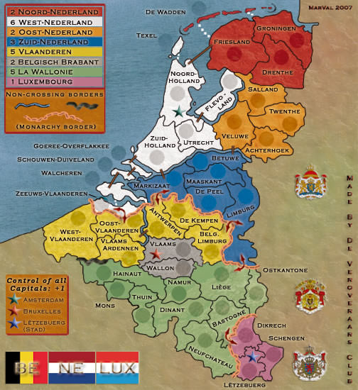
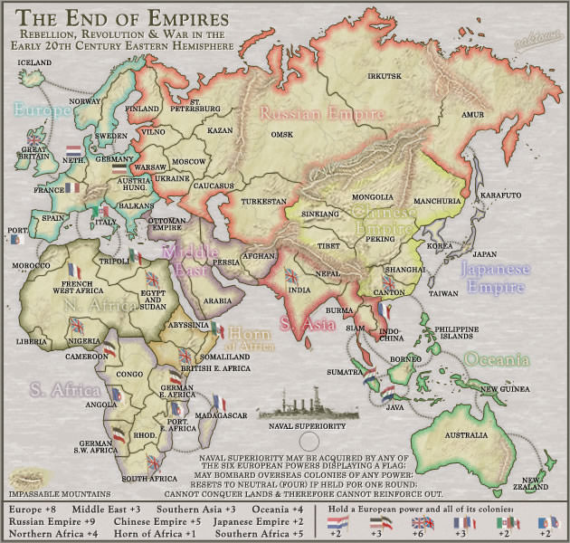
I think the issue here is that this is a grided map, essentially x by y.
Because it is hexes that overlap in the rows [down, up, down, up, down, up etc...] (the columns are fine - they are quite distinct), the lettering in rows 2 & 3, 5 & 6, 8 & 9, 12 & 13, 15 & 16, 18, 19 & 20 are blurry and not distinct.
This means that i end up having to search to a near number that i can recognise and count from there to where i want to examine. This in itself is not a good thing as you well know.
i do not know what else to do about it except trying a different font. Have you explored every possibility there.
Have you explored some alternative way of numbering (I know porkenbeans offered something but i don't think that would be better).
As a complete redesign offer, have you tried taking out the legend at the top, adding a couple of extra rows in there, heighten all the cell rows, to get the small map size and then removing anough cells in the middle of the map to place the legend in the middle...that would possibly give the cells some more room to hold a heightened text like you did with the large map. i don't know if you want to try that, but it might be worth a go to get the deisered play numbers that you want, and of course a large re-design.
But at this stage, i would not be happy letting this go through a graphic stamp if i were foundry forman, because of this legibility issue with having to search for cell IDs and not being able to see them distinctly enough without having to search for them.
I'm sorry WM, i don't want to hold up your progress, but i simply have to say, can you honestly ask for that stamp?