I think in some respects, it does make them pop a little more... but it also males the righthand side of the board look more mucky.
Also... the little rivers that flow into the Mississippi and the Rock river.... what about continuing them to the edge of the board (and under the legend. They end quite abruptly. Also, you might want to remove the texture from beneath the little rivers as well.
Quad Cities Map [Quenched]
Moderator: Cartographers
Re: Quad Cities Map
![]() by Industrial Helix on Fri Jan 28, 2011 11:48 pm
by Industrial Helix on Fri Jan 28, 2011 11:48 pm
Sketchblog [Update 07/25/11]: http://indyhelixsketch.blogspot.com/
Living in Japan [Update 07/17/11]: http://mirrorcountryih.blogspot.com/
Russian Revolution map for ConquerClub [07/20/11]: viewtopic.php?f=241&t=116575
Living in Japan [Update 07/17/11]: http://mirrorcountryih.blogspot.com/
Russian Revolution map for ConquerClub [07/20/11]: viewtopic.php?f=241&t=116575
-

 Industrial Helix
- Posts: 3462
- Joined: Mon Jul 14, 2008 6:49 pm
- Location: Ohio


Re: Quad Cities Map
![]() by Victor Sullivan on Fri Jan 28, 2011 11:57 pm
by Victor Sullivan on Fri Jan 28, 2011 11:57 pm
Industrial Helix wrote:Yeah, that texture does a lot for the map. Big improvement.
I disagree. The texture doesn't work for a cities map, IMO. It doesn't imply civilization, more terrain, which with this map, doesn't quite work for me.
As with the background color, try again, with a different green as opposed to a brown. Also, Eastern Towns kinda fades into the background.
Also, I suggest a consistent font for the river labels. The two separate fonts for the two rivers distract me and slightly take away from the overall flavor.
-Sully
Beckytheblondie: "Don't give us the dispatch, give us a mustache ride."
Scaling back on my CC involvement...
Scaling back on my CC involvement...
-

Victor Sullivan
- Posts: 6010
- Joined: Mon Feb 08, 2010 8:17 pm
- Location: Columbus, OH


Re: Quad Cities Map
![]() by pamoa on Sat Jan 29, 2011 4:37 am
by pamoa on Sat Jan 29, 2011 4:37 am
I love the muddy water look
but maybe the rivers more muddy
and the land a bit more green
maybe
also rivers should go until the frame
you're doing great
if you are wishing to add a layer on your bg
try with some map of the street as lines
with some transparency with bg
but maybe the rivers more muddy
and the land a bit more green
maybe
also rivers should go until the frame
you're doing great
if you are wishing to add a layer on your bg
try with some map of the street as lines
with some transparency with bg
De gueules à la tour d'argent ouverte, crénelée de trois pièces, sommée d'un donjon ajouré, crénelé de deux pièces
Gules an open tower silver, crenellated three parts, topped by a apertured turret, crenellated two parts
Gules an open tower silver, crenellated three parts, topped by a apertured turret, crenellated two parts
-

pamoa
- Posts: 1242
- Joined: Sat Sep 01, 2007 3:18 am
- Location: Confederatio Helvetica


Re: Quad Cities Map
![]() by ironsij0287 on Sat Jan 29, 2011 9:16 pm
by ironsij0287 on Sat Jan 29, 2011 9:16 pm
Wow so I've got all sorts of conflicting critiques now.
My thoughts.
Personally I don't like the texturing as much as keeping it plain. For a country map sure but for a city map I don't see the need. My original vision was to keep it rather simplistic like a political map.
The creeks - Two of them really don't extend that much further out in real life. Not as a significant creek by any means. They more become culverts out in farm lands. The other creek that cuts through Bettendorf extends up and cuts through the Northern Towns region. I don't really want to cut across that.
I can switch back to a green. I just liked how the brown looked when I was fiddling with green hues.
-

ironsij0287
- Posts: 379
- Joined: Tue Nov 09, 2010 2:30 pm
- Location: Dubuque


Re: Quad Cities Map
![]() by pamoa on Sun Jan 30, 2011 11:09 am
by pamoa on Sun Jan 30, 2011 11:09 am
maybe try to tone down the texture you have
but you need some in order to give some vibration to the colours
why not some road structure as texture as suggested
but you need some in order to give some vibration to the colours
why not some road structure as texture as suggested
De gueules à la tour d'argent ouverte, crénelée de trois pièces, sommée d'un donjon ajouré, crénelé de deux pièces
Gules an open tower silver, crenellated three parts, topped by a apertured turret, crenellated two parts
Gules an open tower silver, crenellated three parts, topped by a apertured turret, crenellated two parts
-
pamoa
- Posts: 1242
- Joined: Sat Sep 01, 2007 3:18 am
- Location: Confederatio Helvetica
Re: Quad Cities Map
![]() by ironsij0287 on Sun Jan 30, 2011 5:30 pm
by ironsij0287 on Sun Jan 30, 2011 5:30 pm
pamoa wrote:maybe try to tone down the texture you have
but you need some in order to give some vibration to the colours
why not some road structure as texture as suggested
OK. I'll try toning down the texture. The creeks I'm probably not going to hassle with extending but I will see about removing the texture over top of them.
-
ironsij0287
- Posts: 379
- Joined: Tue Nov 09, 2010 2:30 pm
- Location: Dubuque
Re: Quad Cities Map
![]() by jefjef on Tue Feb 01, 2011 12:24 pm
by jefjef on Tue Feb 01, 2011 12:24 pm
Might want to smooth out the river borders. Get rid of the sharp points/corners.
Like the added texture and the Credit Island name change.
Like the added texture and the Credit Island name change.
This post was made by jefjef who should be on your ignore list.

drunkmonkey wrote:I'm filing a C&A report right now. Its nice because they have a drop-down for "jefjef".
-

jefjef
- Posts: 6026
- Joined: Mon Feb 23, 2009 8:41 pm
- Location: on my ass


Re: Quad Cities Map
![]() by ironsij0287 on Tue Feb 01, 2011 12:32 pm
by ironsij0287 on Tue Feb 01, 2011 12:32 pm
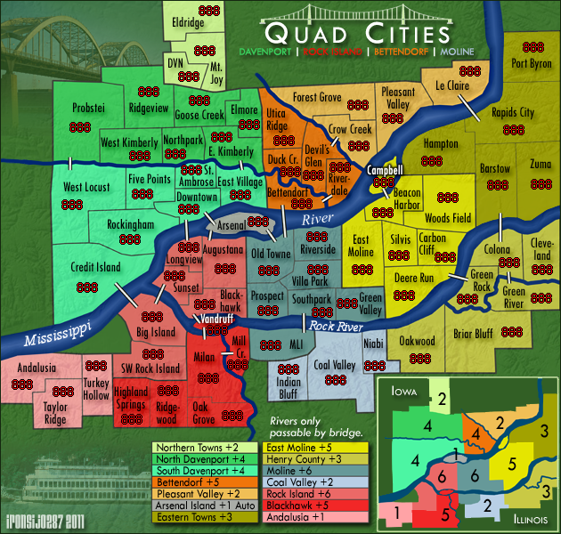
Went back to a warmer green. Softened the texture a bit. Lightened the yellow in Eastern Towns.
Then I did a bunch of small touchups here and there. Nothing major but things that had been bugging me that I hadn't taken care of yet.
Overall I think this is the most polished looking the map has been yet.
-
ironsij0287
- Posts: 379
- Joined: Tue Nov 09, 2010 2:30 pm
- Location: Dubuque
Re: Quad Cities Map
![]() by Industrial Helix on Tue Feb 01, 2011 1:07 pm
by Industrial Helix on Tue Feb 01, 2011 1:07 pm
Hmm... I'm not to fond of the warmer green. i think everything gets lost. Perhaps cool it a little?
Sketchblog [Update 07/25/11]: http://indyhelixsketch.blogspot.com/
Living in Japan [Update 07/17/11]: http://mirrorcountryih.blogspot.com/
Russian Revolution map for ConquerClub [07/20/11]: viewtopic.php?f=241&t=116575
Living in Japan [Update 07/17/11]: http://mirrorcountryih.blogspot.com/
Russian Revolution map for ConquerClub [07/20/11]: viewtopic.php?f=241&t=116575
-
Industrial Helix
- Posts: 3462
- Joined: Mon Jul 14, 2008 6:49 pm
- Location: Ohio
Re: Quad Cities Map
![]() by ironsij0287 on Tue Feb 01, 2011 2:22 pm
by ironsij0287 on Tue Feb 01, 2011 2:22 pm
Industrial Helix wrote:Hmm... I'm not to fond of the warmer green. i think everything gets lost. Perhaps cool it a little?
I was fine with the original green. I made it warmer per your original request to do so.
-
ironsij0287
- Posts: 379
- Joined: Tue Nov 09, 2010 2:30 pm
- Location: Dubuque
Re: Quad Cities Map
![]() by Industrial Helix on Tue Feb 01, 2011 2:35 pm
by Industrial Helix on Tue Feb 01, 2011 2:35 pm
Yeah, i know I'm being a reed in the wind about this. So my apologies... i just think there's a better shade of green to be found. I'll go for either the current version or the original. The original reminded me of the jungle... but it worked really well with the colors. It's up to you.
And is there a better way to write Campbell and Vandruff in there besides the white font? Have you tried anything else?
And is there a better way to write Campbell and Vandruff in there besides the white font? Have you tried anything else?
Sketchblog [Update 07/25/11]: http://indyhelixsketch.blogspot.com/
Living in Japan [Update 07/17/11]: http://mirrorcountryih.blogspot.com/
Russian Revolution map for ConquerClub [07/20/11]: viewtopic.php?f=241&t=116575
Living in Japan [Update 07/17/11]: http://mirrorcountryih.blogspot.com/
Russian Revolution map for ConquerClub [07/20/11]: viewtopic.php?f=241&t=116575
-
Industrial Helix
- Posts: 3462
- Joined: Mon Jul 14, 2008 6:49 pm
- Location: Ohio
Re: Quad Cities Map
![]() by pamoa on Tue Feb 01, 2011 2:55 pm
by pamoa on Tue Feb 01, 2011 2:55 pm
cool
my last pinpointing objection
promise
can you end the crow creek like a thin line
instead of that rounded one you have now
my last pinpointing objection
promise
can you end the crow creek like a thin line
instead of that rounded one you have now
De gueules à la tour d'argent ouverte, crénelée de trois pièces, sommée d'un donjon ajouré, crénelé de deux pièces
Gules an open tower silver, crenellated three parts, topped by a apertured turret, crenellated two parts
Gules an open tower silver, crenellated three parts, topped by a apertured turret, crenellated two parts
-
pamoa
- Posts: 1242
- Joined: Sat Sep 01, 2007 3:18 am
- Location: Confederatio Helvetica
Re: Quad Cities Map
![]() by ironsij0287 on Tue Feb 01, 2011 5:02 pm
by ironsij0287 on Tue Feb 01, 2011 5:02 pm
Industrial Helix wrote:Yeah, i know I'm being a reed in the wind about this. So my apologies... i just think there's a better shade of green to be found. I'll go for either the current version or the original. The original reminded me of the jungle... but it worked really well with the colors. It's up to you.
And is there a better way to write Campbell and Vandruff in there besides the white font? Have you tried anything else?
They were black originally but the white made them more readable. I can play around some more with that.
Perhaps I can find a good in between with the current green and the original green.
Pamoa, I'll see about thinning out the end of Crow Creek a bit.
-
ironsij0287
- Posts: 379
- Joined: Tue Nov 09, 2010 2:30 pm
- Location: Dubuque
Re: Quad Cities Map
![]() by isaiah40 on Tue Feb 01, 2011 8:31 pm
by isaiah40 on Tue Feb 01, 2011 8:31 pm
So after flipping back and forth between the current image and the brown back ground and the dark green background I am liking the looks of the current one better. It doesn't look so glum but lively! Makes me want to play it.
-
isaiah40
- Posts: 3990
- Joined: Mon Aug 27, 2007 7:14 pm


Re: Quad Cities Map
![]() by isaiah40 on Tue Feb 01, 2011 8:49 pm
by isaiah40 on Tue Feb 01, 2011 8:49 pm
This one looks good as well. If I had to choose, I would choose .....
Hmmm......
I know the one you just posted!
Hmmm......
I know the one you just posted!
-
isaiah40
- Posts: 3990
- Joined: Mon Aug 27, 2007 7:14 pm
Re: Quad Cities Map
![]() by AndyDufresne on Thu Feb 03, 2011 11:31 am
by AndyDufresne on Thu Feb 03, 2011 11:31 am
I think the title aesthetic is great, but the two legends at the bottom are no where near as cool as the title.
--Andy
--Andy
-

AndyDufresne
- Posts: 24935
- Joined: Fri Mar 03, 2006 8:22 pm
- Location: A Banana Palm in Zihuatanejo


Re: Quad Cities Map
![]() by ironsij0287 on Thu Feb 03, 2011 3:23 pm
by ironsij0287 on Thu Feb 03, 2011 3:23 pm
I would say that's a fair assessment, but at this point I'm not real interested in doing an overhaul of the legend.
-
ironsij0287
- Posts: 379
- Joined: Tue Nov 09, 2010 2:30 pm
- Location: Dubuque
Re: Quad Cities Map
![]() by AndyDufresne on Thu Feb 03, 2011 3:58 pm
by AndyDufresne on Thu Feb 03, 2011 3:58 pm
ironsij0287 wrote:I would say that's a fair assessment, but at this point I'm not real interested in doing an overhaul of the legend.
Does this mean that at some point, you will, or is it that you are saying just no to it in general? I just want to understand your message.
The legends are really the bottom-drag-of-the-Mississippi on this map.
--Andy
-
AndyDufresne
- Posts: 24935
- Joined: Fri Mar 03, 2006 8:22 pm
- Location: A Banana Palm in Zihuatanejo
Re: Quad Cities Map
![]() by natty dread on Thu Feb 03, 2011 5:28 pm
by natty dread on Thu Feb 03, 2011 5:28 pm
ironsij0287 wrote:I would say that's a fair assessment, but at this point I'm not real interested in doing an overhaul of the legend.
If you agree something is not good, why are you refusing to fix it?

-

natty dread
- Posts: 12877
- Joined: Fri Feb 08, 2008 8:58 pm
- Location: just plain fucked


Re: Quad Cities Map
![]() by ironsij0287 on Fri Feb 04, 2011 3:04 pm
by ironsij0287 on Fri Feb 04, 2011 3:04 pm
natty_dread wrote:ironsij0287 wrote:I would say that's a fair assessment, but at this point I'm not real interested in doing an overhaul of the legend.
If you agree something is not good, why are you refusing to fix it?
I'm not really sure what to do with them.
-
ironsij0287
- Posts: 379
- Joined: Tue Nov 09, 2010 2:30 pm
- Location: Dubuque
Re: Quad Cities Map
![]() by natty dread on Fri Feb 04, 2011 4:44 pm
by natty dread on Fri Feb 04, 2011 4:44 pm
Try looking at some quenched maps for inspiration.
-
natty dread
- Posts: 12877
- Joined: Fri Feb 08, 2008 8:58 pm
- Location: just plain fucked
Re: Quad Cities Map
![]() by RedBaron0 on Sat Feb 05, 2011 12:28 am
by RedBaron0 on Sat Feb 05, 2011 12:28 am
I think when you boil it all down, you've got 2 legends. A listing and a mini-map. Try combining the 2. The minimap is my preference. Try moving the names in there and see if it works. Another map that might be good for you to gleen some inspiration from would be Vancouver. shakeycat took each bonus area shape out and made a listing out of that, and something like that might not be a bad thing to try out also.


-

RedBaron0
- Posts: 2657
- Joined: Sun Aug 19, 2007 12:59 pm
- Location: Pennsylvania


Re: Quad Cities Map
![]() by ironsij0287 on Sat Feb 05, 2011 5:28 pm
by ironsij0287 on Sat Feb 05, 2011 5:28 pm
RedBaron0 wrote:I think when you boil it all down, you've got 2 legends. A listing and a mini-map. Try combining the 2. The minimap is my preference. Try moving the names in there and see if it works. Another map that might be good for you to gleen some inspiration from would be Vancouver. shakeycat took each bonus area shape out and made a listing out of that, and something like that might not be a bad thing to try out also.
I like that idea. Perhaps I'll try that.
-
ironsij0287
- Posts: 379
- Joined: Tue Nov 09, 2010 2:30 pm
- Location: Dubuque
Who is online
Users browsing this forum: No registered users
|
|||||||
| Conquer Club is not associated with RISK online in any way. Copyright © 2006-2025 by Big Wham LLC | |||||||