Confirmation Script by Ishiro
Lets you confirm "End Attacks", "End Fortification", etc...
http://www.conquerclub.com/forum/viewtopic.php?t=7051
[UI] Adjust Position of Phase Action Buttons
Moderator: Community Team


New location for the dice image and attack button
![]() by sully800 on Sat Aug 25, 2007 11:09 pm
by sully800 on Sat Aug 25, 2007 11:09 pm
Concise Idea: Move the attack button so its not below the map, thereby eliminating the need to scroll on larger maps.
I don't know why it took me so long to think of this suggestion, because I consider it an enormous problem and inconvenience. I also think this is a rather simple, and very effective solution!
As I see it, the two most important features to be displayed on the game screen are the map itself and the buttons for attacking. After that, I'd say the dice are the most important. The problem is that the dice and the attack button get shunted to the bottom of the screen, so on large maps you hit attack, the screen refreshes to the top of the page and then you have to scroll down to hit attack again. It's inconvenient but its also the #1 reason that our map sizes are limited.
I think the info such as the game number, round, time remaining and player list takes up a lot more space than it needs to. That information could be condensed or moved around so that the attack button is on the right hand side of the map, and the dice directly below it. There is already plenty of open space there. The great benefit is that you could then play easily on maps that extend to the very bottom or even past the bottom of the screen.
My only fear is that the side of the screen would look a little cluttered and that the change would alarm people, since people generally resist change. It wouldn't look like the traditional CC set up but I think it would be a big improvement.
Priority: 5
-

 sully800
- Posts: 4978
- Joined: Wed Jun 14, 2006 5:45 pm
- Location: Bethlehem, Pennsylvania


Re: New location for the dice image and attack button
![]() by john1099 on Sat Aug 25, 2007 11:16 pm
by john1099 on Sat Aug 25, 2007 11:16 pm
sully800 wrote:Concise Idea: Move the attack button so its not below the map, thereby eliminating the need to scroll on larger maps.
I don't know why it took me so long to think of this suggestion, because I consider it an enormous problem and inconvenience. I also think this is a rather simple, and very effective solution!
As I see it, the two most important features to be displayed on the game screen are the map itself and the buttons for attacking. After that, I'd say the dice are the most important. The problem is that the dice and the attack button get shunted to the bottom of the screen, so on large maps you hit attack, the screen refreshes to the top of the page and then you have to scroll down to hit attack again. It's inconvenient but its also the #1 reason that our map sizes are limited.
I think the info such as the game number, round, time remaining and player list takes up a lot more space than it needs to. That information could be condensed or moved around so that the attack button is on the right hand side of the map, and the dice directly below it. There is already plenty of open space there. The great benefit is that you could then play easily on maps that extend to the very bottom or even past the bottom of the screen.
My only fear is that the side of the screen would look a little cluttered and that the change would alarm people, since people generally resist change. It wouldn't look like the traditional CC set up but I think it would be a big improvement.
Priority: 5
I agree, on some maps, I even switch to the "small map" so that I don't have to scroll 234023948 times!
GunnaRoolsUDrool wrote:yo mama has 3 titties, ones for milk, ones for water, ones out of order
-

john1099
- Posts: 1558
- Joined: Sat Feb 10, 2007 1:14 am
- Location: St. Catharines, ON


![]() by treefiddy on Sun Aug 26, 2007 12:14 am
by treefiddy on Sun Aug 26, 2007 12:14 am
I completely agree with Sully on this one. There are some maps where it works out perfectly to click -> advance -> click -> advance -> etc, but if you happen to hit auto attack and it requires two dice lines, I have to scroll. Some maps I have to scroll no matter what. Moving the button and dice would definitely be an improvement in my eyes.
-

treefiddy
- Posts: 407
- Joined: Fri May 25, 2007 11:37 am


![]() by misterman10 on Sun Aug 26, 2007 12:18 am
by misterman10 on Sun Aug 26, 2007 12:18 am
I've really never had this problem whether it be that I don't play using big maps or my screen is big, but I still like this idea a lot.
Pleasant Chaps still suck cock.
Yakuza power.
Yakuza power.
-

misterman10
- Posts: 9412
- Joined: Thu May 24, 2007 1:48 pm
- Location: Out on the Pitch.


![]() by mumbles on Sun Aug 26, 2007 3:15 am
by mumbles on Sun Aug 26, 2007 3:15 am
mach wrote:I don't consider the dice very important at all. You can't change them and knowing them doesn't change anything (except for people that believe previous rolls affect future rolls).
I also don't need the dice moved but would like the attack , movement and deploy buttons and the map on the same screen
M
-
mumbles
- Posts: 19
- Joined: Sat Dec 09, 2006 1:59 am
- Location: A small town in Aust


![]() by cena-rules on Sun Aug 26, 2007 8:20 am
by cena-rules on Sun Aug 26, 2007 8:20 am
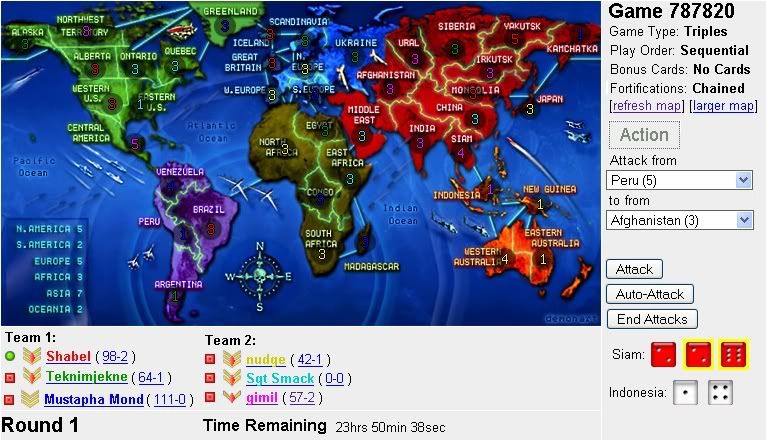
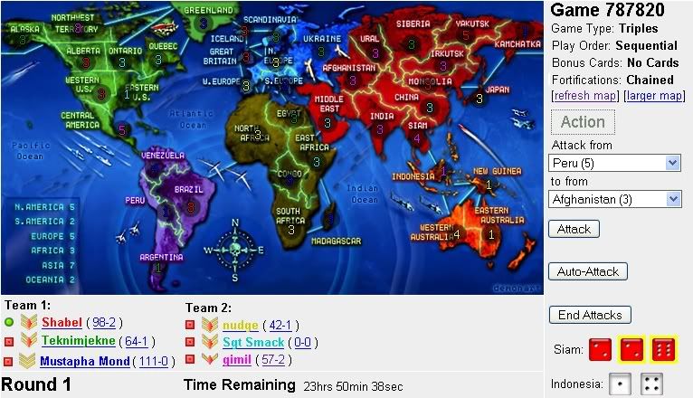
gimil wrote:how about something like this?
the qualities a bit poor but you get the idea
damn that looks good
19:41:22 ‹jakewilliams› I was a pedo
-

cena-rules
- Posts: 9740
- Joined: Sat Apr 28, 2007 2:27 am
- Location: Chat


![]() by lalaland on Sun Aug 26, 2007 8:34 am
by lalaland on Sun Aug 26, 2007 8:34 am
the only problem with gimil's version (for me, anyway) is that the end attack button is very close to auto attack. I believe they were originally next to each other earlier on in the site, but were moved because people kept accidentally hitting end attacks.
other than that, i think that it looks pretty good.
other than that, i think that it looks pretty good.
I worship the dice gods


-

lalaland
- Posts: 743
- Joined: Mon Apr 16, 2007 5:28 pm
- Location: in lalaland... duh
![]() by ParadiceCity9 on Sun Aug 26, 2007 8:44 am
by ParadiceCity9 on Sun Aug 26, 2007 8:44 am
well, i like the idea. but i think were all used to good ole' CC set up with the attacks under the map....but i guess it would just need some getting used to like when we all started on CC.
-
ParadiceCity9
- Posts: 4239
- Joined: Thu Feb 15, 2007 4:10 pm


![]() by gimil on Sun Aug 26, 2007 8:45 am
by gimil on Sun Aug 26, 2007 8:45 am
lalaland wrote:the only problem with gimil's version (for me, anyway) is that the end attack button is very close to auto attack. I believe they were originally next to each other earlier on in the site, but were moved because people kept accidentally hitting end attacks.
other than that, i think that it looks pretty good.
this is jsut for you
What do you know about map making, bitch?
Top Score:2403
natty_dread wrote:I was wrong
Top Score:2403
-

gimil
- Posts: 8599
- Joined: Sat Mar 03, 2007 12:42 pm
- Location: United Kingdom (Scotland)


![]() by lalaland on Sun Aug 26, 2007 8:48 am
by lalaland on Sun Aug 26, 2007 8:48 am
gimil wrote:lalaland wrote:the only problem with gimil's version (for me, anyway) is that the end attack button is very close to auto attack. I believe they were originally next to each other earlier on in the site, but were moved because people kept accidentally hitting end attacks.
other than that, i think that it looks pretty good.
this is jsut for you
thanks
but what if the End Attacks button was moved over to the left, below the lower right hand corner of the map? then it would be even more out of the way.
I worship the dice gods
-
lalaland
- Posts: 743
- Joined: Mon Apr 16, 2007 5:28 pm
- Location: in lalaland... duh


![]() by gimil on Sun Aug 26, 2007 8:54 am
by gimil on Sun Aug 26, 2007 8:54 am
Kaplowitz wrote:Put the "End Attack" near where it says "Nudge". Then no one will hit it by accident.
Also, this is small map. HOw would this work for World 2.1??
it would probably still be off the screen but thats just 2.1 for ya
What do you know about map making, bitch?
Top Score:2403
natty_dread wrote:I was wrong
Top Score:2403
-
gimil
- Posts: 8599
- Joined: Sat Mar 03, 2007 12:42 pm
- Location: United Kingdom (Scotland)
![]() by sully800 on Sun Aug 26, 2007 8:30 pm
by sully800 on Sun Aug 26, 2007 8:30 pm
gimil wrote:how about something like this?
the qualities a bit poor but you get the idea
I love it!
But to sort out the auto attack and end attack buttons, maybe those could be moved just below the dice. And I understand the thought that the dice aren't important since you can't change them, but I still like to see the results of an attack and I'm sure many others do as well.
As for World 2.1, that map is the perfect case for this suggestion. Not only is it the tallest map we currently have, but the bottom of the map is also not very important. If you had to scroll and see the bonuses it would only be once or twice per turn so it wouldn't really matter if that was off the bottom of your screen. If this were to be implemented I could see many more maps moving the bonus text to the bottom because it would be a great location for the less important info.
-
sully800
- Posts: 4978
- Joined: Wed Jun 14, 2006 5:45 pm
- Location: Bethlehem, Pennsylvania
![]() by Keredrex on Sun Aug 26, 2007 10:28 pm
by Keredrex on Sun Aug 26, 2007 10:28 pm
gimil wrote:how about something like this?
the qualities a bit poor but you get the idea
awesome .. but if you put the Teams running across the top of the map somehow you wouldn't even need to scroll to see who goes first
or for that matter put the game info up there and have the "Buttons" on the top right
-

Keredrex
- Posts: 400
- Joined: Sun Jan 14, 2007 1:41 am
- Location: New York
![]() by 3seven1 on Mon Aug 27, 2007 1:31 pm
by 3seven1 on Mon Aug 27, 2007 1:31 pm
gimil wrote:lalaland wrote:the only problem with gimil's version (for me, anyway) is that the end attack button is very close to auto attack. I believe they were originally next to each other earlier on in the site, but were moved because people kept accidentally hitting end attacks.
other than that, i think that it looks pretty good.
this is jsut for you
I'd suggest having the End Attacks button right aligned, also the end fortification button. That would help a little bit. Looks good though.
Either way there going to be some additonal scrolling I think. Right now it's up and down. With this change i think it would be left to right. Not everybody can affort large monitors.
-
3seven1
- Posts: 294
- Joined: Fri Jul 27, 2007 5:24 pm
- Location: Fresno, CA, USA


Return to Archived Suggestions
Who is online
Users browsing this forum: No registered users
|
|||||||
| Conquer Club is not associated with RISK online in any way. Copyright © 2006-2024 by Big Wham LLC | |||||||