
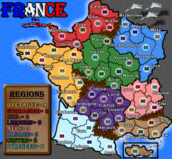
new sea colour/texture
added the jet planes, i will add more stuff like that if u want!
do u like the border now?
any other improvments?
Moderator: Cartographers
![]() by spinwizard on Mon Apr 02, 2007 6:09 am
by spinwizard on Mon Apr 02, 2007 6:09 am


![]() by Skittles! on Mon Apr 02, 2007 6:35 am
by Skittles! on Mon Apr 02, 2007 6:35 am
KraphtOne wrote:when you sign up a new account one of the check boxes should be "do you want to foe colton24 (it is highly recommended) "


![]() by spinwizard on Mon Apr 02, 2007 6:55 am
by spinwizard on Mon Apr 02, 2007 6:55 am
Skittles! wrote:Why did you add the Jets?
![]() by Skittles! on Mon Apr 02, 2007 7:04 am
by Skittles! on Mon Apr 02, 2007 7:04 am
spinwizard wrote:Skittles! wrote:Why did you add the Jets?
dunno, i wanted 2 try putting some on.
do u like them?
KraphtOne wrote:when you sign up a new account one of the check boxes should be "do you want to foe colton24 (it is highly recommended) "
![]() by cairnswk on Mon Apr 02, 2007 7:10 am
by cairnswk on Mon Apr 02, 2007 7:10 am


![]() by sam_levi_11 on Mon Apr 02, 2007 7:37 am
by sam_levi_11 on Mon Apr 02, 2007 7:37 am
cairnswk wrote:SpinWizard....I'd like to make some suggestions if I can...not criticisms but things I feel can be improved...it would be more favourable to attend to them now...
* I am not sure about the additions of the concords... i do understand they have french relevance however. Can you explain? Do you think this map needs additional imagery?
* I feel your legend is now having serious issues - i can hardly read Limousin and Med is not entirely clear, Normandie sits in the border of the legend (a graphical no-no), and they are not all left justified with a little margin between the start of their names and the border of the legned.
* most of your district borders appear slightly blurred - good - but between Champagne and Yonne there is something too thick happening there near Vosges
* I still think the background image in the legend is too hidden - i can't make out what it even is, though previously you have explained a king or suchlike.
* can you examine the thick border around the whole country - in places it looks thicker than in others
* your signature is too prominent and sits over Manche - not a good look. The wave of the tri colour opposes the horizontal wave you have in the title. Can you offer an alternative to that and see what it looks like.
* does yellow and light blue have textured background? they look different from the other districts.
* have you tried turning some of your mountains around and having some with small peak facing left and right - you know a bit of a mixture.
* to me the colours are fine
Keep going. Clink! Clink! Soon you'll be dancing....
Hope this helps!


![]() by Ruben Cassar on Mon Apr 02, 2007 8:32 am
by Ruben Cassar on Mon Apr 02, 2007 8:32 am


![]() by spinwizard on Mon Apr 02, 2007 9:10 am
by spinwizard on Mon Apr 02, 2007 9:10 am

![]() by Ruben Cassar on Mon Apr 02, 2007 9:50 am
by Ruben Cassar on Mon Apr 02, 2007 9:50 am
Ruben Cassar wrote:The fighter planes are out of place in this map. Remove them or at least use French fighters!
The black borders are too thick and messy.
Change the textures of the territories and the sea.
![]() by spinwizard on Mon Apr 02, 2007 9:58 am
by spinwizard on Mon Apr 02, 2007 9:58 am
boberz wrote:a few co-ordinates are off especially orne oise metz and herault
![]() by cairnswk on Mon Apr 02, 2007 1:05 pm
by cairnswk on Mon Apr 02, 2007 1:05 pm
spinwizard wrote:i think i made all major updates...
new better borders
new legend(simpleistic)
more new colours
changed my sig.
are there any changes u mentioned that i have not made?
![]() by spinwizard on Mon Apr 02, 2007 1:11 pm
by spinwizard on Mon Apr 02, 2007 1:11 pm
cairnswk wrote:spinwizard wrote:i think i made all major updates...
new better borders
new legend(simpleistic)
more new colours
changed my sig.
are there any changes u mentioned that i have not made?
SpinWizard...vast improvement...keep going! Onward Upward
* Pyrenees is too bright in that yellowish lime green
* Med in the legend appears to be the same colour as the moutains not of the riviera
* signature looks much better - just move it slightly right to line up with the front of france
* region borders still messy
![]() by Bad Speler on Mon Apr 02, 2007 6:12 pm
by Bad Speler on Mon Apr 02, 2007 6:12 pm


![]() by sam_levi_11 on Mon Apr 02, 2007 6:40 pm
by sam_levi_11 on Mon Apr 02, 2007 6:40 pm
![]() by Bad Speler on Mon Apr 02, 2007 7:13 pm
by Bad Speler on Mon Apr 02, 2007 7:13 pm
![]() by Ruben Cassar on Mon Apr 02, 2007 8:09 pm
by Ruben Cassar on Mon Apr 02, 2007 8:09 pm
Gozar wrote:What if you stood Corse up the right way, and just made it disporpotionitly smaller?
(I know, I know, enough about the island, but figured I would throw it out)
![]() by luckiekevin on Mon Apr 02, 2007 8:48 pm
by luckiekevin on Mon Apr 02, 2007 8:48 pm

Return to Melting Pot: Map Ideas
Users browsing this forum: No registered users
|
|||||||
| Conquer Club is not associated with RISK online in any way. Copyright © 2006-2025 by Big Wham LLC | |||||||


