Conquer Club

High Seas Map [Abandoned - new project thread]

Have an idea for a map? Discuss ideas and concepts here.

Moderator: Cartographers

Forum rules
Please read the Community Guidelines before posting.

Postby ViscountGort on Sat Feb 03, 2007 8:19 am

Okay the poll shows almost a 3-1 preference for a land-based split over a sea-based one. I agree this is the way forward.

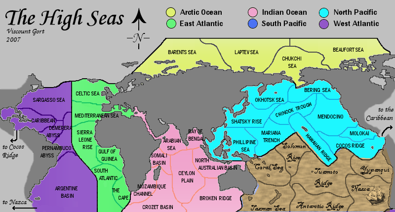
However, I'm in agreement with oaktown in his last post. While the atlantic split (v1.0) is not appropriate for all the reasons previously listed by sully & others, the african split (v1.1) just looks a bit crap.

So I took a suggestion he made and have produced the following map - v1.3:

Image

I'm a really big fan of this layout to be honest. In a way I see it simply as an improvement on the mid-africa split, so based on how people have voted in the poll I'm hoping this will be well-received. I won't put a new poll up, but if anyone has any major objections to this new version please post them. (Positive comments also welcome, naturally :wink: )

If we can agree upon this I'll start working on the other ideas. Top priorities are:
    Sort out the borders - are there too many? are they all wrong? etc.
    Add the bermuda triangle, a territory that can't attack anywhere.
    Figure out some new impassables (you'll notice I've done away with the ridge & seamounts in v1.3

After that I'll work on the appearance of the map.

btw, KK, thanks for your input regarding the map projection, pleased to hear this is the one used in the nautical world.

ViscountGort.
User avatar
Corporal 1st Class ViscountGort
 
Posts: 35
Joined: Mon Jan 22, 2007 7:21 am
Location: University of Durham, England

Postby Fitz69 on Sat Feb 03, 2007 8:58 am

a Couple of suggestions:

1. Darken the land areas.
2. What happened to the generally open waters in the north atlantic north of Iceland and around Greenland?
3. If you ever want to put an impassable barrier in the atlantic, ther's something called "the doldrums" between Brazil and West africa. Back in the days of sail this area was infamous for its lack of wind.
User avatar
Cook Fitz69
 
Posts: 196
Joined: Wed Nov 29, 2006 8:46 am
Location: Sweden

Postby ViscountGort on Sat Feb 03, 2007 9:22 am

thanks fitz, i was especially interested in the doldrums - great idea for an impassable.

just been reading about them:

the doldrums, or equatorial belt of calms, is an area around the earth centered between the two belts of trade winds noted for calms, periods when the winds disappear, trapping sailing vessels for days or weeks.


Sounds perfect.

From what I've read, the doldrums exist in all the oceans, between 5 degrees north & 5 degrees south of the equator. as such, they'll have to form a horizontal impassable boundary on my map, so maybe they'll be better used in the pacific than the atlantic. i get the impression the name was coined by early european mariners crossing the atlantic to the new world, but it nows seems to be generally applicable, so can be used in the pacific as well.
User avatar
Corporal 1st Class ViscountGort
 
Posts: 35
Joined: Mon Jan 22, 2007 7:21 am
Location: University of Durham, England

Postby ViscountGort on Sat Feb 03, 2007 10:47 am

Oaktown, i was giving some thought to your earlier post

Seems like this map would be best served by taking full advantage of the nautical theme, and making it look like an old sea chart or pirate map. You know, Spanish galleons, sea monsters, skull and cross bones, crap like that. I'd love to see something that looks like it's etched onto leather and been bleached by years of sun exposure.


Had a little play with the south pacific. It's pretty rough but how do you feel about something along these lines:

Image

What does everyone else think?
User avatar
Corporal 1st Class ViscountGort
 
Posts: 35
Joined: Mon Jan 22, 2007 7:21 am
Location: University of Durham, England

Postby Balsiefen on Sat Feb 03, 2007 12:30 pm

Nice, i like the ship its a bit too dark but that is definatly the way to go

I also think the new split is good and its well done without mpving the amereicas too much

however i would add the sea around norway (or at least an attack route) to make the arctic a bit harder to hold
User avatar
Sergeant 1st Class Balsiefen
 
Posts: 2299
Joined: Wed Aug 30, 2006 6:15 am
Location: The Ford of the Aldar in the East of the Kingdom of Lindissi

Postby Balsiefen on Sat Feb 03, 2007 12:39 pm

Just out of intrest i tried using a film grain tool on picassa, it didn't look too bad
Image
User avatar
Sergeant 1st Class Balsiefen
 
Posts: 2299
Joined: Wed Aug 30, 2006 6:15 am
Location: The Ford of the Aldar in the East of the Kingdom of Lindissi

Postby oaktown on Sat Feb 03, 2007 2:23 pm

South Pacific looks good - this map is making considerable progress!

Now that it seems you are re-orienting the map, does it seem more logical to split the Atlantic into North and South, rather than East and West? A split between Africa and Brazil would allow you to lose the awkward, and kinda random, straight line down the middle of the ocean.
Image
User avatar
Captain oaktown
 
Posts: 4451
Joined: Sun Dec 03, 2006 9:24 pm
Location: majorcommand

Postby gavin_sidhu on Sun Feb 04, 2007 1:31 am

You spelt Tasman Sea wrong.

I like the font and feel of south pacific, the rest looks real bad. I don't understand why you cut of the artic ocean and think you should colour in all those inside lakes that are currently gray (eg, baltic sea, Hudson bay, Persian Gulf etc.)

The connection between Arabian Sea and Mediterranean sea looks dodgy, i suggest you connect Africa back up to Asia and do a connection like you did with the panama canal.

Also i think you shoudl get rid of the sharp edges of everything and make them all curvy and sea like (eg, Solomon Rise).

Really like this map, looks very promising.
User avatar
Lieutenant gavin_sidhu
 
Posts: 1428
Joined: Mon May 22, 2006 6:16 am
Location: Brisbane, Australia

Postby ViscountGort on Sun Feb 04, 2007 9:43 am

This is the new version, now fully based on an old-fashioned looking sea map:

Image

I think it's much better than the old colourful version. I'll sort out the pointy edges when I put the Doldrums in as an impassable in the Pacific. I dont think the atlantic needs an impassable now that it's split north/south instead of east/west (good suggestion oaktown), as there are far fewer borders there now.

Comments?
User avatar
Corporal 1st Class ViscountGort
 
Posts: 35
Joined: Mon Jan 22, 2007 7:21 am
Location: University of Durham, England

Postby Ruben Cassar on Sun Feb 04, 2007 10:11 am

Hmm...maybe you could use some more hues of blue and green for the colours of the sea...because that's what the seas looks like after all. Make the Mediterranean blue please! ;)
ImageImageImageImageImage
User avatar
Colonel Ruben Cassar
 
Posts: 2160
Joined: Thu Nov 16, 2006 6:04 am
Location: Civitas Invicta, Melita, Evropa

Postby johloh on Sun Feb 04, 2007 10:37 am

looks good...

id change....
-fonts on seas are hard to read (either change the font to something clearer, or give an outline, drop a shadow, something)
-i agree with ruben, try and give it more blue colors
-once the sea is blue, id give some sort of a color/effect to the continents, i know you want the seas to be the focus, but as it is now i think the continents looks a little strange.
User avatar
Major johloh
 
Posts: 472
Joined: Mon Dec 04, 2006 12:58 pm
Location: San Francisco

Postby bedplay on Sun Feb 04, 2007 10:49 am

all I have to say is the sea needs to contrast the land A LOT more.

It looks pretty awful as it is (colourwise)
"It is fatal to enter any war without the will to win it."
- General Douglas MacArthur
User avatar
Private 1st Class bedplay
 
Posts: 171
Joined: Fri Jan 19, 2007 2:00 pm

Postby Tamar_Bagrationi on Sun Feb 04, 2007 11:26 am

This maps a great idea! I like the way you've tried to keep the seas in keeping with the old map theme by making them quite neutral, sea-esque colours.

I don't understand Johloh's comment, surely if their all blue there won't be enough differences between them? Brown and green seem sea-like enough to me.

Think maybe the land does need to be changed to make it a bit less grey looking, but overall it looks v good! Love the use of Nelson in the corner.
Corporal 1st Class Tamar_Bagrationi
 
Posts: 2
Joined: Mon Jan 22, 2007 3:46 pm
Location: Durham, England

Postby ViscountGort on Sun Feb 04, 2007 11:41 am

Regarding the sea colours, I was aiming for the sort of colours used in nautical maps from the age of sail era. The colours are based on those in the following images:

Atlantic Ocean: (thanks for oaktown for this one :) )

Image

Arctic / Indian Oceans:

Image

Pacific Ocean:

Image


Clearly in a real map the tone used would be one, not all, of these, but in this case I needed to differentiate between the oceans somehow. i think the tones compliment each other quite well.
User avatar
Corporal 1st Class ViscountGort
 
Posts: 35
Joined: Mon Jan 22, 2007 7:21 am
Location: University of Durham, England

Postby Ruben Cassar on Sun Feb 04, 2007 12:11 pm

You can still use different hues of blue and green. Like Dark Blue, Azure, Light Blue, Aquamarine, etc

The fact is that some of the colours you are using don't resemble the sea at all.
ImageImageImageImageImage
User avatar
Colonel Ruben Cassar
 
Posts: 2160
Joined: Thu Nov 16, 2006 6:04 am
Location: Civitas Invicta, Melita, Evropa

Postby sully800 on Sun Feb 04, 2007 12:35 pm

Yeah, they don't ALL need to be blue, but I think at least ONE should be!

If you replace the browns with 2 shades of blue it will look a lot better. 2 blues, 2 greens and an icy gray is fine for sea colors. You also need to differentiate the colors between North/South Atlantic and Pacific more I think.
User avatar
Major sully800
 
Posts: 4978
Joined: Wed Jun 14, 2006 5:45 pm
Location: Bethlehem, Pennsylvania

Postby Balsiefen on Sun Feb 04, 2007 1:11 pm

I like the couler changes but the north pacific doesent look right and i would use a pale blue for the arctic (the green, although a good sea colour, just doesn't seem right for the arctic). The land also needs to be altered(it might be an idea to use the colour you used for the south pacific for it)

finally i dont see why people are wanting more blues, the browns and greens are good colours if you move them about a bit and too many blues would be confusing

Edit:
Yeah, they don't ALL need to be blue, but I think at least ONE should be!

the atlantic looks a good blue to me
User avatar
Sergeant 1st Class Balsiefen
 
Posts: 2299
Joined: Wed Aug 30, 2006 6:15 am
Location: The Ford of the Aldar in the East of the Kingdom of Lindissi

Postby reverend_kyle on Sun Feb 04, 2007 4:29 pm

yuck and change the stupid font.
DANCING MUSTARD FOR POOP IN '08!
User avatar
Sergeant reverend_kyle
 
Posts: 9250
Joined: Tue Mar 21, 2006 4:08 pm
Location: 1000 post club

Postby oaktown on Sun Feb 04, 2007 6:15 pm

i like the direction this is going, which I guess is obvious since i posted that first old map. :)

I know it probably isn't your top priority, nor is it playable space, but don't forget that the land also has to look like it's on the same old map.

I agree that some light blues and greens - ocean colors - would reinforce the idea that you're playing on water rather than land.

And cool font - a bit hard to read in places, but it nails the hand-crafted theme. The spacing between lines of text is way too big - hard to tell which words go together. Example: "demerera" is closer to "carribean" than to "abyss".

Think about flipping the image of the admiral so he looks in on the map, rather than off into oblivion.
Image
User avatar
Captain oaktown
 
Posts: 4451
Joined: Sun Dec 03, 2006 9:24 pm
Location: majorcommand

Postby gavin_sidhu on Mon Feb 05, 2007 4:47 am

Looks good. The writing of Hawaiian Ridge seems to be bolder than the rest of North Pacific. Also you should draw a connection from Nazca to Argentine Basin so people dont think it is a one way attack (or is it?). , didn't you like these ideas?

gavin_sidhu wrote:think you should colour in all those inside lakes that are currently gray (eg, baltic sea, Hudson bay, Persian Gulf etc.)

The connection between Arabian Sea and Mediterranean sea looks dodgy, i suggest you connect Africa back up to Asia and do a connection like you did with the panama canal.
User avatar
Lieutenant gavin_sidhu
 
Posts: 1428
Joined: Mon May 22, 2006 6:16 am
Location: Brisbane, Australia

Postby KEYOGI on Mon Feb 05, 2007 5:37 am

I like the concept but I'm really not a fan of the design. I understand what you're trying to do, but it's hard to read and those colours aren't doing you any favours.

I would consider using a different colour for the non-playable area for a start, it kind of blends into the map rather than being distinctly non-playable. I also noticed you've got islands that are coloured in with the seas which looks odd. Most of Oceania is brown when it should be non-playable grey. for example New Zealand, New Guinea, etc.

Also where are you going to put your numbers/army shadows?

Sorry if any of these points have been mentioned, I don't have time to read through multiple pages.
Sergeant 1st Class KEYOGI
 
Posts: 1632
Joined: Tue Oct 10, 2006 6:09 am

Postby Wisse on Mon Feb 05, 2007 7:04 am

can you make a drop shadow down the land? i otherwise get to much confused :S
Image Image
User avatar
Sergeant Wisse
 
Posts: 4448
Joined: Fri Oct 13, 2006 2:59 pm
Location: The netherlands, gelderland, epe

Postby ViscountGort on Tue Feb 06, 2007 8:48 am

okay here's an update. i think i've addressed a lot of the comments. as regards the colours, the atlantic was actually supposed to be in 2 tones of blue in the last version, but evidently only balsiefen and i could see this! in retrospect, i concede it was pretty grey.

in the new version i've changed the brown of the pacific (which seemed very unpopular) to an icy grey as the atlantic had before, and then changed the atlantic to a much bluer blue. Sully said "If you replace the browns with 2 shades of blue it will look a lot better. 2 blues, 2 greens and an icy gray is fine for sea colors." I agree with him, and this is what the new version has.

The continents are no longer dark grey, as this was also objected to. The brown is more land-appropriate and i've deliberately chosen a shade that blends with the new background. comments on this? overall the map is much more sepia-brown where previosuly it had a grey tone.

gavin sorry i didn't address your points sooner. i've now coloured in the lakes and inland seas, but i've left the mediterranean-arabian sea link as it is for now. essentially the map has unrealistically exaggerated the suez canal here, but i'm ok with that. i think anything more complex might be unnecessary. i've also added an arrow from Nazca as per your suggestion.

I added a slight grey shadow behind the writing, which i think it helps legibility, but do you all think it should be more pronounced? i think it's a bit less noticeable in the png here than it was in the editor program.

finally, i've also sorted out the land which (as keyogi pointed out) was accidentally coloured in with the seas, and i've altered the pacific to include the doldums, which is impassable. i think the fact that this is impassable needs to be made clearer.

Version 2.1:

Image

many thanks for all your help & input everyone, much appreciated. keep it coming! :D
User avatar
Corporal 1st Class ViscountGort
 
Posts: 35
Joined: Mon Jan 22, 2007 7:21 am
Location: University of Durham, England

Postby happysadfun on Tue Feb 06, 2007 2:01 pm

Change font. Lighten background. Move map upwards. Change font. Make font legible. Change font. Change font. Do as I say. :D
ImageChildren, this is what happens to hockey players, druggies, and Hillary Clinton.

Rope. Tree. Hillary. Some assembly required.
User avatar
Cadet happysadfun
 
Posts: 1251
Joined: Mon Jul 10, 2006 9:06 pm
Location: Haundin at DotSco, Being Sad that Mark Green Lost in Suburban Wisconsin

Postby rantanplan on Tue Feb 06, 2007 4:54 pm

I love the font used, I agree that the background got be a bit lighter though.

Great map by the way, good work.
Sergeant 1st Class rantanplan
 
Posts: 10
Joined: Fri Aug 11, 2006 9:57 am

PreviousNext

Return to Melting Pot: Map Ideas

Who is online

Users browsing this forum: No registered users

cron