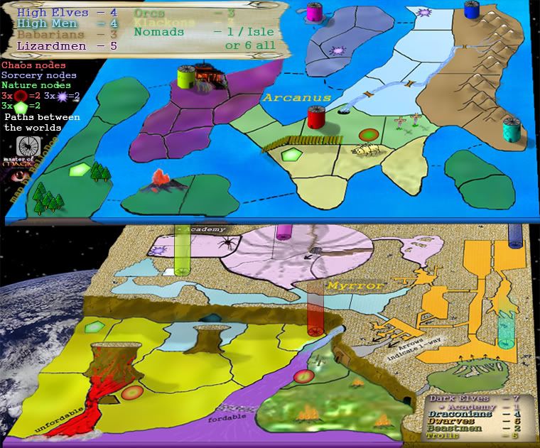
Its fine that you want it to have a different feel to other maps, but the colours don;t go whatsoever. At all. There are different hues, for example a vivid yellow and pastel purple which just make it look... well... ugly!
If you don't wanna check out a colour wheel at least take a look at some of the nice maps we have up at the moment or those that are in development. For example, the Middle Earth map has different colours but they are the same 'brightness'. By way of comparison, if you look at the legend the colours there are slightly brighter, and if you substituted the legend colour for the one on the actual map it would look wrong.
CC Master of Magic [Abandoned]
Moderator: Cartographers
78 posts
• Page 2 of 4 • 1, 2, 3, 4
![]() by Guiscard on Mon Mar 05, 2007 10:25 pm
by Guiscard on Mon Mar 05, 2007 10:25 pm
qwert wrote:Can i ask you something?What is porpose for you to open these Political topic in ConquerClub? Why you mix politic with Risk? Why you not open topic like HOT AND SEXY,or something like that.
-
 Guiscard
- Posts: 4103
- Joined: Fri Dec 08, 2006 7:27 pm
- Location: In the bar... With my head on the bar

![]() by unriggable on Mon Mar 05, 2007 10:35 pm
by unriggable on Mon Mar 05, 2007 10:35 pm
I don't like the concept of the map, too complicated, but judging from thoe overwhelming rity of the people here I best be staying out fo your way.
-

unriggable
- Posts: 8037
- Joined: Thu Feb 08, 2007 9:49 pm


![]() by Evil Pope on Mon Mar 05, 2007 11:01 pm
by Evil Pope on Mon Mar 05, 2007 11:01 pm
I don't see much wrong with it, as far as appearances go. It doesn't look bad; however, I think some of it could look a bit more.. 3D.. things look flat, which clashes with the 3D thing going on with the levels.
-

Evil Pope
- Posts: 275
- Joined: Fri Jan 13, 2006 8:39 pm
![]() by BelJoDoe on Mon Mar 05, 2007 11:13 pm
by BelJoDoe on Mon Mar 05, 2007 11:13 pm
I've tried to make things a little more 3D. I've improved the mountains and added shadows to the cylinder bases.
I understand and agree with Evil Pope's assessment of the "flat feeling". I'll try to address that when I figure out how ... If anyone can make suggestions (including how to implement them), that'd be much appreciated!
I understand and agree with Evil Pope's assessment of the "flat feeling". I'll try to address that when I figure out how
-
BelJoDoe
- Posts: 76
- Joined: Sat Oct 21, 2006 6:09 pm
- Location: UK
![]() by Captain Crash on Tue Mar 06, 2007 1:26 am
by Captain Crash on Tue Mar 06, 2007 1:26 am
BelJoDoe wrote:Can you be more specific about the childish graphics?
Also, links to the images for the maps you've mentioned would be nice.
Chinese Checkers:
http://www.conquerclub.com/forum/viewtopic.php?t=10403&start=375
Senate:
http://www.conquerclub.com/forum/viewtopic.php?t=10268&postdays=0&postorder=asc&start=270
King of the Mountains:
http://www.conquerclub.com/forum/viewtopic.php?t=11009&start=225
Conquer 4:
http://www.conquerclub.com/forum/viewtopic.php?t=13215
See what I mean now by childish graphics?
I like the idea of the multi-layered world, but it has to look nice too!


-

Captain Crash
- Posts: 252
- Joined: Thu Feb 01, 2007 7:06 pm
- Location: Melbourne

![]() by BelJoDoe on Tue Mar 06, 2007 6:57 am
by BelJoDoe on Tue Mar 06, 2007 6:57 am
Captain Crash, I understand what you like about those maps but they are very different maps. They use very simple shapes that can have crisp clean lines and get away with it. Some of those maps I like very much but I'm not trying to make a map of that sort. By setting my theme as "Master of Magic", I'm trying to give the map a different feel entirely to the maps you mentioned. What I was requesting in terms of the 'childish' graphics was where on my map in particular you felt was childish. If possible, I'd still like an answer to that question.
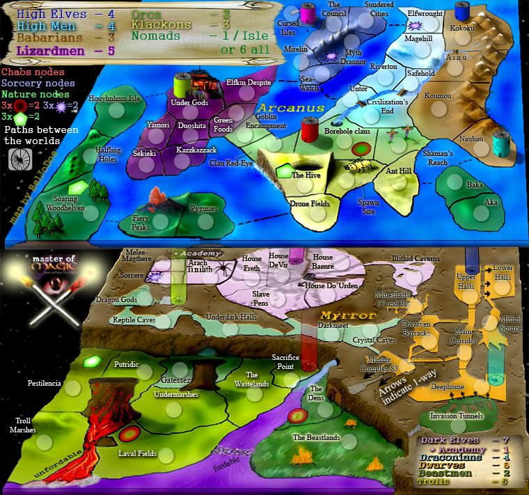
Antjo, I added the nodes because they're part of the game (MoM) and I still quite like the idea of wizards, from the game, linking together the nodes in order to increase their power and summon fearsome creatures of myth and legend.
If they think they'd actually affect gameplay in a negative way though, I'd still be interested to hear why, so thanks for the feedback.
-
BelJoDoe
- Posts: 76
- Joined: Sat Oct 21, 2006 6:09 pm
- Location: UK
![]() by XenHu on Tue Mar 06, 2007 8:09 am
by XenHu on Tue Mar 06, 2007 8:09 am
BelJoDoe wrote:
Good: The idea, although I personally wouldn't play it.
Bad: Everything else: For starters, I can't stand the texture. Myrror looks like it's sitting on carpet while the rest of the map has bland, flat texture(aside from Beastmen, which looks like badly pixelated grass .
Also, the way you have the boards positioned make it diffcult to see some of the territories. Do you plan on naming the territories? If so, that spider shadow will have to go. It would be diffcult to read anything with that there. Everything is still flat IMO(including the trees) and I find the colors don't work well with the map. The top legend is ok, although you would have to change the color on Klackons. However, I don't think that the bottom legend should be slanted like it is now. I almost found it impossible to read. Finally, I don't really like the fact that the game board seems to be 'suspended' in space.
-X
-

XenHu
- Posts: 4307
- Joined: Mon Nov 27, 2006 3:38 pm
![]() by Captain Crash on Wed Mar 07, 2007 1:49 am
by Captain Crash on Wed Mar 07, 2007 1:49 am
BelJoDoe wrote:Captain Crash, I understand what you like about those maps but they are very different maps. They use very simple shapes that can have crisp clean lines and get away with it. Some of those maps I like very much but I'm not trying to make a map of that sort. By setting my theme as "Master of Magic", I'm trying to give the map a different feel entirely to the maps you mentioned. What I was requesting in terms of the 'childish' graphics was where on my map in particular you felt was childish. If possible, I'd still like an answer to that question.
The top map feels like a childs painting, simple colors with very little texture. What extras are there, e.g. the trees, look like something out of an early 90s video game. (Yes I can remember what those were like).
The bottom map has a similar problem but the opposite: over used simple textures.
I like the idea of the multi-layered map, the 'slanted' or 'stacked' approach. But the graphics make it look silly and I feel people would be turned off from exploring your world because of this.
-
Captain Crash
- Posts: 252
- Joined: Thu Feb 01, 2007 7:06 pm
- Location: Melbourne
![]() by BelJoDoe on Sat Mar 10, 2007 9:09 pm
by BelJoDoe on Sat Mar 10, 2007 9:09 pm
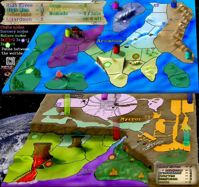
How's this?

By the way, in future, please draw any changes you wish me to add. That way, I have something to work towards and I know it can be done. So rather than telling me the colours are bad, if you could upload new colours for each area instead, I'd find your idea considerably easier to implement.
It would be helpful if I could receive more in the way of advice or actual help, rather than critisism, at this point.
As for the 2 planes being suspended above a planet, it's not to be taken literally, simply to give the impression that the planes are drawn from a 'real' world.
There has been some advice given that I have found helpful in creating a map for the community but largely the map or I have been critisised (or so I have felt, to date). I began doing this because I wanted to make something nice for the community and for the game. So far though, I've felt frankly unwelcome in the Map Foundry forum and made to feel like my efforts have been wasted. If there is no enthusiasm for this project from anyone other than myself, clearly that feeling is correct for the map must be unwanted.
If that continues to be the case, I shall create a poll to confirm this and put an end to my involvement in the MoM map.
-
BelJoDoe
- Posts: 76
- Joined: Sat Oct 21, 2006 6:09 pm
- Location: UK
![]() by Molacole on Sun Mar 11, 2007 1:20 am
by Molacole on Sun Mar 11, 2007 1:20 am
nah don't give up on this it looks like a very good map for playability. It's just the type of graphics you currently have on it are really not my style. I know I said I wouldn't, but I would play it... I would prefer to see it look different though. Right now it looks like an old school atari type screen and that just doesn't do a whole lot for me. Maybe a more modern day type of magical theme would work better. Best way I could describe what I mean is probably by saying if I had the same game for atari and playstation I would never even consider playing on the atari version because the playstation is more advanced and up to date.
The portals need lining up along with the volcano
The portals need lining up along with the volcano
-

Molacole
- Posts: 552
- Joined: Fri Jun 23, 2006 8:19 am
- Location: W 2.0 map by ZIM


![]() by Kebis on Sun Mar 11, 2007 5:13 pm
by Kebis on Sun Mar 11, 2007 5:13 pm
Looks like an interesting map. I think the color of the water on the top world could use some more texture, or possibly a deeper shade of blue. Maybe switch the blue of the water with the blue of the portal?
-

Kebis
- Posts: 4
- Joined: Sun Jan 07, 2007 3:47 pm
- Location: CA
Heroes
![]() by Shacekenhall on Thu May 24, 2007 1:25 pm
by Shacekenhall on Thu May 24, 2007 1:25 pm
This maps looks a lot like the game
"Heroes of migth and Magic 3"
Looks nice, if you are working thinking on that game, go ahead, if not, take a look at the game you would have good ideas.
Also, the graphics are ok, but can improve a lot.
Regards
Shace
"Heroes of migth and Magic 3"
Looks nice, if you are working thinking on that game, go ahead, if not, take a look at the game you would have good ideas.
Also, the graphics are ok, but can improve a lot.
Regards
Shace
AB ALIO EXPECTES ALTERI QUOD FECERIS
-

Shacekenhall
- Posts: 41
- Joined: Wed Jan 03, 2007 6:38 pm
- Location: Ecuador - Guayaquil


Time
![]() by Shacekenhall on Thu May 24, 2007 2:28 pm
by Shacekenhall on Thu May 24, 2007 2:28 pm
edbeard wrote:there's been no posts in this thread for 2 months. let the author bump the thread. other maps are seeking your comments, so don't waste everyone's time bumping maps that don't need it please
Ok, I won't waste your time. But you could be more courteus in your petition or I'm going to start to think you are an asshole.
Just a tought
Shace
AB ALIO EXPECTES ALTERI QUOD FECERIS
-
Shacekenhall
- Posts: 41
- Joined: Wed Jan 03, 2007 6:38 pm
- Location: Ecuador - Guayaquil

![]() by Great Pretender on Wed Jul 11, 2007 1:45 am
by Great Pretender on Wed Jul 11, 2007 1:45 am
I like it, I personally think that the graphics should be more "magical"
aslo i don't like the background (the space Earth thing)
keep working on it
aslo i don't like the background (the space Earth thing)
keep working on it


-
Great Pretender
- Posts: 336
- Joined: Mon Dec 11, 2006 4:29 am
![]() by BelJoDoe on Wed Jul 11, 2007 9:30 am
by BelJoDoe on Wed Jul 11, 2007 9:30 am

I cut the Earth out, you're not the only one that thought it was out of place.
I also made the map a little more magical by including a pair of crossed wands in place of the Earth.
Better? Any more ideas?
-
BelJoDoe
- Posts: 76
- Joined: Sat Oct 21, 2006 6:09 pm
- Location: UK
![]() by Molacole on Wed Jul 11, 2007 1:45 pm
by Molacole on Wed Jul 11, 2007 1:45 pm
the portals don't all line up.
The theme is great.
The graphics remind me of an old coleco vision/atari game maybe even old school nintendo and that is a big turn off for me.
I think if you could keep the same theme and use a different approach as far as graphics goes you could really have yourself a popular map!
The whole thing with the hovering style bug look just doesn't look good. In a way I guess I mean it doesn't all blend in and fit together smoothly.
-
Molacole
- Posts: 552
- Joined: Fri Jun 23, 2006 8:19 am
- Location: W 2.0 map by ZIM
![]() by BelJoDoe on Wed Jul 11, 2007 4:02 pm
by BelJoDoe on Wed Jul 11, 2007 4:02 pm
I'm glad you like the ideas behind the map. I anticipate it being fun to play (or maybe that should be, "I hope it will be fun to play").
I've thought about removing the ant that you referred to but I'm afraid that not many of today's games-players might know what a Klackon is or was... Orcs, Barbarians, Beastmen and Lizardmen etc are all easy. Lord of the Rings has guarenteed that we have a fair idea what a troll, a dwarf, an elf (and with a little imagination, a dark-elf) and such like might be. The noble races of Klackons and Draconians however are probably being forgotten
Draconians, of course, have it easy, the name has meaning in English and many may connect them to dragons but what's a Klackon? ... My little ant-creature is my own hommage to that dying race.
I'd prefer to keep it in but if everyone objects, I guess I have no choice
I'm working on the names and army-circles now so I expect that I'll post an update again, soon.
-
BelJoDoe
- Posts: 76
- Joined: Sat Oct 21, 2006 6:09 pm
- Location: UK
![]() by KEYOGI on Thu Jul 12, 2007 4:44 am
by KEYOGI on Thu Jul 12, 2007 4:44 am
I appreciate the effort you're putting into this map BelJoDoe, but I just don't feel this map is up to the standards set by Conquer Club. Perhaps see if you can get some help with the graphics by approaching some of the more experienced cartograhpers.
WidowMakers is offering his services for free... or food if you feel guilty about using his talent without giving something back.
Here's the link: http://www.conquerclub.com/forum/viewtopic.php?t=22136
WidowMakers is offering his services for free... or food if you feel guilty about using his talent without giving something back.
Here's the link: http://www.conquerclub.com/forum/viewtopic.php?t=22136
-
KEYOGI
- Posts: 1632
- Joined: Tue Oct 10, 2006 6:09 am


![]() by Molacole on Thu Jul 12, 2007 6:30 am
by Molacole on Thu Jul 12, 2007 6:30 am
BelJoDoe wrote:I'm glad you like the ideas behind the map. I anticipate it being fun to play (or maybe that should be, "I hope it will be fun to play").
I've thought about removing the ant that you referred to but I'm afraid that not many of today's games-players might know what a Klackon is or was... Orcs, Barbarians, Beastmen and Lizardmen etc are all easy. Lord of the Rings has guarenteed that we have a fair idea what a troll, a dwarf, an elf (and with a little imagination, a dark-elf) and such like might be. The noble races of Klackons and Draconians however are probably being forgotten
Draconians, of course, have it easy, the name has meaning in English and many may connect them to dragons but what's a Klackon? ... My little ant-creature is my own hommage to that dying race.
I'd prefer to keep it in but if everyone objects, I guess I have no choice
I'm working on the names and army-circles now so I expect that I'll post an update again, soon.
I see the map as an old school style map and I think you could keep your ant if you could manage to give this map more of a modern day feel to it.
It reminds me of an old video game with low-tech graphics so if you could give it a revamp of more modern or closer to modern day appearance I think you could score quit a few fans. The map itself as far as playability goes looks very interesting, but like I said before it's just too outdated looking to get mass appeal.
-
Molacole
- Posts: 552
- Joined: Fri Jun 23, 2006 8:19 am
- Location: W 2.0 map by ZIM
78 posts
• Page 2 of 4 • 1, 2, 3, 4
Return to Melting Pot: Map Ideas
Who is online
Users browsing this forum: No registered users
|
|||||||
| Conquer Club is not associated with RISK online in any way. Copyright © 2006-2025 by Big Wham LLC | |||||||