France-Update 20=no texture
Moderator: Cartographers
![]() by Ruben Cassar on Sat Mar 24, 2007 2:03 pm
by Ruben Cassar on Sat Mar 24, 2007 2:03 pm
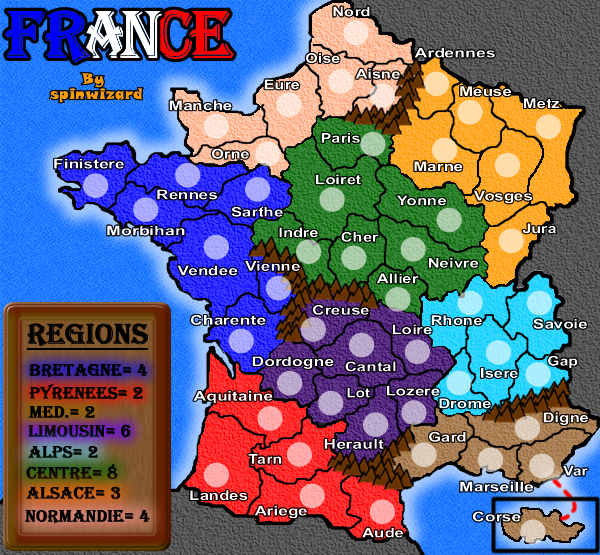
I like the cartoonish look of this map but I want Corsica in there and I will continue to complain about this...Corsica is part of France and should be included.


-
 Ruben Cassar
- Posts: 2160
- Joined: Thu Nov 16, 2006 6:04 am
- Location: Civitas Invicta, Melita, Evropa


![]() by spinwizard on Sat Mar 24, 2007 3:51 pm
by spinwizard on Sat Mar 24, 2007 3:51 pm
Wisse wrote:i prefered kyles one this one sucks
thanks 4 the encoragement, care 2 elaborate?
-
spinwizard
- Posts: 5016
- Joined: Sun Dec 10, 2006 9:52 am


![]() by spinwizard on Sat Mar 24, 2007 3:52 pm
by spinwizard on Sat Mar 24, 2007 3:52 pm
boberz wrote:the circles are much too big and that makes the map seem very crowded but i will maintain in every post until Kyle turns up that i prefer his map
ok then, y is kyles so much better?
*waits 4 kyle 2 make a comment*
-
spinwizard
- Posts: 5016
- Joined: Sun Dec 10, 2006 9:52 am
![]() by boberz on Sat Mar 24, 2007 3:57 pm
by boberz on Sat Mar 24, 2007 3:57 pm
its better in every way but mainly it looks so much more proffesional and it seems to represent france better i have nothing against cartoony maps in general but france is known as a sophisticated society and a professional map looks better, but if kyle does not want to complete it then it is pointless me complaining how aboutn pm and see what he plans to do
-

boberz
- Posts: 864
- Joined: Sun Dec 03, 2006 12:21 pm


![]() by spinwizard on Sat Mar 24, 2007 4:05 pm
by spinwizard on Sat Mar 24, 2007 4:05 pm
ok u pm him and see (his map crashed cause his photoshop free trial ended) i like the cartoon feel but i will make a 2nd more sophisticated version then poll for the options, happy?
also the newest version is abit less cartoony cause the texture is used more and beter colours!
do u like the mountains?
also the newest version is abit less cartoony cause the texture is used more and beter colours!
do u like the mountains?
-
spinwizard
- Posts: 5016
- Joined: Sun Dec 10, 2006 9:52 am
![]() by boberz on Sat Mar 24, 2007 4:11 pm
by boberz on Sat Mar 24, 2007 4:11 pm
thank you for doing that now i understand.
army circles must be smaller (I know i have already said that)
i think it is just the font that makes it look less sophisticated change that and it will be better
Corsica is in France it must be included i think especially as thisis a new map there isnt the "we talked about this earlier" or "its too late now" arguments
-
boberz
- Posts: 864
- Joined: Sun Dec 03, 2006 12:21 pm
![]() by spinwizard on Sat Mar 24, 2007 4:19 pm
by spinwizard on Sat Mar 24, 2007 4:19 pm
i have'nt pm'd him 2 ask but if u look u will see he was asking 4 a photoshop key code cause his trial ended (here) and he says that he cant finnish his french map
-
spinwizard
- Posts: 5016
- Joined: Sun Dec 10, 2006 9:52 am
![]() by Wisse on Sat Mar 24, 2007 4:21 pm
by Wisse on Sat Mar 24, 2007 4:21 pm
ok here it comes (i make a comment on the map before your laste one because your last one is ugly):
make the army circles tinyer
don't put the outern shade around every word it looks ugly
make anather texture for the sea
make anather texture for the unplayable land
make the army circles tinyer
don't put the outern shade around every word it looks ugly
make anather texture for the sea
make anather texture for the unplayable land


-
Wisse
- Posts: 4448
- Joined: Fri Oct 13, 2006 2:59 pm
- Location: The netherlands, gelderland, epe


![]() by cairnswk on Sat Mar 24, 2007 4:43 pm
by cairnswk on Sat Mar 24, 2007 4:43 pm
Spinwizard...i like this map, even with its cartoon like appearance, with some exceptions.
* I can see you are using a combination of commune (towns) and department names for the districts. Is it possible to include some of the more well-known names such as Champagne (an official region), Dijon, Bordeaux, Lyon, Calais, Nice, Le Mans.
http://www.gites-de-france.com/gites/uk ... er_un_gite
This map is a very good reference showing the main towns within the 96 districts within the 22 regions and includes Corsica, which I agree with others - you should be including on this map.
* Perhaps change the title font to that of the Legend font, that might lose the cartoon like appearance that everyone seems to have some objection to.
* The Alps region colour - everytime I look at it, it conjours up the image that there is a lake there. Is it possible for a colour change?
* I feel there needs to be more of a distiction in the region colours between Britagne and Limousin
* Do you plan to include any other geographical features such as rivers?
Hope this helps.

* Pearl Harbour * Waterloo * Forbidden City * Jamaica * Pot Mosbi
-

cairnswk
- Posts: 11510
- Joined: Sat Feb 03, 2007 8:32 pm
- Location: Australia


![]() by spinwizard on Sat Mar 24, 2007 4:48 pm
by spinwizard on Sat Mar 24, 2007 4:48 pm
cairnswk wrote:Spinwizard...i like this map, even with its cartoon like appearance, with some exceptions.
* I can see you are using a combination of commune (towns) and department names for the districts. Is it possible to include some of the more well-known names such as Champagne (an official region), Dijon, Bordeaux, Lyon, Calais, Nice, Le Mans.
http://www.gites-de-france.com/gites/uk ... er_un_gite
This map is a very good reference showing the main towns within the 96 districts within the 22 regions and includes Corsica, which I agree with others - you should be including on this map.
* Perhaps change the title font to that of the Legend font, that might lose the cartoon like appearance that everyone seems to have some objection to.
* The Alps region colour - everytime I look at it, it conjours up the image that there is a lake there. Is it possible for a colour change?
* I feel there needs to be more of a distiction in the region colours between Britagne and Limousin
* Do you plan to include any other geographical features such as rivers?
Hope this helps.
erm, my names were chose with size in mind. eg instead of a big nape (champagnon i chose marine cause it is short, is this ok?
i am only useing mountains as my rivers look rubbish
-
spinwizard
- Posts: 5016
- Joined: Sun Dec 10, 2006 9:52 am
![]() by Ruben Cassar on Sat Mar 24, 2007 5:14 pm
by Ruben Cassar on Sat Mar 24, 2007 5:14 pm
spinwizard wrote:i tryed, i cant fit corsica!
If you had tried hard enough you could fit it in. Or maybe you do not want to try to include it because that would involve doing more work.
Just make an inset or something in the lower right corner. You can make the continental part of France smaller as there will be less territories that you can add in Corsica instead.
You can even fiddle with the angle of the map like RJ Beals has done with his Italy map. Do not tell me you cannot do it though because it is possible to do it...you just do not want to be bothered with including Corsica.
-
Ruben Cassar
- Posts: 2160
- Joined: Thu Nov 16, 2006 6:04 am
- Location: Civitas Invicta, Melita, Evropa
-
spinwizard
- Posts: 5016
- Joined: Sun Dec 10, 2006 9:52 am
![]() by cairnswk on Sat Mar 24, 2007 5:49 pm
by cairnswk on Sat Mar 24, 2007 5:49 pm
spinwizard wrote:cairnswk wrote:Spinwizard...i like this map, even with its cartoon like appearance, with some exceptions.
* I can see you are using a combination of commune (towns) and department names for the districts. Is it possible to include some of the more well-known names such as Champagne (an official region), Dijon, Bordeaux, Lyon, Calais, Nice, Le Mans.
http://www.gites-de-france.com/gites/uk ... er_un_gite
This map is a very good reference showing the main towns within the 96 districts within the 22 regions and includes Corsica, which I agree with others - you should be including on this map.
* Perhaps change the title font to that of the Legend font, that might lose the cartoon like appearance that everyone seems to have some objection to.
* The Alps region colour - everytime I look at it, it conjours up the image that there is a lake there. Is it possible for a colour change?
* I feel there needs to be more of a distiction in the region colours between Britagne and Limousin
* Do you plan to include any other geographical features such as rivers?
Hope this helps.
erm, my names were chose with size in mind. eg instead of a big nape (champagnon i chose marine cause it is short, is this ok?
i am only useing mountains as my rivers look rubbish
* Rivers - no worries
* Names - thanks for the reasoning, i understand your thinking, although I still think the map would project better to players if some of the names were more in line with possibly what players might know, rather than obscure deaprtment names that players might not be familiar with. For instance - Nord could become Calais, Aquitaine could become Bordeaux, Vendee could become Nantes, Indre could become Tours, Sarthe might become Le Mans, Rhone might become Lyon, etc.
* The title you changed looks much better now - more French and even this is the style that is used in so many posters I have seen about France -looks very civilized and classy.
This version is looking much better.
One last aspect....can you work the red white and blue of the title into the legend, so that the region names are backed by white and red and blue form the borders of the legend?
Give it a go and see what it looks like. Perhaps those region colour might become clearer with a white background.
Excellent work...btw!
* Pearl Harbour * Waterloo * Forbidden City * Jamaica * Pot Mosbi
-
cairnswk
- Posts: 11510
- Joined: Sat Feb 03, 2007 8:32 pm
- Location: Australia
![]() by spinwizard on Sat Mar 24, 2007 5:54 pm
by spinwizard on Sat Mar 24, 2007 5:54 pm
cairnswk wrote:spinwizard wrote:cairnswk wrote:Spinwizard...i like this map, even with its cartoon like appearance, with some exceptions.
* I can see you are using a combination of commune (towns) and department names for the districts. Is it possible to include some of the more well-known names such as Champagne (an official region), Dijon, Bordeaux, Lyon, Calais, Nice, Le Mans.
http://www.gites-de-france.com/gites/uk ... er_un_gite
This map is a very good reference showing the main towns within the 96 districts within the 22 regions and includes Corsica, which I agree with others - you should be including on this map.
* Perhaps change the title font to that of the Legend font, that might lose the cartoon like appearance that everyone seems to have some objection to.
* The Alps region colour - everytime I look at it, it conjours up the image that there is a lake there. Is it possible for a colour change?
* I feel there needs to be more of a distiction in the region colours between Britagne and Limousin
* Do you plan to include any other geographical features such as rivers?
Hope this helps.
erm, my names were chose with size in mind. eg instead of a big nape (champagnon i chose marine cause it is short, is this ok?
i am only useing mountains as my rivers look rubbish
* Rivers - no worries
* Names - thanks for the reasoning, i understand your thinking, although I still think the map would project better to players if some of the names were more in line with possibly what players might know, rather than obscure deaprtment names that players might not be familiar with. For instance - Nord could become Calais, Aquitaine could become Bordeaux, Vendee could become Nantes, Indre could become Tours, Sarthe might become Le Mans, Rhone might become Lyon, etc.
* The title you changed looks much better now - more French and even this is the style that is used in so many posters I have seen about France -looks very civilized and classy.
This version is looking much better.
One last aspect....can you work the red white and blue of the title into the legend, so that the region names are backed by white and red and blue form the borders of the legend?
Give it a go and see what it looks like. Perhaps those region colour might become clearer with a white background.
Excellent work...btw!
thanks 4 ur comments,
i don't get what the red bit means!
-
spinwizard
- Posts: 5016
- Joined: Sun Dec 10, 2006 9:52 am
![]() by Samus on Sat Mar 24, 2007 6:10 pm
by Samus on Sat Mar 24, 2007 6:10 pm
The Manche-Orne border reverted back, you need to fix it again. 
Centre and Limousin are both unholdable. Now I'm okay with one of them being like this, but 2 of your 8 regions seems like a waste. Limousin is almost there, I think if you block off the Herault-Tarn border, it then has 4 total border territories. Still hard to hold, but not impossible now.
Most of the bonuses are good, with the exception of Normandie. It has 6 territories with 3 borders, which is identical to Alsace, thus is worth +3.
That's all I see for now.
-

Samus
- Posts: 372
- Joined: Mon Jan 01, 2007 12:33 pm

![]() by Ruben Cassar on Sat Mar 24, 2007 6:27 pm
by Ruben Cassar on Sat Mar 24, 2007 6:27 pm
Hmm I am not entirely satisfied with the Corsica solution but it is definitely better than nothing!
-
Ruben Cassar
- Posts: 2160
- Joined: Thu Nov 16, 2006 6:04 am
- Location: Civitas Invicta, Melita, Evropa
![]() by spinwizard on Sun Mar 25, 2007 3:48 am
by spinwizard on Sun Mar 25, 2007 3:48 am
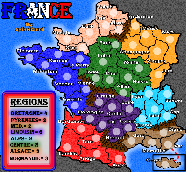
-changes some names
-put in another set of mountains by pyreenes
-changed normande bonus
-changed legend
-
spinwizard
- Posts: 5016
- Joined: Sun Dec 10, 2006 9:52 am
![]() by Wisse on Sun Mar 25, 2007 3:52 am
by Wisse on Sun Mar 25, 2007 3:52 am
ok here it comes:
-make anather texture for the water
-make anather texture for the land this looks ugly
-also make anather texture for the not-playable land but make this anather texture than the playable land
-make the borders all the same thickness
-choose a different font for the title
-make th army shades a bit more transparant
-change the outern glow from land -> sea to an outern shade
-the legend looks ugly and needs a total make-over
-
Wisse
- Posts: 4448
- Joined: Fri Oct 13, 2006 2:59 pm
- Location: The netherlands, gelderland, epe
Return to Melting Pot: Map Ideas
Who is online
Users browsing this forum: No registered users
|
|||||||
| Conquer Club is not associated with RISK online in any way. Copyright © 2006-2025 by Big Wham LLC | |||||||