AntarcticaV10 [Abandoned]
Moderator: Cartographers
82 posts
• Page 2 of 4 • 1, 2, 3, 4
-

 wrightfan123
- Posts: 601
- Joined: Sat Jan 06, 2007 2:58 pm
- Location: Looking over every baseball team's schedule to try to determine who will win the World Series.


![]() by edocsil on Tue Jun 12, 2007 11:07 pm
by edocsil on Tue Jun 12, 2007 11:07 pm
for some reason this is updating int the ideas section but i didnt put it here could someone put it back into the foundry?
Edoc'sil
Commander9 wrote:Trust Edoc, as I know he's VERY good.
zimmah wrote:Mind like a brick.
-

edocsil
- Posts: 102
- Joined: Sat Apr 28, 2007 8:09 am
- Location: The Great State Of Minnesota


![]() by KEYOGI on Wed Jun 13, 2007 6:28 am
by KEYOGI on Wed Jun 13, 2007 6:28 am
The thread has been moved to the ideas forum until you've shown that the map is in development. At the moment, all you've really shown is a very rough draft that is hard to leave any feedback on.
Make sure you read over the new Sub-Forum Organization & Other Things! announcement.
Make sure you read over the new Sub-Forum Organization & Other Things! announcement.
-
KEYOGI
- Posts: 1632
- Joined: Tue Oct 10, 2006 6:09 am


![]() by edocsil on Mon Jun 18, 2007 9:58 am
by edocsil on Mon Jun 18, 2007 9:58 am
Manoman: Looks good, but make it a little brighter.
ok did that also changed some border things and brought down the value of East Antarctica (5 to 4)
ok did that also changed some border things and brought down the value of East Antarctica (5 to 4)
Edoc'sil
Commander9 wrote:Trust Edoc, as I know he's VERY good.
zimmah wrote:Mind like a brick.
-
edocsil
- Posts: 102
- Joined: Sat Apr 28, 2007 8:09 am
- Location: The Great State Of Minnesota
![]() by Neutrino on Wed Jun 20, 2007 12:44 am
by Neutrino on Wed Jun 20, 2007 12:44 am
The straight edged territories look a bit unnatural and the title looks a bit out of place, but other than that, Great map.
We own all your helmets, we own all your shoes, we own all your generals. Touch us and you loooose...
The Rogue State!
The Rogue State!
-

Neutrino
- Posts: 2693
- Joined: Wed Sep 20, 2006 2:53 am
- Location: Combating the threat of dihydrogen monoxide.


![]() by edocsil on Fri Jun 22, 2007 10:02 am
by edocsil on Fri Jun 22, 2007 10:02 am
fixed the teritory lines so they wernt so blocky made they contry lines cyan and added 4 teritories
Edoc'sil
Commander9 wrote:Trust Edoc, as I know he's VERY good.
zimmah wrote:Mind like a brick.
-
edocsil
- Posts: 102
- Joined: Sat Apr 28, 2007 8:09 am
- Location: The Great State Of Minnesota
![]() by RobinJ on Fri Jun 22, 2007 10:32 am
by RobinJ on Fri Jun 22, 2007 10:32 am
This map needs a bit of a makeover...
1) Text for the territories isn't easy enough to read and this is the large version? Also, try to get the Elisworth Mountains label straighter - vertical does not work
2) Putting the continent names on the map looks messy - just colour-code the legend - it would be much better.
3) I don't know where the Transatlantic mountains are, unless they are a part of the texture. Just put some mountain graphics in and leave a space in them where you want to make them passable (that would also allow you to remove the rather messy note in the legend)
4) The line colours are too harsh. Tone down the black to grey and also blur them a bit to remove some sharpness. The cyan doesn't look too great either unfortunately - is it necessary? Also, the lines are too straight and jagged in places - allow them to curve more so that the map is easier on the eye.
5) I see you have images in the background. You need to make them to stand out more if they are to have any value
What I do like is the texture but I'm afraid that's about it. Out of interest, what program did you use?
Anyway, there's some constructive criticism - make use of it. Also, perhaps take a look at the Arctic map - you might gain some good ideas
1) Text for the territories isn't easy enough to read and this is the large version?
2) Putting the continent names on the map looks messy - just colour-code the legend - it would be much better.
3) I don't know where the Transatlantic mountains are, unless they are a part of the texture. Just put some mountain graphics in and leave a space in them where you want to make them passable (that would also allow you to remove the rather messy note in the legend)
4) The line colours are too harsh. Tone down the black to grey and also blur them a bit to remove some sharpness. The cyan doesn't look too great either unfortunately - is it necessary? Also, the lines are too straight and jagged in places - allow them to curve more so that the map is easier on the eye.
5) I see you have images in the background. You need to make them to stand out more if they are to have any value
What I do like is the texture but I'm afraid that's about it. Out of interest, what program did you use?
Anyway, there's some constructive criticism - make use of it. Also, perhaps take a look at the Arctic map - you might gain some good ideas
nmhunate wrote:Speak English... It is the language that God wrote the bible in.
Highest Score: 2437
Highest Place: 84
-

RobinJ
- Posts: 1901
- Joined: Mon Aug 21, 2006 1:56 pm
- Location: Northern Ireland


![]() by edocsil on Fri Jun 22, 2007 11:09 am
by edocsil on Fri Jun 22, 2007 11:09 am
Thanks this is the kind of info i need i was flying blind b4
im using inkscape and it isnt so great for image editing its kinda like powerpoint but i dont know how to use any of the other recomended ones
i might go buy photoshop
this is the small one
the TA mnts r texured in here but the text covers them .......
and the borders r a piece of cake to change
ok i put in most those changes that robin sugested in v6 but left the TA mnts thing because i dont know how to make it clear with just pics
Edoc'sil
Commander9 wrote:Trust Edoc, as I know he's VERY good.
zimmah wrote:Mind like a brick.
-
edocsil
- Posts: 102
- Joined: Sat Apr 28, 2007 8:09 am
- Location: The Great State Of Minnesota
![]() by gimil on Fri Jun 22, 2007 12:05 pm
by gimil on Fri Jun 22, 2007 12:05 pm
download the trial photoshop then find someone with the keygen for it 
Conquerclub.com does not advertise nor approve of any breach in copyright law and ensures that its online community does not committe a copyright offence within the premesis of its site
Conquerclub.com does not advertise nor approve of any breach in copyright law and ensures that its online community does not committe a copyright offence within the premesis of its site
What do you know about map making, bitch?
Top Score:2403
natty_dread wrote:I was wrong
Top Score:2403
-

gimil
- Posts: 8599
- Joined: Sat Mar 03, 2007 12:42 pm
- Location: United Kingdom (Scotland)


![]() by edocsil on Fri Jun 22, 2007 12:25 pm
by edocsil on Fri Jun 22, 2007 12:25 pm
: D if the trial is some 30 day thing ill just download it and use it for the month
Edoc'sil
Commander9 wrote:Trust Edoc, as I know he's VERY good.
zimmah wrote:Mind like a brick.
-
edocsil
- Posts: 102
- Joined: Sat Apr 28, 2007 8:09 am
- Location: The Great State Of Minnesota
![]() by edocsil on Fri Jun 22, 2007 3:36 pm
by edocsil on Fri Jun 22, 2007 3:36 pm
i was thinking about it but thats only tru on the magnetic pole thatsof the eastern coast
Edoc'sil
Commander9 wrote:Trust Edoc, as I know he's VERY good.
zimmah wrote:Mind like a brick.
-
edocsil
- Posts: 102
- Joined: Sat Apr 28, 2007 8:09 am
- Location: The Great State Of Minnesota
![]() by Balsiefen on Mon Jun 25, 2007 7:30 am
by Balsiefen on Mon Jun 25, 2007 7:30 am
Very nice. You need a few more impassable borders and i'd add some clearly impassable graphics for the mountains (even if its just a thicker line)
-

Balsiefen
- Posts: 2299
- Joined: Wed Aug 30, 2006 6:15 am
- Location: The Ford of the Aldar in the East of the Kingdom of Lindissi


![]() by edocsil on Tue Jun 26, 2007 10:12 am
by edocsil on Tue Jun 26, 2007 10:12 am
no there is actuly a mountain range there
antarctica falling apart?? some of the iceshelfs (they r on the map) r melting but the whole place certainently isnt breaking up maybe u mean the arctic?
antarctica falling apart?? some of the iceshelfs (they r on the map) r melting but the whole place certainently isnt breaking up maybe u mean the arctic?
Edoc'sil
Commander9 wrote:Trust Edoc, as I know he's VERY good.
zimmah wrote:Mind like a brick.
-
edocsil
- Posts: 102
- Joined: Sat Apr 28, 2007 8:09 am
- Location: The Great State Of Minnesota
![]() by edocsil on Tue Jun 26, 2007 10:55 am
by edocsil on Tue Jun 26, 2007 10:55 am
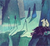
V7 - added the mountains (thanks DiM for the help), changed the country values, made the terit text darker, fixed the penguin

Last edited by edocsil on Tue Jun 26, 2007 11:40 am, edited 1 time in total.
Edoc'sil
Commander9 wrote:Trust Edoc, as I know he's VERY good.
zimmah wrote:Mind like a brick.
-
edocsil
- Posts: 102
- Joined: Sat Apr 28, 2007 8:09 am
- Location: The Great State Of Minnesota
![]() by DiM on Tue Jun 26, 2007 10:59 am
by DiM on Tue Jun 26, 2007 10:59 am
you're welcome. the mountains look good.
one thing. could you post the updates in the first page but also in your post?
for example the post above me is the post where you present V9, but to look at v9 i had to go to page one. if that post included v9 it would have been much easier to follow.
one thing. could you post the updates in the first page but also in your post?
for example the post above me is the post where you present V9, but to look at v9 i had to go to page one. if that post included v9 it would have been much easier to follow.
“In the beginning God said, the four-dimensional divergence of an antisymmetric, second rank tensor equals zero, and there was light, and it was good. And on the seventh day he rested.”- Michio Kaku
-

DiM
- Posts: 10415
- Joined: Wed Feb 14, 2007 6:20 pm
- Location: making maps for scooby snacks


![]() by gimil on Tue Jun 26, 2007 12:12 pm
by gimil on Tue Jun 26, 2007 12:12 pm
here what i feel needs attention:
1. the mountains do look good BUT they blend to much into the background try to make them stand out a little by either darkening them or mibi adding a shadow
2. lose the title it horrible.
3. the whole map looks a little to blue change the overlay which is doing it please
keep up the good work thou id like to see this map move on
What do you know about map making, bitch?
Top Score:2403
natty_dread wrote:I was wrong
Top Score:2403
-
gimil
- Posts: 8599
- Joined: Sat Mar 03, 2007 12:42 pm
- Location: United Kingdom (Scotland)
82 posts
• Page 2 of 4 • 1, 2, 3, 4
Return to Melting Pot: Map Ideas
Who is online
Users browsing this forum: No registered users
|
|||||||
| Conquer Club is not associated with RISK online in any way. Copyright © 2006-2025 by Big Wham LLC | |||||||