cowshrptrn wrote:don't worry pope, i got ur OCD covered
Haha, thanks for that..
And maybe you should try a black and white logo as P Gizzle suggested, altough I also like it as it is..
Moderator: Cartographers
![]() by cowshrptrn on Mon Aug 28, 2006 11:16 pm
by cowshrptrn on Mon Aug 28, 2006 11:16 pm


![]() by reverend_kyle on Tue Aug 29, 2006 2:04 am
by reverend_kyle on Tue Aug 29, 2006 2:04 am


![]() by gavin_sidhu on Tue Aug 29, 2006 2:19 am
by gavin_sidhu on Tue Aug 29, 2006 2:19 am

![]() by Ishiro on Tue Aug 29, 2006 6:03 am
by Ishiro on Tue Aug 29, 2006 6:03 am


![]() by cowshrptrn on Tue Aug 29, 2006 8:38 am
by cowshrptrn on Tue Aug 29, 2006 8:38 am

![]() by gavin_sidhu on Tue Aug 29, 2006 8:44 am
by gavin_sidhu on Tue Aug 29, 2006 8:44 am
![]() by cowshrptrn on Tue Aug 29, 2006 8:46 am
by cowshrptrn on Tue Aug 29, 2006 8:46 am
![]() by gavin_sidhu on Tue Aug 29, 2006 8:50 am
by gavin_sidhu on Tue Aug 29, 2006 8:50 am
![]() by gavin_sidhu on Tue Aug 29, 2006 8:56 am
by gavin_sidhu on Tue Aug 29, 2006 8:56 am
![]() by cowshrptrn on Tue Aug 29, 2006 10:45 am
by cowshrptrn on Tue Aug 29, 2006 10:45 am

![]() by Ishiro on Tue Aug 29, 2006 11:10 am
by Ishiro on Tue Aug 29, 2006 11:10 am
cowshrptrn wrote:ok, iamde it black and white and changed the font. Its smooth tho, so it doesn't go w/ the grainy texture of the picture, if anyone know how to fix that w/ photoshop plz tell me

![]() by cowshrptrn on Tue Aug 29, 2006 12:10 pm
by cowshrptrn on Tue Aug 29, 2006 12:10 pm

![]() by Ishiro on Tue Aug 29, 2006 12:50 pm
by Ishiro on Tue Aug 29, 2006 12:50 pm
![]() by cowshrptrn on Tue Aug 29, 2006 1:01 pm
by cowshrptrn on Tue Aug 29, 2006 1:01 pm

![]() by sully800 on Tue Aug 29, 2006 7:22 pm
by sully800 on Tue Aug 29, 2006 7:22 pm


![]() by happysadfun on Tue Aug 29, 2006 8:21 pm
by happysadfun on Tue Aug 29, 2006 8:21 pm
 Children, this is what happens to hockey players, druggies, and Hillary Clinton.
Return to Melting Pot: Map Ideas
Users browsing this forum: No registered users
|
|||||||
| Conquer Club is not associated with RISK online in any way. Copyright © 2006-2025 by Big Wham LLC | |||||||


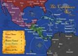 MIDDLE AMERICA MAP