lol
Conquer Club Park [Abandoned]
Moderator: Cartographers
108 posts
• Page 4 of 5 • 1, 2, 3, 4, 5


![]() by killerkid037 on Sun Jul 15, 2007 9:01 pm
by killerkid037 on Sun Jul 15, 2007 9:01 pm
thegeneralpublic wrote:I concur; the background picture looks fine to me! This map is looking downright awesome!
Agreed.
-

 killerkid037
- Posts: 39
- Joined: Tue Jun 05, 2007 3:50 am
![]() by musicman_379 on Mon Jul 16, 2007 1:59 pm
by musicman_379 on Mon Jul 16, 2007 1:59 pm
edbeard wrote:I'm totally against the background you currently have.
1. It's probably copyrighted so you'll have to deal with that and probably not worth the hassle.
2. More importantly it doesn't look right at all. The contrast between the gameplay area and this drawing as the background stands out too much.
I think you're missing an opportunity here. You can draw an actual background of the map outside. Parking lot. A river. Freeway. Possibly draw a pitcher or a batter or something.
To be Frank, what you have now looks bad. Shirley you can do quite a bit better.
As for other parts of the graphics. I think it'd be cool if you could actually draw in the seats on the bleachers. The boxes and sweets would obviously need a different look, but it could really add something if done subtley.
AndyDufresne wrote:I agree with most everything edbeard has suggested, especially the background part.
--Andy
Though the picture is one I personally took, the "All trademarks are property of thier respective owners" disclaimer probably wouldn't be enough for the visible ads. And, the more I think about it, a background of things nearby a baseball stadium is the best way to go.
After changing the background, the textures will be getting the most work.

-

musicman_379
- Posts: 141
- Joined: Sat Apr 07, 2007 2:22 pm
- Location: SW Kansas

![]() by musicman_379 on Mon Jul 16, 2007 8:24 pm
by musicman_379 on Mon Jul 16, 2007 8:24 pm
Another new update:


2 Changes:
>A new background--
streets, grass, concourse outside the stadium, river/stream
>Scoreboard legend resized and moved
I'm changing graphics programs to better accomplish the texture concerns. Thanks for the comments and please keep them coming.
2 Changes:
>A new background--
streets, grass, concourse outside the stadium, river/stream
>Scoreboard legend resized and moved
I'm changing graphics programs to better accomplish the texture concerns. Thanks for the comments and please keep them coming.
-
musicman_379
- Posts: 141
- Joined: Sat Apr 07, 2007 2:22 pm
- Location: SW Kansas
![]() by Kaplowitz on Mon Jul 16, 2007 8:27 pm
by Kaplowitz on Mon Jul 16, 2007 8:27 pm
NO! YOU RUINED IT! it was looking sooo much better! You cant see the score board at all, and the bg has to be much darker, lighter, or different. It looks too much like the rest of the map.
And, yes as you mentioned, textures should be added.
And, yes as you mentioned, textures should be added.

-

Kaplowitz
- Posts: 3088
- Joined: Tue May 01, 2007 5:11 pm


![]() by thegeneralpublic on Mon Jul 16, 2007 8:43 pm
by thegeneralpublic on Mon Jul 16, 2007 8:43 pm
The scoreboard idea was cool, but unless it's EXACTLY right (and considering it's a vertical view, you won't be able to while it's legible), it looks like crapola. Just go back to how you had it in D1, in the corner.
EDIT: And as for the background, it looked much better with the real picture. If you could take one of your own or get someone else to, it would look much better. Without it, it really does look like you spent maybe five minutes on it. With the good picture, it looks more like the seating chart you see when buying tickets.
EDIT: And as for the background, it looked much better with the real picture. If you could take one of your own or get someone else to, it would look much better. Without it, it really does look like you spent maybe five minutes on it. With the good picture, it looks more like the seating chart you see when buying tickets.
-
thegeneralpublic
- Posts: 126
- Joined: Fri Mar 09, 2007 9:49 pm
- Location: In front of my computer screen.
ok...
![]() by Keredrex on Tue Jul 17, 2007 12:08 am
by Keredrex on Tue Jul 17, 2007 12:08 am
Not bad but i agree put the legend back in the corner smaller ...
as for the background.... it needs more and should be lighter or greyscale that way the map stands out, and you should shrink those roads.. (look at a google map to see the style).... Show some of a Parking lot of to a corner or something...
you should write the title across the top with the Legend in the same box.... try using a baseball or sports inspired Font Style... Like the way the scoreboard looks at a game... and
-

Keredrex
- Posts: 400
- Joined: Sun Jan 14, 2007 1:41 am
- Location: New York


The stands
![]() by oldbenjamin on Tue Jul 24, 2007 5:18 pm
by oldbenjamin on Tue Jul 24, 2007 5:18 pm
The upper deck, press box, and suites seem to be a little too easy, considering there are only three places they open up onto the mezzanine, and the incredible bonus
-
oldbenjamin
- Posts: 56
- Joined: Mon Jun 11, 2007 5:21 pm


![]() by musicman_379 on Tue Jul 24, 2007 6:27 pm
by musicman_379 on Tue Jul 24, 2007 6:27 pm
Update 7:

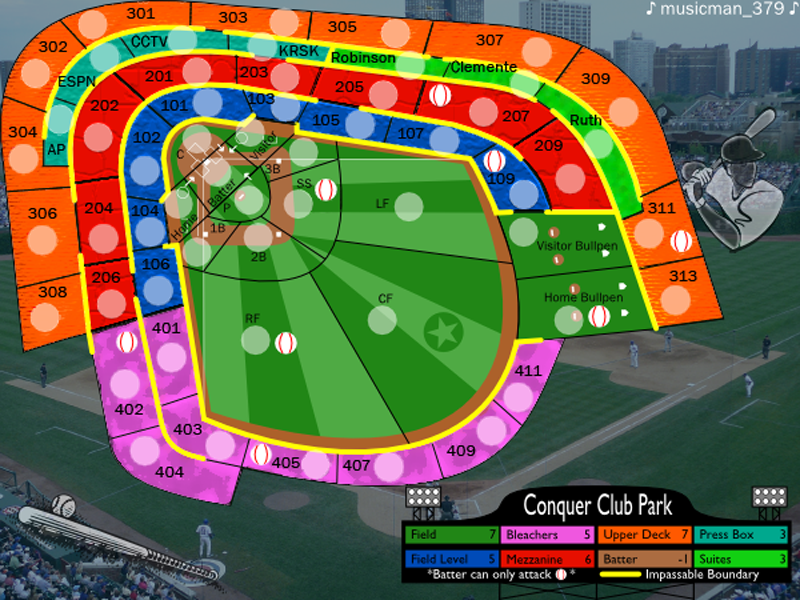
Changes from Previous:
Background change
Scoreboard Legend resized and moved
Map Title on scoreboard
Textures added
Changes from Previous:
Background change
Scoreboard Legend resized and moved
Map Title on scoreboard
Textures added
-
musicman_379
- Posts: 141
- Joined: Sat Apr 07, 2007 2:22 pm
- Location: SW Kansas

![]() by Daring Overlord5 on Tue Jul 24, 2007 6:41 pm
by Daring Overlord5 on Tue Jul 24, 2007 6:41 pm
i have to agree with riggable
THE BLUE TERRITORY JUST LOOKS LIKE CRAPOLA!!!!
for a first attempt at texture, i guess he did ok
its starting to look like a playable map now
riggable wrote:I don't like the new texture. It seems forced and doesnt have anything really to do with the map. Try make a bench like texure, so the territories look more like grandstands.
THE BLUE TERRITORY JUST LOOKS LIKE CRAPOLA!!!!
for a first attempt at texture, i guess he did ok
its starting to look like a playable map now
-

Daring Overlord5
- Posts: 1511
- Joined: Fri Aug 11, 2006 4:13 pm
- Location: KANSAS


![]() by edbeard on Tue Jul 24, 2007 6:41 pm
by edbeard on Tue Jul 24, 2007 6:41 pm
not trying to be mean, but this is a large step backward.
The background area is just plain bad. I said this already so you can go back and read it if you want to be reminded. You never mentioned whether you got the right to use it either.
The batter and the bat are nice. Are they your design? Free for use clip art?
You just threw textures onto the map. I'm not a fan of the outfield lines, but at least they could exist in a real stadium. The textures you have applied are just bad. They're not anything like how real seats are. It looks better without them.
The Legend is quite good. Apply the same effort to the background you had in the previous update and to the bleachers. This will do wonders for the map.
Put cars in the parking lot. The roads should probably be thinner.
You were headed in the right direction and took a wrong turn. But, you can easily get back on track.
-

edbeard
- Posts: 2501
- Joined: Thu Mar 29, 2007 12:41 am


I agree
![]() by Keredrex on Tue Jul 24, 2007 8:07 pm
by Keredrex on Tue Jul 24, 2007 8:07 pm
Go back to the "GOOGLE Maps" look to the background... Hell if you have to take a snap shot of random roads and highways and clean off the names and place it behind the stadium... I see no issue doing it that way.... as long as it is random and unnamed.... Obviously use an area that has some curve to the road that would fit your Stadium ... maybe if there is a lake or river in it ...and a parking lot or something.....
textures...GONE.. if anything you would be better off with no textures at all... Or look at a stadium seating map and Make a texture of a few seats.. and place it around your stadium....you could even get an arial pic of grass and make a texture with that for the field....Make the Outfield lines a bit closer to the green color to much contrast the way they are now.... you don't need to texture the background... in fact it should be Grayscale.....to let the field stand out....
The Bonus board ... great leave it be
Bonuses????they need work i think -- you may want to consult the CLub with a poll.. I posted an earlier option...Swap the Upper deck and the Mezzanine.. also make Suites worth 2 since they are easier to defend than the Press boxes...
-
Keredrex
- Posts: 400
- Joined: Sun Jan 14, 2007 1:41 am
- Location: New York
![]() by musicman_379 on Wed Jul 25, 2007 2:18 pm
by musicman_379 on Wed Jul 25, 2007 2:18 pm
Time for a rebuttal:
Looking again at what I actually did with the textures, it really doesn't fit with a ballpark at all. Textures, if any, should be bleacher seats to look like grandstands.
I don't think I ever said this, but the backgroud picture was a personal picture taken on a recent vacation. The batter and bat are clip arts, but I am unsure whether they are free-for-use. I used the clip art function from my word processing program. Also, the clip arts cover up previously visible logos in the picture.
I started my update post before you posted this, and it was fininshed before my post was finished, so it was not factored in the update...sorry. But I will look at that, though. About the poll, I set a time limit for the first one, and I can't make a new one.
The negative bonus for the batter is because of its power. It is the only position that can distance attack, and it can attack more countires and continents than any other position.
riggable wrote:I don't like the new texture. It seems forced and doesnt have anything really to do with the map. Try make a bench like texure, so the territories look more like grandstands.
Keredrex wrote:textures...GONE.. if anything you would be better off with no textures at all... Or look at a stadium seating map and Make a texture of a few seats...
Looking again at what I actually did with the textures, it really doesn't fit with a ballpark at all. Textures, if any, should be bleacher seats to look like grandstands.
edbeard wrote:The background area is just plain bad. I said this already so you can go back and read it if you want to be reminded. You never mentioned whether you got the right to use it either.
The batter and the bat are nice. Are they your design? Free for use clip art?
I don't think I ever said this, but the backgroud picture was a personal picture taken on a recent vacation. The batter and bat are clip arts, but I am unsure whether they are free-for-use. I used the clip art function from my word processing program. Also, the clip arts cover up previously visible logos in the picture.
Keredrex wrote:Bonuses????they need work i think -- you may want to consult the CLub with a poll.. I posted an earlier option...Swap the Upper deck and the Mezzanine.. also make Suites worth 2 since they are easier to defend than the Press boxes...
I started my update post before you posted this, and it was fininshed before my post was finished, so it was not factored in the update...sorry. But I will look at that, though. About the poll, I set a time limit for the first one, and I can't make a new one.
Night Strike wrote:Why is the batter a -1?
The negative bonus for the batter is because of its power. It is the only position that can distance attack, and it can attack more countires and continents than any other position.
-
musicman_379
- Posts: 141
- Joined: Sat Apr 07, 2007 2:22 pm
- Location: SW Kansas
![]() by edbeard on Wed Jul 25, 2007 4:44 pm
by edbeard on Wed Jul 25, 2007 4:44 pm
musicman_379 wrote:I don't think I ever said this, but the backgroud picture was a personal picture taken on a recent vacation. The batter and bat are clip arts, but I am unsure whether they are free-for-use. I used the clip art function from my word processing program. Also, the clip arts cover up previously visible logos in the picture.
well I think your play area and this background have way too much of a contrast. just looks like they don't belong together.
a possible good idea would be just to use this picture as your map and abandon the drawing you have. (Maybe keep the scoreboard if your picture doesn't have one in it) apply some type of glow similar to the San Francisco Map to clarify continents. I actually like this idea a lot.
you could use the players on the field to connect directly and possibly the area around them as a separate territory.
something to think about anyway.
-
edbeard
- Posts: 2501
- Joined: Thu Mar 29, 2007 12:41 am
![]() by killerkid037 on Fri Jul 27, 2007 11:40 pm
by killerkid037 on Fri Jul 27, 2007 11:40 pm
Kaplowitz wrote:NO! YOU RUINED IT! it was looking sooo much better! You cant see the score board at all, and the bg has to be much darker, lighter, or different. It looks too much like the rest of the map.
And, yes as you mentioned, textures should be added.
Agreed. It was fine before, I thought the first one was much better.
-
killerkid037
- Posts: 39
- Joined: Tue Jun 05, 2007 3:50 am
![]() by Risktaker17 on Sat Jul 28, 2007 8:16 am
by Risktaker17 on Sat Jul 28, 2007 8:16 am
Why is the batter -1.
Highest place: 40 1/17/08
Highest point total: 2773 1/17/08
Top Poster Position: 97th
Highest point total: 2773 1/17/08
Top Poster Position: 97th
-

Risktaker17
- Posts: 1495
- Joined: Sun Apr 01, 2007 8:09 am


![]() by musicman_379 on Mon Oct 01, 2007 10:39 am
by musicman_379 on Mon Oct 01, 2007 10:39 am
After much thought, I have decided to indefinitely suspend my development on Conquer Club Park. I may work more on it in December, but I am more or less abandoning the project. 
<<FOR ANYONE INTERESTED>>
The PNG images are on photobucket.com, just type musicman_379 in the search bar. I also have SVG files as well, so if you would like those as well, please PM me about it.
<<FOR ANYONE INTERESTED>>
The PNG images are on photobucket.com, just type musicman_379 in the search bar. I also have SVG files as well, so if you would like those as well, please PM me about it.
-
musicman_379
- Posts: 141
- Joined: Sat Apr 07, 2007 2:22 pm
- Location: SW Kansas
![]() by cairnswk on Mon Oct 01, 2007 10:45 am
by cairnswk on Mon Oct 01, 2007 10:45 am
music man....sorry to hear your are abondoning this.
1. is your poll finished?
2. if someone else wants to finish this map, are they able to do so with you permission? Please advise ASAP so that this may be determined now, and not later, thanks.
1. is your poll finished?
2. if someone else wants to finish this map, are they able to do so with you permission? Please advise ASAP so that this may be determined now, and not later, thanks.

* Pearl Harbour * Waterloo * Forbidden City * Jamaica * Pot Mosbi
-

cairnswk
- Posts: 11510
- Joined: Sat Feb 03, 2007 8:32 pm
- Location: Australia


108 posts
• Page 4 of 5 • 1, 2, 3, 4, 5
Return to Melting Pot: Map Ideas
Who is online
Users browsing this forum: No registered users
|
|||||||
| Conquer Club is not associated with RISK online in any way. Copyright © 2006-2025 by Big Wham LLC | |||||||