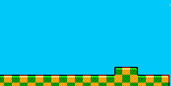
Conquer Club

New Mideast Map Graphic - Better or Worse?

Have an idea for a map? Discuss ideas and concepts here.

Moderator: Cartographers

Forum rules
Please read the Community Guidelines before posting.

Mideast Map Revamp - Yay or Nay

Poll ended at Thu May 31, 2007 4:13 pm

 
Total votes : 0

New Mideast Map Graphic - Better or Worse?

Postby mbs on Thu May 24, 2007 4:13 pm

I don't like the new Mideast map graphic that much as I feel the older one was more legible. But what does everybody else think?

New graphic:
Image

Old graphic:

Gone! Can't find a copy anyplace. Bleh.
User avatar
Lieutenant mbs
 
Posts: 10
Joined: Sun Mar 18, 2007 4:49 am
Location: Austin, TX

Postby Keredrex on Thu May 24, 2007 4:24 pm

I Think It's Better.... Perfect... NO.... But Definitely Better
User avatar
Sergeant 1st Class Keredrex
 
Posts: 400
Joined: Sun Jan 14, 2007 1:41 am
Location: New York

Postby Beastly on Thu May 24, 2007 4:26 pm

I hate the color scheme, I wish it wasn't changed!!!

pissed me off!

I joined the game, because I liked how it was.

not to have it changed.

It was better before!
User avatar
Corporal 1st Class Beastly
 
Posts: 1137
Joined: Tue Feb 21, 2006 3:48 am

Postby Coleman on Thu May 24, 2007 4:43 pm

Beastly wrote:I hate the color scheme, I wish it wasn't changed!!!

pissed me off!

I joined the game, because I liked how it was.

not to have it changed.

It was better before!
:shock: You are kidding right?

Anyway, the thumbnail needs to change.
Warning: You may be reading a really old topic.
User avatar
Sergeant Coleman
 
Posts: 5402
Joined: Tue Jan 02, 2007 10:36 pm
Location: Midwest

Postby t.e.c on Thu May 24, 2007 7:42 pm

much much better. everyone who thinks otherwise are idiots :wink:
Corporal t.e.c
 
Posts: 298
Joined: Sat Dec 09, 2006 10:55 am
Location: aichi, japan

Postby Coleman on Thu May 24, 2007 7:46 pm

t.e.c wrote:much much better. everyone who thinks otherwise are idiots :wink:

Or at the very least outnumbered 8 to 1 in the foundry.
Warning: You may be reading a really old topic.
User avatar
Sergeant Coleman
 
Posts: 5402
Joined: Tue Jan 02, 2007 10:36 pm
Location: Midwest

Postby Beastly on Thu May 24, 2007 8:09 pm

Colors are to much alike.

If you think I'm a idiot for having a opinion, then everybody must be a idiot.


You should go flame me in the right thread....but what can you expect from a NEWB.
User avatar
Corporal 1st Class Beastly
 
Posts: 1137
Joined: Tue Feb 21, 2006 3:48 am

Postby AndyDufresne on Thu May 24, 2007 8:13 pm

Throughout the length of the REVAMP thread, it was pointed out the colors could be so close, due to the fact the names of each continent is written on each specific location.


--Andy
User avatar
Corporal 1st Class AndyDufresne
 
Posts: 24935
Joined: Fri Mar 03, 2006 8:22 pm
Location: A Banana Palm in Zihuatanejo

Postby sfhbballnut on Thu May 24, 2007 8:16 pm

I love the Revamp, it's much more profeesional and all around better looking now
Corporal sfhbballnut
 
Posts: 1687
Joined: Fri May 05, 2006 3:01 pm

Postby KEYOGI on Fri May 25, 2007 1:55 am

I understand why some people would not appreciate the new graphics, it is a different approach to anything else on the site. I take offence at saying they're worse than something whipped up in paint though. :wink:
Sergeant 1st Class KEYOGI
 
Posts: 1632
Joined: Tue Oct 10, 2006 6:09 am

Postby AK_iceman on Fri May 25, 2007 2:09 am

Meh, it doesn't really appeal to me, but I do appreciate the work KEYOGI went through to make the map better. =D>
User avatar
Sergeant 1st Class AK_iceman
 
Posts: 5704
Joined: Wed May 10, 2006 10:39 pm

Postby t.e.c on Fri May 25, 2007 3:09 am

Beastly wrote: If you think I'm a idiot for having a opinion, then everybody must be a idiot.


You should go flame me in the right thread....but what can you expect from a NEWB.

no you didn't pull out the newb call, did you? :shock: well that just confirms my opinion.
Corporal t.e.c
 
Posts: 298
Joined: Sat Dec 09, 2006 10:55 am
Location: aichi, japan

Postby Iliad on Fri May 25, 2007 3:20 am

Beastly wrote:Colors are to much alike.

If you think I'm a idiot for having a opinion, then everybody must be a idiot.


You should go flame me in the right thread....but what can you expect from a NEWB.

no he said that it is better and anyone who thinks otherwise is an idiot. Very different so actually learn how to read.

and it is much better now.
User avatar
Private 1st Class Iliad
 
Posts: 10394
Joined: Mon Mar 05, 2007 12:48 am

Postby Guiscard on Fri May 25, 2007 6:52 am

100% better. If people don't like the colour scheme then, quite frankly, they should pay more attention to the foundry and should have commented when it was under discussion. Most people in development thought the colour scheme in this state was the right way to go, and Keyogi presented us with numerous other options to debate.
qwert wrote:Can i ask you something?What is porpose for you to open these Political topic in ConquerClub? Why you mix politic with Risk? Why you not open topic like HOT AND SEXY,or something like that.
User avatar
Private 1st Class Guiscard
 
Posts: 4103
Joined: Fri Dec 08, 2006 7:27 pm
Location: In the bar... With my head on the bar

Postby Molacole on Fri May 25, 2007 7:07 am

I'm kind of on the fence with this one maybe leaning a bit towards better looking.

The only thing I don't like about it is the way it looks with numbers on it. The map itself as a picture is top notch and very nice to look at. I also like how the names of the bonus helped describe what's what.

I just don't like the weird mixture of a beige type map with a bright ass rainbow running through it. It throws everything off...
User avatar
Lieutenant Molacole
 
Posts: 552
Joined: Fri Jun 23, 2006 8:19 am
Location: W 2.0 map by ZIM

Postby alex_white101 on Fri May 25, 2007 7:17 am

i think its awesome!
''Many a true word is spoken in jest''
User avatar
Corporal 1st Class alex_white101
 
Posts: 1992
Joined: Sun Feb 25, 2007 1:05 am

Postby Beastly on Fri May 25, 2007 3:37 pm

KEYOGI wrote:I understand why some people would not appreciate the new graphics, it is a different approach to anything else on the site. I take offence at saying they're worse than something whipped up in paint though. :wink:


ok I have joined on the map again, and I like it now..

I think it is a great improvement actually, So kudos.. to the revamp..
User avatar
Corporal 1st Class Beastly
 
Posts: 1137
Joined: Tue Feb 21, 2006 3:48 am

Postby Qwert on Fri May 25, 2007 5:46 pm

Revamp of Revamp.Its these posible? :?
Image
NEW REVOLUTION-NEW RANKS PRESS THESE LINK viewtopic.php?f=471&t=47578&start=0
User avatar
Major Qwert
SoC Training Adviser
 
Posts: 9262
Joined: Tue Nov 07, 2006 5:07 pm
Location: VOJVODINA

Postby Steel Panzer on Fri May 25, 2007 6:00 pm

qwert wrote:Revamp of Revamp.Its these posible? :?


it could be possible...in a year or so when the graphic requirments will possibly be bigger, but i don't see the problem with this revamp. it gives the map an antique view, like i imagine middle east.
Image
User avatar
Corporal 1st Class Steel Panzer
 
Posts: 459
Joined: Sun May 13, 2007 4:24 am

Postby KEYOGI on Fri May 25, 2007 6:29 pm

Yes, a revamp of a revamped map would be possible. The original cartographer and the revamp cartographer would have to agree though.
Sergeant 1st Class KEYOGI
 
Posts: 1632
Joined: Tue Oct 10, 2006 6:09 am

Postby fireedud on Fri May 25, 2007 6:46 pm

Guiscard wrote:100% better. If people don't like the colour scheme then, quite frankly, they should pay more attention to the foundry and should have commented when it was under discussion. Most people in development thought the colour scheme in this state was the right way to go, and Keyogi presented us with numerous other options to debate.


No, If people don't like, they just don't play it!
Cook fireedud
 
Posts: 1704
Joined: Fri Mar 02, 2007 10:06 pm

Postby kingwaffles on Fri May 25, 2007 7:00 pm

I really like the new look, but why is it so LOTResque?
Image
User avatar
Corporal 1st Class kingwaffles
 
Posts: 718
Joined: Mon Jan 23, 2006 9:05 am
Location: Pseudopolis Yard, Ankh Morpork, Discworld

Postby KEYOGI on Fri May 25, 2007 7:13 pm

I think the real question is why not?

That was my intention though and where I took some of the inspiration from since the original cartographer was looking for an ancient parchment look to the map.
Sergeant 1st Class KEYOGI
 
Posts: 1632
Joined: Tue Oct 10, 2006 6:09 am

Postby sully800 on Fri May 25, 2007 7:33 pm

Beastly wrote:
KEYOGI wrote:I understand why some people would not appreciate the new graphics, it is a different approach to anything else on the site. I take offence at saying they're worse than something whipped up in paint though. :wink:


ok I have joined on the map again, and I like it now..

I think it is a great improvement actually, So kudos.. to the revamp..


lol, at least you came around!
User avatar
Major sully800
 
Posts: 4978
Joined: Wed Jun 14, 2006 5:45 pm
Location: Bethlehem, Pennsylvania

Postby ParadiceCity9 on Fri May 25, 2007 9:37 pm

are you kidding me..the new ones money!
Corporal 1st Class ParadiceCity9
 
Posts: 4239
Joined: Thu Feb 15, 2007 4:10 pm

Next

Return to Melting Pot: Map Ideas

Who is online

Users browsing this forum: No registered users

cron