The graphics have drastically improved, it's hard to tell when they're ever done though.
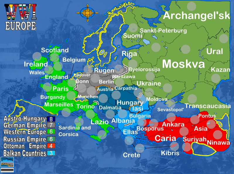
Your size is fine for a large, but it will need to be much smaller for the small version. To help this I would just take Iceland off the map, move the legend to the top left corner, and move the WWI to the bottom left, then you'll be able to make the map shorter, so to speak.
You'll prolly be needing army shadows, so be sure to place those. That will show how crowded parts of your map will become, and will probably lead to a dispersing of country size, so that you dont have so many small ones and so many large ones. Also, with 49 countries, no matter what, you'll have neutral armies. You'll prolly wanna lose/gain a country to at least have an even number.
WWI EUROPE 1914[ABANDONED]
Moderator: Cartographers
Forum rules
Please read the Community Guidelines before posting.
Please read the Community Guidelines before posting.
-
DublinDoogey

- Posts: 329
- Joined: Tue Feb 28, 2006 7:03 pm
- Location: Wisconsin
-
happysadfun

- Posts: 1251
- Joined: Mon Jul 10, 2006 9:06 pm
- Location: Haundin at DotSco, Being Sad that Mark Green Lost in Suburban Wisconsin
 Children, this is what happens to hockey players, druggies, and Hillary Clinton.
-
DublinDoogey
- Posts: 329
- Joined: Tue Feb 28, 2006 7:03 pm
- Location: Wisconsin
-
happysadfun
- Posts: 1251
- Joined: Mon Jul 10, 2006 9:06 pm
- Location: Haundin at DotSco, Being Sad that Mark Green Lost in Suburban Wisconsin
-
reverend_kyle

- Posts: 9250
- Joined: Tue Mar 21, 2006 4:08 pm
- Location: 1000 post club
- Contact:

-
Ruben Cassar
- Posts: 2160
- Joined: Thu Nov 16, 2006 6:04 am
- Gender: Male
- Location: Civitas Invicta, Melita, Evropa
-
gavin_sidhu

- Posts: 1428
- Joined: Mon May 22, 2006 6:16 am
- Location: Brisbane, Australia


-
AndyDufresne

- Posts: 24935
- Joined: Fri Mar 03, 2006 8:22 pm
- Location: A Banana Palm in Zihuatanejo
- Contact:
-
DublinDoogey
- Posts: 329
- Joined: Tue Feb 28, 2006 7:03 pm
- Location: Wisconsin
-
gavin_sidhu
- Posts: 1428
- Joined: Mon May 22, 2006 6:16 am
- Location: Brisbane, Australia
-
reverend_kyle
- Posts: 9250
- Joined: Tue Mar 21, 2006 4:08 pm
- Location: 1000 post club
- Contact:

-
Ruben Cassar
- Posts: 2160
- Joined: Thu Nov 16, 2006 6:04 am
- Gender: Male
- Location: Civitas Invicta, Melita, Evropa

I think the map needs some work, visually at least.
I don't like the neutral territories. Can't they be done a better way? I feel they should be solid at least.
I think the text throughout needs to be consistent. The variety of sizes and orientations make it inconsistent and (no offense) ugly in my opinion.
The numbers shadows are too dark. It's going to be extremely difficult to read green or blue numbers on them at present.
The natural borders could use some work. I don't think they're overly clear. Maybe they could benefit from being bigger/thicker?
The key/legend is very cramped. If you took out the neutral territories at the bottom of the map, you could use that space to spread the key/legend out a bit. Space (or in visual/design terms "white space") is extremely important. I also don't think it'd hurt to seperate the key/legend from the background with some shading behind it or something to reduce the busy-ness behind the text.
Final point. I don't think the "ring effect" in the continents works. Is there a reason behind it, because I can't see how it ties to WWI or anything else. I think a simple texture would work better.
It looks playable though. I just find it visually confusing.

-
Qwert

- SoC Training Adviser
- Posts: 9262
- Joined: Tue Nov 07, 2006 5:07 pm
- Location: VOJVODINA
- Contact:
i can pleased everybody, some like maps and some dont.
you got planty of maps where numbers shadows it's dark-
standard world map
germany map
tamriel map
ancient greece
europe
america
in some of these you can see wery difficult blue and stil people play these maps.
You say to took out the neutral territories, and some say to put,who is right.
Have somebody can confuse Russia and Western Europe,only a daltonist can.
I put some original numbers on map with all 7 colors