
I love the style, do not change the style of graphics (.eg. mountains/ attack line arrows.)
Like most have said though the colours need changing.
the blue clashes with rivers, i suggest don't have a blue continent.
(unless you change the orange cont to blue and blue to orange, as the current orange continent has no rivers.
tone down all the colours, and I suggest change the baige/cream coloured continent to a different colour, purple?
Or, have you thought about having every country that beige / cream colour (In keeping with the original hand drawn map) Then to signify continent have outlines, glow, inner glow as the different colours.
Last thing the text needs to be a little smaller. Plus, one font needs to be chosen (I like the one in the blue continent, can you make that bolder? if not the one in the green)
EDIT: also, change the red borders in some places to just normal dark grey, and borders for small town and dagonaut city need to be cleaned up.
Plus texture for the sea looks pretty awful
I love the map, i have to say, this and China are my two favourite at the moment, this looks really really good, you've struck gold in my opinion with the anime/ abstract style!
Really Really great work!
Land of Tiuri: ABANDONED
Moderator: Cartographers
Forum rules
Please read the Community Guidelines before posting.
Please read the Community Guidelines before posting.


Oops!
Something got wrong in the upload.
Here is the image:

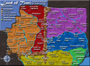
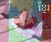
I made East Unauwen darker, and Eviellan also.
I don't like the Eviellan color right now, I think I'll make it some brighter again.
I also changed the West Unauwen/South Dagonaut colors.
I left the sea for what it is now, I'll look at it later.
Choose your font.
Because no-one really liked the other font, I made some new.
Look and choose the one you like.
I counted 54 country's now, maybe that needs some changings too.
But first, I would like ALL comments on layout.
Something got wrong in the upload.
Here is the image:
I made East Unauwen darker, and Eviellan also.
I don't like the Eviellan color right now, I think I'll make it some brighter again.
I also changed the West Unauwen/South Dagonaut colors.
I left the sea for what it is now, I'll look at it later.
Choose your font.
Because no-one really liked the other font, I made some new.
Look and choose the one you like.
I counted 54 country's now, maybe that needs some changings too.
But first, I would like ALL comments on layout.
-
spinwizard
- Posts: 5016
- Joined: Sun Dec 10, 2006 9:52 am

-
Nikita_2006
- Posts: 486
- Joined: Thu Oct 19, 2006 8:35 am
A few things, i like the font in the green section, although when sized down i think most will say its too hard to read...
in the orange continent, you need to tone down the orange (it's too bright compared to the other continents (others are more dull)
also, a few of the rivers need to be widened just a tad.
in the purple continent, the purple needs to be lightened, you can't see the border lines well enough.
not all of the continents are on the key, i don't know which you mean
I realise they are at the beginning of the thread but i cba looking
one last thing, again sea texture must be changed, red line must be removed. Plus, i don't think the land should shadow the sea areas, the black line is enough.
in the orange continent, you need to tone down the orange (it's too bright compared to the other continents (others are more dull)
also, a few of the rivers need to be widened just a tad.
in the purple continent, the purple needs to be lightened, you can't see the border lines well enough.
I made East Unauwen darker, and Eviellan also.
I don't like the Eviellan color right now, I think I'll make it some brighter again.
I also changed the West Unauwen/South Dagonaut colors.
not all of the continents are on the key, i don't know which you mean
I realise they are at the beginning of the thread but i cba looking
one last thing, again sea texture must be changed, red line must be removed. Plus, i don't think the land should shadow the sea areas, the black line is enough.
"It is fatal to enter any war without the will to win it."
- General Douglas MacArthur
- General Douglas MacArthur
Well, here's the update:

Things that are done:
- Made small rivers some bigger
- Resized all fonts (except Deltaland)
- Made West Unauwen darker
- Made North Dagonaut lighter
- Added a kompass in the lowerleft corner
- Added a legend, which I really like
- Removed red lines
- Changed sea texture
Your opinion about fonts is strange.
Firstly, no-one liked the font.
So I added some new ones.
And now, everyone likes the older font. (deltaland)
Well, here's the opinioncount:
Deltaland 3
North Dagonaut 2 (also me)
More opinions are needed!!
(but also thanks for all opinions so far)
Edit: There is now also a discussion going on about me making this map (copyright issues). I will see what gets out.
-
Bad Speler
- Posts: 1027
- Joined: Fri Jun 02, 2006 8:16 pm
- Gender: Male
- Location: Ottawa
- Contact:
The map is beautiful.
The sea looks much better, you can just keep it like that or add a bit more texture to it (but very discreetly.)
About the font, I fear that a lot of people will say the deltaland is too unreadable, i suggest having deltaland font for the legend and something similar, but simpler for the country names.
For the font (for the countries,) my vote goes to Eviellan, although it seems it's not as white as the other fonts?
+ can you make an example of what it would look like but bolder?
Then you could keeps the legend and Title as the Deltaland font...
It's looking really nice, now all i think you need is the right fonts and army shadows! (do the shadows after though!)
two last things, one is that there needs to be a border line between south city and pass to eveillan.
The other is that south dagonaut, 6 borders seems quite a lot, maybe you should remove the two brdges at Mirtelan's castle? unless you're going for a hard to hold, low no. of countries continent. If you are I feel that continent will become a bit of a desert to attack between red, yellow, green and purple.
"It is fatal to enter any war without the will to win it."
- General Douglas MacArthur
- General Douglas MacArthur

Turion Map
I think this a great idea and a great map. It seems very interesting. I think lack should put this on his to-do list. Bad Speler has made some great maps before. Ex: Artic
-
Bad Speler
- Posts: 1027
- Joined: Fri Jun 02, 2006 8:16 pm
- Gender: Male
- Location: Ottawa
- Contact:


Wisse wrote:why do you have those black lines near the sea?
What are you talking about?
qwert wrote:My opinion its that you must have 1 Text style not 6 diferent.
You must create better mountains.
Can you read?
Everyone is supposed to vote.
Bad Speler wrote:Small town is...well...a bit too small. It is very hard to tell the borders there.
Next update I will move the text.
Good point, by the way.
bedplay wrote:About the font, I fear that a lot of people will say the deltaland is too unreadable, i suggest having deltaland font for the legend and something similar, but simpler for the country names.
For the font (for the countries,) my vote goes to Eviellan, although it seems it's not as white as the other fonts?
+ can you make an example of what it would look like but bolder?
Then you could keeps the legend and Title as the Deltaland font...
It's looking really nice, now all i think you need is the right fonts and army shadows! (do the shadows after though!)
Good point.
See next update.
bedplay wrote:two last things, one is that there needs to be a border line between south city and pass to eveillan.
The other is that south dagonaut, 6 borders seems quite a lot, maybe you should remove the two brdges at Mirtelan's castle? unless you're going for a hard to hold, low no. of countries continent. If you are I feel that continent will become a bit of a desert to attack between red, yellow, green and purple.
Oops!
I totally forgot that border.
See next update.
About the continents, I want to do visuals first.
Eviellan is rising....
qwert wrote:What vote? I see pool question"DO YOU LIKE THIS MAP?". And these not mean that people like 6 diferent text font style, and these mountain, these only mean that people like yours idea, or not.
I love the mountains and don't want them to changed a single bit, they go with the stle of the overall map.
he can't change the poll, he asked in an earlier post if people would just post which font they want.
And santon, by the black lines, wisse means why are the lines so much bigger than the normal border lines on the sea borders, I don't mind, but maybe we could see them smaller?
Can't wait for the next update, and btw, you are very quick at fixing these problems, good work
"It is fatal to enter any war without the will to win it."
- General Douglas MacArthur
- General Douglas MacArthur
-
Nikita_2006
- Posts: 486
- Joined: Thu Oct 19, 2006 8:35 am