“In the beginning God said, the four-dimensional divergence of an antisymmetric, second rank tensor equals zero, and there was light, and it was good. And on the seventh day he rested.”- Michio Kaku
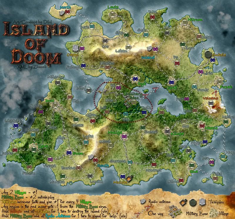
I think you could try a different font for the territory names... Or at the very least, you could smooth out that stroke and make it a bit more like a dark outer glow.
The same with the coloured text in the legend, btw.
natty_dread wrote:I think you could try a different font for the territory names... Or at the very least, you could smooth out that stroke and make it a bit more like a dark outer glow.
The same with the coloured text in the legend, btw.
the font stays. i really like it.
the stroke will be tweaked.
“In the beginning God said, the four-dimensional divergence of an antisymmetric, second rank tensor equals zero, and there was light, and it was good. And on the seventh day he rested.”- Michio Kaku
“In the beginning God said, the four-dimensional divergence of an antisymmetric, second rank tensor equals zero, and there was light, and it was good. And on the seventh day he rested.”- Michio Kaku
If you're using PS and Stroke, do you have the stroke effect on "position: centered"? If so, changing it to "position: outside" would probably help.
it's outside
“In the beginning God said, the four-dimensional divergence of an antisymmetric, second rank tensor equals zero, and there was light, and it was good. And on the seventh day he rested.”- Michio Kaku
natty_dread wrote:You could try a drop shadow instead.
it has a drop shadow, an outer glow and an outside stroke. aside from an inner shadow and an inner glow there's nothing else i can add, and the inner effects won't help. in fact they'll make the text illegible.
“In the beginning God said, the four-dimensional divergence of an antisymmetric, second rank tensor equals zero, and there was light, and it was good. And on the seventh day he rested.”- Michio Kaku
That's the problem with dynamic filters (ie. layers styles and such)... lack of precision. They're convenient and all, but you're limited with the settings that are coded to the filters...
Anyway, there's got to be something you can do to them. Maybe you can try a thicker glow or shadow, or maybe you can try to find a similar font that is a little bolder, unless there's a bold version of your current font available? I don't know, I'm sure you'll figure something out.
natty_dread wrote:That's the problem with dynamic filters (ie. layers styles and such)... lack of precision. They're convenient and all, but you're limited with the settings that are coded to the filters...
Anyway, there's got to be something you can do to them. Maybe you can try a thicker glow or shadow, or maybe you can try to find a similar font that is a little bolder, unless there's a bold version of your current font available? I don't know, I'm sure you'll figure something out.
that's already bolded. unbolded looks like crap
“In the beginning God said, the four-dimensional divergence of an antisymmetric, second rank tensor equals zero, and there was light, and it was good. And on the seventh day he rested.”- Michio Kaku
“In the beginning God said, the four-dimensional divergence of an antisymmetric, second rank tensor equals zero, and there was light, and it was good. And on the seventh day he rested.”- Michio Kaku
“In the beginning God said, the four-dimensional divergence of an antisymmetric, second rank tensor equals zero, and there was light, and it was good. And on the seventh day he rested.”- Michio Kaku
“In the beginning God said, the four-dimensional divergence of an antisymmetric, second rank tensor equals zero, and there was light, and it was good. And on the seventh day he rested.”- Michio Kaku
I am satisfied with the new choice of font as well. It look alot clear. Nice one.
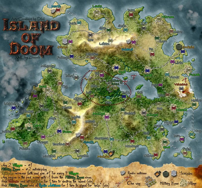
The only thing I don't really like now is the arrangement of the legend icons n the right hand side. I think they could be better arranged... utilising the space better. Other than that I think we are about there.
gimil wrote:The only thing I don't really like now is the arrangement of the legend icons n the right hand side. I think they could be better arranged... utilising the space better. Other than that I think we are about there.
utilising the space better is a very vague suggestion.
could you be a bit more specific?
are the icons too close? too far apart? too to the right? should they be smaller/larger?
“In the beginning God said, the four-dimensional divergence of an antisymmetric, second rank tensor equals zero, and there was light, and it was good. And on the seventh day he rested.”- Michio Kaku
gimil wrote:The only thing I don't really like now is the arrangement of the legend icons n the right hand side. I think they could be better arranged... utilising the space better. Other than that I think we are about there.
utilising the space better is a very vague suggestion.
could you be a bit more specific?
are the icons too close? too far apart? too to the right? should they be smaller/larger?
To...untidy. Not immediately understandable. I would go for an arrangement where 'radio antenna' is above 'village'. 'Temples' next to 'village' and then fit the bigger 'military base' and 'one way' in the remaining space.
i can't place them that way. one way and the military base are the biggest icons so they both need to be on the same line.
the best i can do for you is move the one way and military base icons to fit and follow the line of the legend space.
“In the beginning God said, the four-dimensional divergence of an antisymmetric, second rank tensor equals zero, and there was light, and it was good. And on the seventh day he rested.”- Michio Kaku
That is actually much better than what I suggested. The legends look much better like that. One more minor suggestion from me...if you could put some more space between;
1. radio antenna text and village icon, and,
2.village text and temples icons.
Just to separate those bits a little more. Know what I mean?
gimil wrote:That is actually much better than what I suggested. The legends look much better like that. One more minor suggestion from me...if you could put some more space between;
1. radio antenna text and village icon, and,
2.village text and temples icons.
Just to separate those bits a little more. Know what I mean?
like so?
“In the beginning God said, the four-dimensional divergence of an antisymmetric, second rank tensor equals zero, and there was light, and it was good. And on the seventh day he rested.”- Michio Kaku