Meh, looks more like a very dark grey. The point still stands.natty_dread wrote:Check your monitor settings. It's not black, it's blue. Like, the ocean.
-Sully
Moderator: Cartographers

Meh, looks more like a very dark grey. The point still stands.natty_dread wrote:Check your monitor settings. It's not black, it's blue. Like, the ocean.


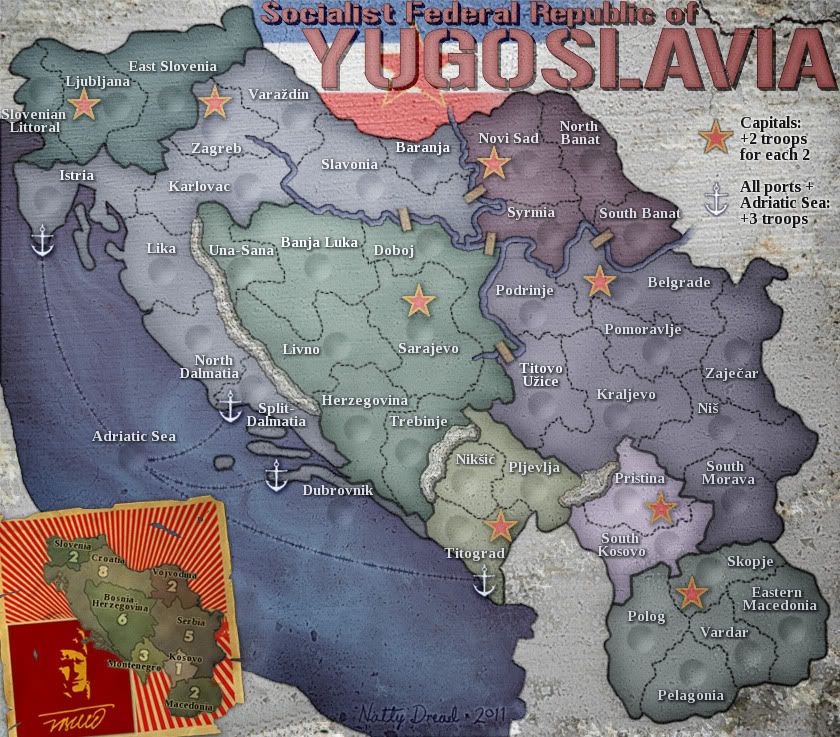
Because there is actually sea in that place, in actual, real world?Victor Sullivan wrote:But why is it there?
-Sully
I did not mean add to map also emblem. I meant kick off flag (the title looks better alone) and add ONLY emblem to the left low corner. it was only my little input...natty_dread wrote:wrt. eblem: I'm a big believer in simplicity on maps. I don't believe in cluttering the map full of every damn thing you can think of that you can possibly associate with the subject of the map, which seems to be popular these days... The flag works, because it's part of the title. Adding another element on the map... not so much.
Ah! That had not crossed my mind. Perhaps use the Adriatic's blue color.natty_dread wrote:Because there is actually sea in that place, in actual, real world?Victor Sullivan wrote:But why is it there?
-Sully
*Sigh* I read it. It should still have the same gradient as the Adriatic - why would it be darker? It's not a continuation of the Adriatic, so why continue the gradient into the darker shades?natty_dread wrote:Refer to the previous post.


I think the flag is a really good part of the map where it is, and I think it works better than any emblem could. I would vote for the flag to stay, personally. As for the dark spot in the bottom left corner, I see what victor is getting at but don't really think it is that big a deal. If you were to change it I would probably go for something along the lines of the mid tones of the ocean, rather than the darker tones.theBastard wrote:I did not mean add to map also emblem. I meant kick off flag (the title looks better alone) and add ONLY emblem to the left low corner. it was only my little input...natty_dread wrote:wrt. eblem: I'm a big believer in simplicity on maps. I don't believe in cluttering the map full of every damn thing you can think of that you can possibly associate with the subject of the map, which seems to be popular these days... The flag works, because it's part of the title. Adding another element on the map... not so much.
Top Score:2403natty_dread wrote:I was wrong


Top Score:2403natty_dread wrote:I was wrong
I don't know, looks pretty ok to me..gimil wrote:The small looks good, except that the army circles might be to small for the army number.


Top Score:2403natty_dread wrote:I was wrong

I completely agree that poster is completely distracting. I just like the idea of a "poster" of some sorts to separate the bonus structure from the map itself. Right now, it looks like it's part of the map even though I know full well it isn't.rdsrds2120 wrote:I agree with natty. The poster doesn't really "fit". It's more thematically pleasing this way, and I think the poster is distracting.
-rd