Baltic States [3/10] V33 P34 Beta!!
Moderator: Cartographers
Forum rules
Please read the Community Guidelines before posting.
Please read the Community Guidelines before posting.
-
General Bax

- Posts: 1860
- Joined: Wed Oct 13, 2010 11:32 am
Re: Baltic States [6/13] V16 P18
how about adding a victory condition - holding the island, the capitals and cauna for 1 round?

Re: Baltic States [6/13] V16 P18
General Bax wrote:how about adding a victory condition - holding the island, the capitals and cauna for 1 round?
I think I want to keep this a simple map for many reasons, but I like simple maps is the main one.
Highest Rank: 26 Highest Score: 3480


Re: Baltic States [6/13] V16 P18
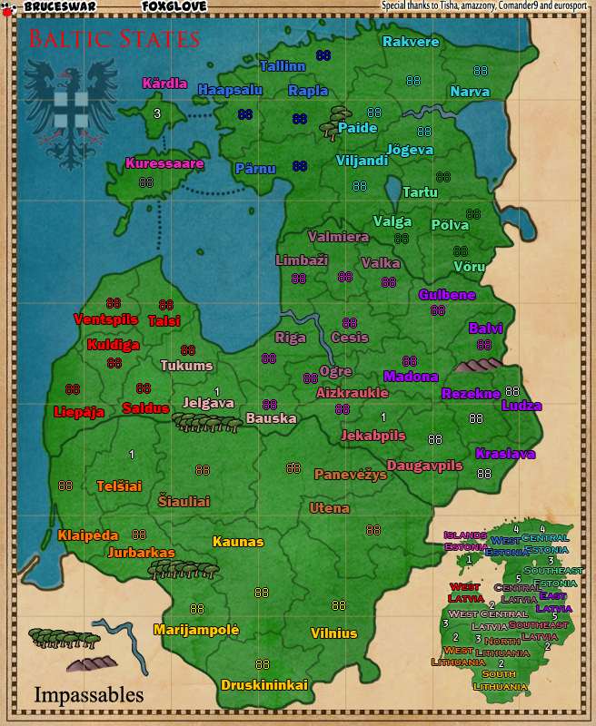
sorry Bruce, my first thoughts when seeing this map are not nice ones.
- i don't like the solid blob of green
- the cartoonish font for territory names
- the legend is too packed to make out the bonuses without a struggle
- some of the terit borders are darker than others but i can't work out why
- what does the eagle in the top left represent
- where in the world is the Baltic States
- what is the blue blob on the left
- what is the faded brown blob on the right and bottom
-
Marshallbobby

- Posts: 1340
- Joined: Thu Feb 03, 2011 4:52 am
- Gender: Male
- Location: Longueuil, Quebec
Re: Baltic States [6/13] V16 P18
nice map Bruce
appreciate the different colors for terts names making it easy to identify territories, that way you dont have to make any special borders identifications I love that.
one question: how about bonuses for southern territories? none?
appreciate the different colors for terts names making it easy to identify territories, that way you dont have to make any special borders identifications I love that.
one question: how about bonuses for southern territories? none?
-
nolefan5311
- Posts: 1768
- Joined: Mon Nov 22, 2010 11:51 am
- Gender: Male
- Location: Florida
Re: Baltic States [6/13] V16 P18
I would probably prefer that each bonus zone is a different color. They don't necessarily need to contrast too sharply, but I probably agree with greenoaks in that it'd be nice to see more colors on the map.
Re: Baltic States [6/13] V16 P18
I like the map Bruce, but let me use greenoaks comments to pitch some of mine
Also, I think a capitals bonus for holding the 3 capitals will be nice. (the last two suggestion also came from BeNelux map that had the same idea)
Other comment:
The East side of the map has completely passable. I think you should add some impassible to add to gameplay. I suggest to use the two Rivers Daugava that runs thru Latvia (and you use part of it already) and Namunas that runs thru Lithuania to add some impassables. (bridges will need to be added some rivers can be passed in some places)
I understand you did that to differentiate between the 3 different countries. I think it was better if you used a different line to show country borders. Benelux map is a good example.greenoaks wrote:some of the terit borders are darker than others but i can't work out why
I totally agree with that comment. I couldn't figure out the bonus for the two west Latvia bonus areas. I don't know if the number is on top\bottom of the bonus name or left right. (And by the way West Latvia has 5 territs with 4 bordering other bonus territs. I think 2 or even 3 bonus is too low. maybe isolate one of the terrirts by impassable border)greenoaks wrote:the legend is too packed to make out the bonuses without a struggle
maybe if you write Baltic sea on the blob that will help eliminate some of the confusion. The name of the countries in the map are hidden in the bonus name. If you wish to keep all map in single color you need to better display the names so people will understand these are real countries. maybe add the flags...greenoaks wrote: [*]where in the world is the Baltic States
[*]what is the blue blob on the left
Also, I think a capitals bonus for holding the 3 capitals will be nice. (the last two suggestion also came from BeNelux map that had the same idea)
Other comment:
The East side of the map has completely passable. I think you should add some impassible to add to gameplay. I suggest to use the two Rivers Daugava that runs thru Latvia (and you use part of it already) and Namunas that runs thru Lithuania to add some impassables. (bridges will need to be added some rivers can be passed in some places)

Re: Baltic States [6/13] V16 P18
Your map is great - wish I was as talented...
Better is the enemy of Good...
So if you keep on changing it, you'll end up ruining it...
You have a great map - you should take it and run with it....
Better is the enemy of Good...
So if you keep on changing it, you'll end up ruining it...
You have a great map - you should take it and run with it....

Re: Baltic States [6/13] V16 P18
If you look at my maps you probably wont be surprised, but I really liked it before you changed to green, version 14. I was a big fan of the color scheme, and forgive my laziness, but I'm not sure what the problem with that version was and why you switched. I thought I remembered reading about the colors, but maybe there is a middle ground. Personally for a "map" themed map, not sure you know what I mean, but like it were on an actual map, etc., I think that earlier color scheme worked better, and I really don't like the colored font, especially how bright they are. If the problem was differentiating the bonus regions in the legend, why not go back to that color scheme but use the mini-map from this one. Then you get the best of both worlds, but I don't know what you as the map maker liked better, and should go with that in the end.


Re: Baltic States [6/13] V16 P18
To answer a few concerns. The more I look at the green map the more it just is not going to work.
I will be going back to colors.
My next update will be packed full of fixes etc.
Update will come in a few days time max.
I will be going back to colors.
My next update will be packed full of fixes etc.
Update will come in a few days time max.
Highest Rank: 26 Highest Score: 3480
Re: Baltic States [6/13] V16 P18
Bruceswar wrote:To answer a few concerns. The more I look at the green map the more it just is not going to work.
I will be going back to colors.
My next update will be packed full of fixes etc.
Update will come in a few days time max.
Re: Baltic States [6/13] V16 P18
Seamus76 wrote:Bruceswar wrote:To answer a few concerns. The more I look at the green map the more it just is not going to work.
I will be going back to colors.
My next update will be packed full of fixes etc.
Update will come in a few days time max.
You are going to like my next update.. I have a bit of a surprise!
Highest Rank: 26 Highest Score: 3480
Re: Baltic States [6/13] V17 P20
I pretty much took what was in Version 7 which people seemed to like and combined it with 16 to come up with version 17!

Version 17 - Color!
What is new:
We are going back from the green which just did not work to color.
That mini map was a mess! So we are reverting back.
Changes to the Water also
Added Sea Names
Other minor fixes..
Comments and suggestions always welcome!
Version 17 - Color!
What is new:
We are going back from the green which just did not work to color.
That mini map was a mess! So we are reverting back.
Changes to the Water also
Added Sea Names
Other minor fixes..
Comments and suggestions always welcome!
Highest Rank: 26 Highest Score: 3480
Re: Baltic States [6/13] V16 P18
Fixed!greenoaks wrote:sorry Bruce, my first thoughts when seeing this map are not nice ones.
[*]i don't like the solid blob of green
Also Changed!greenoaks wrote:[*]the cartoonish font for territory names
Yeah I agree it was so Changed also.greenoaks wrote:[*]the legend is too packed to make out the bonuses without a struggle
Those are the country boundaries. That was why some were darker than others.greenoaks wrote:[*]some of the terit borders are darker than others but i can't work out why
That Eagle is a Symbol of the region this map is from.greenoaks wrote:[*]what does the eagle in the top left represent
Baltic States are next to the Baltic Sea, which is below Finland and next to Russia. Eastern Europe.greenoaks wrote:[*]where in the world is the Baltic States
That would be the Baltic Sea. I assume that is what you meant?greenoaks wrote:[*]what is the blue blob on the left
Those are very small mountains and or hills. Done in a Brownish color so they stand out more.greenoaks wrote:[*]what is the faded brown blob on the right and bottom
Highest Rank: 26 Highest Score: 3480
Re: Baltic States [6/13] V16 P18
I got lots of response for bringing the colors back and the more I looked at the green it just did not work as far as a map goes... So back to colors I went.nolefan5311 wrote:I would probably prefer that each bonus zone is a different color. They don't necessarily need to contrast too sharply, but I probably agree with greenoaks in that it'd be nice to see more colors on the map.
Highest Rank: 26 Highest Score: 3480
Re: Baltic States [6/13] V16 P18
BluU wrote:I like the map Bruce, but let me use greenoaks comments to pitch some of mine
I understand you did that to differentiate between the 3 different countries. I think it was better if you used a different line to show country borders. Benelux map is a good example.greenoaks wrote:some of the terit borders are darker than others but i can't work out why
I totally agree with that comment. I couldn't figure out the bonus for the two west Latvia bonus areas. I don't know if the number is on top\bottom of the bonus name or left right. (And by the way West Latvia has 5 territs with 4 bordering other bonus territs. I think 2 or even 3 bonus is too low. maybe isolate one of the terrirts by impassable border)greenoaks wrote:the legend is too packed to make out the bonuses without a struggle
maybe if you write Baltic sea on the blob that will help eliminate some of the confusion. The name of the countries in the map are hidden in the bonus name. If you wish to keep all map in single color you need to better display the names so people will understand these are real countries. maybe add the flags...greenoaks wrote: [*]where in the world is the Baltic States
[*]what is the blue blob on the left
Also, I think a capitals bonus for holding the 3 capitals will be nice. (the last two suggestion also came from BeNelux map that had the same idea)
Other comment:
The East side of the map has completely passable. I think you should add some impassible to add to gameplay. I suggest to use the two Rivers Daugava that runs thru Latvia (and you use part of it already) and Namunas that runs thru Lithuania to add some impassables. (bridges will need to be added some rivers can be passed in some places)
Point 1: BelNeLux uses impassbles on some countries yet not on others...
Point 2: Mini map is gone back to the better looking bonus list.
Point 3: Baltic Sea Added and Bay of Riga to help people out.
Point 4. While the right side might look like an easy run up, you will not be able to collect bonuses easy on that side either.
Highest Rank: 26 Highest Score: 3480
Re: Baltic States [6/19] V17 P20
I like this color version much better!
still some comments
still some comments
- I didn't see a response from you on my flags suggestion that will help people with lesser Geographic knowledge, these are three countries. An alternate option is to use a shaded font over the country area stating the names. (I'll respect a response saying you don't see an added value there
 )
) - I want to hear about the logic behind the bonus you put. NO. Lit and SO. Lat are both 3 territories in very similar location, but one gets bonus of 3 and the other 2. Cent Est and We. Lat both have 5 territs which 4 border outside territs, but the 1st have bonus of 4 and the later has bonus of 3. I also think islands should yield a bonus of 1 comparing to the other bonuses of 2 which look much more harder to defend
Re: Baltic States [6/19] V17 P20
BluU wrote:I like this color version much better!
still some comments
- I didn't see a response from you on my flags suggestion that will help people with lesser Geographic knowledge, these are three countries. An alternate option is to use a shaded font over the country area stating the names. (I'll respect a response saying you don't see an added value there
- I want to hear about the logic behind the bonus you put. NO. Lit and SO. Lat are both 3 territories in very similar location, but one gets bonus of 3 and the other 2. Cent Est and We. Lat both have 5 territs which 4 border outside territs, but the 1st have bonus of 4 and the later has bonus of 3. I also think islands should yield a bonus of 1 comparing to the other bonuses of 2 which look much more harder to defend
At the comment about the flags and or country names. I do not think it will help to much, but I will label Russia and Poland to see if that helps some. I do not plan to use flags, but the names will be somewhere.
As far as the bonuses..
North Lit vs South Lat
South Lat has 7 connections and is worth 2 ....
North Lit has 9 connections and thus worth 3....
Valid point about 4 vs 3,,, we shall see how it plays out...
@ the point about the islands. I want that bonus to come into play... So with that said if you make it a 1 bonus then nobody is gonna mess with it. Make it 2 and people will want it.
Highest Rank: 26 Highest Score: 3480


Re: Baltic States [6/19] V17 P20
I like the map, I like the bright colours, I like the concept.
Only thing I would change at this point is to make the font a little smaller so not so many province names overflow their borders.
Only thing I would change at this point is to make the font a little smaller so not so many province names overflow their borders.
“Life is a shipwreck, but we must not forget to sing in the lifeboats.”
― Voltaire
― Voltaire
Re: Baltic States [6/19] V17 P20
While some of us have great vision other people do not, so with that in mind I have to keep some size or else the small version will be really hard to read for some people.Dukasaur wrote:I like the map, I like the bright colours, I like the concept.
Only thing I would change at this point is to make the font a little smaller so not so many province names overflow their borders.
Highest Rank: 26 Highest Score: 3480
Re: Baltic States [6/19] V17 P20
Version 18

What is new:
What is next? I wanna start moving towards the end graphically. Ofc the small map will be one of the last things I do and the xml.
What is new:
- Fixed Lithuania Territory Names
- Changed West Lithuania to a different color to make it easier to read.
- Added the names of Russia, Poland and Belarus
- Other minor fixes
What is next? I wanna start moving towards the end graphically. Ofc the small map will be one of the last things I do and the xml.
Highest Rank: 26 Highest Score: 3480
Re: Baltic States [6/19] V18 P20
I need to be a Geo NerdAdded the names of Russia, Poland and Belarus
Poland name should be between the Word "Impassable" and the province of Druskinimkai
I love the way this map is going. Good Job!
Re: Baltic States [6/19] V17 P20
I'm 50 years old, and my eyes are terrible. Trust me, if I can see it, anybody can!Bruceswar wrote:While some of us have great vision other people do not, so with that in mind I have to keep some size or else the small version will be really hard to read for some people.Dukasaur wrote:I like the map, I like the bright colours, I like the concept.
Only thing I would change at this point is to make the font a little smaller so not so many province names overflow their borders.
However, it looks as if the font in your latest version is much smaller than in the version I was commenting on, so my comments were based on an obsolete version anyway.
“Life is a shipwreck, but we must not forget to sing in the lifeboats.”
― Voltaire
― Voltaire
Re: Baltic States [6/19] V18 P20
BluU wrote:I need to be a Geo NerdAdded the names of Russia, Poland and Belarushere and point out that the place you put the name "Poland" is actually the Kaliningrad Oblast and belongs to Russia.
Poland name should be between the Word "Impassable" and the province of Druskinimkai
I love the way this map is going. Good Job!
Yes you are 100% correct and I tried to squeeze in Poland. I will try again to see if I can make it work.
Highest Rank: 26 Highest Score: 3480
-
ManBungalow
- Posts: 3431
- Joined: Sun Jan 13, 2008 7:02 am
- Location: On a giant rock orbiting a star somewhere
Re: Baltic States [6/19] V18 P20
Looks very...clean. I like it.
One thing while I'm here:
The grid you have on top of everything looks a little uncomfortable. Like it needs to be a darker colour (near black) and set the layer mode to overlay or something.
One thing while I'm here:
The grid you have on top of everything looks a little uncomfortable. Like it needs to be a darker colour (near black) and set the layer mode to overlay or something.

Re: Baltic States [6/19] V18 P20
ManBungalow wrote:Looks very...clean. I like it.
One thing while I'm here:
The grid you have on top of everything looks a little uncomfortable. Like it needs to be a darker colour (near black) and set the layer mode to overlay or something.
I just tried what you said and it looks very funky... I will see if there is anything I can do.. New version coming soon.
Highest Rank: 26 Highest Score: 3480