Classic Map Touch-Up - Update: Live map changed
Moderator: Community Team
Forum rules
Please read the Community Guidelines before posting.
Please read the Community Guidelines before posting.
-
Scott-Land

- Posts: 2423
- Joined: Tue Jan 23, 2007 9:37 pm
Re: Classic Map Touch-Up
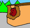
What's up with the white circles ? Very busy and cluttered......
-
JOHNNYROCKET24

- Posts: 5514
- Joined: Mon May 08, 2006 4:11 am
- Gender: Male
- Location: among the leets
Re: Classic Map Touch-Up
please put it back to the way it was. Im having trouble trying to focus in where the remaining enemy troops are at.AndyDufresne wrote:Ahoy Ahoy Everyone,
As many of you may know, from time to time we employ full REVAMPs and minor TOUCH-UPs to help beautify and fix some of our precious, older maps. In the Map Foundry, our beloved Classic Map has been under going some minor TOUCH-UPs for the past while. A dedicated anonymous TOUCH-UP artist, with the assistance of all you who have commented in the Foundry, has fixed a number of trouble and irksome issues.
==================================================================================================================
- What Has Been Changed
Lighter army shadows to allow for easier readability of army coordinates.
Color coordination between continents and the legend.
Slight color alteration to the Australia continent.
Territory names visually improved for added clarity and beauty.
Irregular army coordinates properly centered.
***Additionally, the old Classic Map will be temporarily renamed "Classic!" to avoid cache issues.***
We hope that above alterations and changes can make for a better experience on our beloved Classic Map for all, while still maintaining its originality and classic feel.
--Andy
thanks for the attempt to improve the map
JR's Game Profile
Spoiler
Highest Score- 3969
Highest Place- 1st
Highest Rank- Conqueror
Total Medals Won- 157
6 time Wac-a-Mod Champion
June 2014 Monthly Challenge Winner
August 2020 Monthly Challenge Winner
Highest Place- 1st
Highest Rank- Conqueror
Total Medals Won- 157
6 time Wac-a-Mod Champion
June 2014 Monthly Challenge Winner
August 2020 Monthly Challenge Winner

-
firstholliday

- Posts: 1338
- Joined: Sat Feb 10, 2007 1:51 pm
- Gender: Male
- Location: Amsterdam (the fun city)
Re: Classic Map Touch-Up
FFS i,m of to bed and gonna mis some turns........ bloody drama!!!!

7 firstholliday 3589 (58%) General 128-2 Netherlands
-
thegeneralpublic
- Posts: 126
- Joined: Fri Mar 09, 2007 9:49 pm
- Location: In front of my computer screen.
- Contact:
Re: Classic Map Touch-Up
Wow, that's a lot of ire going around. I personally feel that the changes were an improvement, for what it's worth.
@Detractors: How about constructive criticism?
@Detractors: How about constructive criticism?
GENERATION 23:
The first time you see this, copy it into your sig on any forum and add 1 to the generation. Social experiment.
The first time you see this, copy it into your sig on any forum and add 1 to the generation. Social experiment.
-
Pedronicus
- Posts: 2080
- Joined: Tue Jan 24, 2006 2:42 pm
- Gender: Male
- Location: Busy not shitting you....
Re: Classic Map Touch-Up
the map needed going over properly, so as it looks as smooth as some of the recent graphical maps that have been posted.
It still looks like a nightmare in paint
It still looks like a nightmare in paint

Re: Classic Map Touch-Up
I know the overall opinion is unhappiness, but I’d like to give you praise.
I feel this new map is a great improvement. I'm a user who has just joined and is not stuck in his ways with the old appearance of the map (which was illegible and was difficult to see the blue armies). It is easier to see all the armies and I can now read all of the place names easily at a glance. Good job, and time well spent!
Thank you
Re: Classic Map Touch-Up
this sucks really sucks 
Re: Classic Map Touch-Up
It's simple, the circles are bloody awful, get rid of them or at least make them optional!thegeneralpublic wrote:Wow, that's a lot of ire going around. I personally feel that the changes were an improvement, for what it's worth.
@Detractors: How about constructive criticism?
-
skillerman

- Posts: 17
- Joined: Tue Jan 29, 2008 1:33 pm
- Contact:
Re: Classic Map Touch-Up
I can't see a thing with those giant white circles all over. Just lost a freestyle that changed to this new map mid-way, partly because I couldn't see a thing on the map. PLEASE change that part back!
-
PapalKings

- Posts: 14
- Joined: Thu Mar 22, 2007 2:47 am
Re: Classic Map Touch-Up
All that is is Risk II colours...and it looks horrible...how unoriginal.

Re: Classic Map Touch-Up
Sorry guys, but I prefer the original Classic map, even though sometimes it was hard to see green or blue on it. If I wanted a map like the new version, I would play World. Even just a slightly lighter background to the numbers on the old map would have sufficed. Thanks anyway, but back to the drawing board...
-
CatfishJohnson

- Posts: 137
- Joined: Tue Feb 19, 2008 3:47 pm
- Location: Michigan
- Contact:
Re: Classic Map Touch-Up
STOP FUCKING COMPLAINING, I SWEAR DO CC PLAYERS CONSIST OF SPOILED FUCKING LITTLE GURLS damn it, get lives all, people put work into these things and all u do is fucking complain, now i kno why the person wasnt named f*ck guys seriously
Re: Classic Map Touch-Up
Although I agree that the white dots are a bit overpowering..KaiserJim wrote: I feel this new map is a great improvement.
-
justhavinfun
- Posts: 4
- Joined: Sun Dec 09, 2007 12:36 am
Re: Classic Map Touch-Up
I'm just one vote, but change it back, please.
The lighter shadow makes it even harder to distinguish the color of the armies. Particularly, yellow, white, and grey all look very similar.
On a positive note, I love the enthusiasm and effort to continue to improve CC.
The lighter shadow makes it even harder to distinguish the color of the armies. Particularly, yellow, white, and grey all look very similar.
On a positive note, I love the enthusiasm and effort to continue to improve CC.
-
oggiss

- Posts: 1607
- Joined: Thu Jan 18, 2007 8:43 am
- Location: Sweden - Probably the best country in the world
Re: Classic Map Touch-Up
Haha, more negative people than positive... funny ^^
Record - 3582 p rank - 6 General
Re: Classic Map Touch-Up
HORRIBLE CHANGE, THE WHITE CIRCLES ARE AWFUL...THEY MAKE IT MORE DIFFICULT TO MAKE OUT THE INDIVIDUAL COLOURED ARMIES, THE WHITE IS TOO BRIGHT... CLASSIC WAS BETTER BEFORE THE CHANGE.
Re: Classic Map Touch-Up
I have to agree with the consensus that the change looks horrible - the white dots make things less readable than before, which is the opposite of what I believe the intention was.
Re: Classic Map Touch-Up
People complain if there are valid reasons to do so Catfish. When helpful improvements are made people say thank you.
These changes are horrible. If you insist on making maps worse and less fun to play on at least leave the old map up so we have not forced to play on this hideous one. Thank you for ruining the best map in the game.
These changes are horrible. If you insist on making maps worse and less fun to play on at least leave the old map up so we have not forced to play on this hideous one. Thank you for ruining the best map in the game.
Last edited by Etoh on Tue Apr 08, 2008 4:29 pm, edited 1 time in total.

Re: Classic Map Touch-Up
Guys, this touch up has been in the map foundry since the end of January. If you don't like it, you should have posted there sometime in the past three months. If you were too lazy to do so, it's your own damn fault.
I think the touch-up looks lovely
I think the touch-up looks lovely
-
firstholliday
- Posts: 1338
- Joined: Sat Feb 10, 2007 1:51 pm
- Gender: Male
- Location: Amsterdam (the fun city)
Re: Classic Map Touch-Up
Better save yourself some time. there will be a 1000 negs in 24 hours.....
CHANGE IT BACK plzzzzzzzzzzzzzzzzzzzzz

CHANGE IT BACK plzzzzzzzzzzzzzzzzzzzzz
7 firstholliday 3589 (58%) General 128-2 Netherlands

Re: Classic Map Touch-Up
Bit of a curates egg from my viewpoint.
The circles were tested some months back if I remember correctly. The reaction then was pretty negative, seems so again. I do not like them, they are not easy on the eye at all.
Australia looks better. Colour cordination is better, I suppose. I cannot actually see the difference regarding the territory names, the same goes for the irregular army co-ordinates.
Not the best, you can't please all the people all the time, but surely the worst 'improvement' has to be those circles.

Due to current economic conditions the light at the end of the tunnel has been turned off
-
causualplayer
- Posts: 2
- Joined: Thu Dec 27, 2007 12:56 am
- Location: United States
Re: Classic Map Touch-Up
Very, very nice! Thank you!!

Re: Classic Map Touch-Up
good try but the mission is a failure...best thing i can think of is change it back and make white circles optional
-
firstholliday
- Posts: 1338
- Joined: Sat Feb 10, 2007 1:51 pm
- Gender: Male
- Location: Amsterdam (the fun city)
Re: Classic Map Touch-Up
ZeakCytho wrote:Guys, this touch up has been in the map foundry since the end of January. If you don't like it, you should have posted there sometime in the past three months. If you were too lazy to do so, it's your own damn fault.
I think the touch-up looks lovely
MORAN people play games instead of reading crap. 80% of the new maps are hiddeous anyway, why do you think most people play classic?
7 firstholliday 3589 (58%) General 128-2 Netherlands